Note
Access to this page requires authorization. You can try signing in or changing directories.
Access to this page requires authorization. You can try changing directories.
A control used to display data.
Note
Full documentation and source code found in the GitHub code components repository.
Description
This code component provides a tag list that provides flexible-width rendering bound to a collection.
Properties
Key properties
| Property | Description |
|---|---|
SelectedKey |
The key to select. This will be updated via the OnChange event when the user interacts with the control. |
Items |
The action items to render |
Items properties
Each item uses the following schema to visualize data in the component.
| Name | Description |
|---|---|
ItemDisplayName |
The Display Name of the command/tab/menu item |
ItemKey |
The key to use to indicate which item is selected, and when adding sub items. The keys must be unique. |
ItemIconName |
The Fluent UI icon to use (see Fluent UI icons) |
ItemIconColor |
The color to render the icon as (e.g. named, rgb or hex value) |
ItemTextColor |
The color of the text inside the tag |
ItemBackgroundColor |
The color of the tag background |
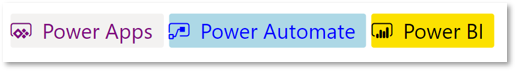
Example:
Table(
  {
  	ItemDisplayName: "Power Apps",
  	ItemKey: "1",
  	ItemEnabled: true,
      ItemChecked: true,
  	ItemIconName: "Powerapps",
  	ItemIconColor: "purple",
  	ItemTextColor: "purple",
  	ItemBackgroundColor: "lightpurple"
  },
  {
  	ItemDisplayName: "Power Automate",
  	ItemKey: "2",
  	ItemEnabled: false,
  	ItemIconName: "MicrosoftFlowLogo",
  	ItemIconColor: "Blue",
  	ItemTextColor: "blue",
  	ItemBackgroundColor: "lightBlue"
  },
  {
  	ItemDisplayName: "Power BI",
  	ItemKey: "3",
  	ItemEnabled: false,
  	ItemIconName: "Powerbilogo",
  	ItemIconColor: "black",
  	ItemTextColor: "black",
  	ItemBackgroundColor: "#fce100"
  }
)
Style properties
| Name | Description |
|---|---|
Theme |
Accepts a JSON string that is generated using Fluent UI Theme Designer (windows.net). Leaving this blank will use the default theme defined by Power Apps. See theming for guidance on how to configure. |
AccessibilityLabel |
Screen reader aria-label |
Event properties
| Name | Description |
|---|---|
InputEvent |
An event to send to the control (E.g. SetFocus) |
Behavior
Supports SetFocus as an InputEvent.
Limitations
This code component can only be used in canvas apps and custom pages.