Note
Access to this page requires authorization. You can try signing in or changing directories.
Access to this page requires authorization. You can try changing directories.
Application Insights collects usage information to help you understand how your users interact with your application. This tutorial walks you through the different resources that are available to analyze this information.
You'll learn how to:
- Analyze details about users who access your application.
- Use session information to analyze how customers use your application.
- Define funnels that let you compare your desired user activity to their actual activity.
- Create a workbook to consolidate visualizations and queries into a single document.
- Group similar users to analyze them together.
- Learn which users are returning to your application.
- Inspect how users move through your application.
Prerequisites
To complete this tutorial:
- Install Visual Studio 2019 with the following workloads:
- ASP.NET and web development.
- Azure development.
- Download and install the Visual Studio Snapshot Debugger.
- Deploy a .NET application to Azure and enable the Application Insights SDK
- Send telemetry from your application for adding custom events/page views.
- Send user context to track what a user does over time and fully utilize the usage features.
Sign in to Azure
Sign in to the Azure portal.
Get information about your users
The Users pane helps you to understand important details about your users in various ways. You can use this pane to understand information like where your users are connecting from, details of their client, and what areas of your application they're accessing.
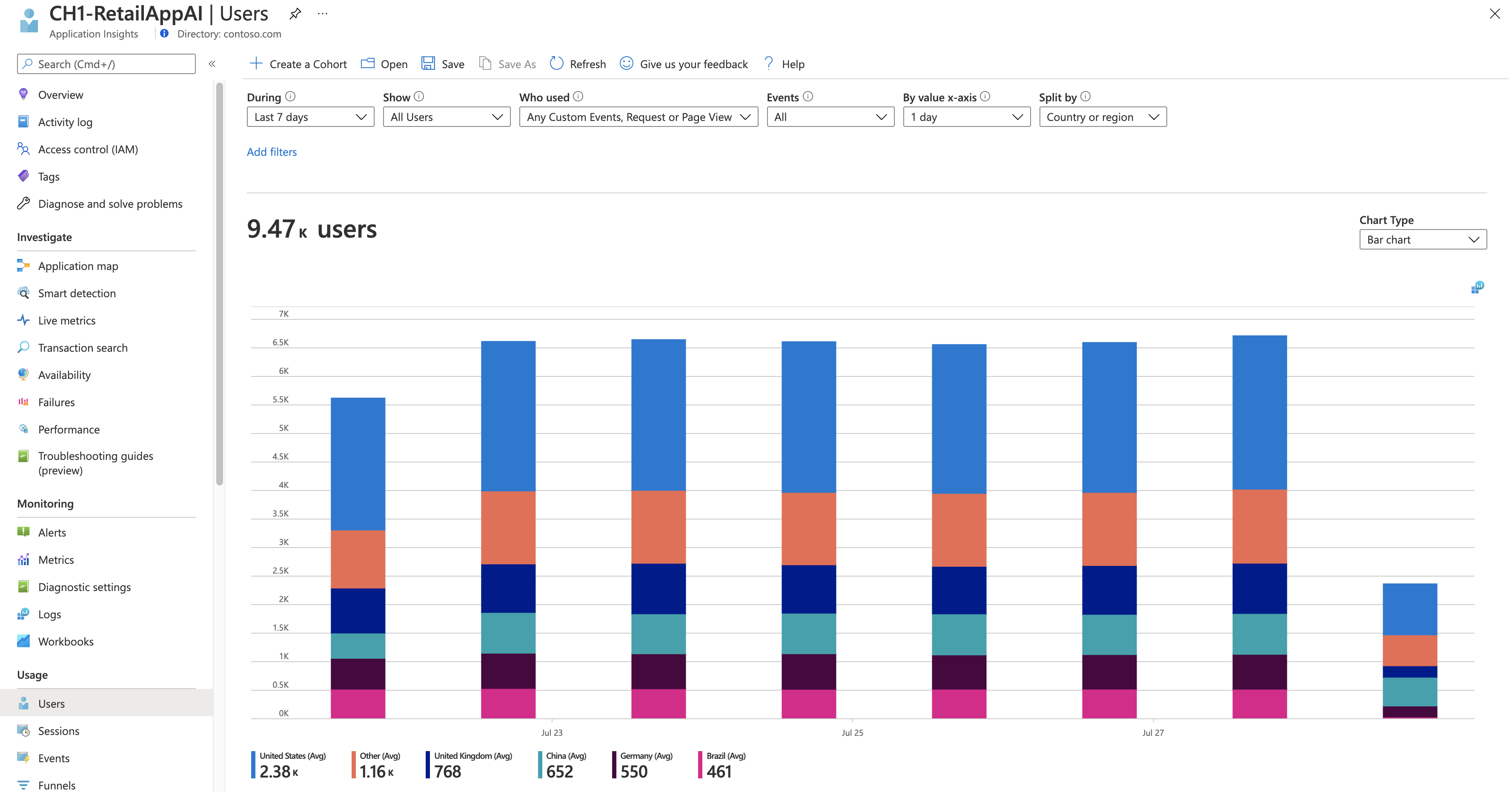
In your Application Insights resource, under Usage, select Users.
The default view shows the number of unique users that have connected to your application over the past 24 hours. You can change the time window and set various other criteria to filter this information.
Select the During dropdown list and change the time window to 7 days. This setting increases the data included in the different charts in the pane.
Select the Split by dropdown list to add a breakdown by a user property to the graph. Select Country or region. The graph includes the same data, but you can use it to view a breakdown of the number of users for each country/region.
Position the cursor over different bars in the chart and note that the count for each country/region reflects only the time window represented by that bar.
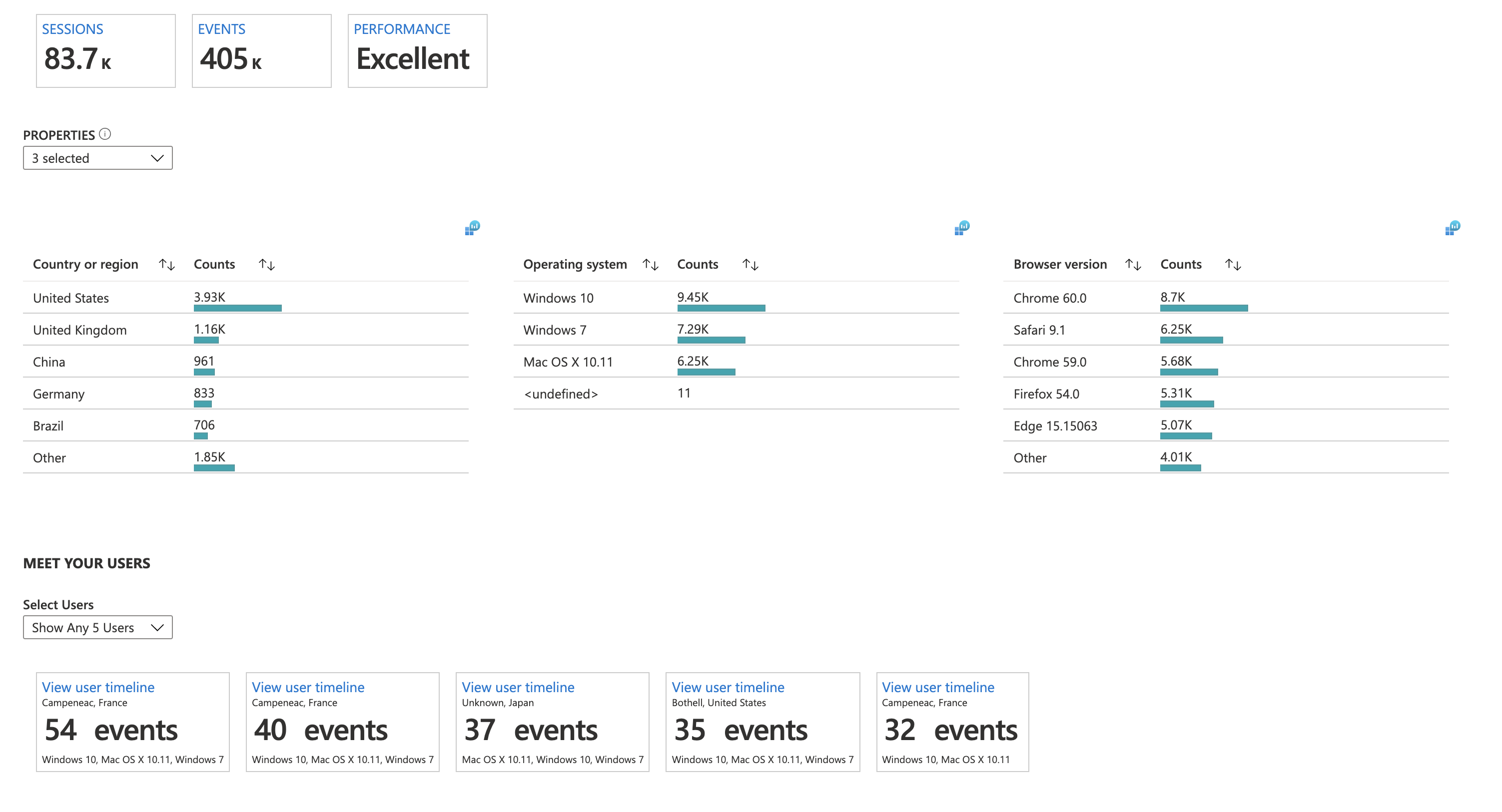
Select View More Insights for more information.
Analyze user sessions
The Sessions pane is similar to the Users pane. Users helps you understand details about the users who access your application. Sessions helps you understand how those users used your application.
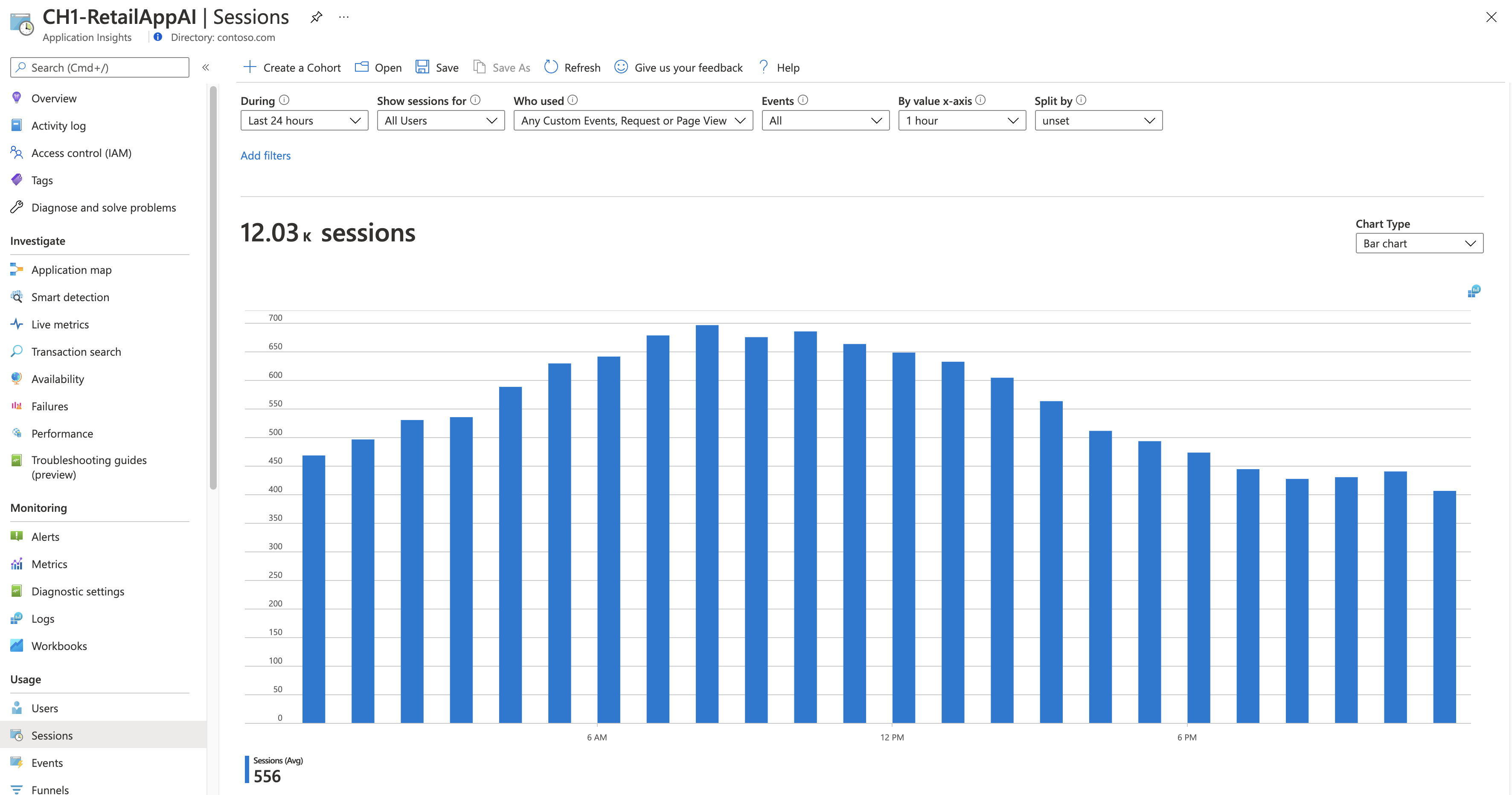
Under Usage, select Sessions.
Look at the graph and note that you have the same options to filter and break down the data as in the Users pane.
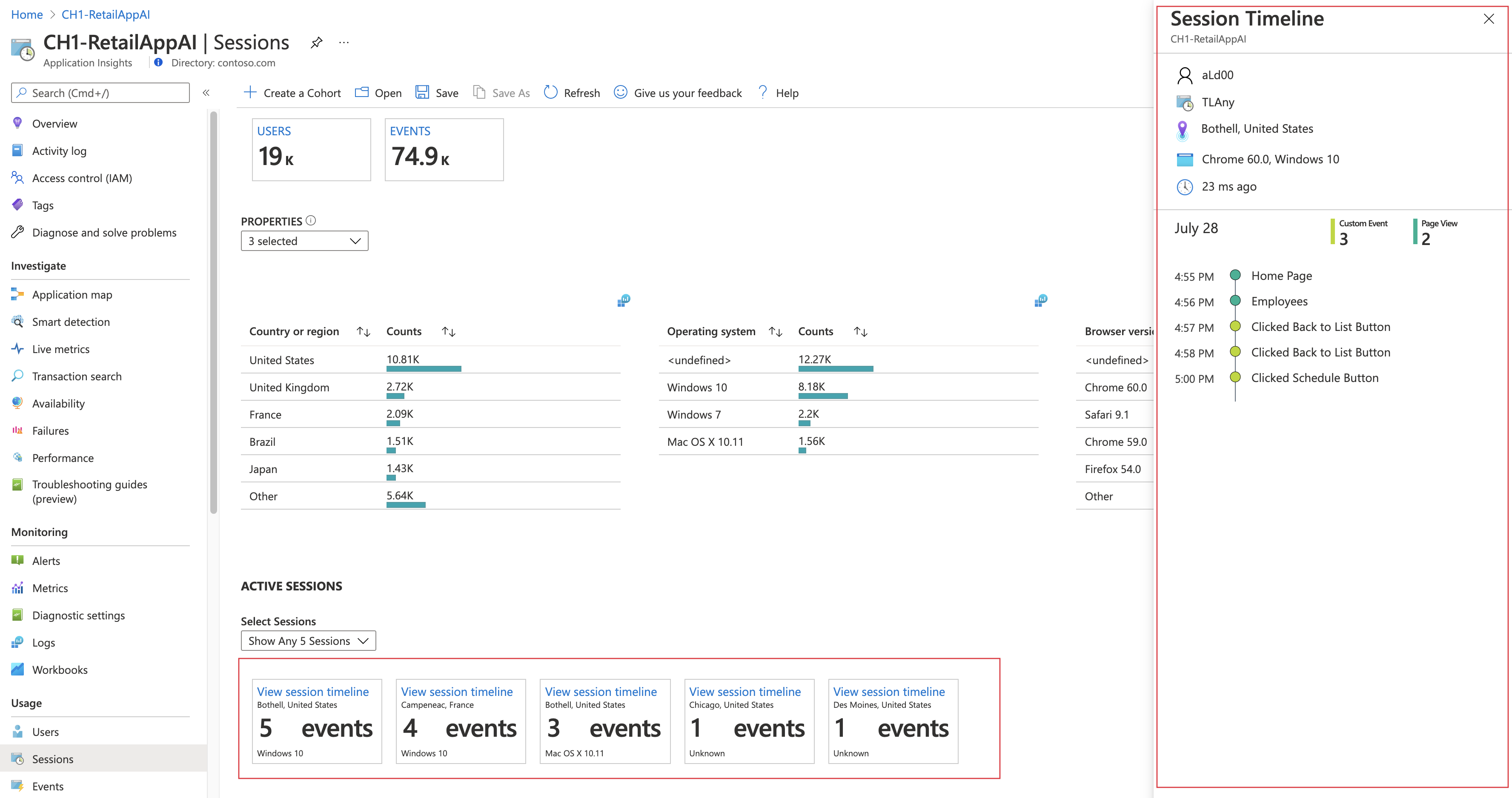
To view the sessions timeline, select View More Insights. Under Active Sessions, select View session timeline on one of the timelines. The Session Timeline pane shows every action in the sessions. This information can help you identify examples like sessions with a large number of exceptions.
Group together similar users
A cohort is a set of users grouped by similar characteristics. You can use cohorts to filter data in other panes so that you can analyze particular groups of users. For example, you might want to analyze only users who completed a purchase.
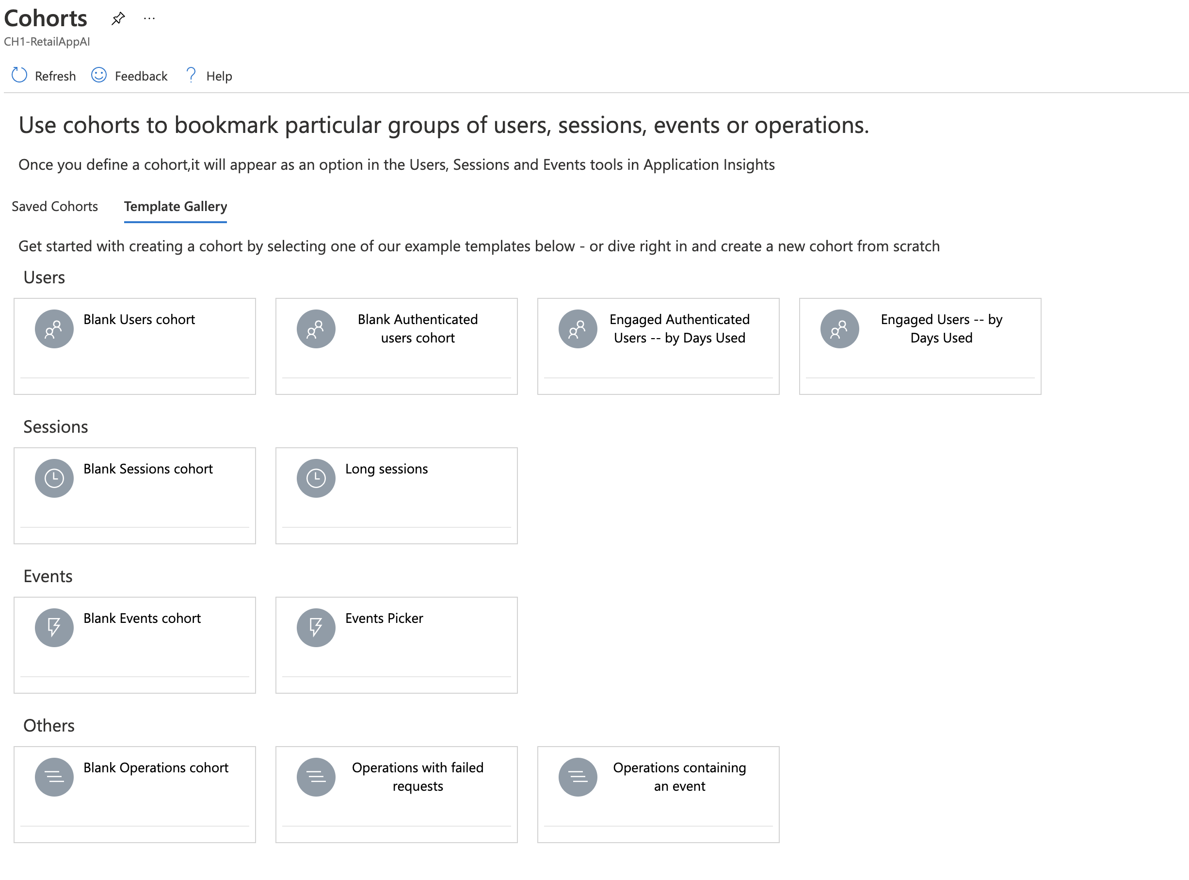
On the Users, Sessions, or Events tab, select Create a Cohort.
Select a template from the gallery.
Edit your cohort and select Save.
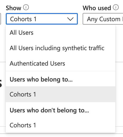
To see your cohort, select it from the Show dropdown list.
Compare desired activity to reality
The previous panes are focused on what users of your application did. The Funnels pane focuses on what you want users to do. A funnel represents a set of steps in your application and the percentage of users who move between steps.
For example, you could create a funnel that measures the percentage of users who connect to your application and search for a product. You can then see the percentage of users who add that product to a shopping cart. You can also see the percentage of customers who complete a purchase.
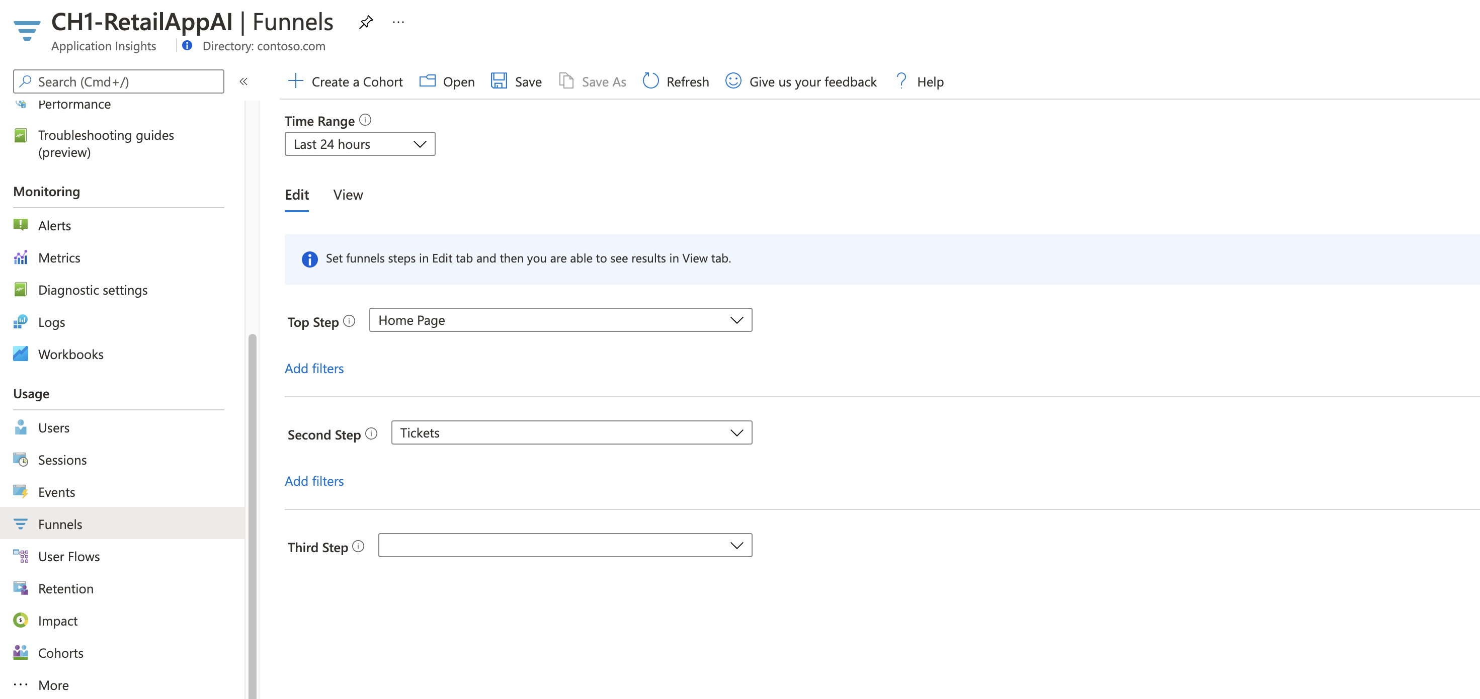
Select Funnels > Edit.
Create a funnel with at least two steps by selecting an action for each step. The list of actions is built from usage data collected by Application Insights.
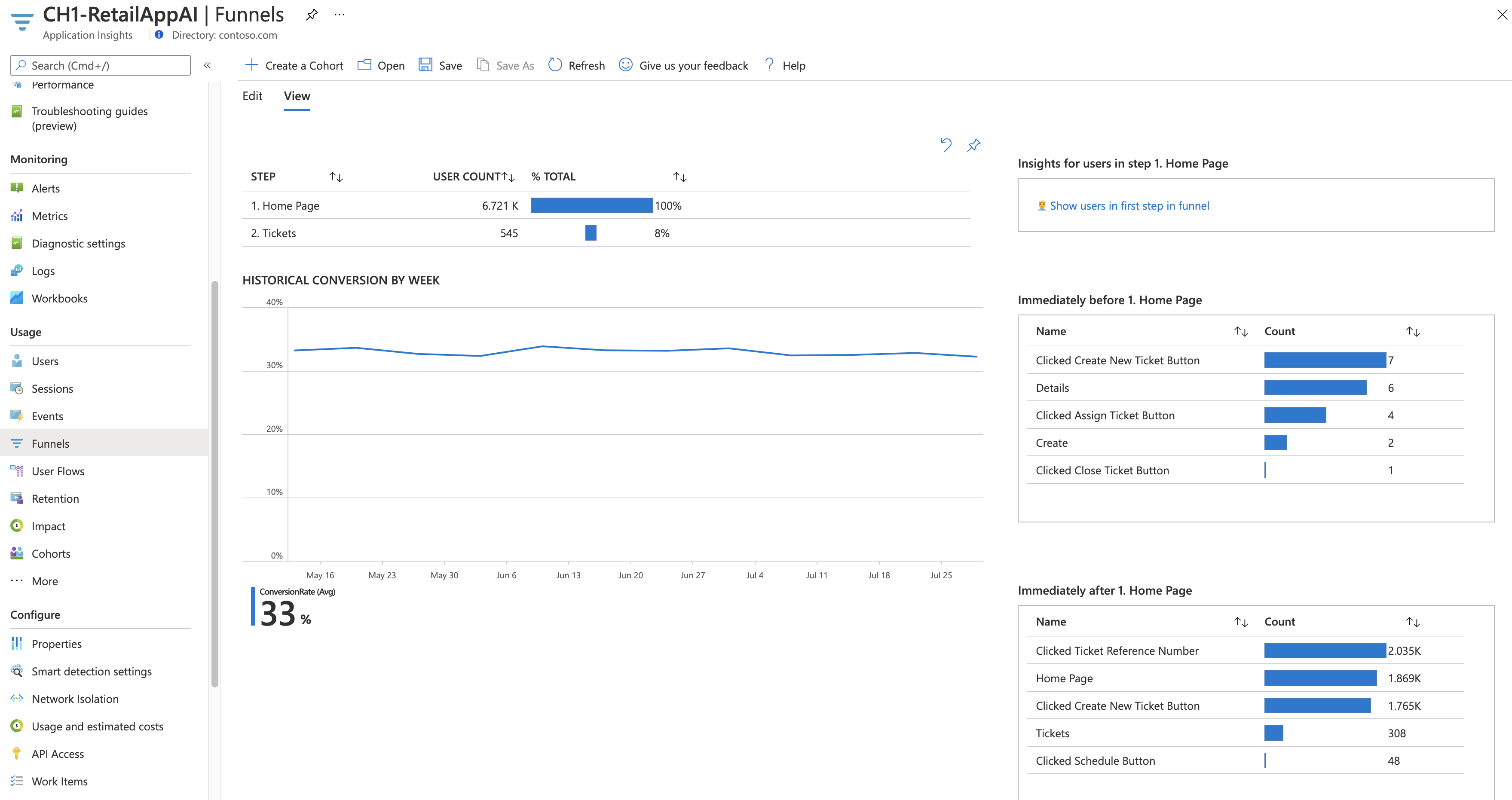
Select the View tab to see the results. The window to the right shows the most common events before the first activity and after the last activity to help you understand user tendencies around the particular sequence.
To save the funnel, select Save.
Learn which customers return
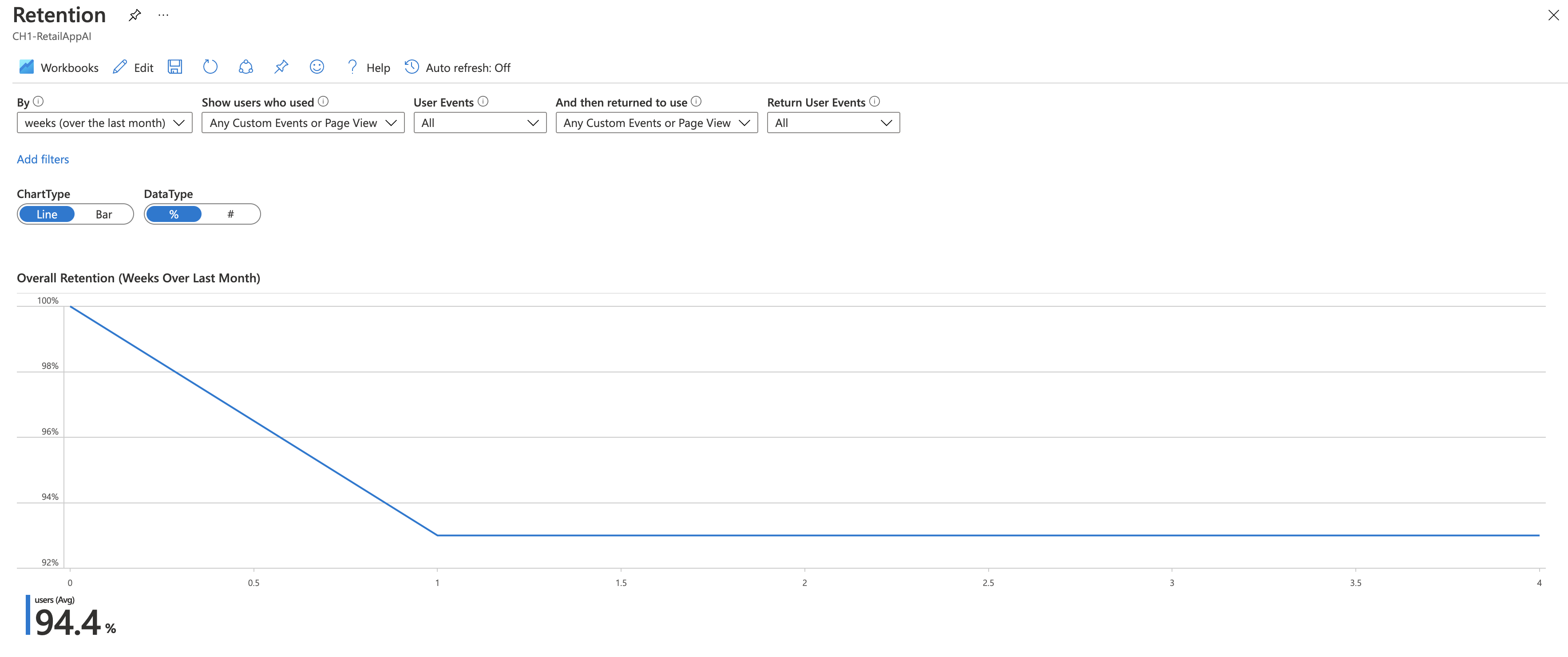
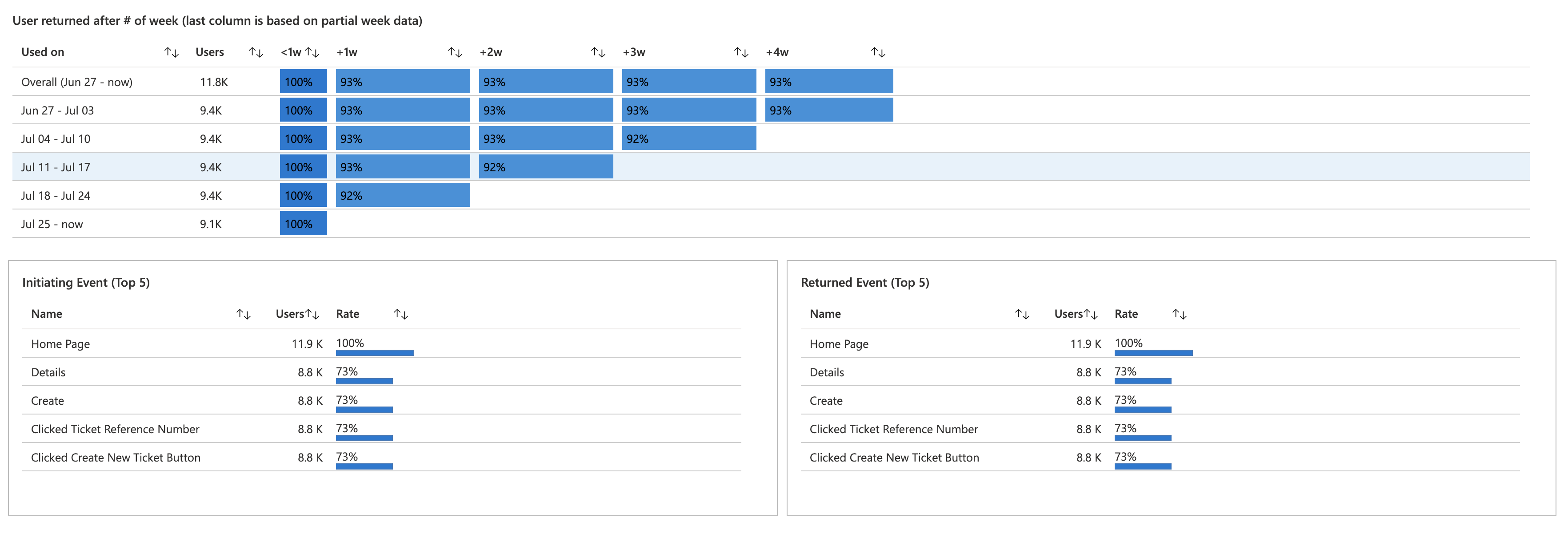
Retention helps you understand which users are coming back to your application.
Select Retention > Retention Analysis Workbook.
By default, the analyzed information includes users who performed an action and then returned to perform another action. For example, you can change this filter to include only those users who returned after they completed a purchase.
The returning users that match the criteria are shown in graphical and table form for different time durations. The typical pattern is for a gradual drop in returning users over time. A sudden drop from one time period to the next might raise a concern.
Analyze user movements
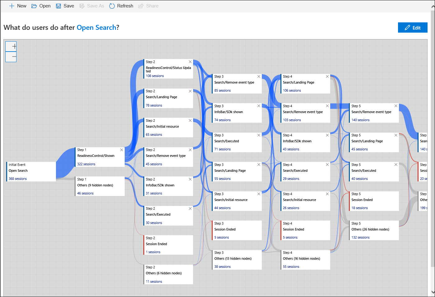
A user flow visualizes how users move between the pages and features of your application. The flow helps you answer questions like where users typically move from a particular page, how they usually exit your application, and if there are any actions that are regularly repeated.
Select User flows on the menu.
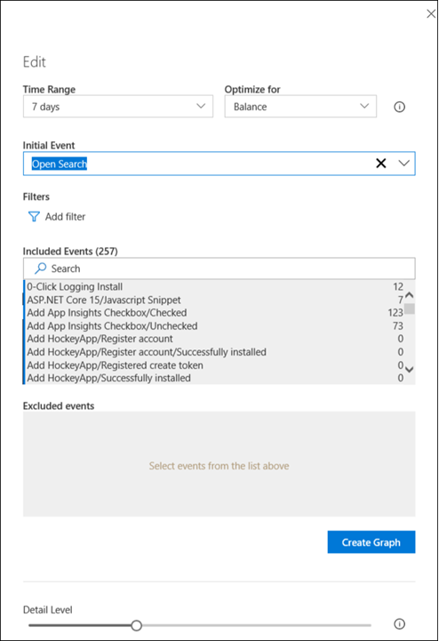
Select New to create a new user flow. Select Edit to edit its details.
Increase Time Range to 7 days and then select an initial event. The flow will track user sessions that start with that event.
The user flow is displayed, and you can see the different user paths and their session counts. Blue lines indicate an action that the user performed after the current action. A red line indicates the end of the user session.
To remove an event from the flow, select the X in the upper-right corner of the action. Then select Create Graph. The graph is redrawn with any instances of that event removed. Select Edit to see that the event is now added to Excluded events.
Consolidate usage data
Workbooks combine data visualizations, Log Analytics queries, and text into interactive documents. You can use workbooks to:
- Group together common usage information.
- Consolidate information from a particular incident.
- Report back to your team on your application's usage.
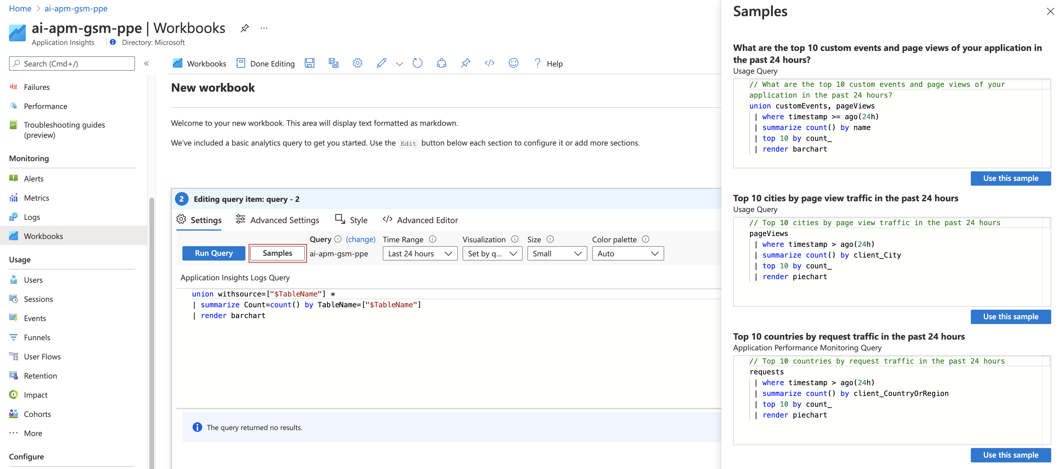
Select Workbooks on the menu.
Select New to create a new workbook.
A query that's provided includes all usage data in the last day displayed as a bar chart. You can use this query, manually edit it, or select Samples to select from other useful queries.
Select Done editing.
Select Edit in the top pane to edit the text at the top of the workbook. Formatting is done by using Markdown.
Select Add users to add a graph with user information. Edit the details of the graph if you want. Then select Done editing to save it.
