Visualize progress
You can quickly view the status of work in progress by charting the results of a flat-list query. You can create several types of charts — such as pie, column, and trend charts — for the same query.
Charts support viewing a count of work items or a sum of values for select numeric fields, such as Remaining Work or Original Estimate.
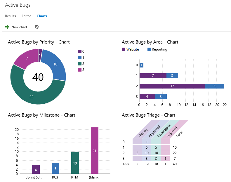
Add a chart
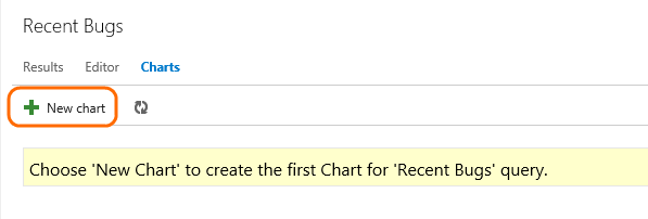
From the Queries page, open the chart editor for a flat list query.
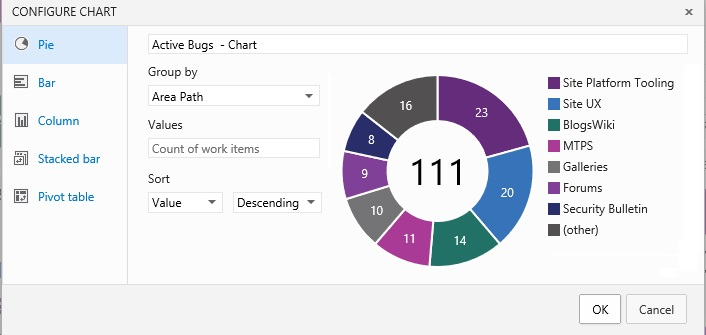
Select the chart type and field for grouping values. When you use pie, bar, and column charts, select a single field to view a count of work items.
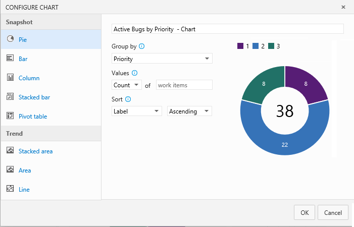
If you don’t see the field you want in the Group by drop-down list, add the field as a column to the query and save the query. You can group by any field except date-time and free-form text fields.
Charts automatically update when you edit the query and when the results of the query change.
Create a stacked bar chart
A stacked bar chart lets you track progress against two field values.
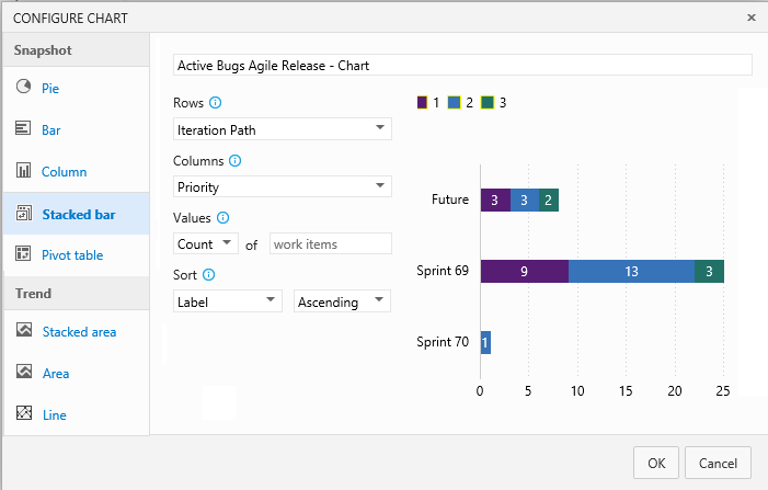
Also, you can sort the rows in the chart by value or label.
Create a trend chart
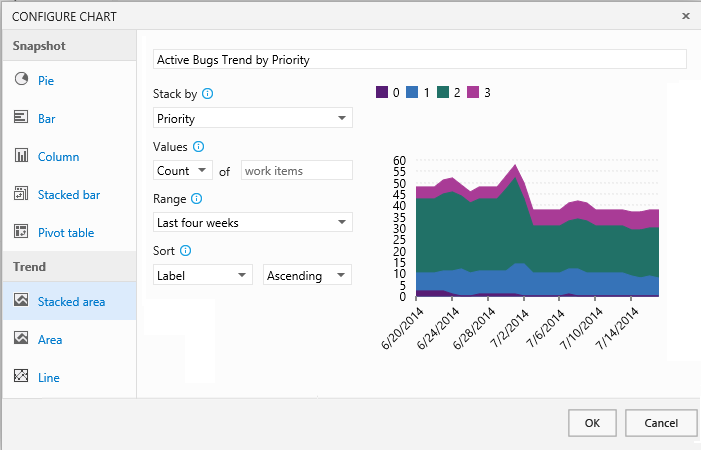
Trend charts let you view progress for the last one, two, or four weeks.
Burndown chart
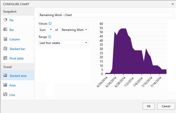
Choose the Sum operator for Remaining Work to view a burndown chart of tasks.
Edit, delete or pin a chart
Select your option from the chart's context menu.
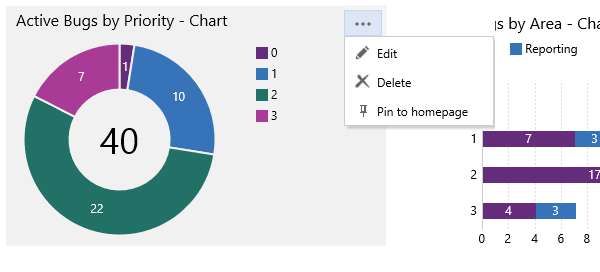
To pin a chart to your team's home page, you must be a team administrator. You can only pin charts defined for shared queries.
Learn more about the home page here. Or learn more about team administration.
Q & A
Q:Why doesn’t my chart show all the field values in the results?
A:When a chart contains more than seven items within the data series, values in the eight-plus items are consolidated into a set labeled “other".
Q:Can I share the charts I create with my team?
A:Yes. Team members can view the charts you create for queries that are saved under Shared Queries. Charts that you create for queries under your My Queries folder are visible only to you.
Also, you can copy the URL of the chart page and email that to a team member.
Q:Why doesn’t the field I want to select show up in the chart editor?
A:Add the field to either the query filter criteria or a displayed column. You can’t select fields for groupings that aren't supported, such as ID, Title, Tags, date-time fields, Description, Repro Steps, and other HTML and long text fields.
Q:How does the chart display areas and iterations?
A:When you select Area Path or Iteration Path, only the leaf node appears in the chart. The leaf node is the last node of the full path. For example, Phone is the leaf node of FabrikamFiber/Fabrikam Website/Phone.
If your query contains a mixed level of leaf nodes, your chart might not reflect expected results.
Q:Can I create a chart that aggregates items using SUM or AVERAGE?
A:Charts support summing numeric fields, but not averaging those fields. Review chart values to determine if they meet expected results. Not all combinations of fields will yield good results.
Q:Can I change the colors in the display of charts?
A:Yes. Simply click on a series in the chart and pick a color from the color picker.
Q:Which browsers support charts?
A:Charts display in browsers that support Scalable Vector Graphics (SGV). This includes Internet Explorer 9, IE 10, IE 11, Chrome, Firefox and Safari on Mac. Charts have not been optimized for mobile or touch displays.
Q:What other charts can I access?
A:From the backlog and board pages, you can access the cumulative flow diagram, team velocity, and sprint burndown charts. Also you can add charts to track test progress.
Try this next
False