Tutorial: Add UI controls to the picture viewer Windows Forms app in Visual Studio
Applies to:  Visual Studio
  Visual Studio for Mac
Note
This article applies to Visual Studio 2017. If you're looking for the latest Visual Studio documentation, see Visual Studio documentation. We recommend upgrading to the latest version of Visual Studio. Download it here
In this series of three tutorials, you'll create a Windows Forms application that loads a picture and displays it. The Visual Studio Integrated Design Environment (IDE) provides the tools you need to create the app. To learn more, see Welcome to the Visual Studio IDE.
This program has a picture box, a checkbox, and several buttons, which you use to control the application. This tutorial shows you how to add these controls.
In this second tutorial, you learn how to:
- Add controls to your application
- Add buttons in a layout panel
- Change control names and locations
- Add dialog components
Prerequisites
This tutorial builds on the previous tutorial, Create a picture viewer application. If you haven't done that tutorial, go through that one first.
Add controls to your application
The Picture Viewer app uses a PictureBox control to display a picture. It uses a checkbox and several buttons to manage the picture and background and to close the app. You'll add the PictureBox and a checkbox from the Toolbox in the Visual Studio IDE.
Open Visual Studio. Your Picture Viewer project appears under Open recent.
In the Windows Forms Designer, select the TableLayoutPanel you added in the previous tutorial. Check that tableLayoutPanel1 appears in the Properties window.
On the left side of the Visual Studio IDE, select the Toolbox tab. If you don't see it, select View > Toolbox from the menu bar or Ctrl+Alt+X. In the toolbox, expand Common Controls.
Double-click PictureBox to add a PictureBox control to your form. Visual Studio IDE adds the PictureBox control to the first empty cell of the TableLayoutPanel.
Choose the new PictureBox control to select it, and then select the black triangle on the new PictureBox control to display its task list.
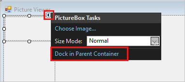
Select Dock in Parent Container, which sets the PictureBox Dock property to Fill. You can see that value in the Properties window.
In the Properties window for the PictureBox, set the ColumnSpan property to 2. The PictureBox now fills both columns.
Set the BorderStyle property to Fixed3D.
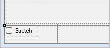
In the Windows Forms Designer, select TableLayoutPanel. Then, in the Toolbox, double-click the CheckBox item to add a new CheckBox control. Your PictureBox takes up the first two cells in the TableLayoutPanel, so the CheckBox control is added to the lower-left cell.
Choose the Text property and enter Stretch.
Add buttons in a layout panel
The controls so far have been added to the TableLayoutPanel. These steps show you how to add four buttons to a new layout panel in the TableLayoutPanel.
Select the TableLayoutPanel on the form. Open the Toolbox, select Containers. Double-click FlowLayoutPanel to add a new control to the last cell of the TableLayoutPanel.
Set the FlowLayoutPanel's Dock property to Fill. You can set this property by selecting the black triangle, then selecting Dock in parent container.
A FlowLayoutPanel is a container that arranges other controls in a row, one after another.
Select the new FlowLayoutPanel, and then open the Toolbox and select Common Controls. Double-click the Button item to add a button control called button1.
Double-click Button again to add another button. The IDE calls the next one button2.
Add two more buttons this way. Another option is to select button2, and then select Edit > Copy or press Ctrl+C. Next, choose Edit > Paste from the menu bar or press Ctrl+V. To paste a copy of your button. Now paste it again. Notice that the IDE adds button3 and button4 to the FlowLayoutPanel.
Select the first button and set its Text property to Show a picture.
Set the Text properties of the next three buttons to Clear the picture, Set the background color, and Close.
To size the buttons and arrange them, select the FlowLayoutPanel. Set the FlowDirection property to RightToLeft.
The buttons should align themselves to the right side of the cell, and reverse their order so that the Show a picture button is on the right. You can drag the buttons around the FlowLayoutPanel to arrange them in any order.
Choose the Close button to select it. Then, to choose the rest of the buttons at the same time, press and hold the Ctrl key and choose them, too.
In the Properties window, set the AutoSize property to True. The buttons resize to fit their text.

You can run your program to see how the controls look. Select the F5 key, select Debug > Start Debugging, or select the Start button. The buttons that you added don't do anything, yet.
Change control names
There are four buttons on your form, named button1, button2, button3, and button4 in C#. In Visual Basic, the default first letter of any control name is capitalized, so the buttons are named Button1, Button2, Button3, and Button4. Use these steps to give them more informative names.
On the form, choose the Close button. If you still have all the buttons selected, choose Esc to cancel the selection.
In the Properties window, look for (Name). Change the name to closeButton.
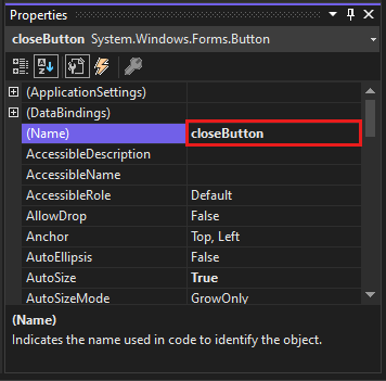
The IDE doesn't accept names that contain spaces.
Rename the other three buttons to backgroundButton, clearButton, and showButton. You can verify the names by choosing the control selector drop-down list in the Properties window. The new button names appear.
You can change the name of any control, such as the TableLayoutPanel or checkbox.
Add dialog components
Your app can open picture files and choose a background color by using components. A component is like a control. You use the Toolbox to add a component to your form. You set its properties using the Properties window.
Unlike a control, adding a component to your form doesn't add a visible item. Instead, it provides certain behaviors that you can trigger with code. For instance, it's a component that opens an Open File dialog box.
In this section, you add an OpenFileDialog component and a ColorDialog component to your form.
Select the Windows Forms Designer (Form1.cs [Design]). Then open the Toolbox and select the Dialogs group.
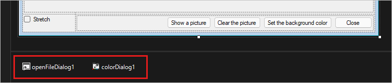
Double-click OpenFileDialog to add a component called openFileDialog1 to your form.
Double-click ColorDialog to add a component called colorDialog1. The components appear at the bottom of Windows Forms Designer as icons.
Choose the openFileDialog1 icon and set two properties:
Set the Filter property to the following:
JPEG Files (*.jpg)|*.jpg|PNG Files (*.png)|*.png|BMP Files (*.bmp)|*.bmp|All files (*.*)|*.*Set the Title property to the following: Select a picture file
The Filter property settings specify the types that the Select a picture dialog box displays.
Next steps
Advance to the next tutorial to learn how to add code to your application.