Note
Access to this page requires authorization. You can try signing in or changing directories.
Access to this page requires authorization. You can try changing directories.
A start page appears in the results pane when the root node of the snap-in is selected. Start pages should be used to organize the activities that can occur in your snap-in. These activities can appear hierarchically on the start pages. It is also appropriate to include any or all of the following on the start page: introductory text, procedural information (such as a first-run task list), a summary of important information and status, and links to the most frequently used nodes, and a More Information pane of links to snap-in–level assistance on and off the box.
Start Page Description Area
Use the following guidelines when creating a start page description area:
- The start page description area contains introductory text that briefly describes the purpose of the snap-in.
- The start page description area should be used only to display descriptive text for the snap-in. It does not support columns, sorting, or multi-selection.
- Only use text and icons in the start page description area. Do not add controls.
- The start page description area uses the feature icon, sized to 32 × 32 pixels.
- Introductory text should be no more than two lines deep.
- Nothing in the start page description area will appear in the tab order (that is, when users tab through the items on the start page, the start page description area does not receive focus).
- The title of the snap-in should appear somewhere in the description area. This will serve as feedback about which snap-in is selected even if the MMC description bar is hidden.
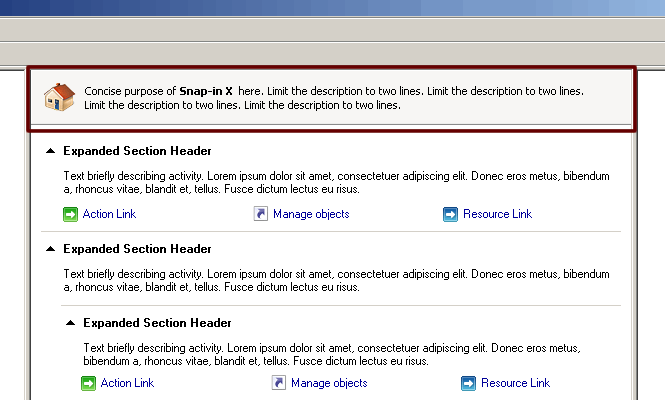
Figure 1 Start page description area.
Activity Section
Each activity should appear in its own section on the start page. Activities can be nested. The creation of an activity section should be balanced between the need to have only a single activity type and the need to not have activity sections be a trivial segmentation of one link per section.
In these cases, the higher-level activities describe groups of activities that involve actions. The lowest level of activity can contain three types of links:
- Action link
This link is for actions that can occur on the start page (actions that do not require an object to be first selected). This type of link usually launches a wizard or a dialog box. A common example of the link phrasing is “Create <object>.” - Navigation link
This type of link navigates users to a node in the tree where actions can be performed on objects. Clicking this link causes the same behavior as clicking the node in the tree to which the link refers. The link acts like a shortcut for the node in the tree. - Resource link
This link should be used to navigate users to resources that will help users understand more about the activity. These resources can be Help files, for example. If the link will navigate users off the computer, the link label should be written to clearly indicate that the resource is not available locally.
Lay out activities using the design shown in Figure 2. Each activity section should expand or collapse when the activity header is clicked.

Figure 2 Standard layout for activities and links on the start page.
Summary/Status Information
- If you include summary or status information in one of the activity sections on the snap-in start page, provide a Refresh command for the start page node so that the user can quickly see the most current information.
Summary information can be set up in one-, two-, or three-column presentations. See Snap-in Start Pages: Visual Design for additional information.
Artwork
Sometimes it is appropriate to include simple diagrams on the snap-in start page so that users can better understand some of the concepts behind your snap-in. For example, you might include a diagram of how the different parts of the snap-in interact. This information might help a user get started.
If you decide to use artwork on the start page, put the artwork in a start page panel, and use the following guidelines:
- Use a font that can easily be read online, such as Arial or Verdana in 8 or 9 point, and use it consistently throughout your snap-in.
- Avoid italics.
- Follow the UI text guidelines for artwork, including:
- Don't use too much text; it overwhelms the graphic.
- Be consistent in labeling; match the terminology used on the UI.
- Text in graphics must be localizable. Make sure that any art to be localized has 30 percent expansion room for text.
- Graphics must have screen reader alt text.
- Keep your artwork small to fit within the frame you want to show it in.
- Use standard symbols/icons, and keep them consistent in size and color.
- If you use colors to make graphical distinctions, be aware that the colors might appear as shades of gray if the art is printed.
- Ensure that the colors you choose do not have negative cultural implications.
- Clearly mark any steps in a process alphabetically or numerically.
- If the concept is deep, break the art into smaller representations, and provide links to pop up more content.
- Be clear how the flow is directed; ensure that arrows and lines direct the user, as well as point to or connect elements.
- Make the flow of a diagram from right to left whenever possible.
- Avoid crossing flow lines, but rather use jump-over lines for clarity.

Figure 3 Example of a “jump over” line.
- Make sure that your art will still be legible if the user is viewing a high-contrast display.