Note
Access to this page requires authorization. You can try signing in or changing directories.
Access to this page requires authorization. You can try changing directories.
This page contains best practices for our partners to design an Azure Marketplace experience. The information here is intended for developers engaged in building end-to-end integration with Marketplace Catalog, encompassing both front-end integration and user experience, utilizing the Marketplace Catalog APIs.
General gallery page layout and primary user actions
Search functionality
- Search bar placement: Position the search bar prominently at the top center of the page, next to filters and search results. This placement maintains a visual and functional connection between search input and outcomes.
- Interactive search experience:
- On click: Display suggestions including top search terms, products, and user history with an option to clear past entries.
- On type: Offer autocomplete suggestions.
- On enter/search: Present search results with filter options. Might retain active filters during the search process.
- Visibility: Keep the search term visible until the user either clears it or initiates a new search.
Filters
- Placement: Position filters visibly, either as a vertical menu on the left (with expandable/collapsible sections) or as a horizontal bar at the top featuring dropdowns or pill menus. Filters can be designed to remain constantly visible, anchored in place throughout the user's navigation.
- Organization and customization:
- Order filters by relevance and popularity.
- Offer dynamic and personalized filter suggestions, showing result counts and adjusting order based on relevance.
- Group filters cohesively, distinct from navigation elements.
- Suggested filters: In addition to the standard filter options, it's beneficial to display a curated selection of the most popular or relevant filters. This subset should be dynamically tailored to each user, enhancing the personalization of their browsing experience. As users make selections, these featured filters can adapt and evolve, reflecting the changing preferences or needs of the individual user. This approach not only streamlines the search process but also introduces users to potentially valuable filtering options they might not have initially considered.
Sorting
- Implement a dropdown for sorting options, including relevance, ratings, popularity, and update frequency. Remember user preferences for subsequent visits.
Search and filter results
Allow continuous refinement of search and filter results.
Incorporate efficient pagination and optimize for page load times.
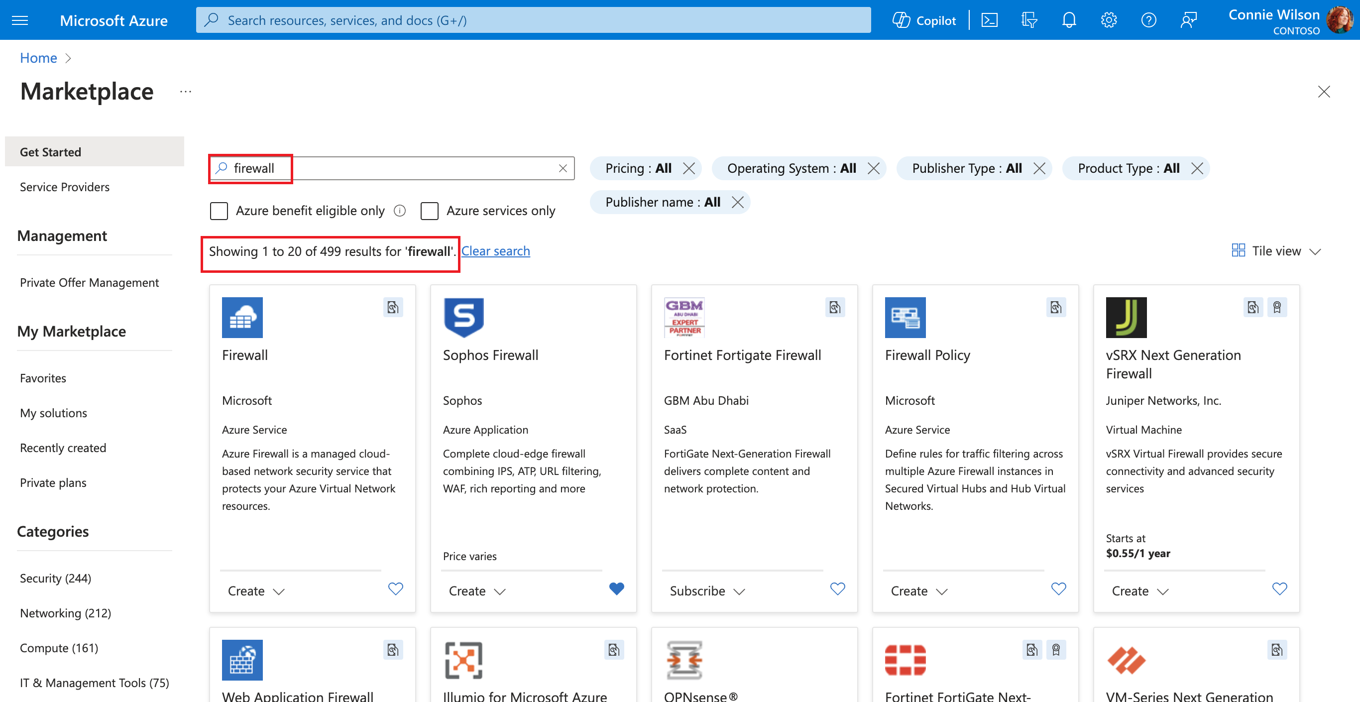
Sample search results are shown here:

Swim lanes and group tile displays
- Mark title sections clearly, like "What's new" or "Trending."
- Display three to eight tiles in view, with interactive elements like carousels for more content.
- See more button or link that shows all results in group.
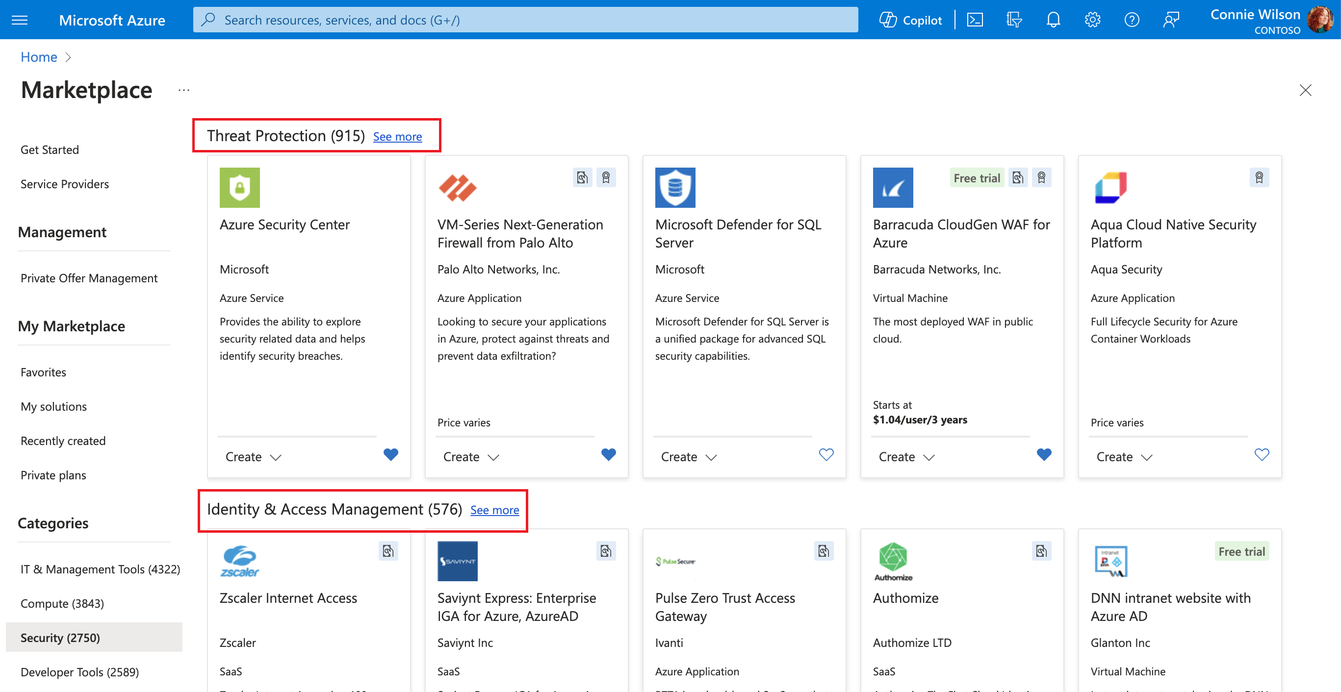
Example swim lanes are shown here:

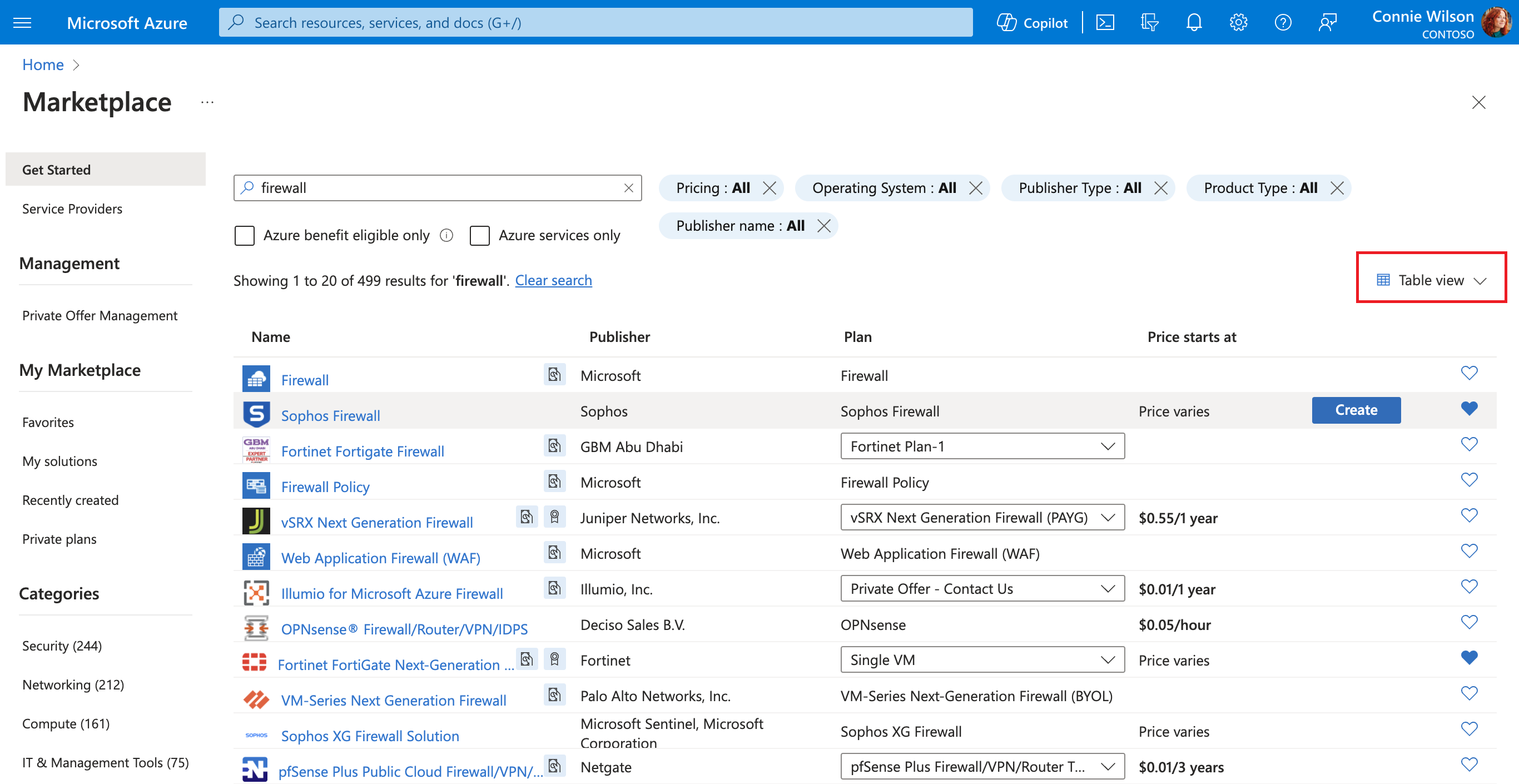
View displays
- Product views can vary between display options (tiles, list, or table). Our research indicates a preference for tile view after search for easier comparisons. Implement a dropdown for selection and remember user preferences for subsequent visits.
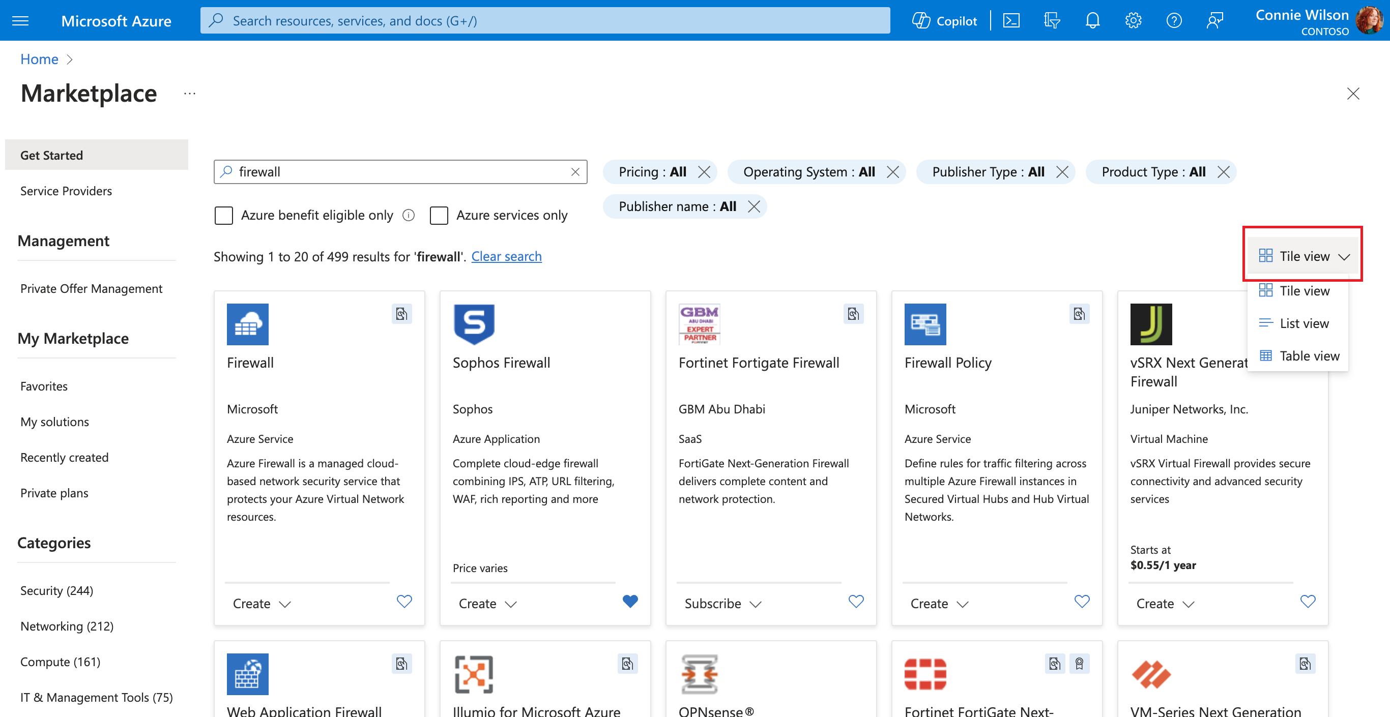
The tile view is shown here:
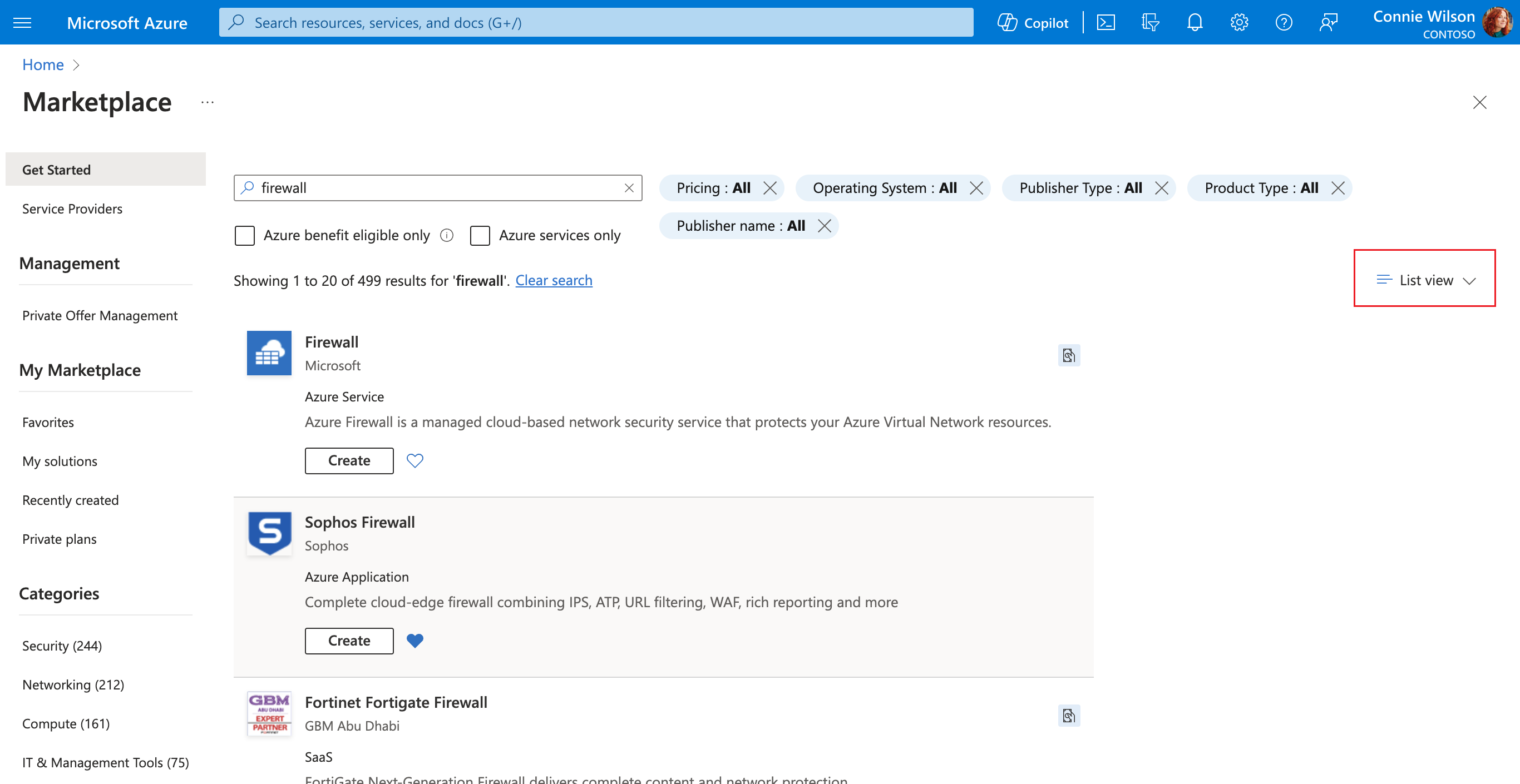
The list view is shown here:
The table view is shown here:


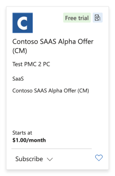
Tiles
Information hierarchy:
- Essential: Product name, logo, description, pricing, "Free trial" badges.
- Secondary: Publisher name, ratings and reviews, categories, supported industries, compatibility information, products supported.
- Additional: Version/plan details, other badges (such as Microsoft preferred solution, sustainability or diversity badges, and so on), bundle types.
Main actions:
- Select a tile to view a full product details page (PDP).
- Include clear calls to action (CTAs; for example, "Purchase," "Get it," "Learn more") and a "favorites" option.
- Offer small or medium tiles with additional information layers presented on hover or click.
A sample tile is shown here:

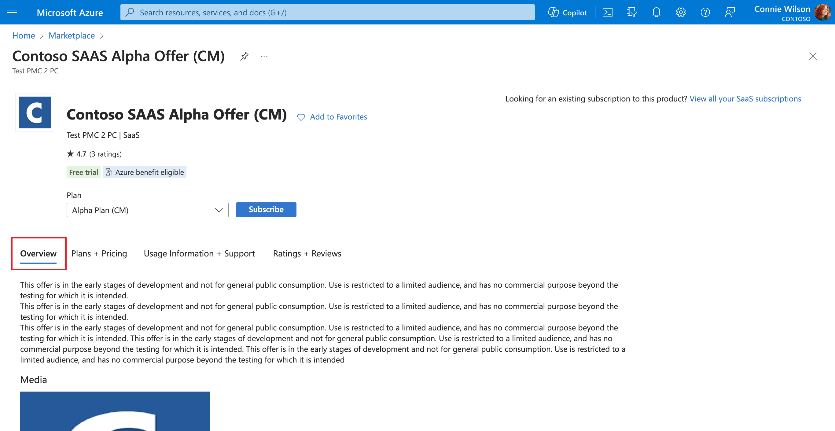
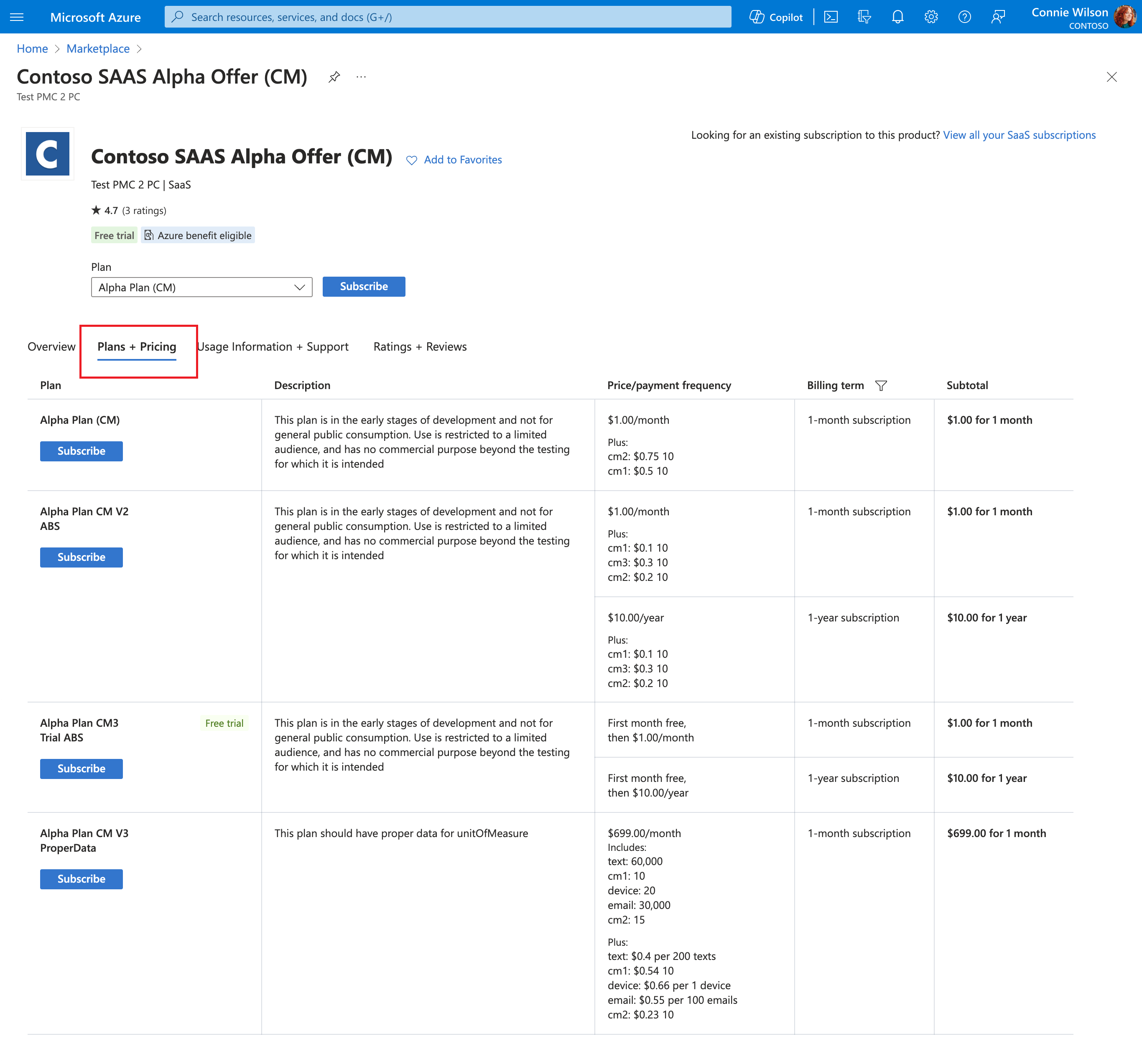
Product detail page (PDP)
- Content structure:
- Include comprehensive product information similar to the tile information format.
- Incorporate sections like Overview (product description and media), Plans and Pricing, Ratings and Reviews, Details and Support.
- Consider implementing tabbed sections or a page scroll, where tabs remain anchored and easily accessible as a sticky element at the top of the page along with CTA.
- Description and media: Show rich media and detailed text to describe the product. Separate descriptions and highlights as sections when available.
- Plans and pricing, promotions, and discounts: Clearly showcase pricing info; highlight any ongoing offers or discounts.
- Publisher information: Include details about the publisher, support links, and their other products.
- User interaction:
- Clear CTA: Each product page should guide the user toward a clear action, like making a purchase or contacting the publisher.
- Facilitate page actions like purchasing, contacting, adding to favorites, and sharing.
- Include a direct purchase CTA for each plan to facilitate a quick and straightforward buying process.
- Display transparent and accessible legal and support information.
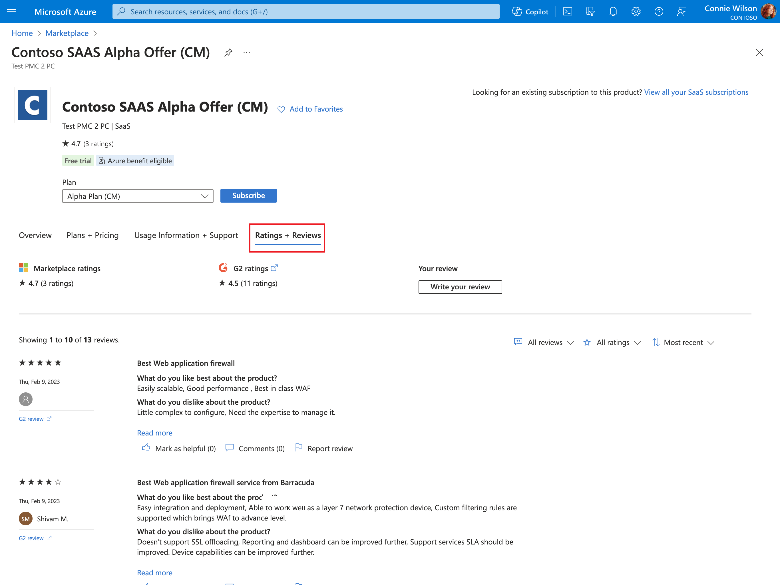
Ratings and reviews
- Display in product tiles and PDP, using a clear format.
- Allow filtering and sorting of reviews (for example, most recent, most helpful).
- Present clear indication of reviews by source (Marketplace and external providers like G2).
Lead generation
- For nontransactable listings, include a "Contact me" CTA, capturing essential user details and legal consent.
Call to action (CTA) types
- Tailor CTAs text according to the offer type and transactability options, like "Get it now," "Free trial," or "Contact me."
The Overview tab is shown here:
The Plans + pricing tab is shown here:
The Ratings + reviews tab is shown here:


Key recommendations for enhancing user experience
- User-centric design: Focus on intuitive navigation and clear information architecture.
- Clear visual hierarchy: Use design elements to guide user attention effectively.
- Responsive and adaptive layouts: Ensure compatibility across devices and screen sizes.
- Personalization: Leverage user data to offer personalized suggestions and filters.
- Performance optimization: Ensure fast load times and smooth interactions.
- Accessibility compliance: Design for diverse user abilities, including screen readers and keyboard navigation.
- Security and privacy: Highlight security features and privacy policies, especially for payment transactions.
- Customer support: Provide easy access to customer support and detailed contact information.
- Regular updates and feedback loop: Incorporate user feedback to continually improve the marketplace experience.
- User behavior tracking: Implement tools to analyze how users interact with your marketplace.
- Inclusive language: Use bias-free language in your content. Avoid stereotypes, slang, and culturally sensitive terms or metaphors.
- Localization: Localization is the process of adapting a product or content (including text and other elements) to meet the language, cultural, and political expectations and requirements of a specific local market (locale). Keep this in mind when creating the content for your experience.
Next steps
- For questions or support, contact MKPL_Platform_API_DL@microsoft.com.