Note
Access to this page requires authorization. You can try signing in or changing directories.
Access to this page requires authorization. You can try changing directories.
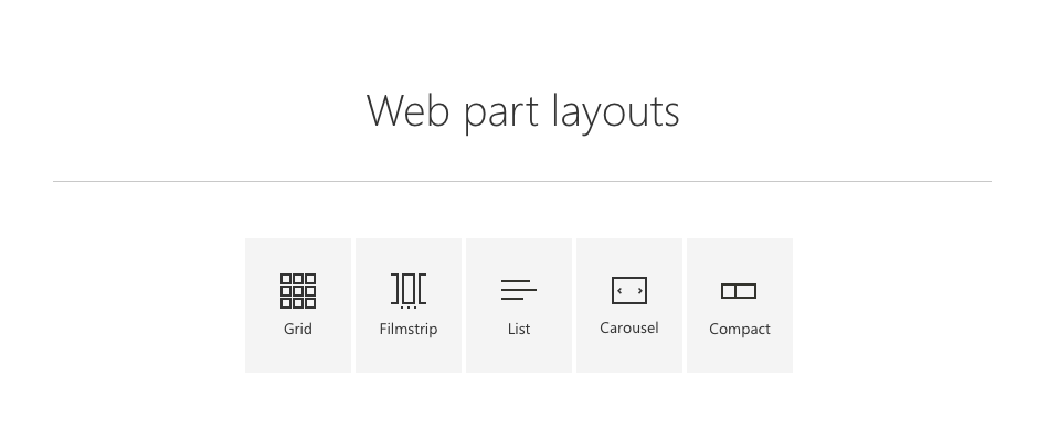
SharePoint uses a number of different layout types for web parts. The most common are grid, list, filmstrip, carousel, and compact. Each one of these five layouts serves a different purpose, depending on the layout, breakpoints, and content density of a page.
When selecting a layout that works best for your web part, consider the type of content you are displaying. Is it highly visual or rich in text and data? Determine how much space is needed on the page for enough content to be displayed. Consider shortening long descriptions to optimize for displaying more items to the user. Remember that you can use the property pane to let authors have control over how much content is displayed.
Grid and filmstrip
Grid and filmstrip layouts are similar. They both use cards to showcase content. However, other rectangular content also works well in these layouts, such as images. The main difference between the two layouts is how they reflow based on various screen sizes or breakpoints.
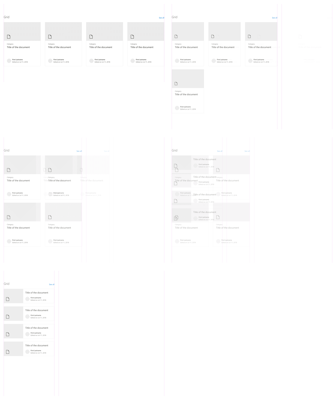
Grid layout
The grid reflows in rows and columns from top to bottom and can contain a few to many items at a time.
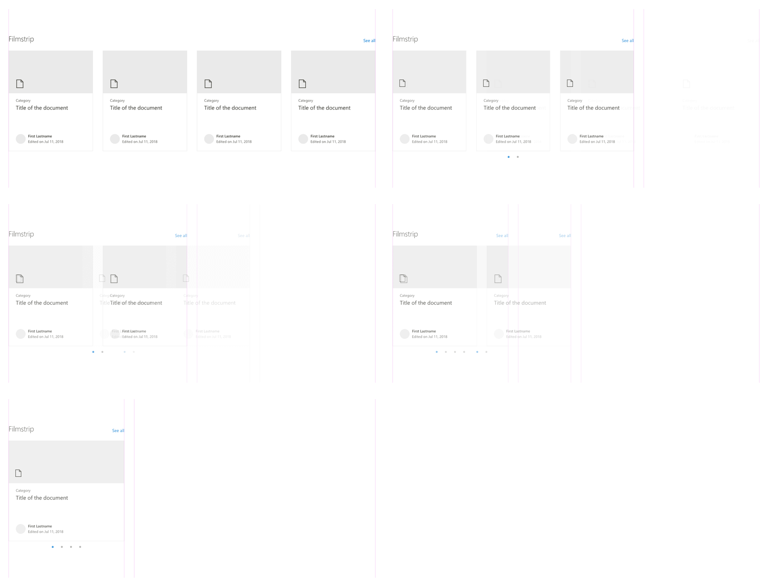
Filmstrip layout
The filmstrip displays multiple items in a single row and carousels to a new set of items.
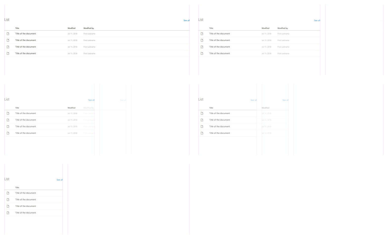
List
The list layout is useful for displaying a large amount of information in a compact way. When resized, the less important columns will be hidden as the page width gets smaller.
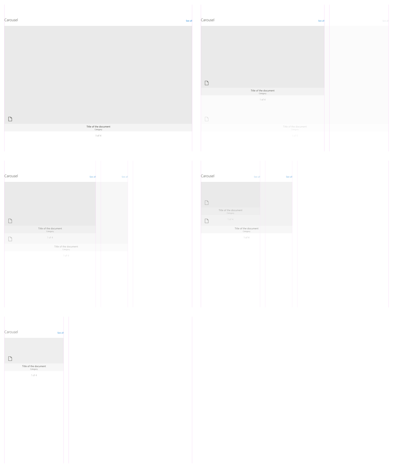
Carousel
If you want to showcase content featuring attractive visuals, choose the carousel layout. This layout is designed to display visual content such as images or PowerPoint files in a one-by-one item carousel.
Compact
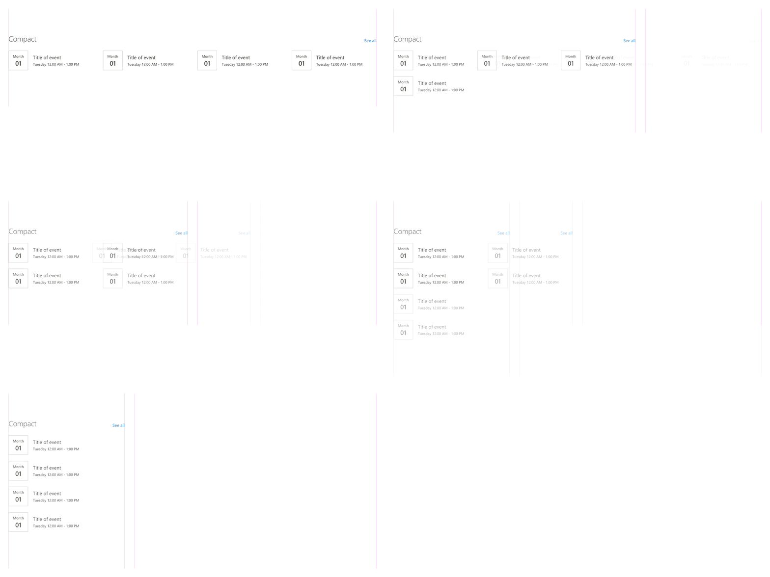
The compact layout is designed to show content in a smaller format and works the best in a one-third column. This layout can support a small image or icon and a few rows of text for a title, description, and/or metadata.
