Note
Access to this page requires authorization. You can try signing in or changing directories.
Access to this page requires authorization. You can try changing directories.
Important
SharePoint Copilot Apps are currently in preview and are subject to change. Do not use them in production environments. Please make sure that you are using the SharePoint Framework v1.24 beta 2 or newer version to be able to complete the following steps.
In this tutorial, you build a baseline SharePoint Copilot App from scratch, test it locally in the Copilot Workbench, package it, deploy it to the SharePoint app catalog, and use it inside Microsoft 365 Copilot. This gives you the complete end-to-end path for the model: create, test, package, deploy, and use.
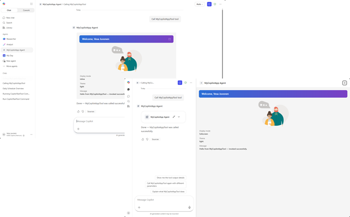
For a conceptual overview of how SharePoint Copilot Apps work, see Overview of SharePoint Copilot Apps.
You can follow these steps by watching the video on the Microsoft Community Learning YouTube Channel:
Prerequisites
Before you start, make sure you have the following in place:
- A Microsoft 365 tenant with the SharePoint app catalog provisioned. For more information, see Set up your SharePoint Framework development environment.
- The SharePoint Framework development toolchain installed, including Node.js (the version required by SPFx v1.24) and a code editor such as Visual Studio Code.
- Permission to upload and deploy solution packages to your tenant app catalog.
Note
During the public preview, no Microsoft 365 Copilot license is required to build, deploy, or run SharePoint Copilot Apps. For more information, see Availability during preview.
Create a Copilot component project
Create a new project directory in your favorite location.
md my-copilot-appGo to the project directory.
cd my-copilot-appCreate a new Copilot component by running the Yeoman SharePoint generator.
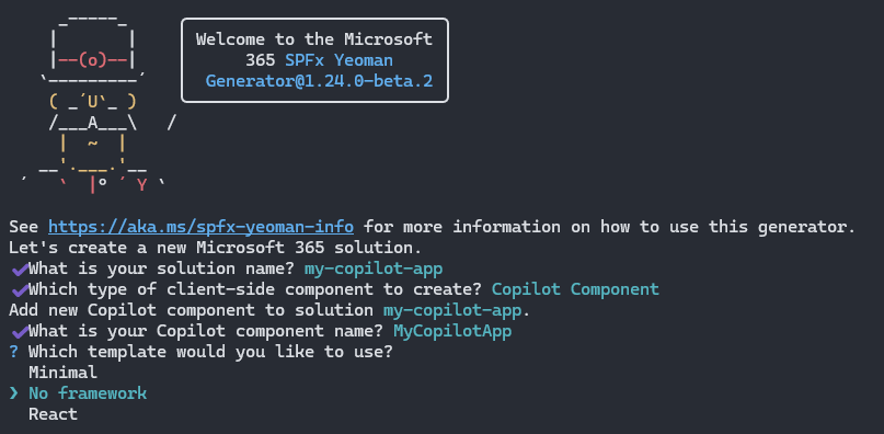
yo @microsoft/sharepointWhen prompted, enter the following values (select the default option for all prompts omitted below):
- What is your solution name?: my-copilot-app
- Which type of client-side component to create?: Copilot Component
- What is your Copilot component name?: MyCopilotApp
- Which template would you like to use?: No framework
The generator installs the required dependencies and scaffolds the solution files along with the MyCopilotApp component.
Start Visual Studio Code (or your preferred editor) in the project folder.
code .
Review the project structure
A SharePoint Copilot App groups the Copilot component source with the declarative agent definition in a single SPFx solution. The following files and folders are the most important ones to understand.
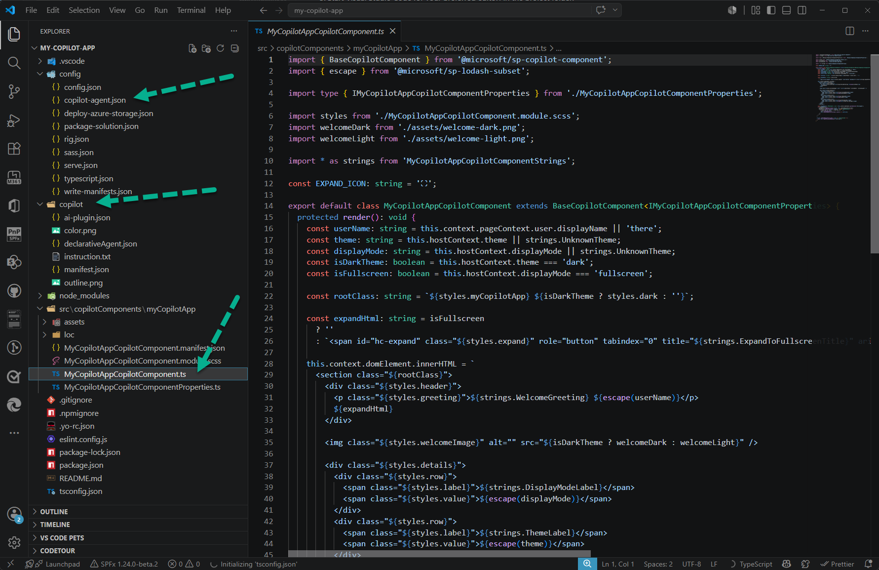
- src/copilotComponents/myCopilotApp contains the Copilot component source.
- copilot contains the declarative agent definition (
manifest.json,declarativeAgent.json,ai-plugin.json, andinstruction.txt). - config/copilot-agent.json groups the Copilot component into an agent.
The Copilot component
Open ./src/copilotComponents/myCopilotApp/MyCopilotAppCopilotComponent.ts.
The component derives from BaseCopilotComponent, imported from the @microsoft/sp-copilot-component package. Its render() method reads the current host context, such as the display mode and theme, and writes the component's UI into this.context.domElement. It also wires up an affordance that requests fullscreen through requestDisplayModeAsync('fullscreen').
import { BaseCopilotComponent } from '@microsoft/sp-copilot-component';

export default class MyCopilotAppCopilotComponent extends BaseCopilotComponent<IMyCopilotAppCopilotComponentProperties> {
  protected render(): void {
    const displayMode: string = this.hostContext.displayMode || strings.UnknownTheme;
    const isFullscreen: boolean = this.hostContext.displayMode === 'fullscreen';
    // ...render UI into this.context.domElement using this.properties
  }

  private _handleRequestFullscreen = async (): Promise<void> => {
    await this.requestDisplayModeAsync('fullscreen');
  };
}
The component manifest
Open ./src/copilotComponents/myCopilotApp/MyCopilotAppCopilotComponent.manifest.json.
The manifest declares the component id, the display modes it supports, and the tools it exposes. Each tool becomes an action the declarative agent can invoke, and points to a properties schema that describes the parameters it accepts.
{
  "$schema": "https://developer.microsoft.com/json-schemas/spfx/client-side-component-manifest.schema.json",
  "id": "7931d745-bd5d-4b2c-9c67-9e8ce7e34432",
  "alias": "MyCopilotAppCopilotComponent",
  "componentType": "CopilotComponent",
  "copilotType": "Ux",
  "version": "*",
  "manifestVersion": 2,

  "capabilities": {
    "availableDisplayModes": ["inline", "fullscreen"]
  },

  "tools": [
    {
      "name": "MyCopilotAppTool",
      "description": {
        "default": "MyCopilotApp description"
      },
      "propertiesSchema": {
        "id": "$../../../lib/copilotComponents/myCopilotApp/MyCopilotAppCopilotComponentProperties.js:default;"
      }
    }
  ]
}
The properties schema in MyCopilotAppCopilotComponentProperties.ts uses Zod to describe the parameters the tool accepts. The default template defines a single message property.
const propertiesSchema = z.object({
  message: z.string().describe('A message to display.')
});
The declarative agent
The copilot folder contains the declarative agent definition. Open ./copilot/declarativeAgent.json to see the agent name, description, instructions, conversation starters, and the action that maps to your Copilot component's tool.
{
  "$schema": "https://developer.microsoft.com/json-schemas/copilot/declarative-agent/v1.7/schema.json",
  "version": "v1.7",
  "name": "MyCopilotApp Agent",
  "description": "MyCopilotApp description",
  "instructions": "$[file('instruction.txt')]",
  "conversation_starters": [
    {
      "title": "Get started",
      "text": "What can you do?"
    }
  ],
  "actions": [
    {
      "id": "myCopilotAppAction",
      "file": "ai-plugin.json"
    }
  ]
}
The config/copilot-agent.json file groups one or more Copilot components into the agent by referencing their component id values.
{
  "$schema": "../node_modules/@microsoft/spfx-heft-plugins/lib-commonjs/plugins/copilotAgentPlugin/copilot-agent.schema.json",
  "agents": [
    {
      "name": {
        "default": "MyCopilotApp Agent"
      },
      "description": {
        "default": "MyCopilotApp description"
      },
      "components": [
        "7931d745-bd5d-4b2c-9c67-9e8ce7e34432"
      ]
    }
  ]
}
Test in the Copilot Workbench
The Copilot Workbench lets you run and debug your component while it is hosted locally on your development machine, without deploying anything to the app catalog.
Compile your code and start the local development server.
heft start --nobrowserWhen the code compiles without errors, the manifest is served from
https://localhost:4321. The--nobrowserswitch prevents the browser from opening automatically, so browse to the Copilot Workbench yourself. The Workbench is always available at the/_layouts/15/copilotworkbench.aspxpath of any site in your tenant, for examplehttps://yourtenantname.sharepoint.com/_layouts/15/copilotworkbench.aspx.When prompted, accept the loading of debug manifests so the debug version of your component loads in the Workbench.
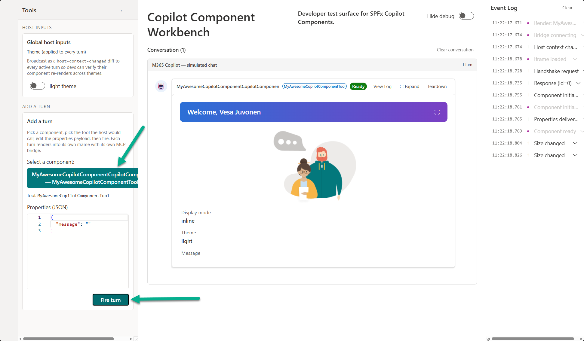
Activate the component from the left side of the screen and select the Fire turn button to pass the properties JSON to the component and initialize it in the debug canvas.
Interact with the component, switch between the inline and fullscreen display modes, and iterate on the code. Changes are reflected as you rebuild, giving you a fast inner-loop before you package and deploy.
Package the solution
When you are satisfied with the experience in the Workbench, build the solution package.
Bundle the solution in production mode.
heft build --productionCreate the solution package.
heft package-solution --productionThe command creates the package at ./sharepoint/solution/my-copilot-app.sppkg. Because
includeClientSideAssetsis set totruein config/package-solution.json, the component assets are bundled into the package and hosted automatically in the tenant where the app is installed.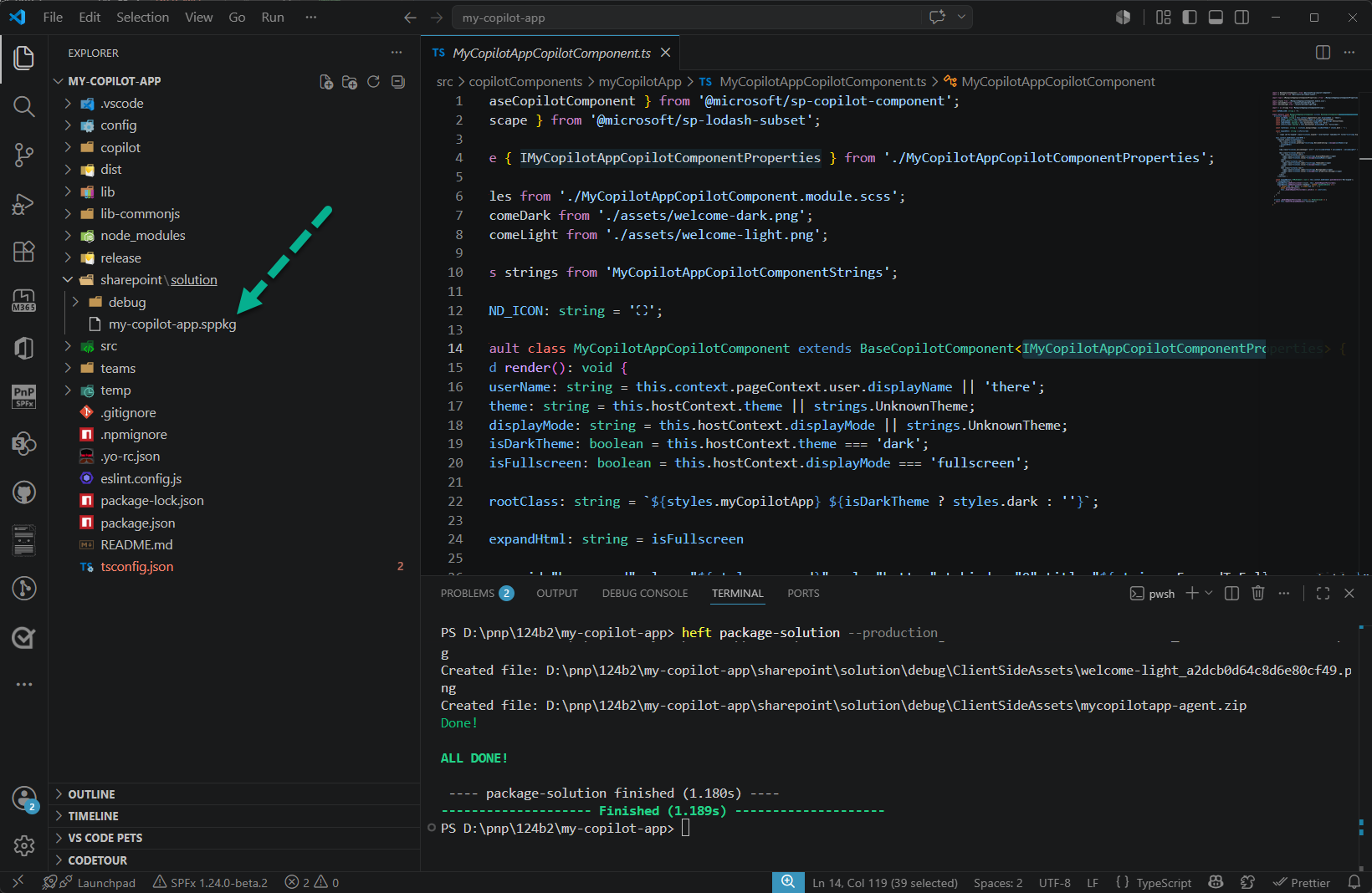
Deploy to the SharePoint app catalog
Go to your tenant's app catalog and open the Apps for SharePoint library.
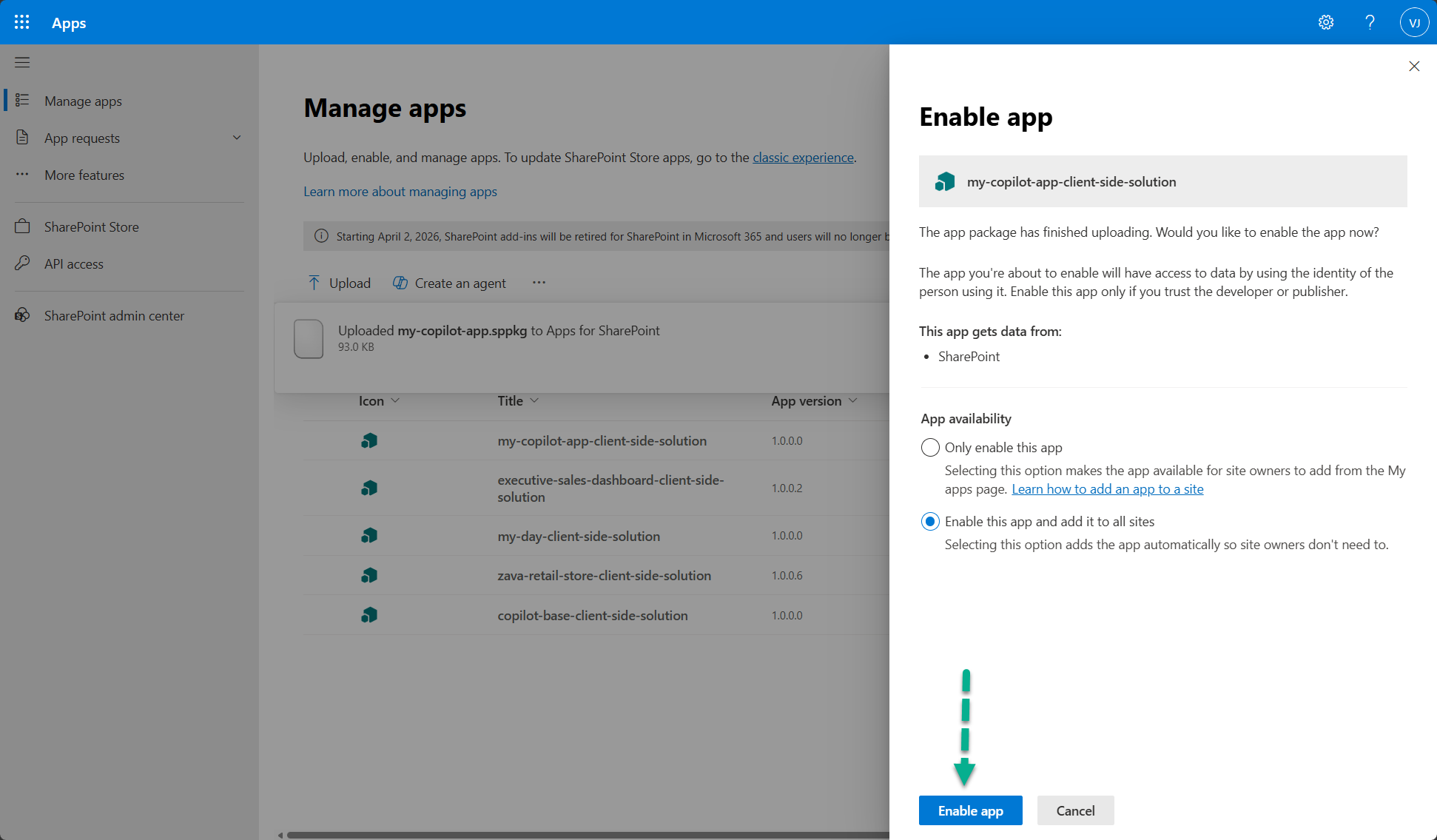
Upload the ./sharepoint/solution/my-copilot-app.sppkg file. SharePoint displays a dialog and asks you to trust the client-side solution. Notice that the Enable this app and add it to all sites option is enabled by default. This is required for the Copilot integration to work properly.
Select Enable app.
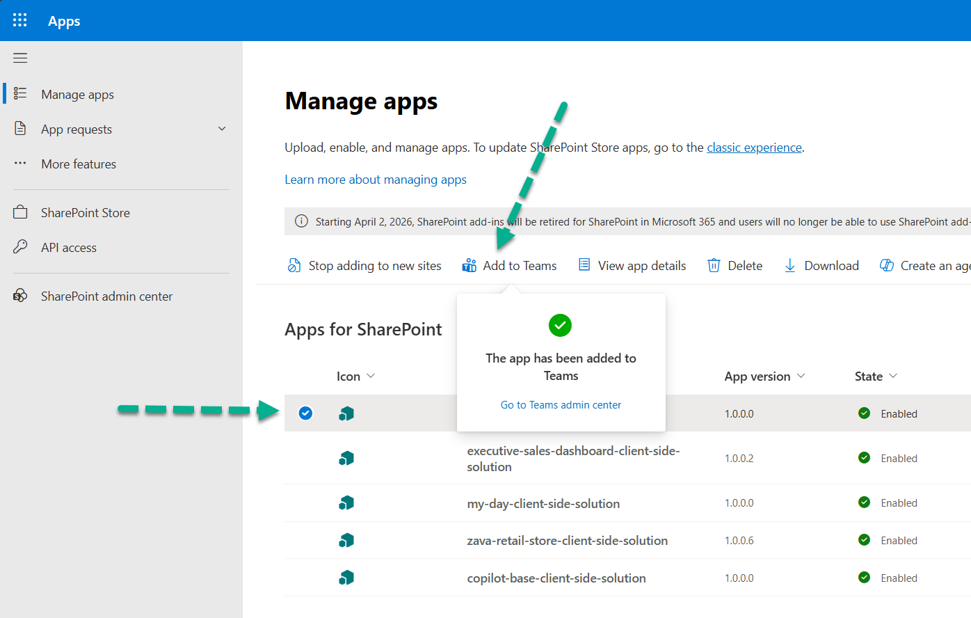
In the app catalog list, select the uploaded app and select Add to Teams. This deploys the declarative agent to the tenant's agent catalog and makes it available to users in Microsoft 365 Copilot.
Note
The Add to Teams button label will be updated in a future release to better reflect that it also publishes the agent to the tenant agent catalog. Deployment of the agent can take some time to complete.
Use the app in Microsoft 365 Copilot
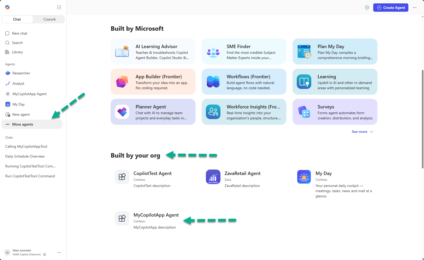
Open Microsoft 365 Copilot and locate the MyCopilotApp Agent in the list of available agents. Select the agent, and then select Add to add it to your list of agents in Copilot.
Note
There can be a delay before the agent appears in the all-agents listing. You can also go to the Microsoft 365 admin center and install the agent directly for users, which can speed up the deployment process.
Start a conversation with the agent by entering "Call MyCopilotAppTool" and submitting it to Copilot. Copilot invokes your tool and renders the Copilot component inline in the conversation.
Note
This is a reliable way to ensure the tool is called directly. It's also needed in this tutorial because we didn't adjust the tool description and the conversation starter to explain the tool's use case. When that information is adjusted, Copilot automatically calls the tool based on user intent.
The first time the tool (UX component) is accessed, Copilot confirms the call with the user. Select Allow when prompted. The prompt might currently appear a few times before the UX renders. After that, Copilot renders the UX component in the Copilot canvas.
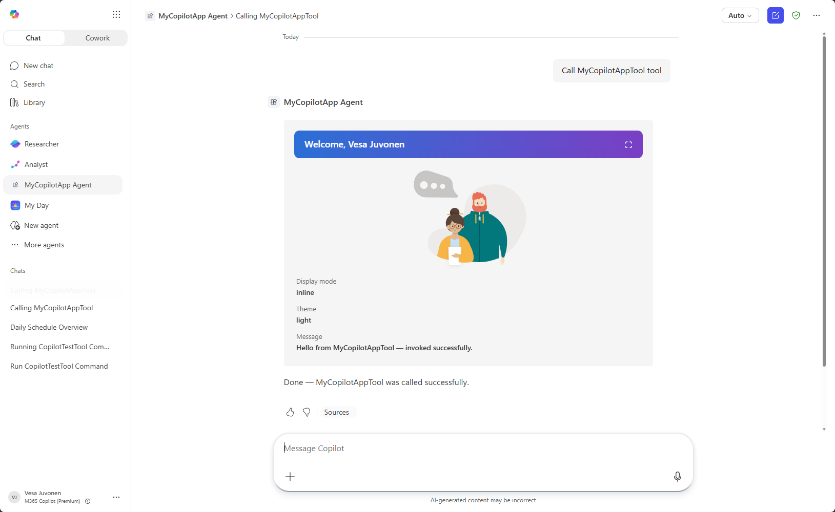
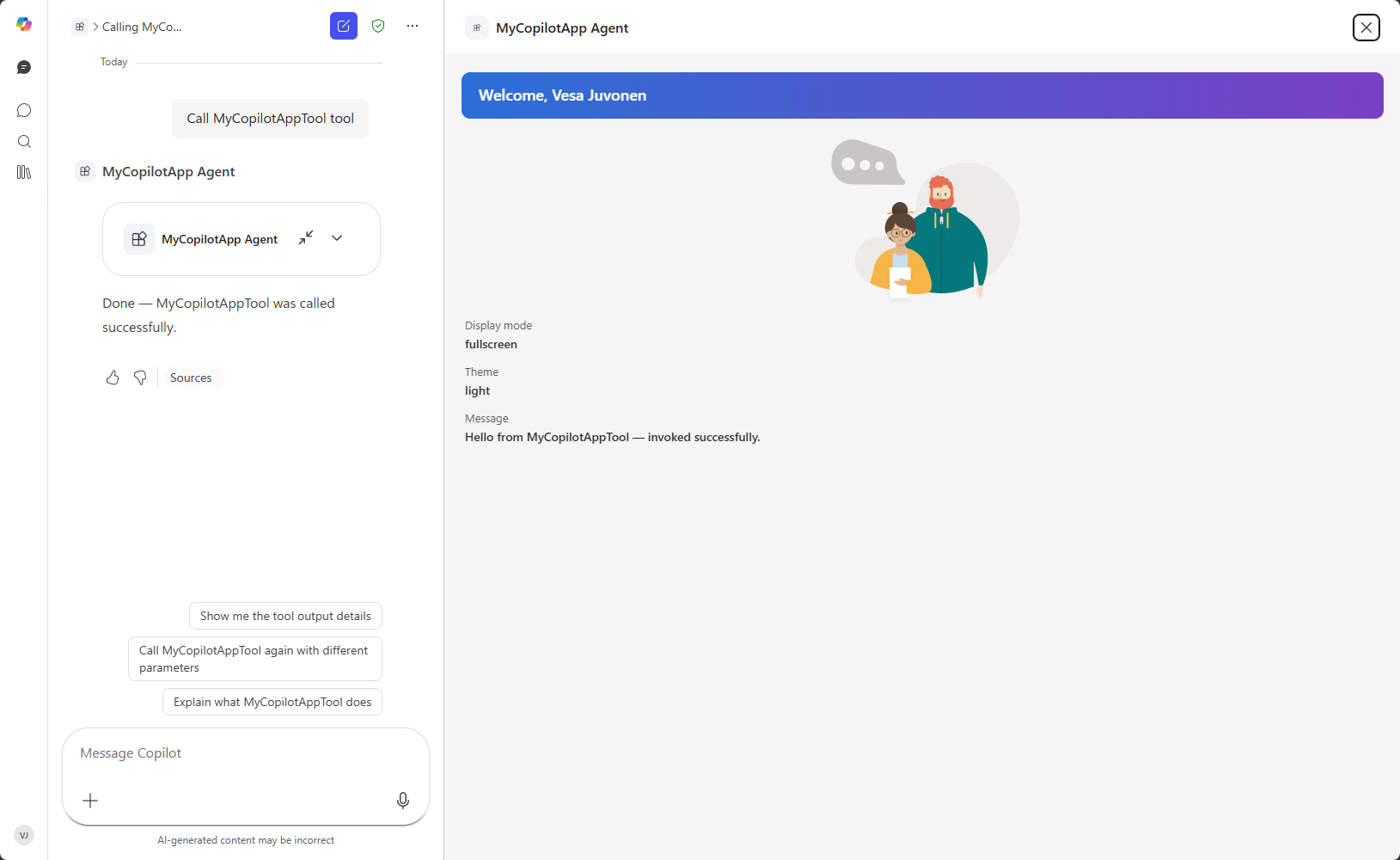
Expand the component to fullscreen to see the display mode switch in action. In the default No framework component, an expand button is rendered in the top-right corner, next to the user's name.
Next steps
- Overview of SharePoint Copilot Apps
- Display modes in SharePoint Copilot components
- Review available samples in the GitHub sample repository.