Note
Access to this page requires authorization. You can try signing in or changing directories.
Access to this page requires authorization. You can try changing directories.
You can use custom dialog boxes, available from the @microsoft/sp-dialog package, within the context of SharePoint Framework Extensions or client-side web parts.
This article describes how to create a custom dialog box and use it within the context of a ListView Command Set extension.
You can access the sample code that this article is based on in the sp-dev-fx-extensions repo.
Important
This tutorial assumes you've setup your development environment as explain in Set up your development environment.
Note
The SharePoint Framework (SPFx) used a gulp-based toolchain from SPFx v1.0 - v1.21.1. SPFx v1.22 transitioned to a new Heft-based toolchain, replacing the gulp-based toolchain.
This article was originally authoring using a SPFx version that used the gulp-based toolchain. We're in the process of updating all affected articles and tutorials (including this page). Due to the number of articles and the age of SPFx, this will take time. At this time, this article has not yet been updated.
Until the article has been validated, it's likely the steps on this page will work by simply replacing the gulp command with the Heft-based equivalent commands. For example, some commands remain unchanged (such as package-solution), some were replaced (such as gulp serve is now heft start), and some command arguments changed (such as --ship is now --production).
Refer to the following page for more information on the the Heft commands and the corresponding gulp commands: Understanding the Heft-based toolchain (how it works).
Create a new project
Create a new project directory for your project and change your current folder to that directory.
Create a new project by running the Yeoman SharePoint Generator from within the new directory you created:
yo @microsoft/sharepointWhen prompted, enter the following values (select the default option for all prompts omitted below):
- Which type of client-side component to create? Extension
- Which type of client-side extension to create? ListView Command Set
- What is your Command Set name? DialogDemo
At this point, Yeoman installs the required dependencies and scaffolds the solution files. This process might take few minutes.
When initial scaffolding is completed, enter the following to install Office UI Fabric to your solution:
npm install office-ui-fabric-react --saveInstall the correct version of React and React-dom indicated in SPFx development environment compatibility.
npm instal react@17.0.1 react-dom@17.0.1 --save-exactOpen your project folder in your code editor. This article uses Visual Studio Code in the steps and screenshots, but you can use any editor that you prefer. To open the folder in Visual Studio Code, use the following command in the console:
code .
Modify the extension manifest
In the extension manifest, configure the extension to have only one button. In the code editor, open the ./src/extensions/dialogDemo/DialogDemoCommandSet.manifest.json file. Replace the commands section with the following JSON:
{
  //...
  "items": {
    "COMMAND_1": {
      "title": { "default": "Open Custom Dialog" },
      "iconImageUrl": "icons/request.png",
      "type": "command"
    }
  }
}
Create a custom dialog box
Create a new file called ColorPickerDialog.tsx in the ./src/extensions/dialogDemo/ folder.
Add the following import statements at the top of the newly created file. You're creating your custom dialog box by using the Office UI Fabric React components, so the implementation is in React.
import * as React from 'react';
import * as ReactDOM from 'react-dom';
import { BaseDialog, IDialogConfiguration } from '@microsoft/sp-dialog';
import { PrimaryButton, DefaultButton } from 'office-ui-fabric-react/lib/Button';
import { ColorPicker } from 'office-ui-fabric-react/lib/ColorPicker';
import { DialogFooter, DialogContent } from 'office-ui-fabric-react/lib/Dialog';
import { IColor } from 'office-ui-fabric-react/lib/Color';
Add the following interface definition just under the import statements. This is used to pass information and functions between your ListView Command Set extension and your custom dialog box.
interface IColorPickerDialogContentProps {
  message: string;
  close: () => void;
  submit: (color: IColor) => void;
  defaultColor?: IColor;
}
Add the following class just under the interface definition. This React class is responsible for rendering the UI experiences inside the custom dialog box. Notice that you use the Office UI Fabric React components for actual rendering and just pass the needed properties.
class ColorPickerDialogContent extends React.Component<IColorPickerDialogContentProps, {}> {
  private _pickedColor: IColor;

  constructor(props) {
    super(props);
    // Default Color
    this._pickedColor = props.defaultColor || { hex: 'FFFFFF', str: '', r: null, g: null, b: null, h: null, s: null, v: null };
  }

  public render(): JSX.Element {
    return <DialogContent
    title='Color Picker'
    subText={this.props.message}
    onDismiss={this.props.close}
    showCloseButton={true}
    >
    <ColorPicker color={this._pickedColor} onChange={this._onColorChange} />
    <DialogFooter>
        <DefaultButton text='Cancel' title='Cancel' onClick={this.props.close} />
        <PrimaryButton text='OK' title='OK' onClick={() => { this.props.submit(this._pickedColor); }} />
    </DialogFooter>
    </DialogContent>;
  }

  private _onColorChange = (ev: React.SyntheticEvent<HTMLElement, Event>, color: IColor) => {
    this._pickedColor = color;
  }
}
Add the following class definition for your custom dialog box under the
ColorPickerDialogContentclass that you just added. This is the actual custom dialog box that is called from the ListView Command Set button click and is inherited from theBaseDialog.export default class ColorPickerDialog extends BaseDialog { public message: string; public colorCode: IColor; public render(): void { ReactDOM.render(<ColorPickerDialogContent close={ this.close } message={ this.message } defaultColor={ this.colorCode } submit={ this._submit } />, this.domElement); } public getConfig(): IDialogConfiguration { return { isBlocking: false }; } protected onAfterClose(): void { super.onAfterClose(); // Clean up the element for the next dialog ReactDOM.unmountComponentAtNode(this.domElement); } private _submit = (color: IColor) => { this.colorCode = color; this.close(); } }
Associate the dialog box with the ListView Command Set button click
To associate the custom dialog box with your custom ListView Command Set, add the code to initiate the dialog box within the button click operation.
In the code editor, open the DialogDemoCommandSet.ts file from the ./src/extensions/dialogDemo/ folder.
Add the following import statements under the existing strings import. These are for using the custom dialog box in the context of your ListView Command Set and using the IColor type to pass colors to and from our dialog.
import ColorPickerDialog from './ColorPickerDialog';
import { IColor } from 'office-ui-fabric-react/lib/Color';
Add the following
_colorCodevariable definition above theonInitfunction in theDialogDemoCommandSetclass. This is used to store the color picker dialog box result.private _colorCode: IColor;Update the
onExecutefunction as follows. This code does the following:- Initiates the custom dialog box.
- Passes a message for the dialog box, which is used for the title.
- Passes a color code for the dialog box with a default value, if not yet set.
- Shows the custom dialog box.
- Receives and stores the return value from the dialog box.
- Shows the received value in a default dialog box by using the
Dialog.alert()function.
@override
public onExecute(event: IListViewCommandSetExecuteEventParameters): void {
  switch (event.itemId) {
    case 'COMMAND_1':
      Dialog.alert(`${this.properties.sampleTextOne}`);
      const dialog: ColorPickerDialog = new ColorPickerDialog();
      dialog.message = 'Pick a color:';
      // Use 'FFFFFF' as the default color for first usage
      let defaultColor : IColor = { hex: 'FFFFFF', str: '', r: null, g: null, b: null, h: null, s: null, v: null };
      dialog.colorCode = this._colorCode|| defaultColor;
      dialog.show().then(() => {
        this._colorCode = dialog.colorCode;
        Dialog.alert(`Picked color: ${dialog.colorCode.hex}`);
      });
      break;
    default:
      throw new Error('Unknown command');
  }
}
Test the dialog box in your tenant
Open the serve.json file in the ./config/ folder and update the current settings in the file. This file is used to make debugging on SharePoint Framework Extensions easier. You can update the file content to match your own tenant and site details where you want to test your extension. The key value to update is the
pageUrlproperty in the json definition to match your own tenant.Update
pageUrlto point to a list URL where you want to test the dialog functionality."serveConfigurations": { "default": { "pageUrl": "https://yourtenantname.sharepoint.com/Shared%20Documents/Forms/AllItems.aspx", "customActions": { "9b98b919-fe5e-4758-ac91-6d62e582c4fe": { "location": "ClientSideExtension.ListViewCommandSet.CommandBar", "properties": { "sampleTextOne": "One item is selected in the list", "sampleTextTwo": "This command is always visible." } } } },Note
The unique identifier of your extension is automatically updated to this file during initial scaffolding. If you update the properties that your extension uses, you should update serve.json before you start debugging.
Return to the console and run the following command:
gulp serve
This starts the bundling of your solution and serves the resulting manifest from the localhost address. Due to the configuration in the serve.json file, it also opens up a browser in the specific URL and automatically sets the query parameters based on the solution configuration.
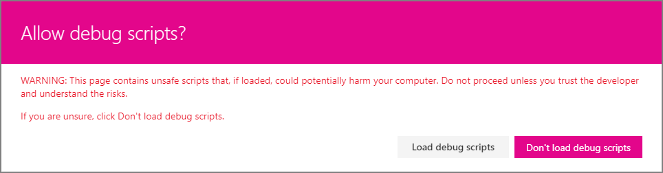
Accept the loading of debug manifests by selecting Load debug scripts when prompted.
Notice that the new button is not visible in the toolbar by default because the default solution requires that you select one item from the list. If you do not have any items in the list or library, create an item or upload a document.
Select an item from the list or library, and notice how the Open Custom Dialog button is visible in the toolbar.
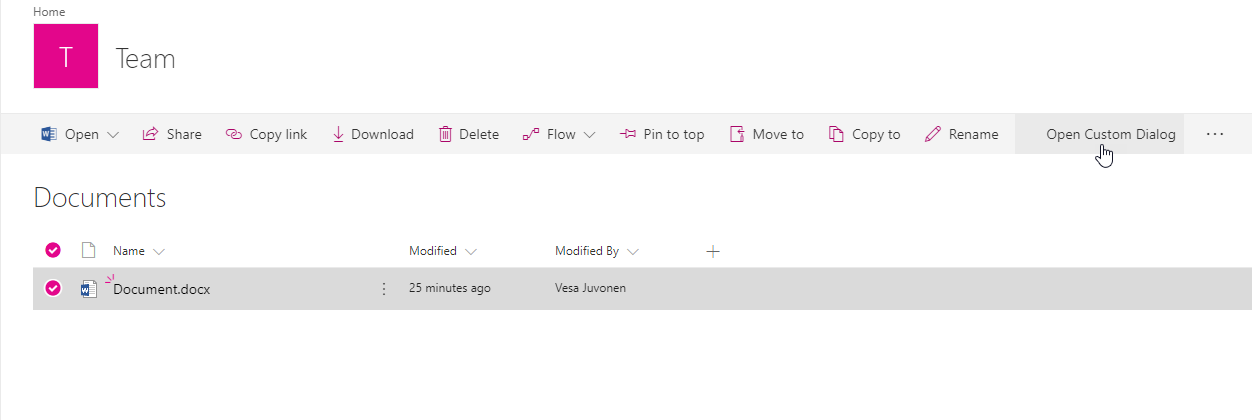
Click the Open Custom Dialog button to see your custom dialog box rendered within the list view.
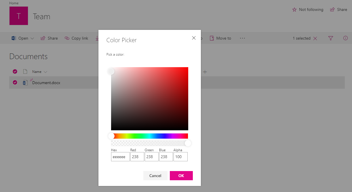
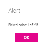
Select a color in the Color Picker, and then select OK to test how the code is returning the selected value back to the caller. The selection is then shown by using the default alert dialog box.
Note
If you find an issue in the documentation or in SharePoint Framework, report that to SharePoint engineering by using the issue list at the sp-dev-docs repository. Thanks for your input in advance.