Designing Viva Connections custom cards for your dashboard
Principles
Cards are used to link resources, surface information, and power direct interaction with applications.
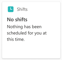
Integrate rather than duplicate: Take advantage of the experiences already available on your intranet, such as task assignments and completion, shift schedules, company policies, and more.
Stay in context: Design cards to avoid making users jump around to different experiences. For example, it's ideal if you can keep interactions within the Viva Connections app using the Quick View. The next best is to keep user interactions within the dashboard.
Bring cards to life with relevant and dynamically refreshable data: Company stock price, due dates for training or projects, task assignment updates, and remaining vacation days are some examples.
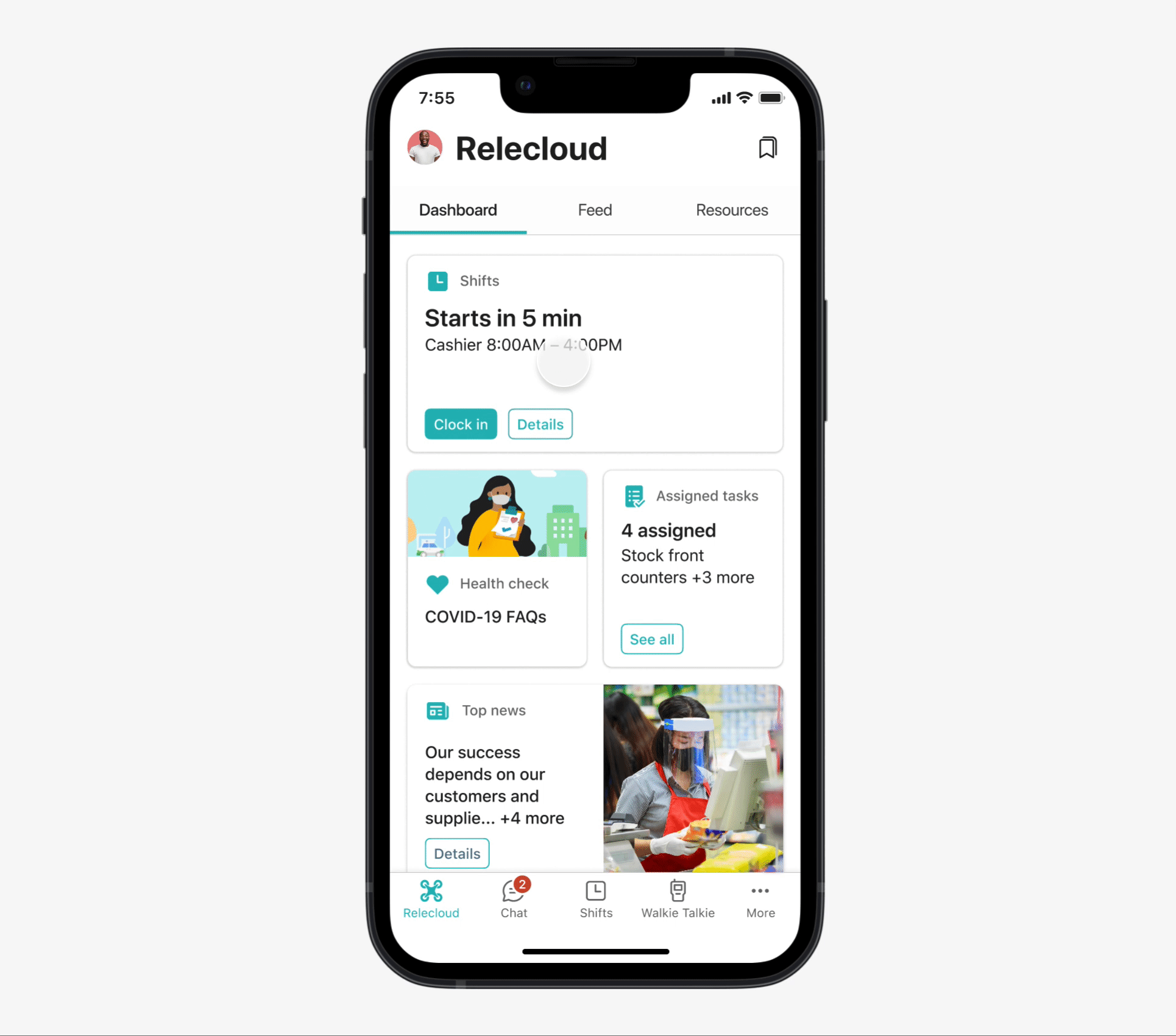
Anatomy of cards
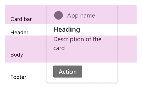
The Connections dashboard is made up of cards that each serve a specific purpose. Each card is a container and is composed of the following sections and elements:
Medium card Layout:
Large card layout:
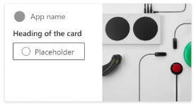
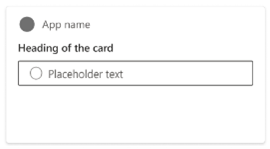
The first section is the card bar, which includes the card’s icon and title.
Icon: Unique visual representation of this card. You can choose the icon from the pre-defined set or upload a customized icon.
Note
For customized icons, the maximum size is 24 px by 24 px. Recommended formats are PNG or SVG. SVG icons scale better across different screen resolutions. Make sure the icon has a transparent background, and it looks good both on light and dark themes.
Title: Typically the app name. All titles should be in sentence case.
The second section is the header, which will be the most prominent words on the card.
- This content is likely to be read first. It's used to communicate the most information and keywords. Heading text can be static or dynamically updated. All headings should be in sentence case.
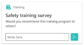
The third section is referred to as the body.
The body can contain elements such as text input, a search box, or a text description.
Note
Use text when the description can add valuable secondary informational value to the heading and can make it easier to understand the purpose of the card. Avoid repeating information already communicated in the heading.
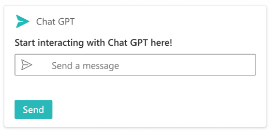
Finally, the last section of the card is the footer.
- The footer section can contain an action button, text input, or a search footer.
Card components and layouts
As part of the SPFX 1.18, we introduced card components to enhance Adaptive Card Extension layouts. These components are the building blocks of card layouts, representing individual elements within a card. Here are card components available:
- Card Bar Component
- Text
- Text input
- Action button
- Search box
- Search footer
With the card components approach, we provide two types of card layout templates, each offering developers varying degrees of flexibility and customization:
- Generic card layout template
- The generic card template serves as a foundational or base card with no predefined elements/ components.
- Developers can utilize this template to fully customize card design layouts according to their specific needs.
- Scenario-focused card layout template
- Scenario-focused templates are designed to address specific customer needs, delivering tailored solutions for distinct scenarios.
- These templates come with pre-built user experiences, enabling developers to initiate their projects swiftly and effortlessly.
Generic card layout template
While the generic card layout offers developers significant flexibility in customizing the card design, we have established a specific set of component combinations in accordance with our design language and guidelines. This approach not only ensures adherence to our design principles but also guarantees a superb user experience for our customers.
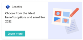
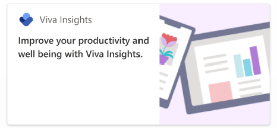
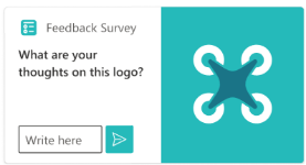
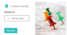
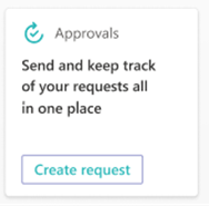
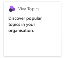
Examples of the generic card with an image (Allowed combinations)
| Combination | Card bar | Header | Body | Footer | Notes | Sample Card |
|---|---|---|---|---|---|---|
| 1 | Yes | Text | Empty | Action button | Previously known as the Image template |
|
| 2 | Yes | Text | Empty | Empty | Previously known as the Image template |
|
| 3 | Yes | Text | Empty | Text Input | New layout |
|
| 4 | Yes | Text | Text input | Action Button | New layout |
|
| 5 | Yes | Text | Text input | Empty | New layout |
|
Note
When using images on a card, note: Images draw the viewer's eye, so use images carefully either to create recognition of a familiar app or website or increase the overall visual prominence of the card on the dashboard. The image should meaningfully connect to the heading and/or title.
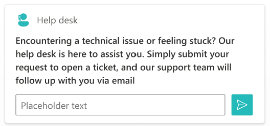
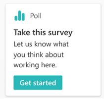
Examples of generic cards without images (Allowed combinations)
| Combination | Card bar | Header | Body | Footer | Notes | Sample Card |
|---|---|---|---|---|---|---|
| 1 | Yes | Text | Empty | Action button | Previously known as the Basic Text |
|
| 2 | Yes | Text | Empty | Empty | Previously known as the Basic Text |
|
| 3 | Yes | Text | Empty | Text Input | New layout |
|
| 4 | Yes | Text | Text | Action Button | Previously known as the Primary Text |
|
| 5 | Yes | Text | Text | Empty | Previously known as the Primary Text |
|
| 6 | Yes | Text | Text | Text Input | New layout |
|
| 7 | Yes | Text | Text input | Action Button | New layout |
|
| 8 | Yes | Text | Text input | Empty | New layout |
|
Note
Search box and search footer components can't be used in generic card template layout.
Recommended best practice for the generic card layout template and components
When adding the text in the heading and body sections, ensure the text doesn't truncate and can fit in the card width on both desktop and mobile in both card sizes and all languages used. Truncated text can hide key information that might be necessary for the end user to complete the task. For the header, in most cases, a length of 10-12 characters should fit the card width well.
Whenever you use a text input component, we highly recommend adding an icon button. Although we allow an icon before and an icon after the text input component, we recommend using one icon to clearly communicate the intent of the card.
Note
The icon before the text input disappears once the textbox is active.
Generally, we don't recommend using text input with an action button AND extra action buttons in the footer BUT if there's a text input with a button AND extra buttons in the footer - we recommend using a secondary button style (default or undefined value for the button style property)
Although we do support the entire card being clickable, we don't recommend having a selection action on a card if there's a text input in the body or it's a search card. This won't provide a great user experience
While we do allow the entire card to be clickable, we strongly advise against enabling selection actions on a card if it contains text input in the body or is a search card template. Doing so will result in a suboptimal user experience.
Scenario-focused card layout template
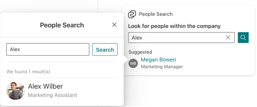
Search template
This scenario-focused card template allows developers to quickly create a search experience for the users. Examples include people, messages or chats, files etc.
Interaction
There are three possible ways to interact with a card:
- Card (the entire card can be clickable)
- Primary button
- Secondary button
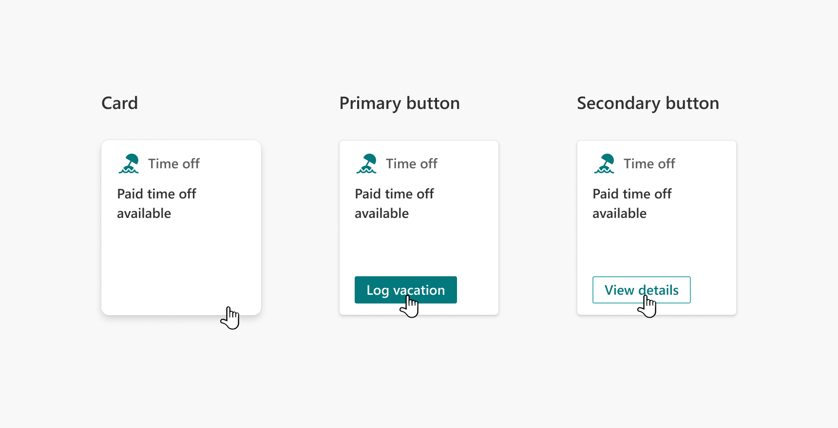
Each of these interactions can be customized. Use these to perform an instant action, send a request to the server, open a Quick View, link to a Teams app, open an external website and so on.
Here are the best practices for designing card interactions:
- The overall card should always be interactive.
- If the primary button is used, because of its visual prominence, it should be the most important action on the card.
- The secondary button can used either on its own or with the primary button if two actions are needed (only available in large-size card layouts). If it's used with the primary button, make sure it's linked to the second most important action on the card. In that case, the card itself will become the least important action.
- For button labels, use concise and clear text that accurately reflects button behavior. For example 'View tasks' can be better than only 'View'.
- Make sure each interaction on the card is unique.
- Design cards to avoid making users jump around to different experiences. For example, it's ideal if you can keep interactions within the Viva Connections app using the Quick View. The next best is to keep user interactions within the dashboard.
Note
Due to lack of space:
- Heading + Image layout does not have buttons with medium size cards.
- Heading and Heading + Description layouts can only have one button with medium size cards.
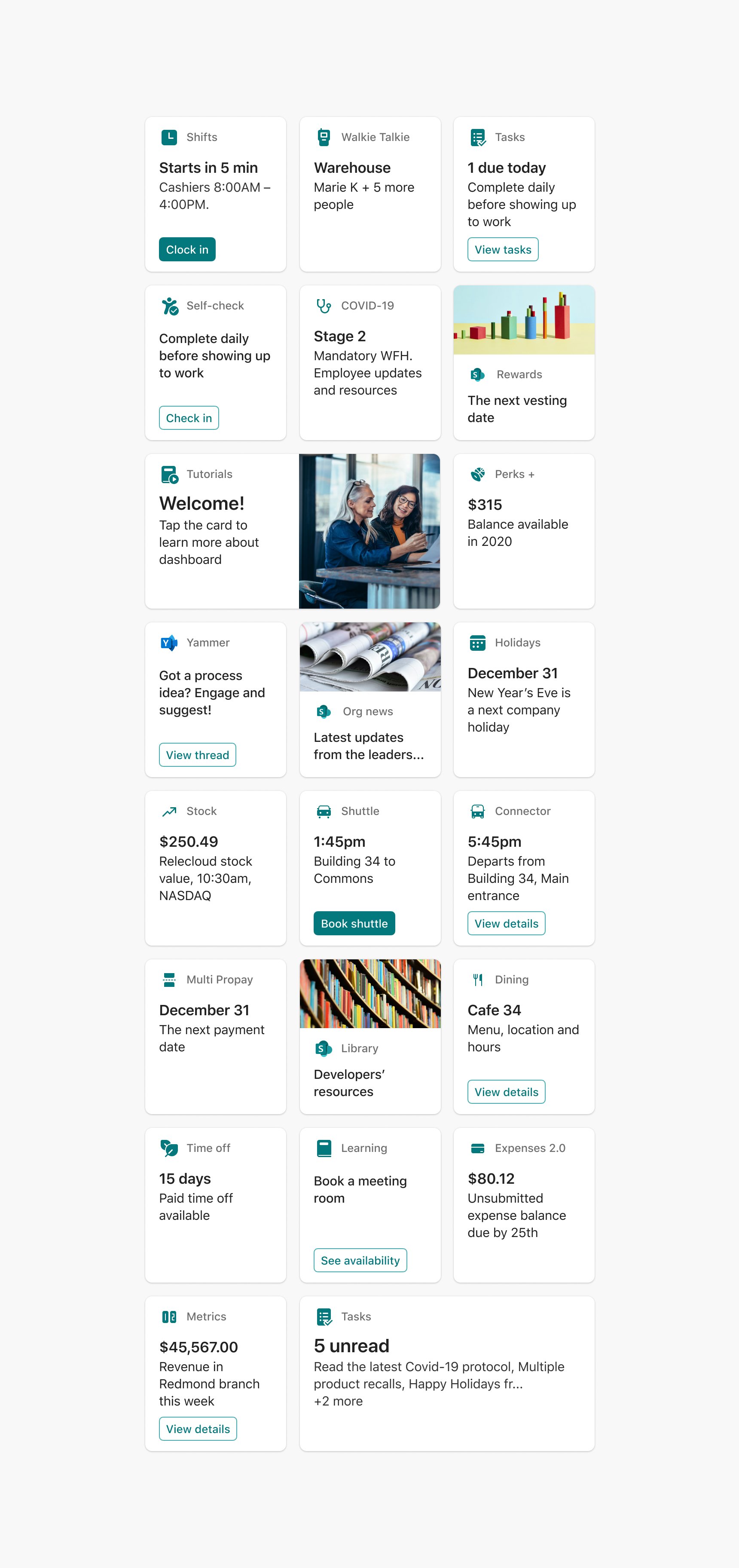
Examples
Here are some example cards for how these layouts can be used
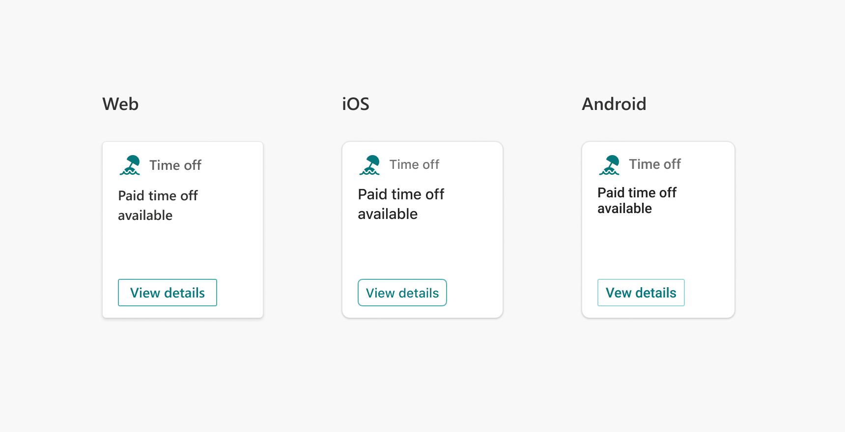
Platforms and modes
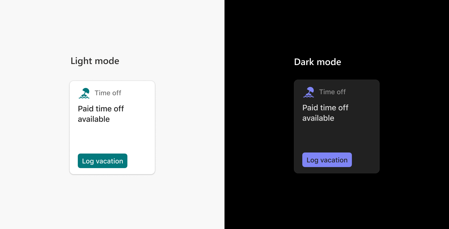
Dashboard cards are supported on iOS, Android, and Web. However, there are slight differences in the styling between different platforms – fonts (Segoe UI for desktop, Roboto for Android, SF Display Pro for iOS), colors, sizes, and spacing are slightly tweaked to better suit the respective platform and make the cards look consistent with the overall experience of that platform.
Dashboard cards also support both light and dark mode themes. Ensure that the colors you use work for both modes – text should be legible, and buttons and icons should be clearly recognizable against the background. To meet accessibility criteria, text should have a color ratio of 4.5:1 against the button background, and non-text components like icon should have a color ratio of 3:1 against the background. Use this tool to check color contrast.
Displaying your app in the toolbox
New cards are added to that dashboard using the following toolbox.
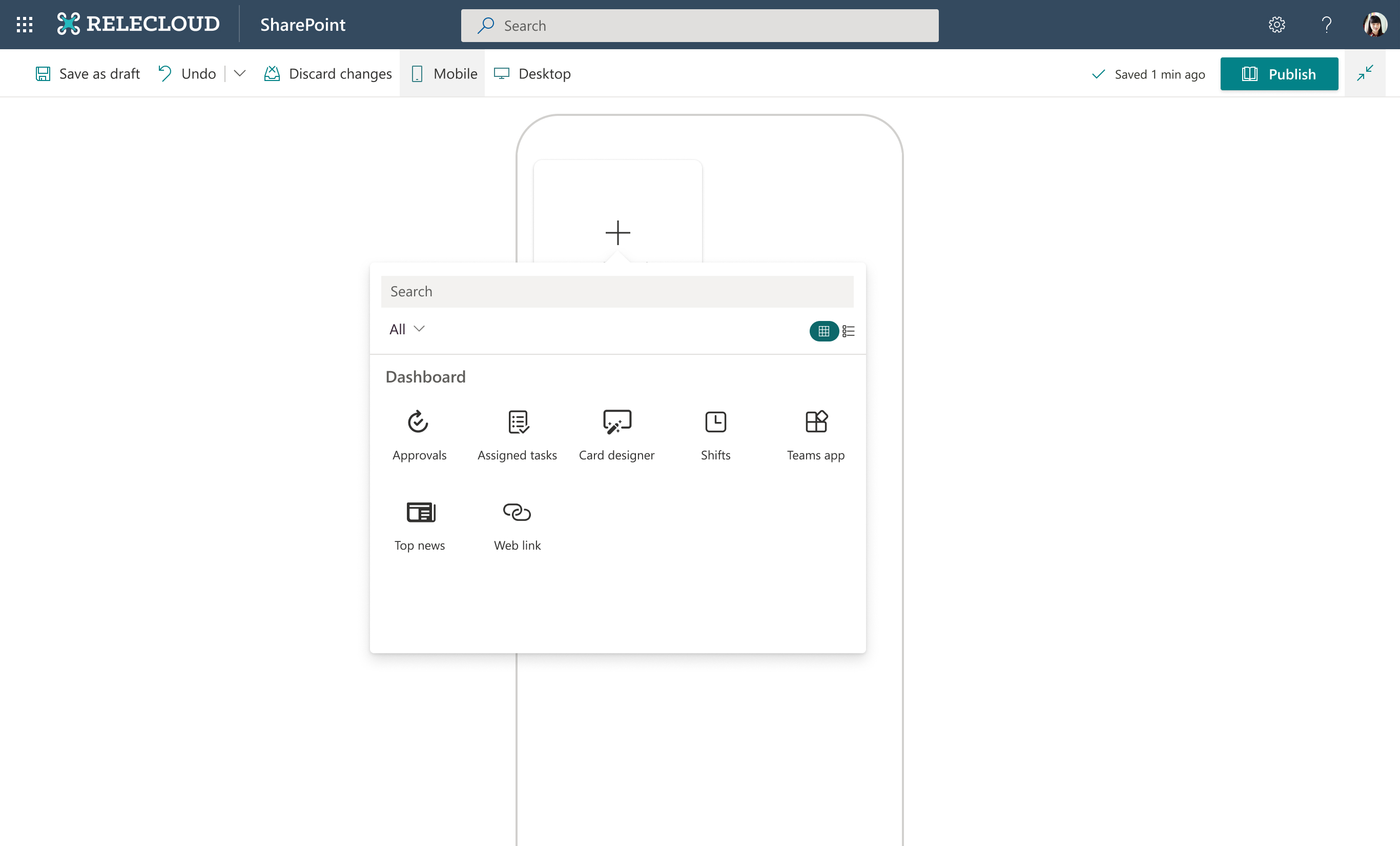
To display your custom app in the dashboard picker, you'll need the following:
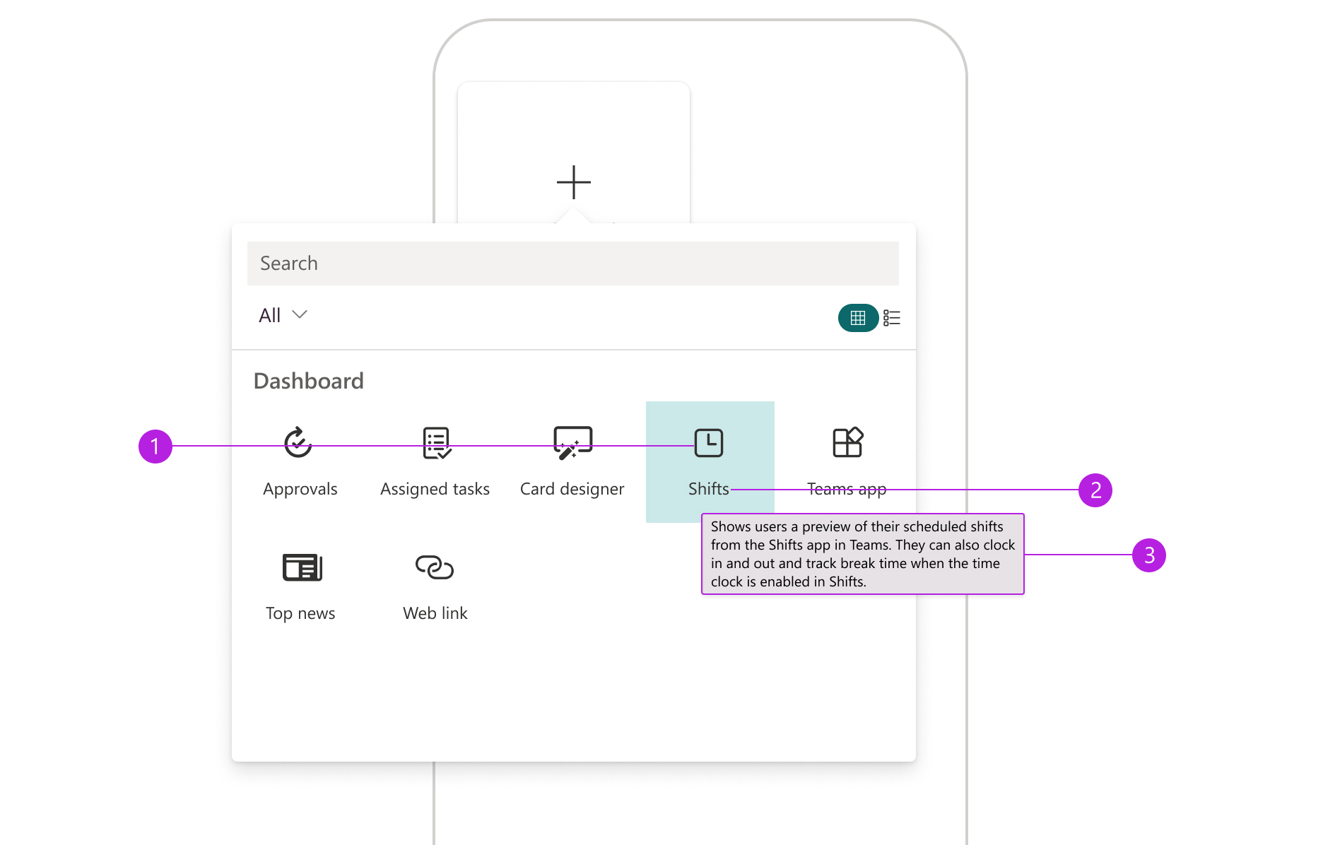
- Icon: Unique visual representation of this app. Your custom icon maximum size is 24px by 24px and should preferably in PNG or SVG format. SVG icons scale better across different screen resolutions. It's preferable to use a monochromatic icon, but you can use color icons if you want to represent your unique brand with the icons. Either way, make sure the icon has a transparent background, and it looks good both on light and dark theme. Learn about SharePoint themes. The same icon is to be used for the dashboard card (see above).
- Title: Make sure the title of the app is concise and isn't truncated. Recommended length is 10-12 characters. The same title should be used for the dashboard card (see above) and the Quick View (if used). If you have multiple apps, it's recommended that each app has a unique title. All titles should be in sentence case.
- Descriptive text: A clear, concise description explains the purpose of the card and provides information about how to use it. It should show up in the tooltip on hover (in web). Make sure the text wraps appropriately and isn't too wide or too narrow in the tooltip. The optimal line length is considered to be 50-60 characters per line, including spaces.
Defining settings for the card
When the app is clicked, the card is displayed on the dashboard. The card can be edited using the settings panel on the right.
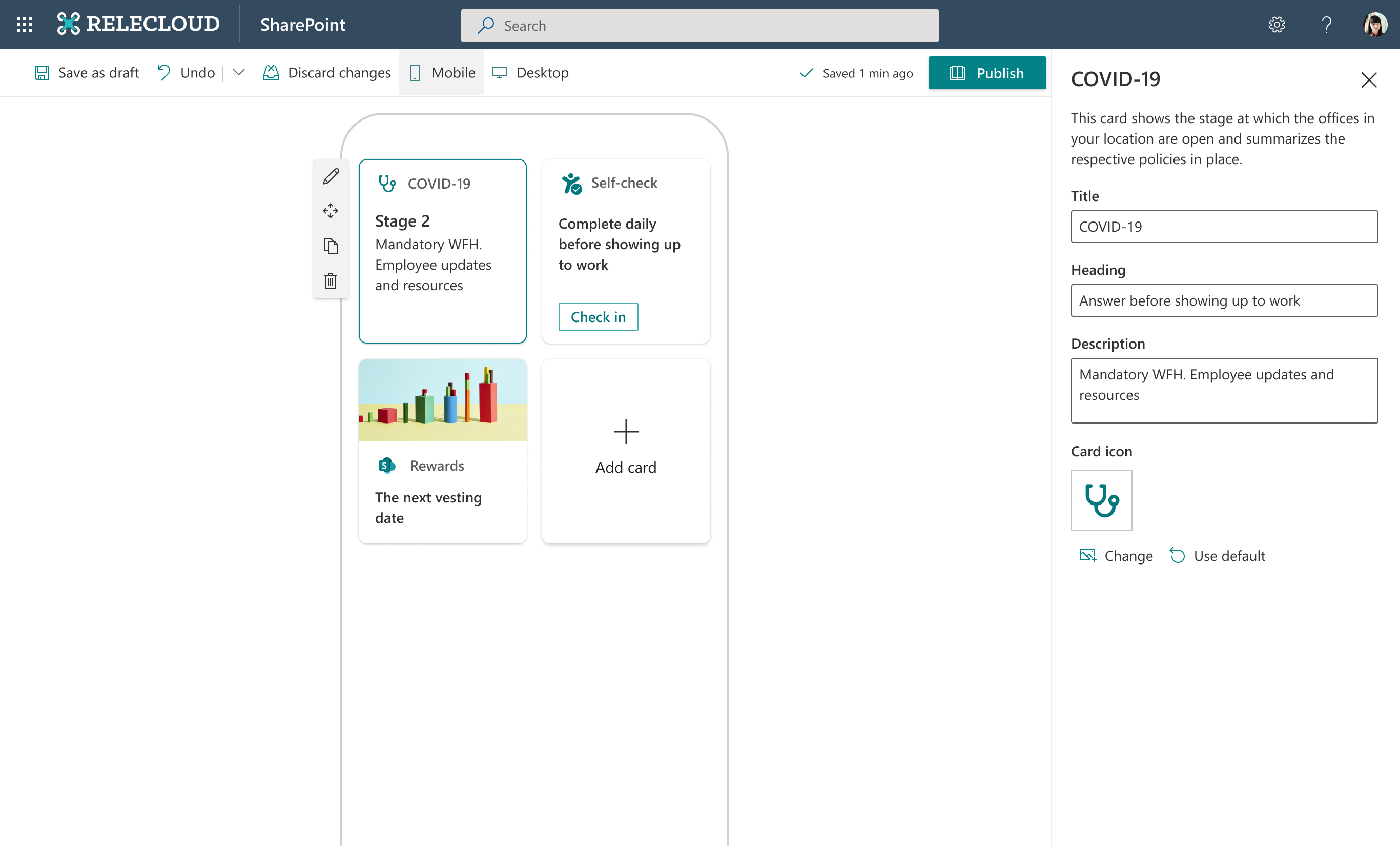
Here are some best practices for offering customization settings:
- Include descriptive text that explains the purpose of the card and provides information about how to use it. Ensure that this is either the same text as the tooltip or adds to it.
- Unless the text on the card is dynamically updated, allow users to edit the text on the card to tailor it to their needs. Consider providing prewritten default text in the fields that the user can override and edit as necessary.
- If multiple cards are available from the same organization, ensure that labels and interactions in the settings panel are consistent across all the cards.
- If there are multiple settings and the card is complex in design, it's recommended to add a "Learn more" link where users can find best practices for adding your card to their dashboard, for example, recommended size, example cards, and so on.