Supporting section backgrounds
Starting with SharePoint Framework v1.8, web parts can be made aware of any section backgrounds and use these colors to improve the appearance of a web part when hosted in a section with a different background.
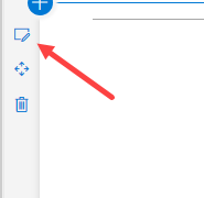
Configuring your section to use a different background
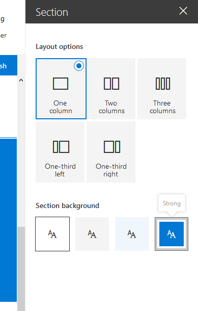
The section background color you can set is based upon the main color of the theme you applied. To set the background of a section open its properties:
In the properties you can define which type of section background you want to set:
Making your web part theme aware
Update the manifest
You need to add a supportsThemeVariants property to the manifest of your webpart and set its value to true:
{
  // ...

  "supportsThemeVariants": true,

  "version": "*",
  "manifestVersion": 2,

  "requiresCustomScript": false,

  "preconfiguredEntries": [{
    // ...
  }]
}
Use the background color awareness in non-React web parts
In order to make the web part aware of any theme changes, you have to implement support for the ThemeProvider service that will raise an event in case a theme change has taken place.
import {
  ThemeProvider,
  ThemeChangedEventArgs,
  IReadonlyTheme,
  ISemanticColors
} from '@microsoft/sp-component-base';

...

private _themeProvider: ThemeProvider;
private _themeVariant: IReadonlyTheme | undefined;

protected onInit(): Promise<void> {
  // Consume the new ThemeProvider service
  this._themeProvider = this.context.serviceScope.consume(ThemeProvider.serviceKey);

  // If it exists, get the theme variant
  this._themeVariant = this._themeProvider.tryGetTheme();

  // Register a handler to be notified if the theme variant changes
  this._themeProvider.themeChangedEvent.add(this, this._handleThemeChangedEvent);

  return super.onInit();
}

/**
 * Update the current theme variant reference and re-render.
 *
 * @param args The new theme
 */
private _handleThemeChangedEvent(args: ThemeChangedEventArgs): void {
  this._themeVariant = args.theme;
  this.render();
}
Using the ThemeProvider we can now retrieve the correct body text color:
public render(): void {
  const semanticColors: Readonly<ISemanticColors> | undefined = this._themeVariant && this._themeVariant.semanticColors;

  const style: string = ` style="background-color:${semanticColors.bodyBackground}"`;

  this.domElement.innerHTML = `<p${'' || (this._themeProvider && style)}>this is a demo</p>`;
}
Use the background color awareness in React-based web parts
For a React based web part you'll have to implement code to consume the ThemeProvider, just like with a basic web part:
import {
  ThemeProvider,
  ThemeChangedEventArgs,
  IReadonlyTheme
} from '@microsoft/sp-component-base';
...

private _themeProvider: ThemeProvider;
private _themeVariant: IReadonlyTheme | undefined;

protected onInit(): Promise<void> {
  // Consume the new ThemeProvider service
  this._themeProvider = this.context.serviceScope.consume(ThemeProvider.serviceKey);

  // If it exists, get the theme variant
  this._themeVariant = this._themeProvider.tryGetTheme();

  // Register a handler to be notified if the theme variant changes
  this._themeProvider.themeChangedEvent.add(this, this._handleThemeChangedEvent);

  return super.onInit();
}

/**
 * Update the current theme variant reference and re-render.
 *
 * @param args The new theme
 */
private _handleThemeChangedEvent(args: ThemeChangedEventArgs): void {
  this._themeVariant = args.theme;
  this.render();
}
Now in order to use the theme variant in your component, you'll have to send the theme variant to your component in the render() method:
public render(): void {
  const element: React.ReactElement<IBasicSectionBackgroundExampleProps > = React.createElement(
    BasicSectionBackgroundExample,
    {
      themeVariant: this._themeVariant
    }
  );

  ReactDom.render(element, this.domElement);
}
In order to use that property in your component, you'll have to add it to your properties interface definition, which in this case is called IBasicSectionBackgroundExampleProps:
import { IReadonlyTheme } from '@microsoft/sp-component-base';

export interface IBasicSectionBackgroundExampleProps {
  themeVariant: IReadonlyTheme | undefined;
}
Then in the render method of the component you can retrieve the correct colors as follows:
public render(): React.ReactElement<IBasicSectionBackgroundExampleProps> {

  const { semanticColors }: IReadonlyTheme = this.props.themeVariant;

  return (
    <div style={{backgroundColor: semanticColors.bodyBackground}}>
      <p>This React web part has support for section backgrounds and will inherit its background from the section</p>
    </div>
  );
}