Add data grids to mobile reports
Note
SQL Server Mobile Report Publisher is deprecated for all releases of SQL Server Reporting Services after SQL Server Reporting Services 2019. It's discontinued starting in SQL Server Reporting Services 2022 and Power BI Report Server.
Sometimes the best visualization is the data itself. Learn about the three data grids, or tables, for displaying data in SQL Server Mobile Report Publisher:
- Simple data grid
- Indicator data grid
- Chart data grid
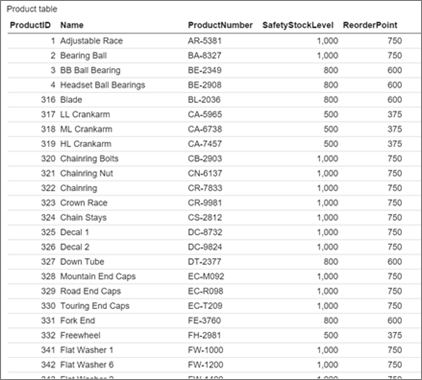
Simple data grid
The simple data grid can display multiple columns of data with custom formatting and headers.
After you add a data grid to the design surface, you can connect it to real data.
Drag a data grid from the Layout tab to the design grid and make it the size you want.
Select the Data tab.
In the Data properties pane, under Data for the grid view, select a data table.
In the Columns pane, select the columns you want. Reorder and rename them and set their format and aggregation.
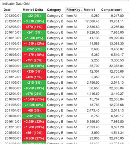
Indicator data grid
You can add columns with gauges to an indicator data grid.
Drag an indicator data grid from the Layout tab to the design grid and make it the size you want.
On the Data tab in the Columns pane, select Add gauge column.
Select Options, then select a Gauge type.
Set the Value and Comparison fields and Value direction, as in Gauges you add directly to your mobile report.
The data grid automatically feeds the gauge only the data specific to that row of the data grid.
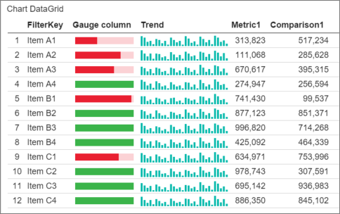
Chart data grid
You can add you can add columns with either gauges or charts to a chart data grid.
When you add a chart column to a data grid, you need to add a separate data table to provide data for the chart in each row. This second data table needs to share a field with the main data table, to link each row to its associated chart data.
Drag a chart data grid from the Layout tab to the design grid and make it the size you want.
On the Data tab in the Columns pane, select Add chart column.
Get data from Excel or a shared dataset to add a second data table that shares a field with the main data table. Do this step if you haven't already.
Under Data properties, select the main data table in Data for the Grid View. Then, select the second table in Reference Data for Chart Visualizations.
Select Options, then select Chart type.
Select Chart data field, Source lookup, and Destination lookup. These three properties determine how the data grid provides data to each chart in the column.
- Source lookup is set to a field in the data table in Data for the Grid View. This field acts as a per-row filter applied to the chart reference data table to provide data to the embedded chart for each row.
- Destination lookup is the field in the data table in Reference data for chart visualizations. The data for the chart in each row is joined on those two fields.
- Chart data field determines which metric in the Reference data for chart visualizations data table to use as the y-axis value or series in the chart in each row.
Related content
Feedback
Coming soon: Throughout 2024 we will be phasing out GitHub Issues as the feedback mechanism for content and replacing it with a new feedback system. For more information see: https://aka.ms/ContentUserFeedback.
Submit and view feedback for