Tutorial: Create a quick chart report offline (Report Builder)
In this tutorial, you use a wizard to create a pie chart in a Reporting Services paginated report in Report Builder. Then you add percentages and modify the pie chart a little.
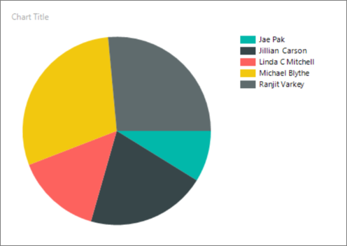
You can do this tutorial two different ways. Both methods have the same outcome, which is a pie chart like the one in this illustration:

Prerequisites
Whether you use XML data or a Transact-SQL query, you need to have access to Report Builder. You can start Report Builder from a Reporting Services report server in native mode or in SharePoint integrated mode, or you can download Report Builder from the Microsoft Download Center. For more information, see Install Report Builder.
Two ways to do this tutorial
Use XML data for this tutorial
You can use XML data that you copy from this article and paste into the wizard. You don't need to be connected to a Reporting Services report server in native mode or in SharePoint integrated mode, and you don't need access to an instance of SQL Server.
Create the pie chart with XML data.
Use a Transact-SQL query that contains data for this tutorial
You can copy a query with data included in it from this article and paste it into the wizard. You need the name of an instance of SQL Server and credentials sufficient for read-only access to any database. The dataset query in the tutorial uses literal data, but an instance of SQL Server must process the query to return the metadata that is required for a report dataset.
The advantage of using the Transact-SQL query is that all the other Report Builder tutorials use the same method. So, when you work on the other tutorials, you already know what to do.
The Transact-SQL query does require a few other prerequisites. For more information, see Prerequisites for tutorials (Report Builder).
Create the pie chart with a Transact-SQL query that contains data.
Create the pie chart with XML data
Start Report Builder from the Reporting Services web portal, or the report server in SharePoint integrated mode, or from your computer.
The Getting Started dialog appears.
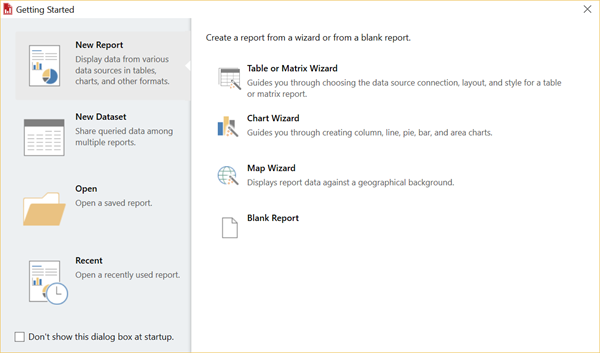
If the Getting Started dialog doesn't appear, select File and choose New. The New Report or Dataset dialog has most of the same contents as the Getting Started dialog.
In the left pane, verify that New Report is selected.
In the right pane, select Chart Wizard, and then choose Create.
In the Choose a dataset page, select Create a dataset, and then choose Next.
In the Choose a connection to a data source page, select New.
The Data Source Properties dialog opens.
You can name a data source anything you want. In the Name box, enter MyPieChart.
In the Select connection type box, select XML.
Select the Credentials tab, select Use current Windows user. Kerberos delegation might be required, and then select OK.
In the Choose a connection to a data source page, select MyPieChart, and then select Next.
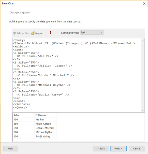
Copy the following text and paste it in the large box in the top of the Design a query page.
<Query>
<ElementPath>Root /S  {@Sales (Integer)} /C {@FullName} </ElementPath>
<XmlData>
<Root>
<S Sales="150">
  <C FullName="Jae Pak" />
</S>
<S Sales="350">
  <C FullName="Jillian  Carson" />
</S>
<S Sales="250">
  <C FullName="Linda C Mitchell" />
</S>
<S Sales="500">
  <C FullName="Michael Blythe" />
</S>
<S Sales="450">
  <C FullName="Ranjit Varkey" />
</S>
</Root>
</XmlData>
</Query>
(Optional) Select the Run button (!) to see the data your chart is based on.
Select Next.
In the Choose a chart type page, select Pie, and then choose Next.
In the Arrange chart fields page, double-click the Sales field in the Available fields box.
It automatically moves to the Values box, because the value is a numerical value.
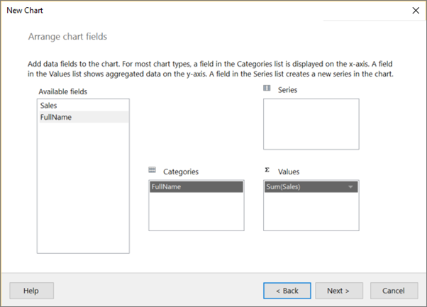
Drag the FullName field from the Available fields box to the Categories box (or double-click it). The value goes to the Categories box, and then select Next.
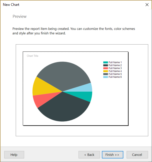
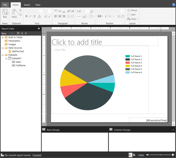
The Preview page shows your new pie chart with representational data. The legend reads Full Name 1, Full Name 2, etc., rather than the salespeople's names, and the size of the slices of pie aren't accurate. This example gives you an idea of what your report looks like.
Select Finish.
Now you see your new pie chart report in Design View, still with representational data.
To see your actual pie chart, select Run on the Home tab of the Ribbon.
To continue modifying your pie chart, go to After you run the wizard in this article.
Create the pie chart with a Transact-SQL query
Start Report Builder from the Reporting Services web portal, from the report server in SharePoint integrated mode, or from your computer.
The Getting Started dialog appears.
Note
If the Getting Started dialog doesn't appear, select File and choose New. The New Report or Dataset dialog has most of the same contents as the Getting Started dialog.
In the left pane, verify that New Report is selected.
In the right pane, select Chart Wizard, and then choose Create.
In the Choose a dataset page, select Create a dataset, and then choose Next.
In the Choose a connection to a data source page, select an existing data source or browse to the report server and select a data source, and then select Next. You might need to enter a user name and password.
Note
The data source you choose is unimportant, as long as you have adequate permissions. You aren't getting data from the data source. For more information, see Prerequisites for tutorials (Report Builder).
On the Design a Query page, select Edit as Text.
Paste the following query into the query pane:
SELECT 150 AS Sales, 'Jae Pak' AS FullName
UNION SELECT 350 AS Sales, 'Jillian Carson' AS FullName
UNION SELECT 250 AS Sales, 'Linda C Mitchell' AS FullName
UNION SELECT 500 AS Sales, 'Michael Blythe' AS FullName
UNION SELECT 450 AS Sales, 'Ranjit Varkey' AS FullName
(Optional) Select the Run button (!) to see the data your chart is based on.
Select Next.
In the Choose a chart type page, select Pie, and then choose Next.
In the Arrange chart fields page, double-click the Sales field in the Available fields box.
It automatically moves to the Values box, because it's a numerical value.
Drag the FullName field from the Available fields box to the Categories box (or double-click it). The value goes to the Categories box, and then select Next.
Select Finish.
You're now looking at your new pie chart report on the design surface. What you see is representational. The legend reads Full Name 1, Full Name 2, etc., rather than the salespeople's names, and the size of the slices of pie aren't accurate. This example gives you an idea of what your report looks like.
To see your actual pie chart, select Run on the Home tab of the Ribbon.
After you run the wizard
Now that you have your pie chart report, you can play with it. On the Run tab of the Ribbon, select Design, so you can continue modifying it.
Make the chart bigger
You might want the pie chart to be bigger.
- Select the chart, but not on any element in the chart. To select it and drag the lower-right corner to resize it.
Notice the design surface gets larger as you drag.
Add a report title
- Select the words Chart title at the top of the chart, and then enter a title, such as Sales Pie Chart.
- With the title selected, in the Properties pane, change Color to Black and FontSize to 12pt.
Add percentages
Right-click the pie chart and select Show Data Labels. The data labels appear within each slice on the pie chart.
Right-click the labels and select Series Label Properties. The Series Label Properties dialog appears.
In the Label data box, type #PERCENT{P0}.
The {P0} gives you the percentage without decimal places. If you enter just #PERCENT, your numbers have two decimal places. #PERCENT is a keyword that performs a calculation or function for you. There are other keywords that you can use.
Select Yes to confirm you want to set UseValueAsLabel to False.
On the Font tab, select Bold and change Color to White.
Select OK.
For more information about customizing chart labels and legends, see Display percentage values on a pie chart (Report Builder) and Change the text of a legend item (Report Builder).
What's next?
Now that you created your first report in Report Builder, you're ready to try the other tutorials and to start creating reports from your own data. To run Report Builder, you need permission to access your data sources, such as databases, with a connection string, which actually connects you to the data source. Your system administrator has this information and can set you up.
To work through the other tutorials, you need the name of an instance of SQL Server and credentials sufficient for read-only access to any database. Your system administrator can also set that up for you.
Finally, to save your reports to a report server or a SharePoint site that is integrated with a report server, you need the URL and permissions. You can run any report you create directly from your computer, but reports have more functionality when run from the report server or SharePoint site. You need permissions to run your reports or others from the report server or SharePoint site where they're published. Talk to your system administrator to obtain access.
It might help to read about some of the concepts and terms before you get started. See Reporting Services concepts. Also, spend some time planning, before you create your first report. It's time well spent. See Plan a report (Report Builder).
Related content
More questions? Try asking the Reporting Services forum.
Feedback
Coming soon: Throughout 2024 we will be phasing out GitHub Issues as the feedback mechanism for content and replacing it with a new feedback system. For more information see: https://aka.ms/ContentUserFeedback.
Submit and view feedback for