Tutorial: Add a KPI to your report (Report Builder)
In this Report Builder tutorial, you add a key performance indicator (KPI) to a Reporting Services paginated report.
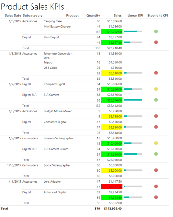
KPIs are measurable values with business significance. In this scenario, the sales summary by product subcategories is the KPI. The current state of the KPI is shown with colors, gauges, and indicators.
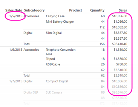
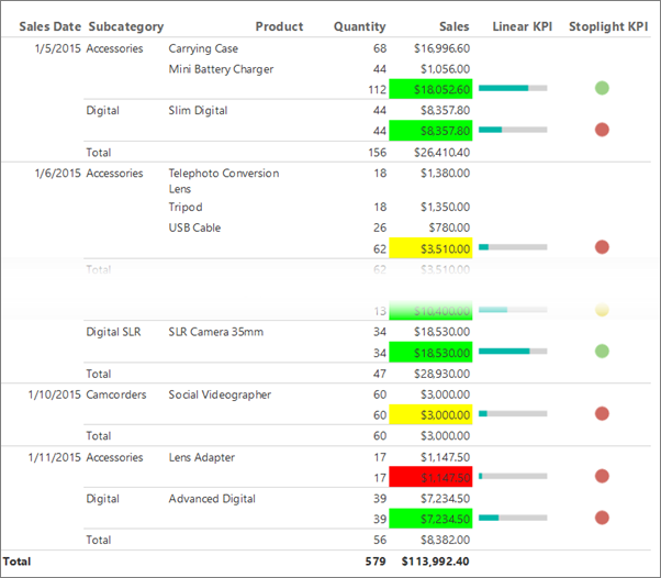
The following illustration is similar to the report you create in this tutorial.
Note
In this tutorial, the steps for the wizard are consolidated into two procedures: one to create the dataset and one to create a table. For step-by-step instructions about how to browse to a report server, choose a data source, create a dataset, and run the wizard, see the first tutorial in this series: Tutorial: Create a basic table report (Report Builder).
Estimated time to complete this tutorial: 15 minutes.
Requirements
For information about requirements, see Prerequisites for tutorials (Report Builder).
1. Create a table report and dataset from the table or Matrix Wizard
In this section, you choose a shared data source, create an embedded dataset, and display the data in a table.
Create a table with an embedded dataset
Start Report Builder either from your computer, the Reporting Services web portal, or SharePoint integrated mode.
The New Report or Dataset dialog box opens.
If you don't see the New Report or Dataset dialog box, on the File menu > New.
In the left pane, verify that New Report is selected.
In the right pane, select Table or Matrix Wizard.
On the Choose a dataset page, select Create a dataset.
Select Next.
On the Choose a connection to a data source page, select an existing data source. Or browse to the report server, and choose a data source. If there no data source is available or you don't have access to a report server, you can use an embedded data source instead. For more information, see Tutorial: Creating a basic table report (Report Builder).
Select Next.
On the Design a query page, select Edit as Text.
Copy and paste the following query into the query pane:
Note
In this tutorial, the query contains the data values, so that it does not need an external data source. This makes the query quite long. In a business environment, a query would not contain the data. This is for learning purposes only.
SELECT CAST('2015-01-05' AS date) as SalesDate, 'Accessories' as Subcategory,
   'Carrying Case' as Product, CAST(16996.60 AS money) AS Sales, 68 as Quantity
UNION SELECT CAST('2015-01-06' AS date) as SalesDate, 'Accessories' as Subcategory,
   'Tripod' as Product, CAST(1350.00 AS money) AS Sales, 18 as Quantity
UNION SELECT CAST('2015-01-11' AS date) as SalesDate, 'Accessories' as Subcategory,
   'Lens Adapter' as Product, CAST(1147.50 AS money) AS Sales, 17 as Quantity
UNION SELECT CAST('2015-01-05' AS date) as SalesDate, 'Accessories' as Subcategory,
   'Mini Battery Charger' as Product, CAST(1056.00 AS money) AS Sales, 44 as Quantity
UNION SELECT CAST('2015-01-06' AS date) as SalesDate,  'Accessories' as Subcategory,
   'Telephoto Conversion Lens' as Product, CAST(1380.00 AS money) AS Sales, 18 as Quantity
UNION SELECT CAST('2015-01-06' AS date) as SalesDate,'Accessories' as Subcategory,
   'USB Cable' as Product, CAST(780.00 AS money) AS Sales, 26 as Quantity
UNION SELECT CAST('2015-01-08' AS date) as SalesDate, 'Accessories' as Subcategory,
   'Budget Movie-Maker' as Product, CAST(3798.00 AS money) AS Sales, 9 as Quantity
UNION SELECT CAST('2015-01-09' AS date) as SalesDate, 'Camcorders' as Subcategory,
   'Business Videographer' as Product, CAST(10400.00 AS money) AS Sales, 13 as Quantity
UNION SELECT CAST('2015-01-10' AS date) as SalesDate, 'Camcorders' as Subcategory,
   'Social Videographer' as Product, CAST(3000.00 AS money) AS Sales, 60 as Quantity
UNION SELECT CAST('2015-01-11' AS date) as SalesDate,  'Digital' as Subcategory,
   'Advanced Digital' as Product, CAST(7234.50 AS money) AS Sales, 39 as Quantity
UNION SELECT CAST('2015-01-07' AS date) as SalesDate,  'Digital' as Subcategory,
   'Compact Digital' as Product, CAST(10836.00 AS money) AS Sales, 84 as Quantity
UNION SELECT CAST('2015-01-08' AS date) as SalesDate,  'Digital' as Subcategory,
   'Consumer Digital' as Product, CAST(2550.00 AS money) AS Sales, 17 as Quantity
UNION SELECT CAST('2015-01-05' AS date) as SalesDate, 'Digital' as Subcategory,
   'Slim Digital' as Product, CAST(8357.80 AS money) AS Sales, 44 as Quantity
UNION SELECT CAST('2015-01-09' AS date) as SalesDate, 'Digital SLR' as Subcategory,
   'SLR Camera 35mm' as Product, CAST(18530.00 AS money) AS Sales, 34 as Quantity
UNION SELECT CAST('2015-01-07' AS date) as SalesDate, 'Digital SLR' as Subcategory,
   'SLR Camera' as Product, CAST(26576.00 AS money) AS Sales, 88 as Quantity
On the query designer toolbar, select Run (!).
Select Next.
2. Organize data and choose a layout in the wizard
The Table or Matrix wizard provides a starting design in which to display data. The preview pane in the wizard helps you to visualize the result of grouping data before you complete the table or matrix design.
Organize data into groups and choose a layout
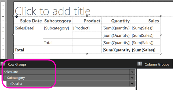
On the Arrange fields page, drag Product to Values.
Drag Quantity to Values and place after Product.
Quantity is summarized with the Sum function, the default function to summarize numeric fields.
Drag Sales to Values and place after Quantity.
Steps 1, 2, and 3 specify the data to display in the table.
Drag SalesDate to Row groups.
Drag Subcategory to Row groups and place after SalesDate.
Steps 4 and 5 organize the values for the fields first by date, and then by all sales for that date.
Select Next.
When you run the report, the table displays each date, all orders for each date, and all products, quantities, and sales totals for each order.
On the Choose the Layout page, under Options, verify that Show subtotals and grand totals is selected.
Verify that Blocked, subtotal below is selected.
Clear the option Expand/collapse groups.
In this tutorial, the report you create doesn't use the drilldown feature that lets a user expand a parent group hierarchy to display child group rows and detail rows.
Select Next.
Select Finish.
The table is added to the design surface. The table has five columns and five rows. The Row Groups pane shows three row groups: SalesDate, Subcategory, and Details. Detail data is all the data that the dataset query retrieves. The Column Groups pane is empty.
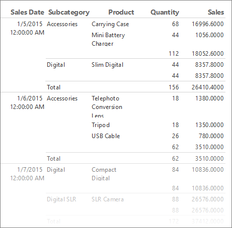
Select Run to preview the report.
For each product that is sold on a specific date, the table displays the product name, the quantity sold, and the sales total. The data is organized first by sales date and then by subcategory.
Format dates and currency
Let's make the columns wider and set the format for the dates and currency.
Select Design to go back to Design view.
The Product names could use more space. To make the Product column wider, select the whole table and drag the right edge of the column handle at the top of the Product column.
Press the Ctrl key, then select the four cells that contain [Sum(Sales)].
On the Home tab > Number > Currency. The cells change to show the formatted currency.
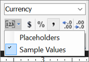
If your regional setting is English (United States), the default sample text is [$12,345.00]. If you don't see an example currency value in the Numbers group, select Placeholder Styles > Sample Values.
(Optional) On the Home tab, in the Number group, select the Decrease Decimals button twice to display dollar figures with no cents.
Select the cell that contains [SalesDate].
In the Number group, select Date.
The cell displays the example date [1/31/2000].
Select Run to preview the report.
3. Use background colors to display a KPI
Background colors can be set to an expression that is evaluated when you run the report.
Display the present state of a KPI by using background colors
In the table, right-click the second
[Sum(Sales)]cell (the subtotal row that displays the sales for a subcategory), then select Text Box Properties.Make sure you select the cell, not the text in the cell, to view Text Box Properties.

On the Fill tab, select the fx button next to Fill color and enter the following expression in the Set expression for: BackgroundColor field:
=IIF(Sum(Fields!Sales.Value) >= 5000 ,"Lime", IIF(Sum(Fields!Sales.Value) < 2500, "Red","Yellow"))This expression changes the background color to "Lime" green for each cell with an aggregated sum for
[Sum(Sales)]greater than or equal to 5000. Values of[Sum(Sales)]between 2500 and 5000 are "Yellow". Values less than 2500 are "Red".Select OK.
Select Run to preview the report.
In the subtotal row that displays the sales for a subcategory, the background color of the cell is red, yellow, or green depending on value of the sales sum.
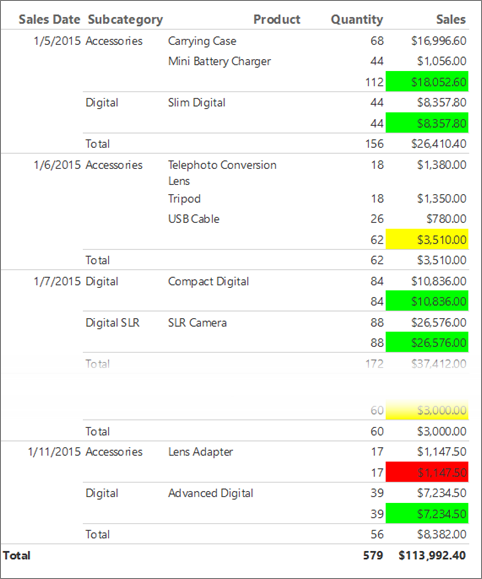
4. Display a KPI by using a gauge
A gauge depicts a single value in a dataset. This tutorial uses a horizontal linear gauge because its shape and simplicity make it easy to read, even in when it's small and within a table cell. For more information, see Gauges in a paginated report (Report Builder).
Display the present state of a KPI by using a gauge
Switch back to Design view.
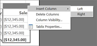
In the table, right-click the column handle for the Sales column > Insert Column > Right. A new column is added to the table.
Enter Linear KPI in the column heading.
On the Insert tab > Data Visualizations > Gauge, and then select the design surface outside the table.
In the Select Gauge Type dialog box, select the first linear gauge type, Horizontal.
Select OK.
A gauge is added to the design surface.
From the dataset in the Report Data pane, drag the
Salesfield to the gauge. The Gauge Data pane opens.When you drop the
Salesfield onto the gauge, it goes to the Values list and is aggregated by using the built-in Sum function.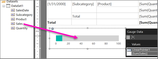
In the Gauge Data pane, select the arrow next to LinearPointer1 > Pointer Properties.
In the Linear Pointer Properties dialog box > Pointer Options tab > Pointer Type, make sure Bar is selected.
Select OK.
Right-click the scale in the gauge and select Scale Properties.
In the Linear Scale Properties dialog box > General tab, set Maximum to 25000.
Note
Instead of a constant such as 25000, you can use an expression to dynamically calculate the value of the Maximum option. The expression would use the aggregate of aggregate feature and look similar to the expression
=Max(Sum(Fields!Sales.value), "Tablix1").On the Labels tab, check Hide scale labels.
Select OK.
Drag the gauge inside the table to the second empty cell in the Linear KPI column, in the row that displays the subtotal sales for the
Subcategoryfield, next to the field where you added the background color formula.Note
You might have to resize the column so the horizontal linear gauge fits into the cell. To resize the column, select the table and drag the column handles. The report design surface resizes to fit the table.
Select Run to preview the report.
The horizontal length of the green bar in the gauge changes depending on the value of the KPI.

5. Display a KPI by using an indicator
Indicators are small simple gauges that communicate data values at a glance. Because of their size and simplicity, indicators are often used in tables and matrices. For more information, see Indicators in a paginated report (Report Builder).
Display the present state of a KPI by using an indicator
Switch to Design view.
In the table, right-click the column handle for the Linear KPI column that you added in the last procedure > Insert Column > Right. A new column is added to the table.
Enter Stoplight KPI in the column heading.
Select the cell for the subcategory subtotal, next to the linear gauge you added in the last procedure.
On the Insert tab, go to Data Visualizations > double-click Indicator.
In the Select Indicator Type dialog box, under Shapes, select the first shape type, 3 Traffic Lights (Unrimmed).
Select OK.
The indicator is added to the cell in the new Stoplight KPI column.
Right-click the indicator and select Indicator Properties.
On the Values and States tab, in the Value box, select [Sum(Sales)]. Don't change any other options.
By default, data synchronization occurs across the data region and you see the value Tablix1, the name of the table data region in the report, in the Synchronization scope box.
In this report, you can also change the scope of an indicator placed in the cell of the subcategory subtotal to synchronize across the SalesDate field.
Select OK.
Select Run to preview the report.
6. Add a report title to your report
A report title appears at the top of the report. You can place the report title in a report header or if the report doesn't use one, in a text box at the top of the report body. In this section, you use the text box that is automatically placed at the top of the report body.
You can further enhance the text by applying different font styles, sizes, and colors to phrases and individual characters of the text. For more information, see Format text in a text box in paginated reports (Report Builder).
Add a report title
On the design surface, select Click to add title.
Enter Product Sales KPIs, and then select outside the text box.
Optionally, right-click the text box that contains Product Sales KPI, select Text Box Properties, and then on the Font tab choose different font styles, sizes and colors.
Select Run to preview the report.
7. Save the report
Save the report to a report server or your computer. If you don't save the report to the report server, many Reporting Services features such as subreports aren't available.
Save the report on a report server
From the Report Builder button, select Save As.
Select Recent Sites and Servers.
Select or enter the name of the report server where you have permission to save reports.
The message "Connecting to report server" appears. When the connection is complete, you see the contents of the report folder that the report server administrator specified as the default location for reports.
In Name, replace the default name with Product Sales KPI.
Select Save.
The report is saved to the report server. The name of report server that you're connected to appears in the status bar at the bottom of the window.
Save the report on your computer
From the Report Builder button, select Save As.
Select Desktop, My Documents, or My computer, and browse to the folder where you want to save the report.
Note
If you do not have access to a report server, select Desktop, My Documents, or My computer and save the report to your computer.
In Name, replace the default name with Product Sales KPI.
Select Save.
Next steps
You successfully completed the Adding a KPI to Your Report tutorial. For more information, see:
Related content
Feedback
Coming soon: Throughout 2024 we will be phasing out GitHub Issues as the feedback mechanism for content and replacing it with a new feedback system. For more information see: https://aka.ms/ContentUserFeedback.
Submit and view feedback for