Note
Access to this page requires authorization. You can try signing in or changing directories.
Access to this page requires authorization. You can try changing directories.
Headings provide both structure and visual points of reference to help readers scan content. If you can break text logically into smaller sections, the extra spacing and distinct fonts associated with headings will help readers scan content and find entry points.
In any type of content—whether it's UI, web content, marketing, or advertising—use headings consistently.
Writing headings
Think of headings as an outline, only more interesting—pithy, even. If readers don't read the headings, they probably won't read the text that follows, either.
Top-level headings communicate what's most important and divide content into major subjects. Make them as specific as you can to catch the reader's attention.
When there's a lot to say under a top-level heading, look for two or more distinct topics, and use second-level headings (subheads) to break up the large section into more scannable chunks. If you can't find at least two distinct topics, skip the second-level headings.
Avoid having two headings in a row without text in between—that might indicate a problem with organization or that the headings are redundant. But don't insert filler text just to separate the headings.
Each new heading represents a new or more specific topic. The heading should introduce the topic in an interesting way.
Use headings judiciously. One heading level is usually plenty for a page or two of content. For long content, you might need to use additional heading levels. For example, this guide uses four heading levels.
Keep headings as short as possible, and put the most important idea at the beginning. This is especially critical in blogs and social media.
Be as specific as you can, and be even more detailed with lower-level headings. For example, a second-level heading should be more specific than a first-level heading.
Focus on what matters to customers, and choose words they'd use themselves. In most cases, don't talk about products, features, or commands in headings. Concentrate on what customers can achieve or what they need to know.
Use parallel sentence structure for all
headings at the same level. For example, use noun phrases for
first-level headings, verb phrases for second-level headings, and
infinitive phrases for headings in instructions.
Examples
Source data
Prepare headings
To create a heading
Scrub data
To remove blank rows
PivotTable reports
Report filters
Consider infinitive phrases, such as To create a heading, for headings and titles related to tasks. For headings that aren't related to tasks, use a noun phrase such as Headings, if possible.
Don’t use ampersands (&) or plus signs (+) in headings unless you're referring to UI that contains them or space is limited.
Avoid hyphens in headings if you can. In resized windows or mobile devices, they can result in awkward line breaks.
Use vs., not v. or versus, in headings.
Formatting headings
Use sentence-style capitalization for headings. That means that you capitalize the first word,
any proper nouns, and the first word after a colon (if there is one). Everything else is lowercase. To learn
more, see Capitalization.
Examples
Say hello to Surface Pro
Set up the deployment environment
Templates and themes for Office Online
My account
Find a store
Can a search engine predict the winner of a sports tournament?
Block party: Communities use Minecraft to create public spaces
Don't end headings with a period. A question mark or (rarely) an exclamation point can be used if it's needed for meaning.
Examples
Not seeing what you want?
What can we help you find?
Use italic if it would be required in body text.
Break two-line headings carefully. Unless you're writing content for a responsive design (which breaks lines dynamically to fit the screen), break the heading in a way that makes sense and balances the length of the two lines. (Shift + Enter inserts a manual line break in many authoring tools.)
Keep adjectives and prepositions with the words they modify.
Keep hyphenated words and multiple-word proper nouns (such as New York) on the same line.
Break after punctuation.
Break naturally, at the end of a complete phrase, if possible.
If you can't fit a headline on two lines, rewrite it.
Use vertical spacing to make headings stand out. Headings typically have extra space above them and often less space below them. Close proximity between the heading and the text that follows it communicates to the reader that they're related. Heading spacing is built into heading styles in most templates. Use those styles to control spacing in a consistent way.
Don't use extra line breaks to increase heading spacing, especially in web content. In responsive web design, the layout and screen elements (including headings) adjust to the screen size automatically, whether they're viewed on mobile devices, tablets, laptops, or desktops. Extra line breaks might detract from the content appearance on mobile devices.
Learn more Using type
Using run-in headings
If you regularly highlight specific types of content, such as benefits, feature highlights, tips, notes, warnings, or cross-references, consider using a special kind of heading for them. Although they don't add white space to a document, bold run-in headings, like the ones you see in this article, draw the reader's eye to interesting information. Because they're part of the paragraph, run-in headings have less impact than separate headings but require much less space—so they're ideal for packaging blurbs, web content, screen callouts, and the like.
When you use bold formatting for run-in headings:
Make sure the first few words of the paragraph are interesting and introduce the paragraph contents.
Consider repeating common phrases, such as Tip, Note, and See also, as run-in headings to call attention to helpful information, interesting but nonessential information, or cross-references, respectively.
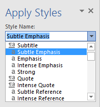
Use a character style, rather than manual formatting, to make your headings consistent, easy to apply, and easy to maintain. You can apply character styles to any selected words in a document without changing the paragraph style. In Microsoft Word, character styles, such as Subtle Emphasis, are designated by an a next to the style name. To create a new character style in a document, select the characters, and then add the style.