Annotations for keyboard and screen reader navigation
Annotations for keyboard accessibility help designers communicate how users can navigate and interact with their designs using a keyboard. Here are some common annotations using the A11y Focus Order Plugin and Fluent Accessibility Design Toolkit:
Focus order
Indicate the sequence in which interactive elements should receive focus when navigating with the tab key. This helps ensure a logical and intuitive flow for keyboard users.
Use the focus order indicators to show the intended ordering of elements when being navigated using a keyboard.
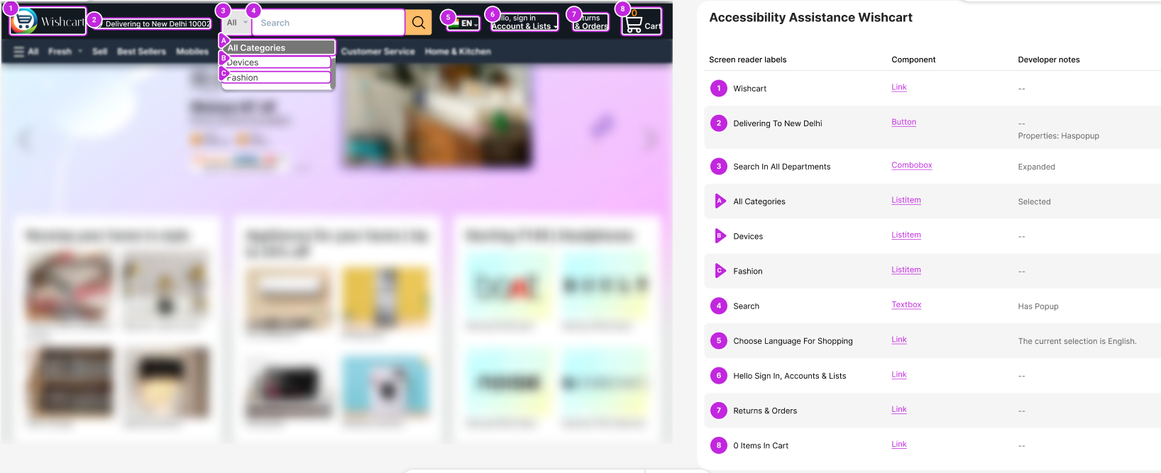
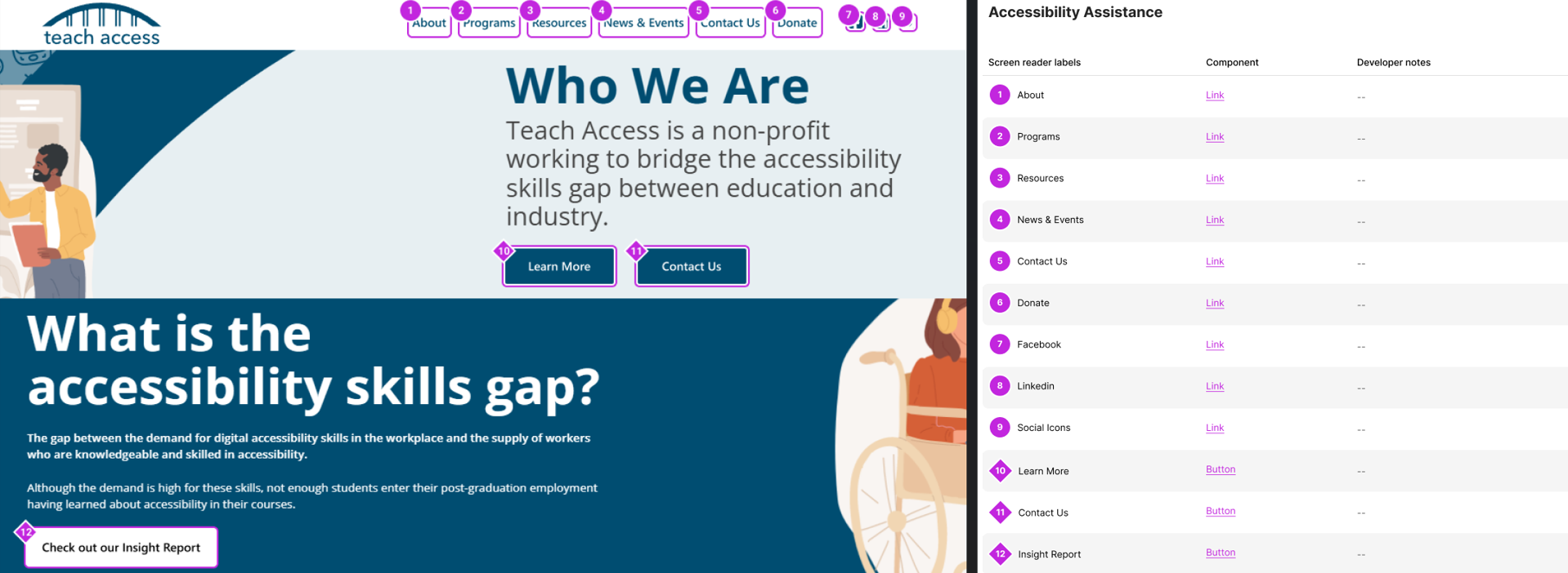


Name, role, and state
It's crucial that all user interface components, including but not limited to form elements, links, and components generated by scripts, have names, and roles that can be programmatically determined. This ensures that assistive technologies can interpret and interact with these elements effectively. Furthermore, has to states, properties, and values which can be set by users are also programmatically settled. This allows users to have a seamless experience while interacting with our interface. Additionally, we need to ensure that any changes to these items aren't field to user agents, including assistive technologies, so that users are always aware of the current state and can interact with the interface accordingly.
For the library components, "Name" will be same as per the design and same will be announced by the screen reader. Role will auto populate and then select or define properties either by selecting via provided checkboxes or mention in the edit field. If need to include any custom keyboard shortcuts that we can add, and all these another properties show up under Developer notes section. For custom components we need to do everything, selecting correct control type, review all the flows, set relevant properties, shortcuts. So before using custom components ask, do I need it? Is there any component that serves the purpose. If not, then use it and ensure covers all flows and edge cases.

When we have multiple components with the same visual name than we should override the visual name. Why should we do this? We have different navigation for buttons, links. When a screen reader user runs with the respective navigation, it will just announce the name and no more context is visible on the UI. For for example, In this image it announces Create, Create, Browse when user navigates with button navigation. You can provide more context using Aria override or another way that includes the visible name of the control.


States are critical only if they're illustrating a flow or a specific condition where that particular state is critical, like cases where in a flow something is disabled, marking out that as disabled is a good practice.

Shortcut keys
Highlight Add any keyboard shortcuts that aren't standard rather a customize one and can be used to perform actions within the design.


Headings
Use headings to make it easy to jump through your designs. These are the titles and subtitles of a web page that can be navigated like a tree structure using hierarchy.
There can be only one H1 on the page.
There can be any number of H2s, H3s, and H4s.
Heading levels must follow an order. You can't jump from H2 to H4 without a subsequent H3.
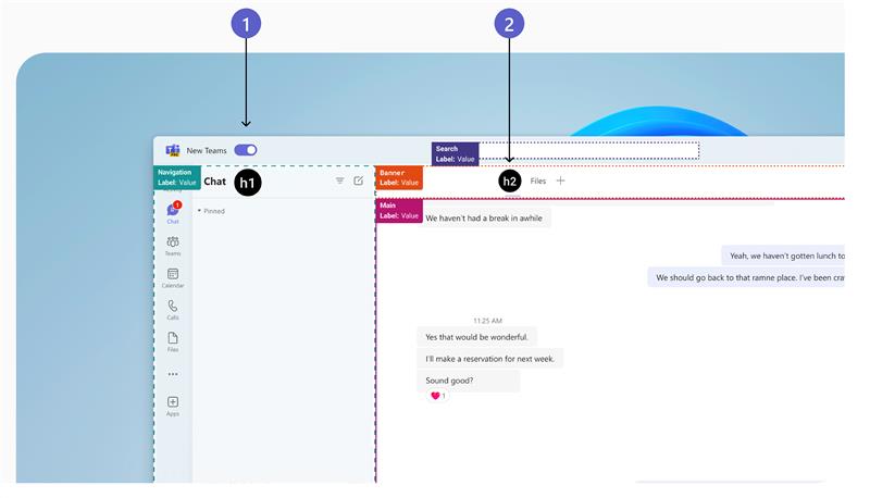


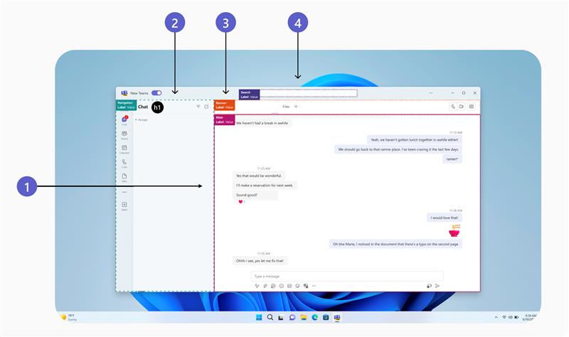
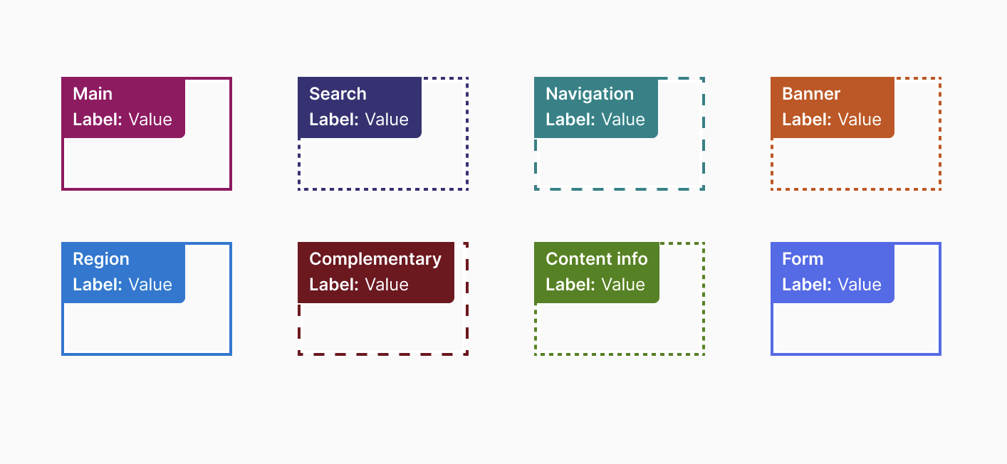
Landmarks
Landmarks can be useful additions when defining entire screen experiences on the web. These are containers or regions that can be used to quickly navigate apps, sites across different regions such as main, search, header, or footer etc. We have various landmarks such as Banner, Navigation, Main, Search, and few others.
If you have just one landmark, make that the main landmark so you can provide a skip link to go directly to the content via keyboard.
Search is another critical landmark. And then Navigation landmark.
Most of the times Headings are going to be sufficient. If you want to make it more diverse and accessible when having long pages/websites that are chunked out with regions and rectangles then define landmarks. Less landmarks are better.
There can only be one banner landmark, which is usually the header of the page.


Alerts, error message, live region
Alerts/Error message/Live region Notifies user of completion, any change on UI any errors. They're used to let screen reader users know when a long-running process has succeeded, a task has failed, or something has happened without user input. Ensure that visual messages are read out in an intelligible and equitable manner without stealing focus.


Focus management
Ensure that focus is managed correctly, especially when modal dialogs or menus are opened or closed then focus lands back to component from where it was triggered. This helps users navigate through the content efficiently by ensuring focus management is predictable and understandable
Alternative text
Provide alternative text for images, icons, and other nontext content. This allows screen readers to describe these elements to users who can't see them. Be sure to follow best practices when writing alt text.