Create a mobile-optimized app that uses responsive designs
In this exercise, you'll build a mobile-optimized, single-screen app using Microsoft Power Apps and data from Contoso Coffee Machines. This hands-on task helps make it easier to understand how to use auto-layout containers and observe how responsive design behaves across devices.
You’ll start from the Power Apps home page. Follow these steps:
Download the App in a Day files and extract them. Open the Excel file named Machine-Order-Data.xslx.
Go to make.powerapps.com. Select Create > Start with a blank canvas > Responsive. If a welcome popup appears, select Skip.
Refer to the image below for assistance with the next few steps. In the command bar, select the Settings button. If it's not visible, select App in the Tree view panel to reveal it.

In the Settings popup panel, select the Display tab, then scroll down make sure the Scale to fit option is toggled Off. (This switches the Lock aspect ratio to Off.)
Close the Settings popup.
Create a New screen by selecting + New screen in the Tree view pane. Select a Sidebar layout for your new screen. Name it Catalog Screen by double clicking on the screen name (Screen2), and then typing "Catalog Screen."
Create another new screen; for this screen use the Success template. Name the new screen "Success Screen."
Delete Screen1 by clicking on the screen in the Tree view, selecting the ellipsis to the right of the screen, and then selecting Delete.
Next select the Catalog Screen's sidebar container. (You'll need to expand several layers of containers to find the sidebar container.) Add a vertical gallery by selecting + Insert and then Vertical gallery with SidebarContainer1 selected.
The Select a data source pane should automatically open. If it doesn't, select the Add data button from the command bar with your gallery control selected in the Tree view pane.
Then find and select OneDrive for Business and create the connection. (You can use the search input field to narrow your search.)
The Choose an Excel file panel appears on the right side of your screen. Select the Machine-Order-Data.xlsx file, then select the Machines table. Connect the table by selecting Connect at the bottom of the panel. You should see a notification at the top of the screen; you can X out of it.
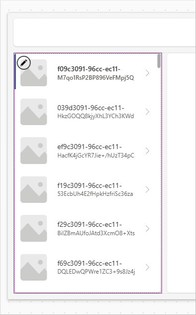
You may need to update the data being displayed in your gallery. If your gallery looks like the image below, follow the following steps. If the correct fields are displaying, you can proceed directly to step #17 below.
Expand the gallery, and select the title field. In the formula bar, change the Text property for the title text label to
ThisItem.'Machine Name'.Next select the subtitle field. In the formula bar, change the Text property for the subtitle text label to
ThisItem.Price.Then, select the image field. In the formula bar, change the Image property for the image control's Image property to
ThisItem.Photo.In the Tree view, select the drop-down next to the sidebar container to collapse its contents.
Select the main container on the right side of your screen, called MainContainer2.

Select the plus (+) icon (or the Insert button from the command bar) to insert an Edit form. Select the Machines table as the data source.
In the Properties panel on the right, select the Edit fields option under the Data source.
In the Fields panel, select Add field and add the following fields by checking the box next to each field name in this order: Photo, Machine ID, Machine Name, Color, Description, Feature, Price, Machine Type, Machine Type ID, Avg. Cups/Week, and Avg. Espressos/Week. Then select the Add button at the bottom.
Close the Fields panel.
Note that fields were inserted into the form in the order you selected them.
With Form1 still selected, in the Property drop down menu at the top left of the screen (above the Tree view header), select the Item property, and in the formula (fx) field input:
Gallery1.Selected. (If your gallery isn't named, Gallery1, use your actual gallery name.)Finally, with your form still selected, set the Fill property to:
Color.LightSteelBlue.Next, you'll add to our header container. Select the HeaderContainer2 control (throughout this exercise, use the name of your actual header control if it's different) and use the plus (+) icon to insert a Text label control. Adjust the text label's properties using down the property drop and formula bar as follows:
Text: "Contoso Coffee Catalog"
Size: change from 13 to 20
Height: change from 40 to Parent.Height
Width: change from 150 to 200
Using the Align drop down in the command bar (to the left of the Color button; alternatively, you can look for the Text alignment selection in the Properties panel on the right), change the Align from Align left to Justify.
Next, select on the Header container outside the text label to deselect the text label control. Insert an Image control to HeaderContainer2, and adjust the properties as follows:
Image: User().Image
Height: Parent.Height
You can create a connection icon by inserting a Globe icon into HeaderContainer2. Adjust the properties as follows:
Height: 20
Width: 20
Color:
If(Connection.Connected, Color.Green, Color.LightSteelBlue)Next, you can right-justify the header container items. To do this, select HeaderContainer2 in the Tree view and look in the Properties panel on the right. Find the Justify (horizontal) option. The third option is End (which you can see if you hover over the icon). Select it.
Finally, you can add some background color to the header container. Adjust the Fill property to:
Color.LightSteelBlue.Select MainContainer2, where your form resides. Insert a Button control with the following properties:
Text: "Save"
Width:
Parent.WidthOnSelect:
SubmitForm(Form1)Select the form inside of MainContainer2, and adjust the OnSuccess property to:
Navigate('Success Screen').From your Tree view panel, select the Success Screen.
Select the Check icon (iconCheck1), and update the OnSelect property to:
Back()Enter preview mode. Adjust the display to the iPhone 12 by selecting the Phone dropdown. Observe how the layout adjusts across devices and orientations.
Save your app if you want to use or revisit it later.


You’ve now created a responsive app usable across platforms.