Create model and explore the data
In this section, you learn about the key parts of the Power BI desktop. You also learn how to model and explore the data and build visuals.
Continue to use your MyFirstPowerBIModel.pbix file from Module 2. If you're joining at this point or unable to complete Module 2, start this Module using the Lab 1 solution.pbix file in the Reports folder.
Section 1: Data modeling
Open the MyFirstPowerBIModel file (the file you saved at the end of Module 2) and go to the main Power BI Desktop window.
Select the Table view icon in the left navigation menu.
Select and expand the Sales table in the Data pane.
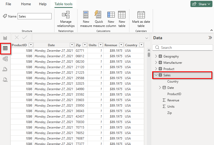
Scroll up and down to see how fast you can go through millions of rows.
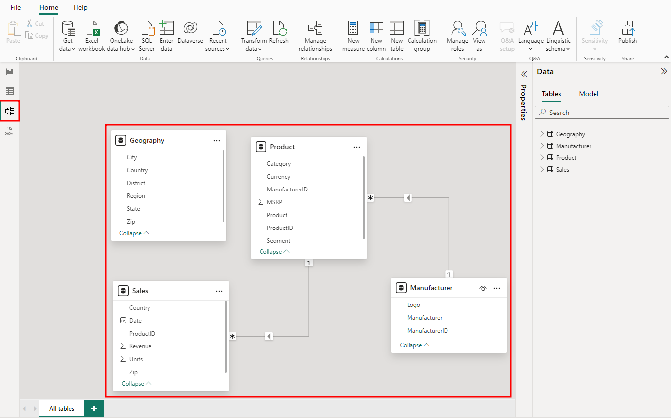
Select the Model view icon in the left navigation menu.
You see the tables you imported along with relationships. The Power BI Desktop can often automatically infer relationships between the tables:
A relationship is created between the Sales and Product tables using the ProductID column.
A relationship is created between the Product and Manufacturer tables using the ManufacturerID column.
Power BI supports multiple types of relationships:
1 to many
1 to 1
Many to many
For this exercise, use the 1 to many type of relationship, which is the most common type of relationship.
This means one of the tables involved in the relationship should have a unique set of values. You create other relationships later in the Module.
Drag, resize, and move the tables to appear like those shown in the following screenshot.
Note
Tables might not look the same as shown in this screenshot. You can zoom in and out of the relationship models by dragging the zoom slider in the bottom right corner of the window. Also, if you want to make sure you can see all the tables, use the Fit to Screen icon. You can resize the tables by selecting the borders of the tables and dragging them.


Section 2: Data exploration
Now that you loaded the data, analyze the sales by country. Make sure that you’re currently viewing the report you created and titled MyFirstPowerBIModel in the previous Module.
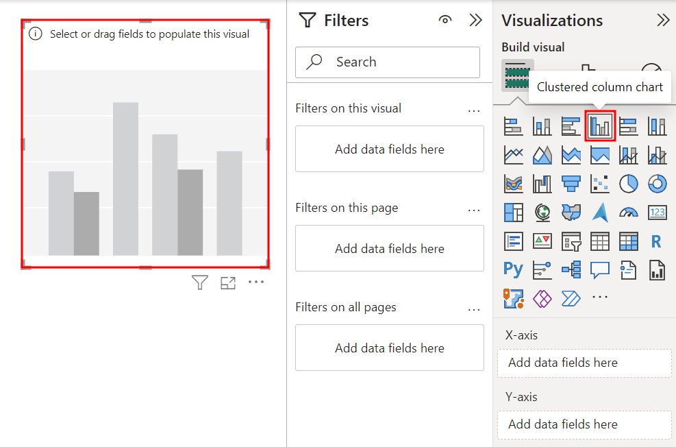
Select the Report view icon from the left navigation menu.
Select the Clustered column chart visual from the Visualizations pane.
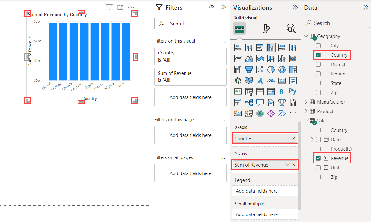
From the Data pane to the right of the screen, expand the Geography field.
Then, select the checkbox next to the Country field. The Country field is placed in the X-axis box in the Visualizations pane.
Still in the Data pane, expand the Sales table.
Select the checkbox next to the Revenue field. The Revenue field is placed in the Y-axis box in the Visualizations pane.
Resize the visual as needed by dragging the anchor points around the edges of the visual.
Note
The Sum of Revenue of each country is the same. This is because there is currently no relationship between the tables used in the visual. In the next unit, you'll learn more about visualization and how to create missing relationships.

