Create missing relationships and use data visualizations
Make sure that you're viewing the report titled MyFirstPowerBIModel from the previous unit. Now you can create new relationships that are missing in your report.
Section 1: Create missing relationships
Currently, there's no relationship between the Sales and Geography tables, so you need to make one:
Select the Model icon in the left navigation menu to go to the Model view.
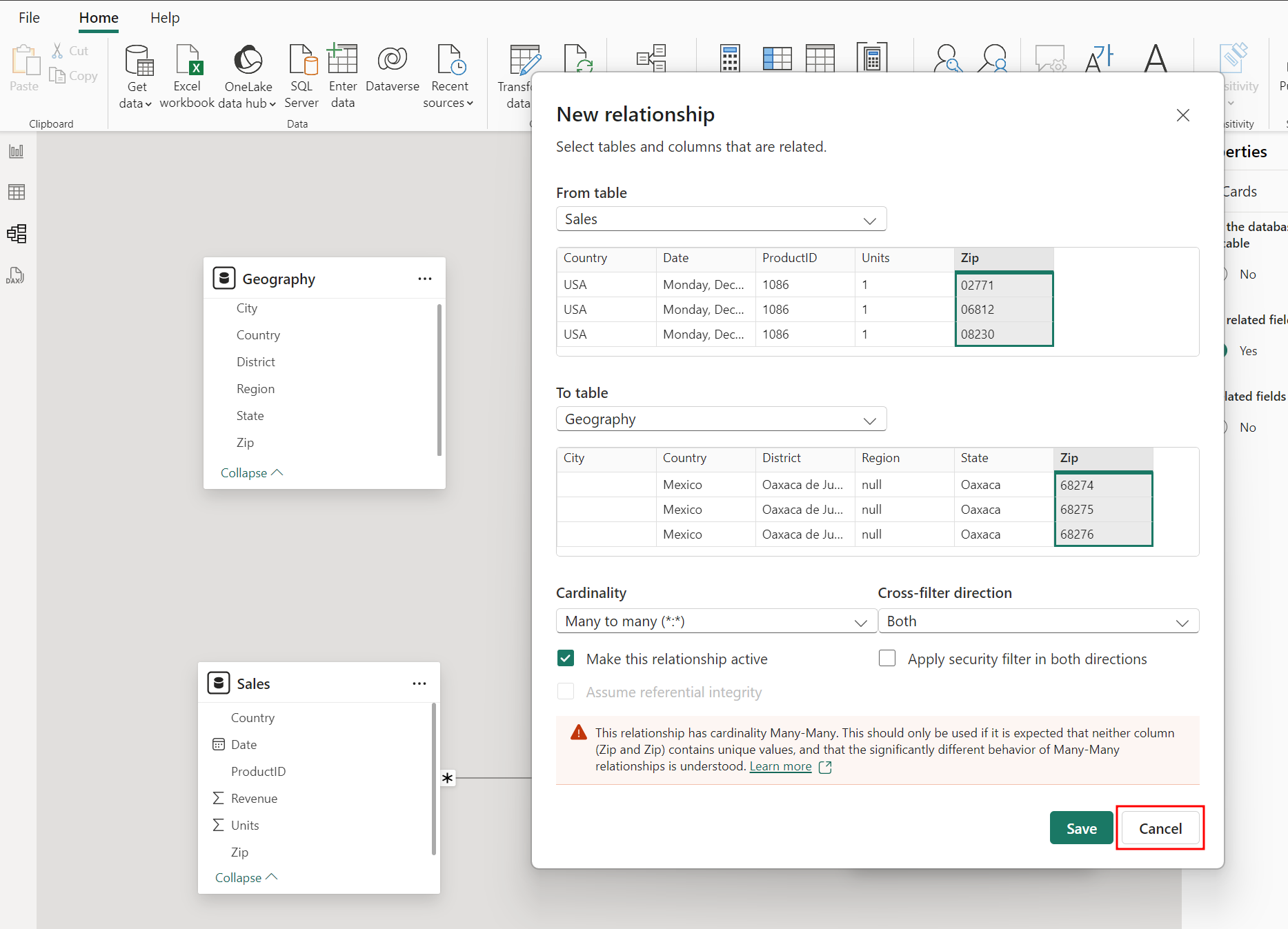
The sales data is by Zip code, so you need to connect the Zip column from the Sales table with Zip column in the Geography table. Select, drag, and drop the Zip field in the Sales table and place on top of the Zip field in the Geography table.
You see the Create relationship dialog box opens with a warning message at the bottom stating the relationship has a many-to-many cardinality. In this type of relationship, more than one record in one table is related to more than one record in another table.
You see this warning because there aren't unique Zip values in the Geography table. Multiple countries could have the same Zip code, which triggers the warning. Let’s concatenate the Zip and Country columns to create a unique value field to fix the issue.
Select the Cancel button at the bottom of the Create relationship dialog box.
You need to create a new column in both the Geography table and the Sales table that combines the Zip and Country columns. Start by creating a new column in the Sales table.
Select the Report icon from the left navigation menu to go to the Report view.
In the Data pane, hover over the Sales table name, then select the ellipses (…) to the right of the table name.
Choose New Column from the options menu. Then, a formula bar appears to help create this new column.
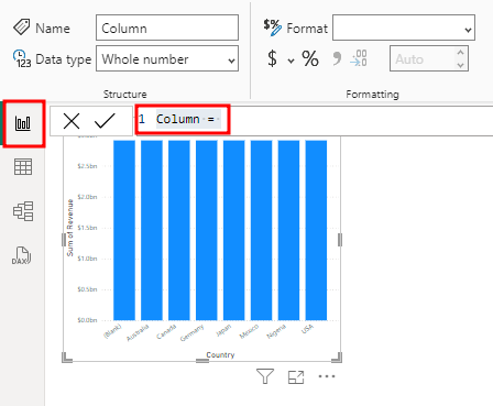
Now you can combine the Zip and Country columns into a new column called ZipCountry. To create this column called ZipCountry, type the following calculation in the formula bar:
ZipCountry = Sales[Zip] & "," & Sales[Country]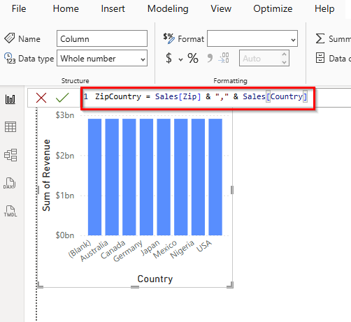
Once the formula is in the formula bar, press Enter on your keyboard or select the checkmark to the left side of the formula bar.
Important
If you get an error creating a new column, make sure your Zip column is the Text Data Type.
You’ll see IntelliSense appears to guide you to choose the correct column. The language you used to create this new column is called Data Analysis Expression (DAX). You're connecting columns (Zip and Country) in each row by using the “&” symbol. The icon with an (fx), near the new column ZipCountry, indicates that you have a column containing an expression, also referred to as a calculated column.
An alternative way to add a new column is to select the table from the Data pane, then select the Table Tools or Modeling tab, and then choose New Column from the menu.
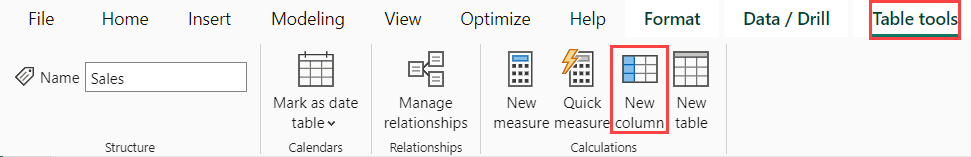
Now create a ZipCountry column in the Geography table by selecting the Geography table in the Data pane, then from the Table Tools tab in the top navigation ribbon, select New Column.
A formula bar appears. Enter the following DAX expression in the formula bar:
ZipCountry = Geography[Zip] & "," & Geography[Country]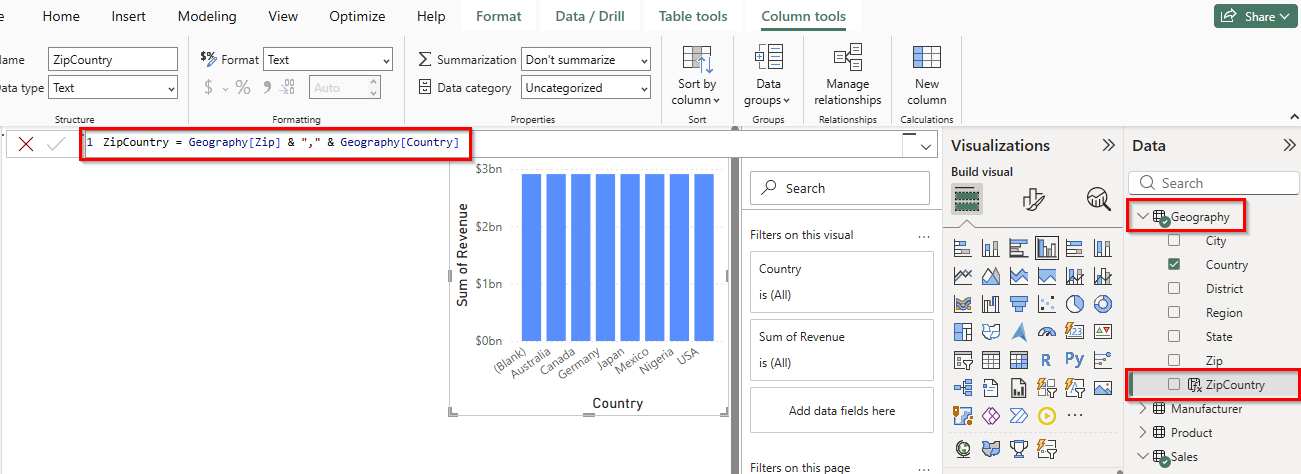
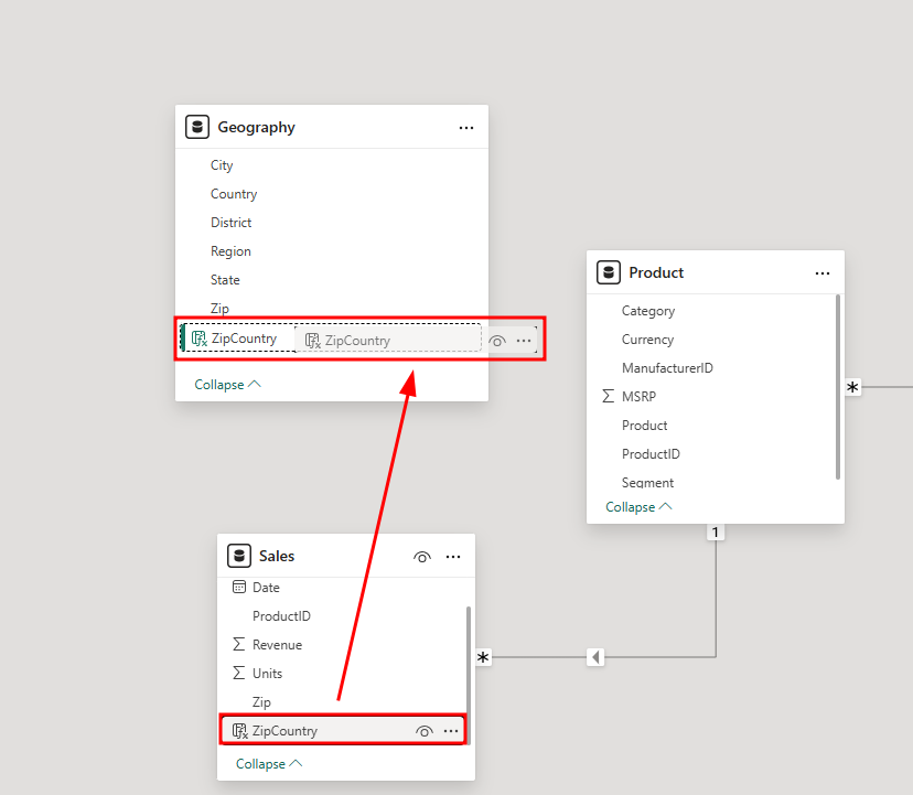
You see a new column, ZipCountry, in the Geography table. The final step is to set up the relationship between the two tables using the newly created ZipCountry columns in each of these tables.
Select the Model icon in the left navigation menu to go back to the Model view.
Drag and drop the ZipCountry field from the Sales table and place on top of the ZipCountry field in the Geography table, then select Save in the Create relationship window.
Note
If you don't see the ZipCountry column, select Collapse twice at the bottom of the Geography and Sales tables. You may need to scroll down on the list of columns in each table.
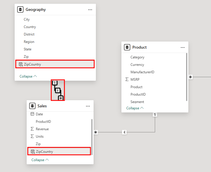
You've successfully created a relationship. The number 1 next to Geography indicates it’s on the one-side of the relationship and the * next to Sales means it's on the many-side of the relationship. In summary, one to many in this context means that one row of the Geography table could relate to many rows of the Sales table.
Select the Report icon in the left navigation menu.
Go back to the Report view.
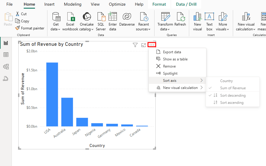
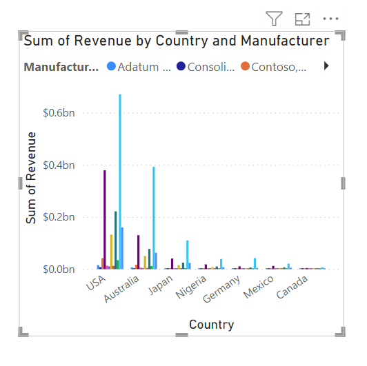
When you look at the clustered column chart you created earlier, it shows different sales for each country or region. The USA has the most sales, followed by Australia, then Japan.
Note
If your clustered column chart is missing countries then you might have made an error in module 2.
By default, the chart is sorted by Revenue. Next, you begin to use data visualization for the data model you designed.


Section 2: Data visualization
Select the Clustered column chart visual.
Select the ellipses (…) located near the top right corner of the visual (or, the ellipses might be at the bottom of the chart). You can Sort axis by Country. Don't make any changes for now.
Select the Clustered column chart again to close out the options menu.
Then, from the Data pane, expand the Manufacturer table.
Drag and drop the Manufacturer column to the Legend section of the Visualizations pane.
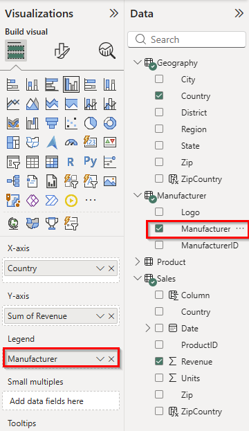
Resize the visual as needed in the canvas. Now you can see the top manufacturers by country.
Now you can try different visuals to see which chart represents the data the best.
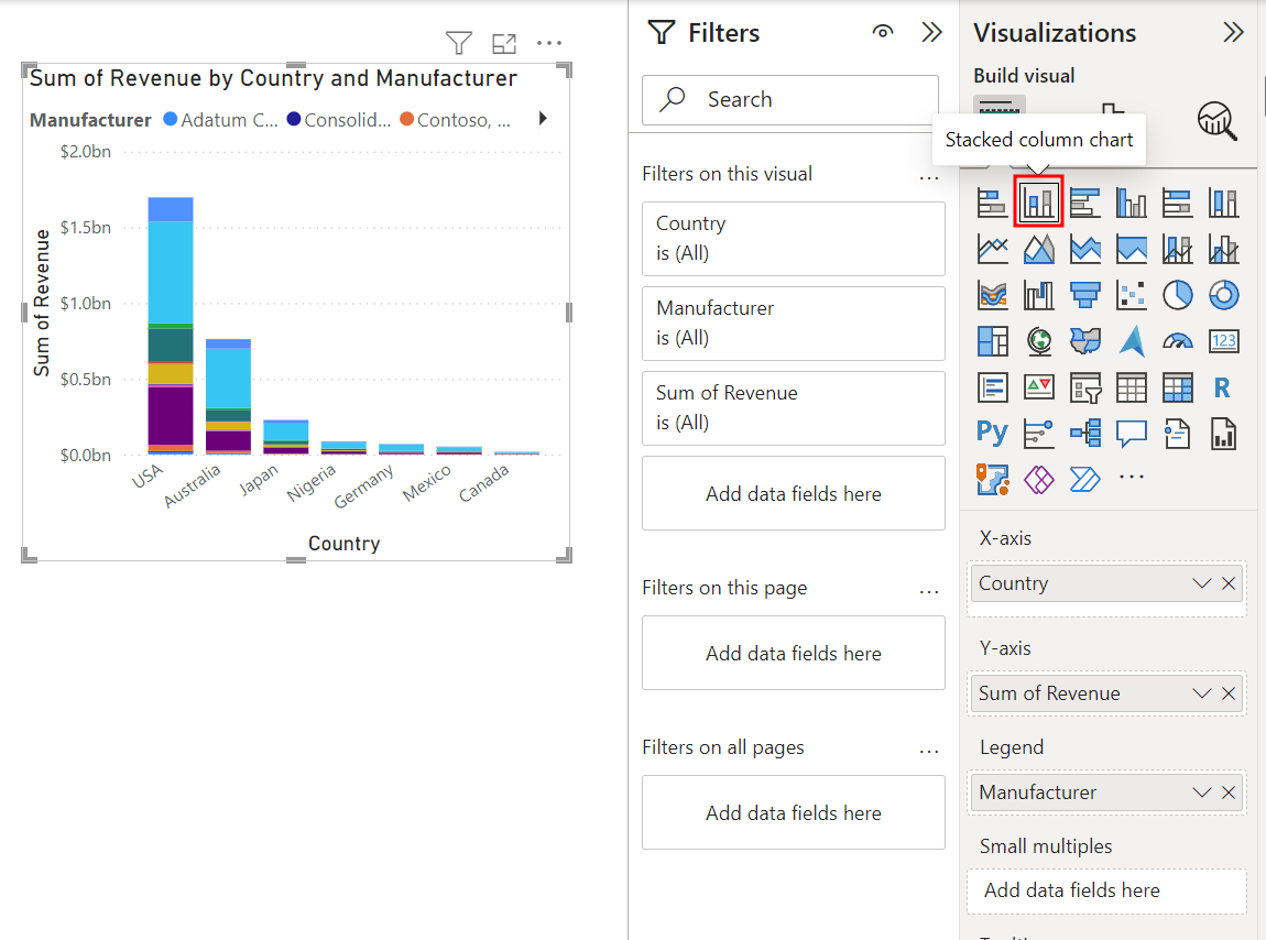
With the Clustered column chart visual selected in the design space, select and change the chart to a Stacked column chart by choosing that visual type in the Visualizations pane.
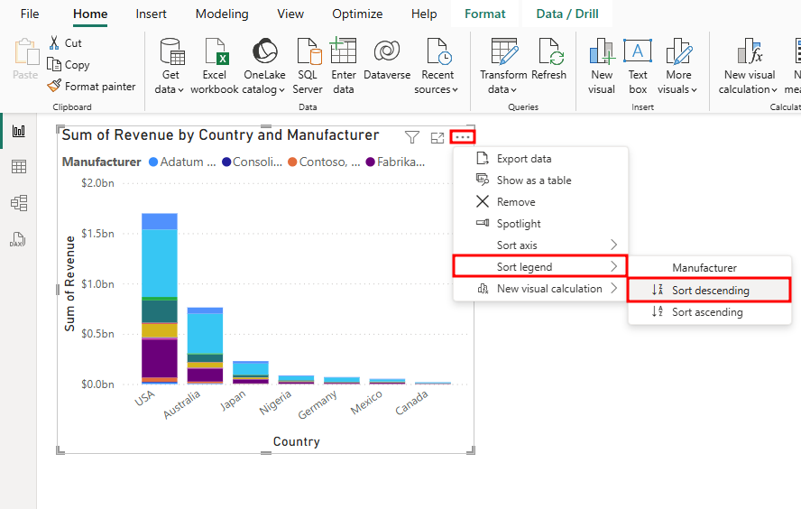
Select the ellipses (...) in the corner of the visual to sort the legend in descending order.
If the Filters pane isn't yet expanded, select the two greater than symbols (>>) at the top right corner of the collapsed pane to expand it.
In the Filters pane, expand Manufacturer under the Filters on this visual section. A drop-down arrow will appear for you to expand when you hover your mouse over Manufacturer.
Using the Filter type dropdown menu, select Top N.
Enter 5 in the text box next to Top.
From the Sales table, drag and drop the Revenue field into the By value section.
Select Apply filter at the bottom of the Manufacturer section in the Filters pane to turn on the filter.
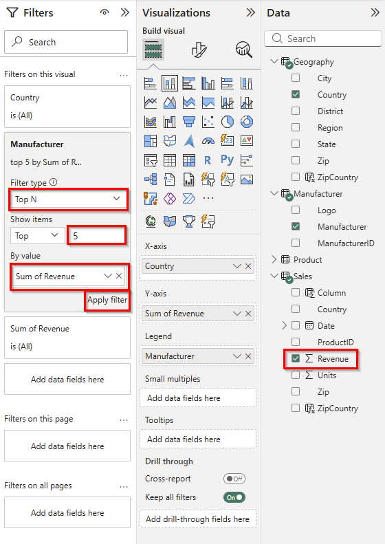
Notice the visual is filtered to display the top five manufacturers by Sum of Revenue. The manufacturer VanArsdel, Ltd. has a higher percentage of sales in Australia compared to other countries or regions.
If you want, you can now collapse the Filters pane until it's needed again. Now add total labels to the stacked visuals. You start with font formatting options.
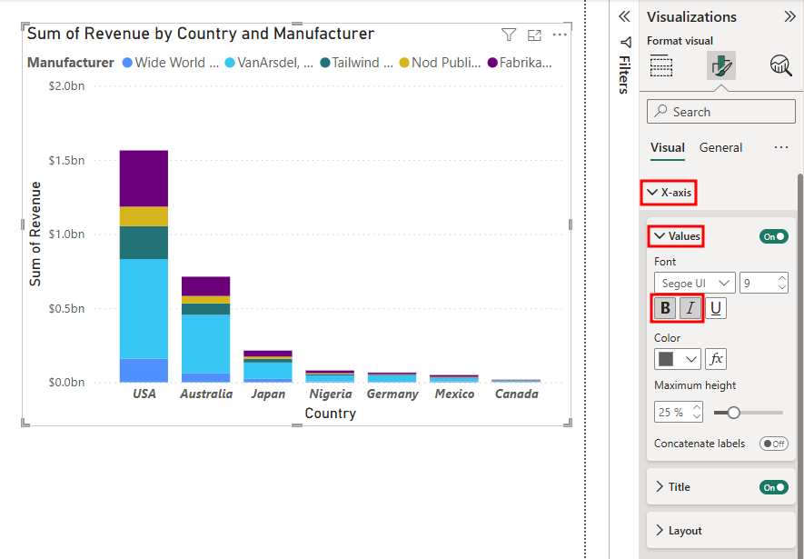
Select the Format visual (the paintbrush icon) tab at the top of the Visualizations pane, and then expand the X-axis section.
Select the Bold and Italic options.
Go to the Total labels section in the Visualizations pane.
Switch the Total labels setting to On.
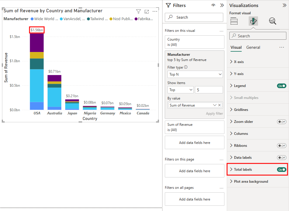
Notice the total labels now appear above each of the columns in the Stacked column chart. Any of these properties can easily be changed or turned on/off whenever you like.
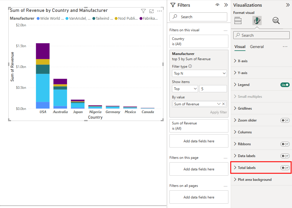
Now let’s remove the total labels. Select the On/Off toggle setting next to Total labels to switch the setting to Off again.
Switch the setting to Off.


Now that you learned various visualization techniques, in the next unit you'll learn how to group elements so that you don't need to add filters to each visual.