Group and bin data
In this unit, you learn the process of grouping data to ensure filters can be applied to multiple elements.
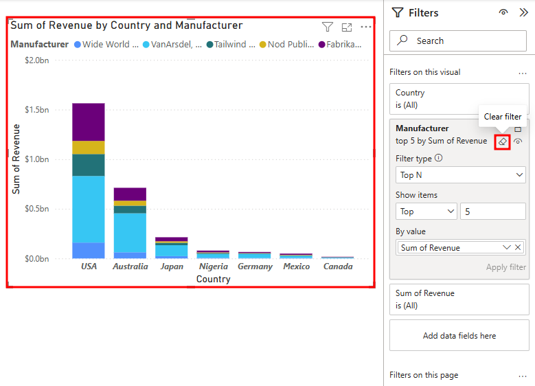
As you continue working as the CMO for VanArsdel, Ltd., you want to know who are the top five competitors by revenue. For this task, you can group them you don’t have to add a filter to every visual. Before you do that, you must remove the Top 5 visual level filter you added earlier.
Section 1: Create Groups
Select the Stacked column chart in the canvas area.
Hover over and select the Clear filter (eraser) icon next to the Manufacturer field in the Filters pane. You might need to expand the Filters pane if you previously collapsed it.
Note
You'll only see the eraser icon if you hover your mouse over the Manufacturer filter section.
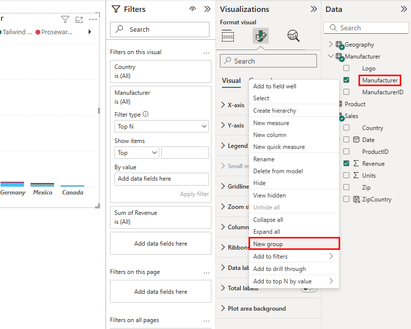
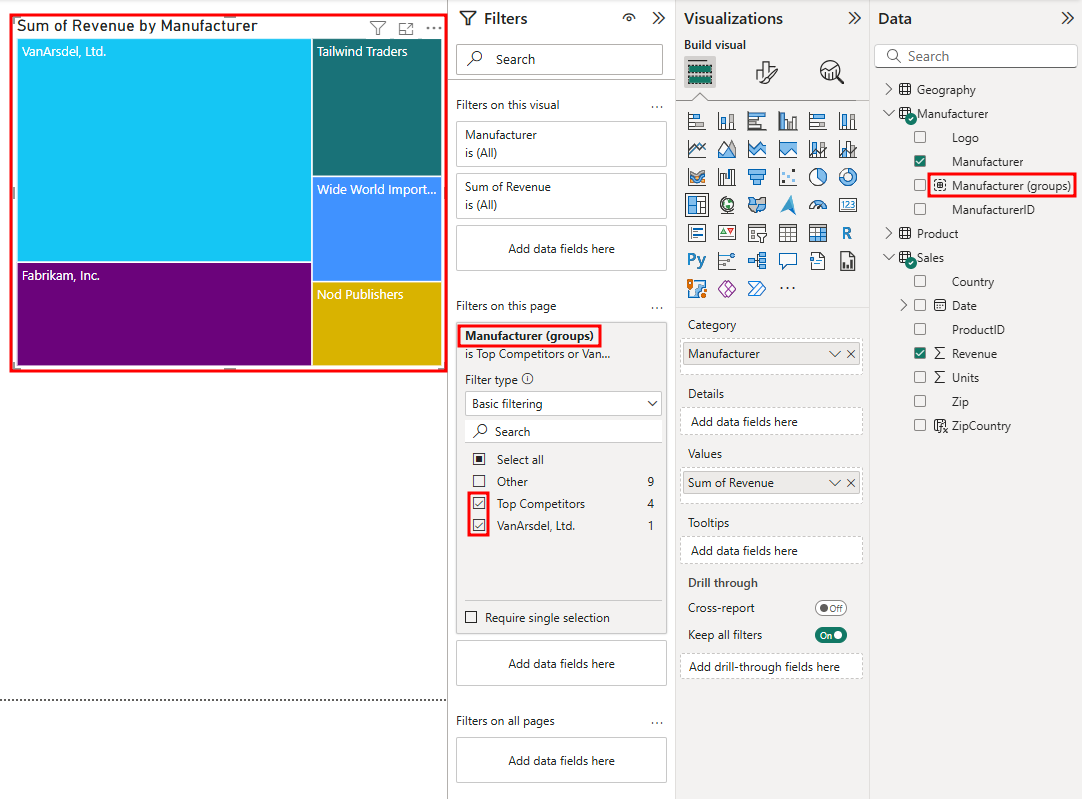
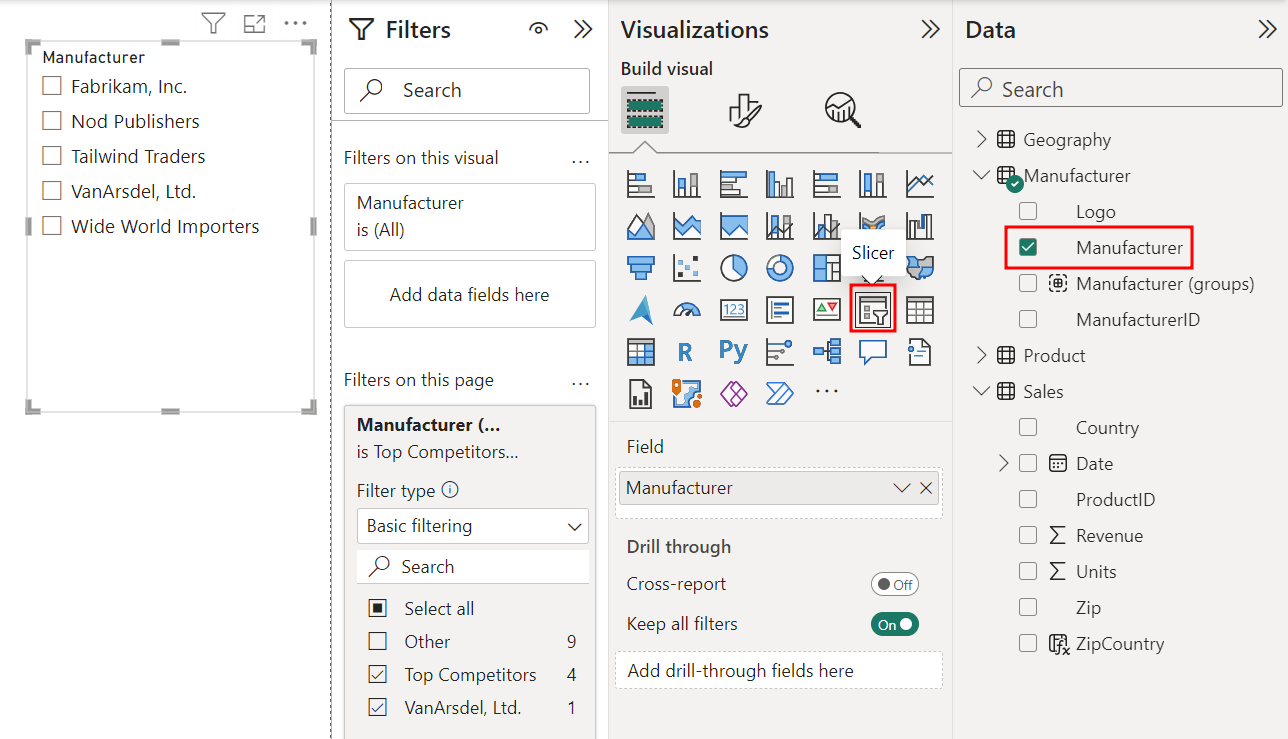
From the Data pane, expand the Manufacturer table.
Right-click on the Manufacturer field.
Note
Do not select the checkbox.
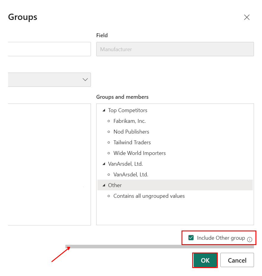
Select New Group from the options menu.
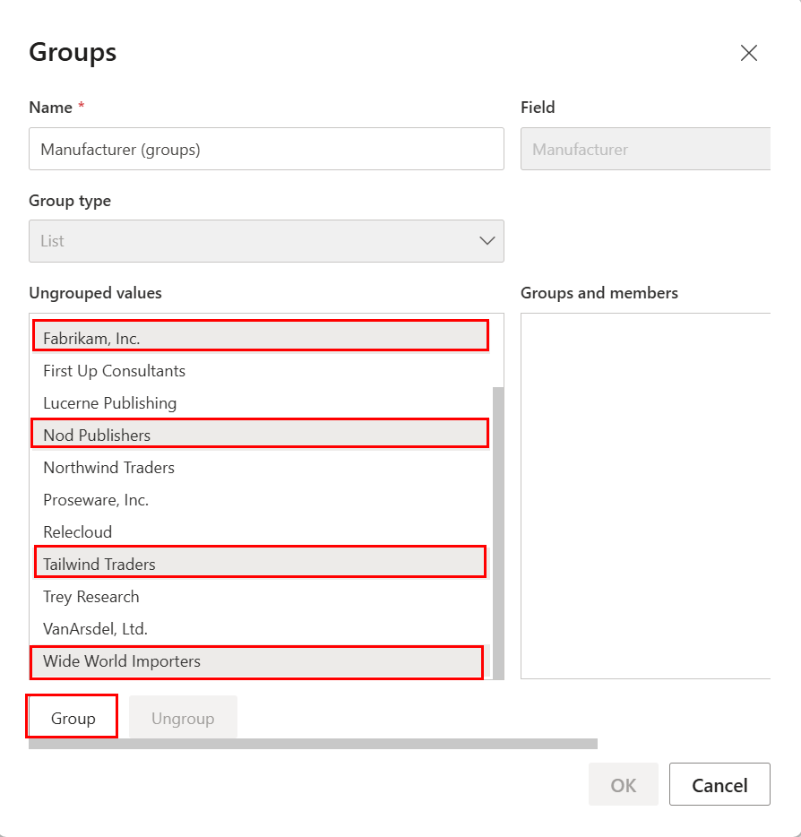
Go to the Ungrouped values section of the Groups dialog.
Use the CTRL key to multi-select: Fabrikam, Inc., Nod Publishers, Tailwind Traders, and Wide World Importers.
Select the Group button. This adds a new group in the Groups and members section.
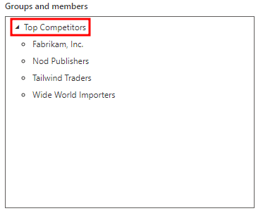
Double-click the newly created group and rename it Top Competitors.
Select VanArsdel, Ltd. from the Ungrouped values section and select the Group button to create the VanArsdel, Ltd. group.
Select the checkbox Include Other group. This action creates an Other group that includes all the other manufacturers.
Note
You may need to use the scroll bar along the bottom of the Groups box to move to the right to see the Include Other Group button.
Select OK to close the Groups dialog box.
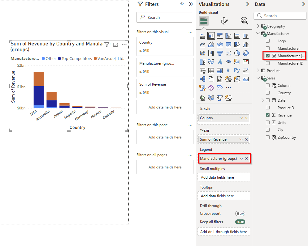
Go back to the Build visual tab of the Visualizations pane.
With the Stacked column chart selected in the canvas, select the X next to Manufacturer in the Legend section of the Visualizations pane. This action removes the Manufacturer field from the Legend.
From the Data pane, drag and drop the newly created Manufacturer (groups) to the Legend section of the Visualizations pane. Now you can see that VanArsdel has nearly 50% share in Australia.
Note
It’s ok if the colors used in your column chart are in a different order than what appears in the screenshot. You can change the Legend sort order if you want.
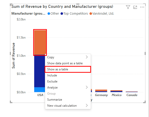
Hover over one of the columns in the Stacked column chart and right-click.
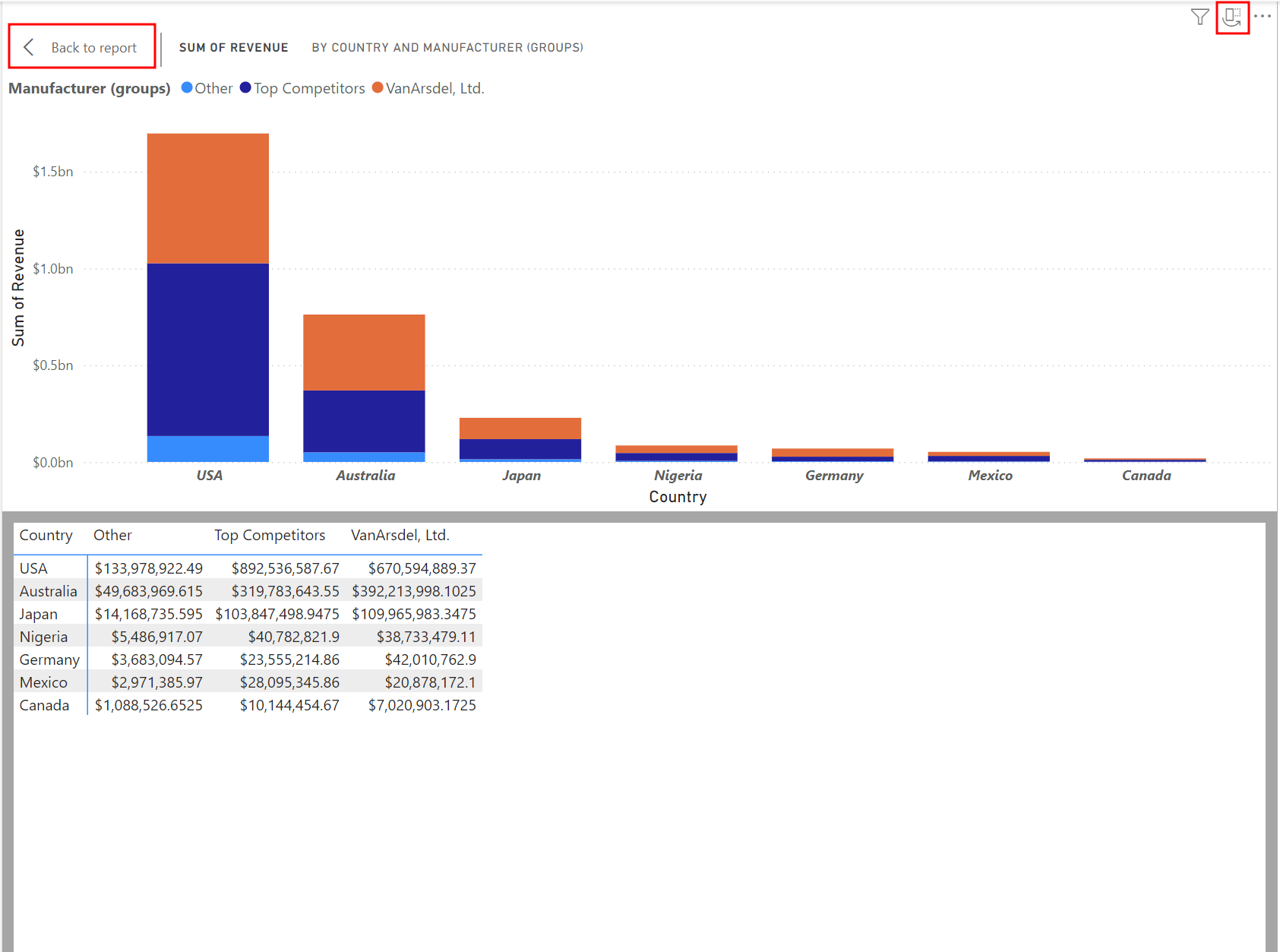
Select Show as a table from the menu. This action starts the Focus mode with the chart displayed on top and the data displayed below. You can see VanArsdel has a large percent of the Australian market.
Use the Orientation icon in the top right corner of the chart to switch to the vertical layout. In this layout, you see the chart in the left panel and the data in the right panel.
Go back to the horizontal layout, then select Back to Report to go back to the Report canvas.
Note
You can also right-click on a column in the chart and select Show data point as a table to see records for a specific data point.
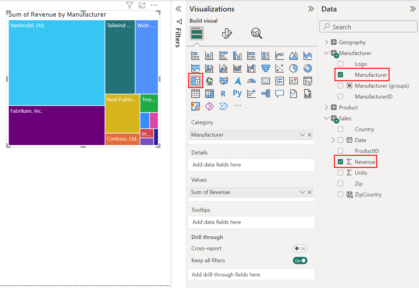
Next, create a Sum of Revenue by Manufacturer visual. Select the white space in the canvas to deselect the Stacked column chart visual.
From the Data pane, select the checkbox next to the Revenue field in the Sales table.
From the Data pane, select the checkbox next to the Manufacturer field in the Manufacturer table.
From the Visualizations pane, select the Treemap visual. This action creates a Sum of Revenue by Manufacturer Treemap visual.
Next, you see how the Stacked column chart and Treemap visual interact with each other.
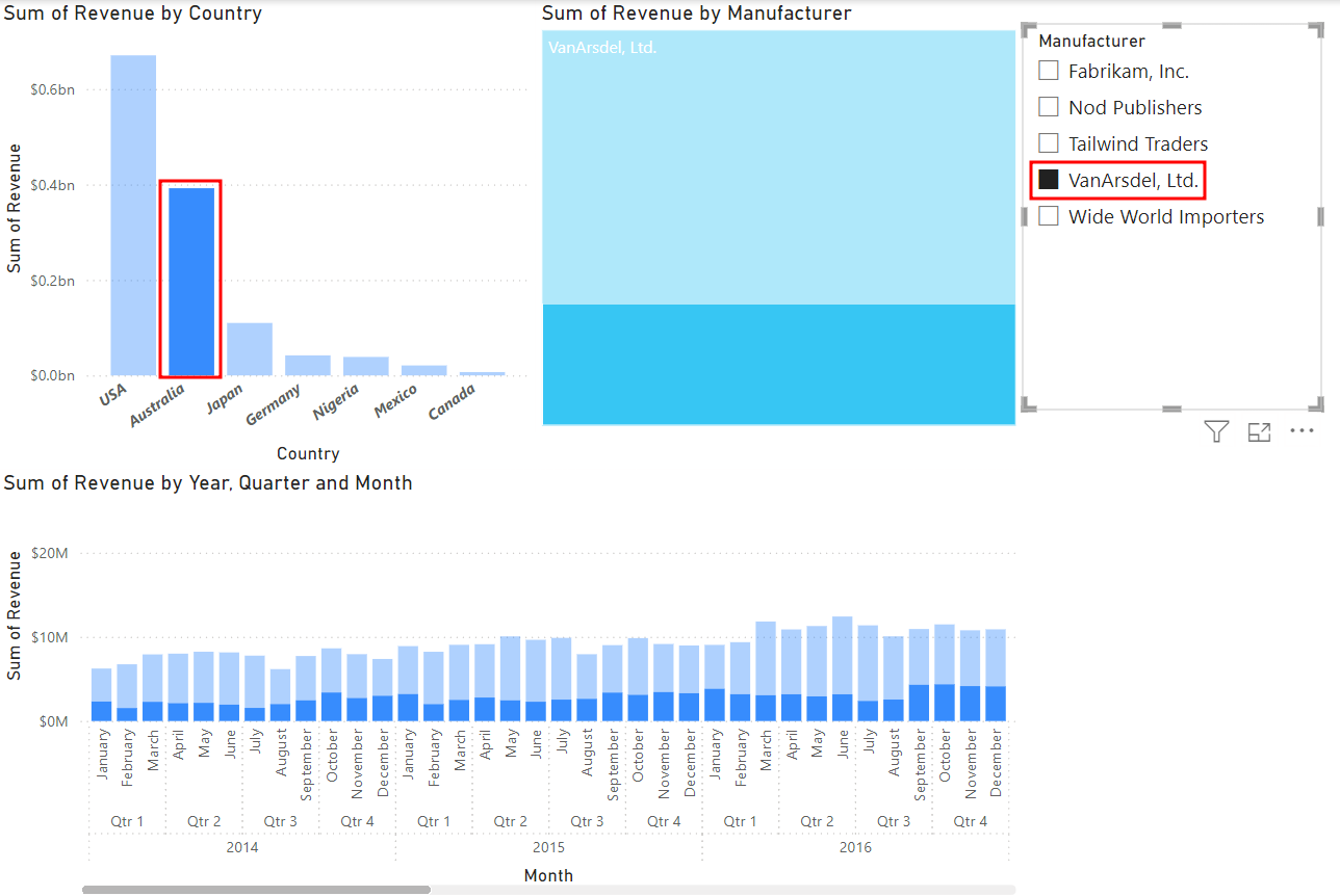
In the Treemap visual, select VanArsdel, Ltd. You'll see the Stacked column chart highlights only the values related to VanArsdel, Ltd. This confirms that VanArsdel, Ltd. has a large percentage of the Australian market.
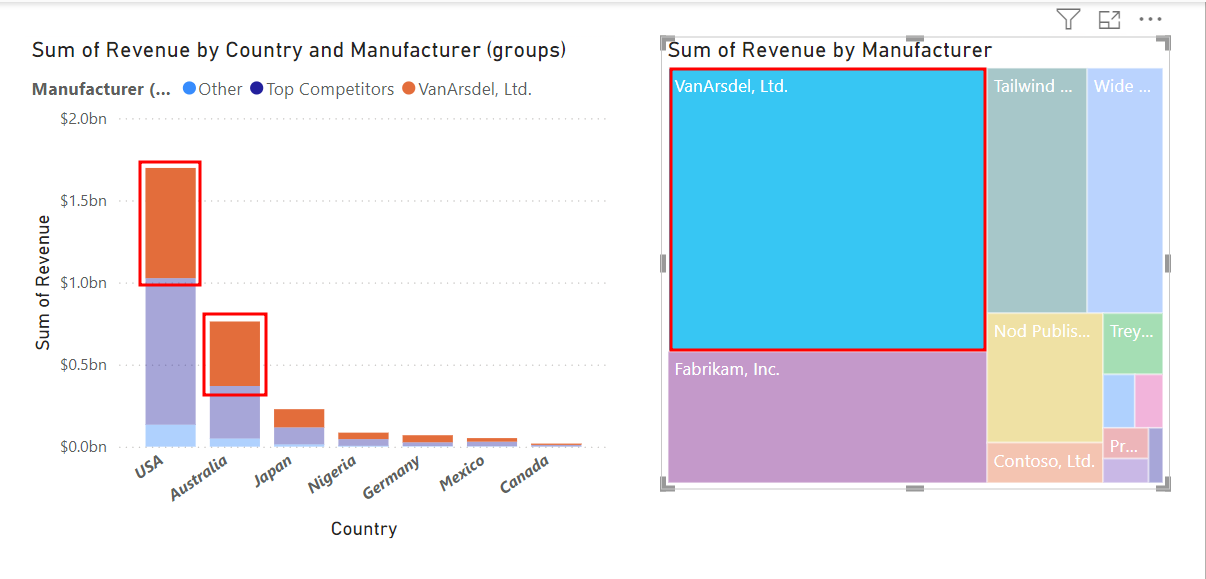
To remove the highlight, select VanArsdel, Ltd. again. This interaction between visuals is called cross-highlighting.


Section 2: Visual level filters
Earlier in the module, you added a Top 5 Visual level filter. Now you need to add a filter to the Page level, so you can work with the top competitors and VanArsdel, and filter out all the other manufacturers. Make sure the Filters pane is expanded and open.
Note
Page-level filters apply to all visuals on the page. Visual-level filters apply only to the visual.
Keep the Treemap visual selected.
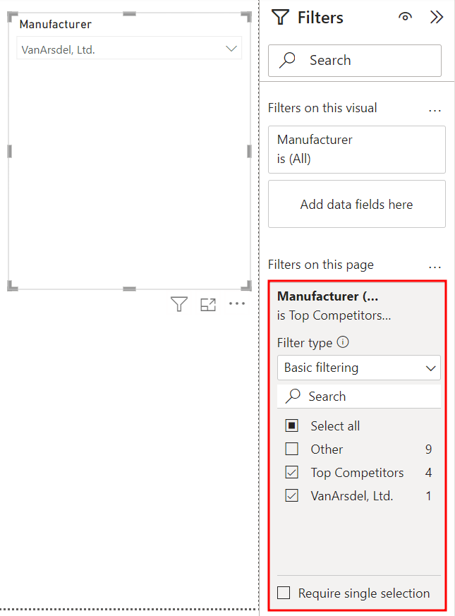
From the Data pane, drag and drop Manufacturer (groups) from the Manufacturer table to the Filters on this page box in the Filters pane.
Select both Top Competitors and VanArsdel, Ltd.
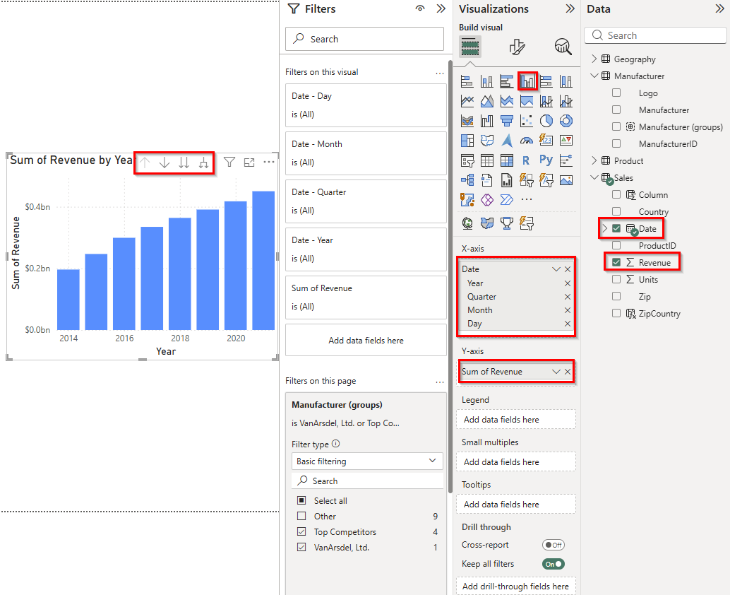
Now, add a visual that provides sales information over time. First, select the white space in the canvas to make sure nothing is selected.
Select the checkbox next to the Date field in the Sales table.
Note
A date hierarchy is created if you have Auto date/time turned on. If you don't see the date hierarchy go to File -> Options and settings -> Options -> Current file -> Data load -> Auto date/time to turn it on.
Select the checkbox next to the Revenue field in the Sales table. This action creates a visual.
Change the visual to a Clustered column chart. In the X-axis section, a date hierarchy is used. There are arrows on the visual header you can use to go through the hierarchy.
You already know from the data that VanArsdel, Ltd. has a large share of the market in Australia, but now you want to know how VanArsdel, Ltd. performed over time in Australia.
Select the Sum of Revenue by Country and Manufacturer (groups) chart.
Select the X in the Visualizations pane to remove Manufacturer (groups) from the legend.
Select VanArsdel in the Sum of Revenue by Manufacturer visual (Treemap).
Then, hold the CTRL key and select Australia in the Sum of Revenue by Country visual. This action multi-selects and highlights both values.
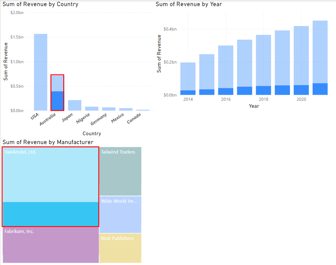
With both VanArsdel, Ltd. and Australia selected, you can see a spike in 2021 sales for VanArsdel, Ltd. in Australia. You decide to investigate this spike in sales further.
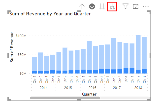
Hover over the Sum of Revenue by Year visual.
Select the down arrow at the top of the Sum of Revenue by Year visual to turn on the Drill Mode.
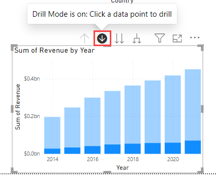
Select the 2021 column in the Sum of Revenue by Year visual.
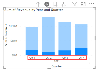
Now that you drilled down to the quarter level of 2021, you see a large spike in the fourth quarter. You decide to investigate more.
Select the double down-arrow icon at the top of the Sum of Revenue by Year and Quarter visual. This action drills down to the next level of the hierarchy, which is the month level.
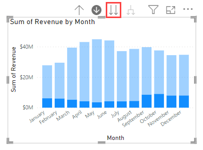
Select the up-arrow icon at the top of the Sum of Revenue by Month visual to drill back up to the Quarter level again.
Select the drill up icon a second time to go all the way back up to the Year level.
Select the split arrow icon at the top of the Sum of Revenue by Year visual. This action expands down to the next level of the hierarchy, which is quarters for all the years; not just 2021.
Resize the visual as needed. You notice the fourth-quarter sales are always high, but in 2021 there's a larger sales spike in the fourth quarter than usual.
Expand down one more time to the month level to investigate. Select the split arrow icon for the Sum of Revenue by Year and Quarter visual again. This action drills down to the next level of the hierarchy and shows revenue for months for all the years.


Section 3: Use slicers
Now you want to add a slicer to filter the data by the manufacturers.
Make sure there are no filtered or highlighted values.
Be sure to reset all visuals to stop highlighting selected values. If you have values selected, select the blank space of the Sum of Revenue by Country visual. This action clears any selected values.
Select the white space in the canvas to deselect any currently selected visuals.
From the Data pane, select the checkbox next to the Manufacturer field in the Manufacturer table.
From the Visualizations pane, select the Slicer visual.
Select VanArsdel, Ltd. from the list of Manufacturers. You see all the visuals are filtered based on your selection. Also, select Australia in the Sum of Revenue by Country visual.
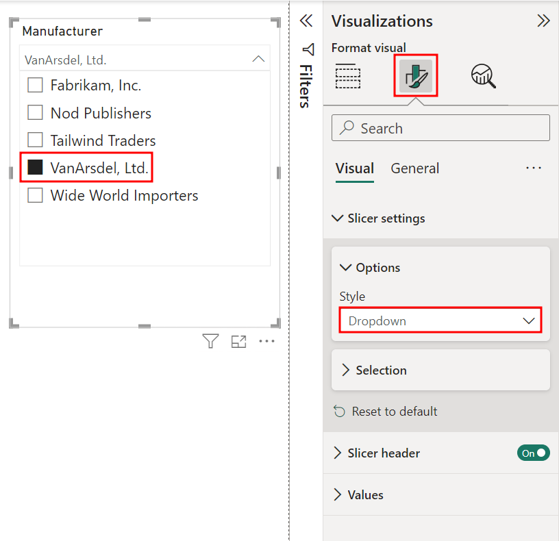
With the Slicer visual still selected, go to the Format visual tab of the Visualizations pane.
Expand the Slicer settings menu. Then, expand the Options menu in the Slicer settings.
From the Options drop-down under Style, select Dropdown.
Then, in the Slicer visual, select VanArsdel, Ltd. from the Manufacturer dropdown.
Make sure you still have Top Competitors and VanArsdel, Ltd. selected in the Manufacturer (groups) filter in the Filters pane.
Note
There is a box for Filters on all pages in the Filters pane. If you have more than one report page, this is how you sync a filter for the whole file.
Now you can use the Manufacturer slicer to analyze one manufacturer at a time. First, deselect the Australia column in the Sum of Revenue by Country visual to remove the filter by country.
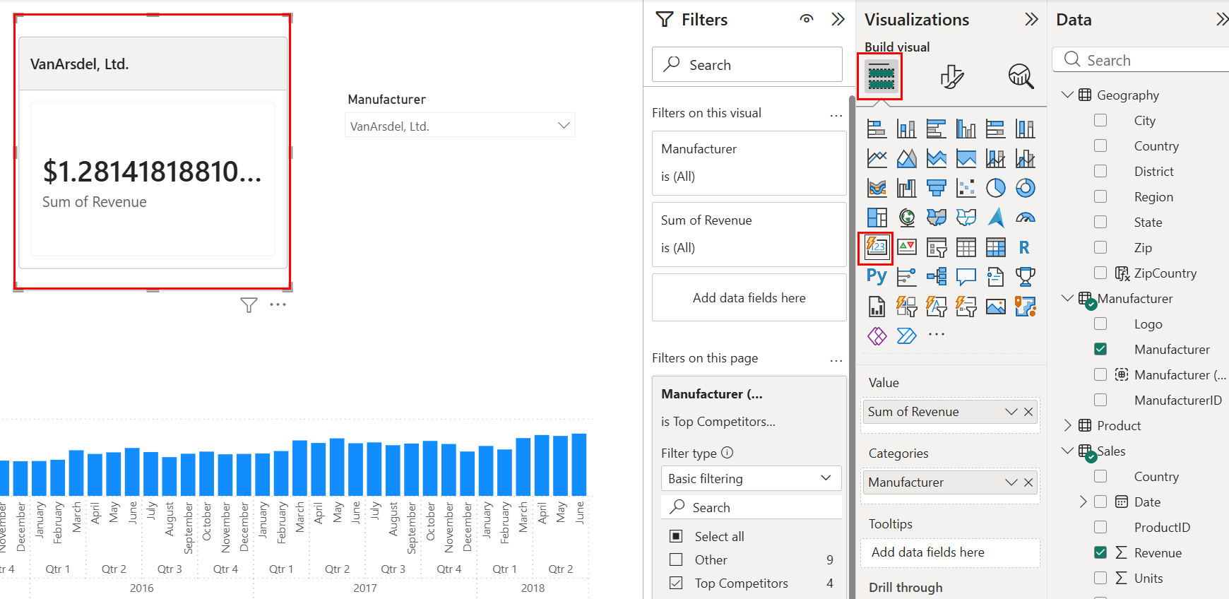
Next, select the Sum of Revenue by Manufacturer (Treemap) visual.
From the Visualizations pane, navigate to the Build visual tab and select the Card visual. The card visual gives us the Sum of Revenue as we filter and cross-filter the visuals.
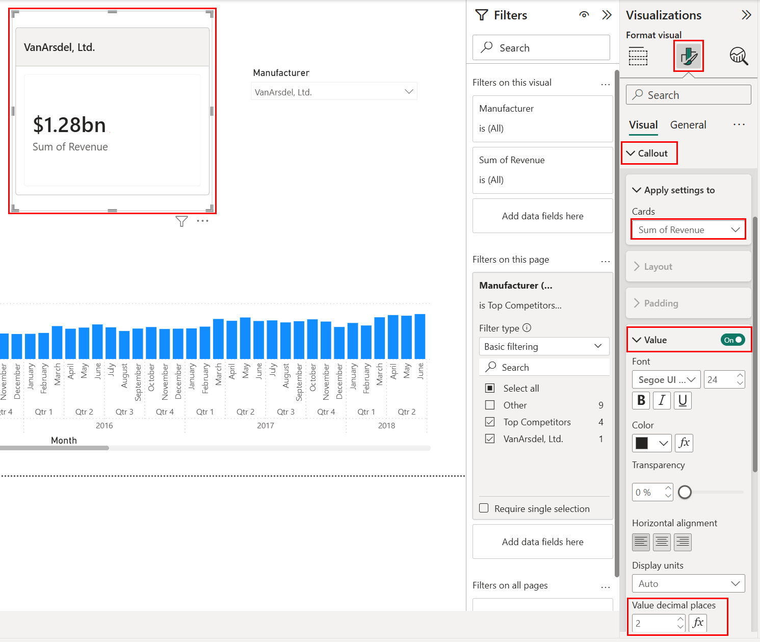
To edit the amount of units displayed after the decimal, go to the Format your Visual in the top of the Visualization Pane, expand Callout, apply settings to Sum of Revenue. In the Value section, adjust the Value Decimal Places to 2.


You see all key dimensions are in tables with related attributes, except for the date. For example, Product attributes are in the Product table. Manufacturer attributes are in the Manufacturer table. In the next unit, you’ll create a Date table.