Introduction to using React within a Power Apps component
React is a standardized client framework for building user interfaces. It provides a declarative way to create interactive UIs and a mechanism to encapsulate components to make complex UIs that manage component states and have high interactivity. Because React is written in JavaScript, you can use this framework within a Power Apps component.
If you're new to React, go to React, which provides a wealth of tutorials and resources on how to build React components.
Prepare your computer for code components
To prepare your computer to build code components, follow these steps:
Install npm (comes with Node.js) or Node.js (comes with npm). We recommend that you use a Long-Term Support (LTS) version.
Install Visual Studio Code.
Install Power Platform Tools extension.
Install the Build Tools for Visual Studio from Visual Studio Downloads.
Fluent UI
One of the many great developments from Microsoft has been its implementation of Fluent UI, a collection of UX frameworks that you can use to build fluent experiences that fit seamlessly into a broad range of Microsoft products. Using Fluent UI within your Power Apps code component is as simple as referencing its libraries, and it provides a React-specific version that you can use. For more information, see Fluent UI.
Implement a sample FacePile component
Important
Download the FacePileComponent.zip zip file to use with this exercise. Extract the zip file.
In this example, you build a component that uses the FacePile Fluent UI component. The FacePile shows a list of faces or initials in a horizontal lookup, each circle representing a person.
A practical example of when you might use this lookup is to list contributors to an article or record, such as what you would see in Microsoft Learn, as shown in the following image.
Create a new component project
To create a component project, follow these steps:
Create a directory where you build your component. In this sample, you place the component in C:\users\username\source\face-pile; however, you can create your own directory. To create your own directory, you use Visual Studio Code.
Start Visual Studio Code.
Select Terminal, select New Terminal, and switch the Terminal shell to the Command Prompt.
Note
If you are not familiar with the Terminal in Visual Studio Code, go to Terminal Basics to learn more.
Create your source folder.
md \sourceChange the directory to your source folder.
cd \sourceFrom your source directory, create a directory named face-pile.
md face-pileChange to the directory you created.
cd face-pileYou should now be in the new directory you created.
Initialize your component project by using Power Platform CLI with the following command.
pac pcf init --namespace Learn --name ReactFacePile --template field --framework ReactInstall the project build tools by using the command
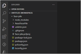
npm install. You might see some warnings displayed; however, you can safely ignore them.npm installRun the following command to open the project in Visual Studio Code.
code -a .The project should look like the following image.
Implement your code component's logic
To implement your code component's logic, follow these steps:
Expand the ReactFacePile folder and open the ControlManifest.Input.xml file.
Locate the property node and replace it with the following XML.
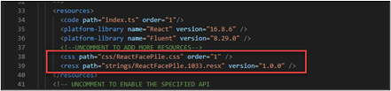
<property name="numberOfFaces" display-name-key="numberOfFaces_Display_Key" description-key="numberOfFaces_Desc_Key" of-type="Whole.None" usage="bound" required="false" />Locate the resources and uncomment the css and resx.
Make sure you still have the ControlManifest.Input.xml file selected and then select New Folder.
Name the new folder components.
Go to the folder where you extracted the downloaded FacePileComponent.zip file and open the FacePileComponent folder.
Drag the files inside the FacePileComponents folder and drop them in the components folder you created.
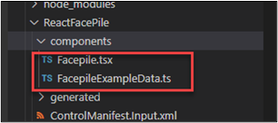
The components folder should now have two files.
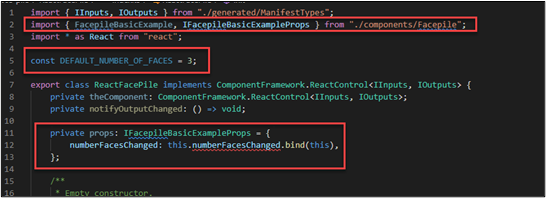
Open the Index.ts file.
Replace import { HelloWorld, IHelloWorldProps } from "./HelloWorld"; with this snippet.
import { FacepileBasicExample, IFacepileBasicExampleProps } from "./components/Facepile" ;After the imports, add the following constant.
const DEFAULT_NUMBER_OF_FACES = 3;Add the snippet before the constructor.
private props: IFacepileBasicExampleProps = {
    numberFacesChanged: this.numberFacesChanged.bind(this),
};
The changes you made should look like the following image.
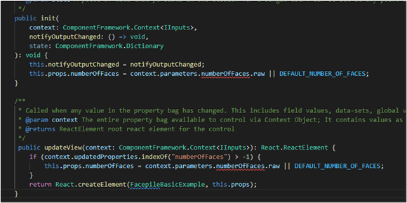
Locate the init method and add the following snippet after this.notifyOutputChanged = notifyOutputChanged; line
this.props.numberOfFaces = context.parameters.numberOfFaces.raw || DEFAULT_NUMBER_OF_FACES;Replace the updateView method with the following method.
public updateView(context: ComponentFramework.Context<IInputs>): React.ReactElement {
    if (context.updatedProperties.indexOf("numberOfFaces") > -1) {
        this.props.numberOfFaces = context.parameters.numberOfFaces.raw || DEFAULT_NUMBER_OF_FACES;
    }
    return React.createElement(FacepileBasicExample, this.props);
}
The init and updateView methods should now look like the following image.
Replace the getOutputs method with the following method.
public getOutputs(): IOutputs {
    return {
        numberOfFaces: this.props.numberOfFaces,
    };
}
Add the following method after the destroy method.
private numberFacesChanged(newValue: number) {
    if (this.props.numberOfFaces !== newValue) {
        this.props.numberOfFaces = newValue;
        this.notifyOutputChanged();
    }
}
Select File and Save All your changes.
Add styling to your code component
To add styling to your code component, follow these steps:
Select the ControlManifest.Input.xml file and then select New Folder.
Name the new folder css.
Select the css folder you created and select New File.
Name the new file ReactFacePile.css.
Open the ReactFacePile.css file you created, and paste the following CSS snippet.
msFacepileExample {
max-width: 300px;
}
.msFacepileExample .control {
 padding-top: 20px;
}
.msFacepileExample .ms-Dropdown-container, .msFacepileExample.ms-Slider {
margin: 10px 0 10px 0;
}
.msFacepileExample .ms-Dropdown-container .ms-Label {
padding-top: 0;
}
.msFacepileExample .ms-Checkbox {
padding-top: 15px;
}
.exampleCheckbox {
margin: 10px 0;
}
.exampleLabel {
margin: 10px 0;
}
Select File and Save your changes.
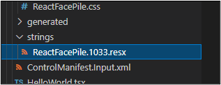
Select the ControlManifest.Input.xml file and select New Folder.
Name the new folder strings.
Go to the folder where you extracted the downloaded FacePileComponent.zip file and open the FacePileStrings folder.
Drag the ReactFacePile.1033.resx file and drop it in the strings folder you created.
The strings folder should now have the resx file.
Select File and Save your changes.
Go to the terminal and run this build command.
npm run buildNote
If you receive an error that JSX is not defined, open the file .eslintrc.json. On line 11:
"ComponentFramework": true, add a comma and then a new line with"JSX": true. On line 41: changeJSX.ElementtoReact.JSX.Element. Save changes and repeat the npm run build command.The build should complete successfully.
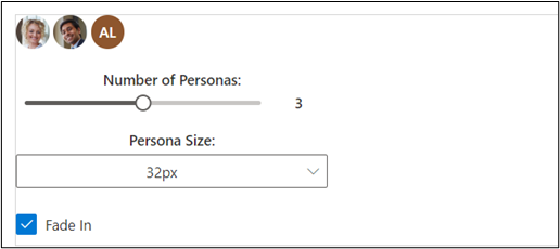
Test the components by running the following command.
npm startThe test harness should open a new browser window.
The component should look like the following image.
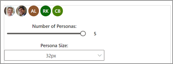
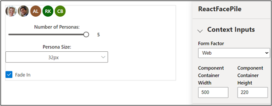
Change the size of the container to 500 x 220 and move the slider to 5.
The component should now look like the following image. Close the test harness browser window.
Close the test harness browser window.
Go back to the terminal and stop the watcher by pressing [CONTROL] + C.
Type Y and then press [ENTER].
For more information, go to Implementing the FacePile component.