Configure charts overview
Charts provide an interactive view of data. This video provides an overview of charts.
To create or configure a chart for your table by using Power Apps, you can use the following steps:
From the Power Apps maker portal, select Tables.
Select the table where you wish to create the view. Ideally you want to pick a table that already has data in it.
From the Tables dashboard for your selected table, look in the Data experiences pane and select Charts.
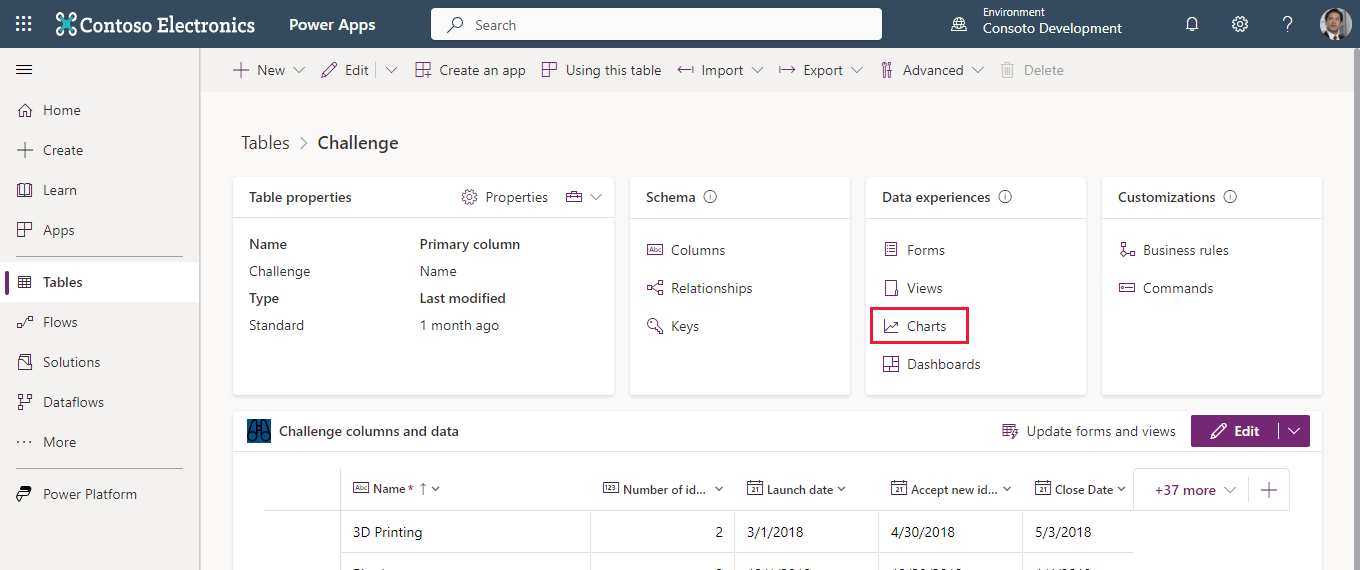
From the list of charts, you can select any existing chart (that you have access to) or choose + New chart from the command bar.
Either option opens a chart editor in a separate browser tab. (Refer to the next image for the following steps.)
You can name the chart and pick the type of chart to display.
Under Legend Entries (series) you can select the data you wish to graph along with how you wish to itemize that data: Average, Count:All, Count:Non-empty, Max, Min or Sum.
Under Horizontal (Category) Axis Labels you can select a complementary field for your data.
If you have data in your table, as you select your Legend Entries and Horizontal Axis Labels, you can see a preview of your table in the viewer under your Chart Title.
You can also (optionally) add a description for your chart.
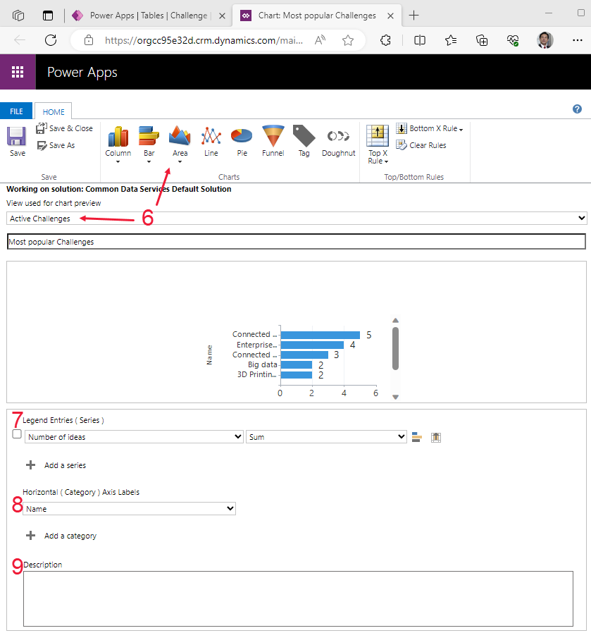
Once you're satisfied with your chart, select Save & Close to close the chart editor and return to your charts list.


Using this technique, you can create charts that you can display in your model-driven app. As you create charts you can then add them to a dashboard, which we'll introduce in the next unit.