Apply advanced data exploration techniques
Advanced data exploration techniques like correlation analysis and dimensionality reduction help uncover hidden patterns and relationships in the data, providing valuable insights that can guide decision-making.
Correlation
Correlation is a statistical method used to evaluate the strength and direction of the linear relationship between two quantitative variables. The correlation coefficient ranges from -1 to 1.
| Correlation Coefficient | Description |
|---|---|
| 1 | Indicates a perfect positive linear correlation. As one variable increases, the other variable also increases. |
| -1 | Indicates a perfect negative linear correlation. As one variable increases, the other variable decreases. |
| 0 | Indicates no linear correlation. The two variables don't have a relationship with each other. |
Let's use the penguins dataset to explain how correlation works.
Note
The penguins dataset used is a subset of data collected and made available by Dr. Kristen Gorman and the Palmer Station, Antarctica LTER, a member of the Long Term Ecological Research Network.
import seaborn as sns
import matplotlib.pyplot as plt
import pandas as pd

# Load the penguins dataset
penguins = pd.read_csv('https://raw.githubusercontent.com/MicrosoftLearning/dp-data/main/penguins.csv')

# Calculate the correlation matrix
corr = penguins.corr()

# Create a heatmap
sns.heatmap(corr, annot=True)
plt.show()
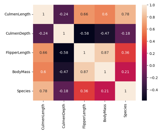
The strongest correlation in the dataset is between FlipperLength and BodyMass variables, with a correlation coefficient of 0.87. This suggests that penguins with larger flippers tend to have a larger body mass.
The identification and analysis of correlations are important for the following reasons.
- Predictive analysis: If two variables are highly correlated, we can predict one variable from the other.
- Feature selection: If two features are highly correlated, we might drop one as it doesn't provide unique information.
- Understanding relationships: Correlation helps in understanding the relationship between different variables in the data.
Important
Fundamentally, correlation doesn't imply causation. Just because two variables are correlated doesn't mean that changes in one variable cause changes in the other.
Principal Component Analysis (PCA)
Principal Component Analysis (PCA) can be used for both exploration and preprocessing of data.
In many real-world data scenarios, we deal with high-dimensional data that can be hard to work with. When used for exploration, PCA helps in reducing the number of variables while retaining most of the original information. This makes the data easier to work with and less resource-intensive for machine learning algorithms.
To simplify the example, we're working with the penguins dataset that contains only five variables. However, you would follow a similar approach when working with a larger dataset.
import pandas as pd
import seaborn as sns
from sklearn.decomposition import PCA
import matplotlib.pyplot as plt

# Load the penguins dataset
penguins = pd.read_csv('https://raw.githubusercontent.com/MicrosoftLearning/dp-data/main/penguins.csv')

# Remove missing values
penguins = penguins.dropna()

# Prepare the data and target
X = penguins.drop('Species', axis=1)
y = penguins['Species']

# Initialize and apply PCA
pca = PCA(n_components=2)
X_pca = pca.fit_transform(X)

# Plot the data
plt.figure(figsize=(8, 6))
for color, target in zip(['navy', 'turquoise', 'darkorange'], penguins['Species'].unique()):
    plt.scatter(X_pca[y == target, 0], X_pca[y == target, 1], color=color, alpha=.8, lw=2,
                label=target)
plt.legend(loc='best', shadow=False, scatterpoints=1)
plt.title('PCA of Penguins dataset')
plt.show()
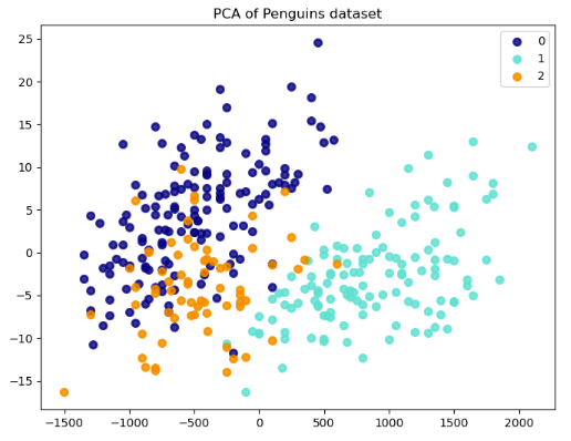
By applying PCA in the penguins dataset, we can reduce these five variables to two principal components that capture the most variance in the data. This transformation reduces the dimensionality of the data from five dimensions to two. We can then create a 2D scatter plot to visualize the data and identify clusters of penguins with similar characteristics.
Each point on the plot represents a penguin from the dataset. The values for the first and second principal components (x and y) determine the position of a point.
These are new variables that PCA creates from linear combinations of the CulmenLength, CulmenDepth, FlipperLength, BodyMass, and Species variables. The first principal component captures the most variance in the data, and each subsequent component captures less variance.
The results show a separation between penguins of different species. That is, points of the same color (species) are closer together and points of different colors are further apart. Differences in the feature distributions for different classes result in this separation, suggesting that we can distinguish these species based on their attributes.