Exercise: Analyze data
Now let's put some of the data analysis principles and techniques you've learned into action. In this lab, you'll use Excel Online to analyze and visualize data.
In this lab, you analyze Rosie's lemonade sales, and create visualizations to help you gain insights from the data.
Before you start
Note
If you have completed the previous module in this learning path, you can skip this Before you start section and go straight to Exercise 1: Analyze data with a PivotTable.
If you don't already have a Microsoft account (for example a hotmail.com, live.com. or outlook.com account), sign up for one at https://signup.live.com.
Upload the workbook to OneDrive
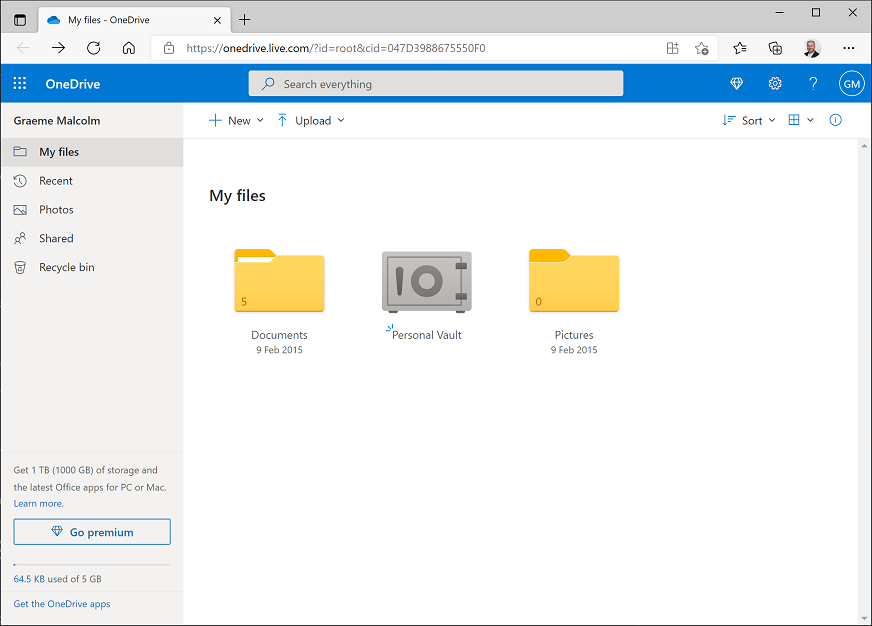
In your web browser, navigate to https://onedrive.live.com, and sign in using your Microsoft account credentials. You should see the files and folders in your OneDrive, like this:
On the + New menu, select Folder to create a new folder. You can name this anything you like, for example DAT101. When your new folder appears, select it to open it.
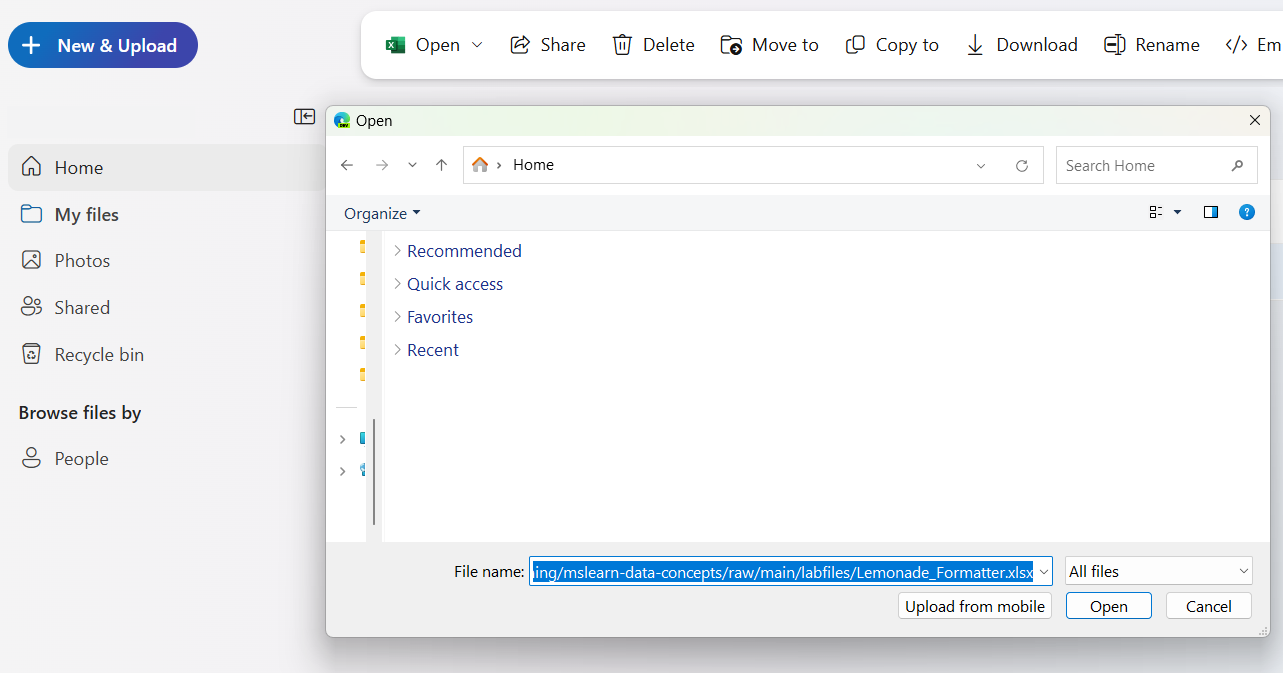
In your new empty folder, on the ⤒ Upload menu, click Files. Then when prompted, in the File name box, enter the following address in the File name field (you can copy and paste it from here!):
https://github.com/MicrosoftLearning/mslearn-data-concepts/raw/main/labfiles/Lemonade_formatted.xlsxThen click Open to upload the Excel file containing Rosie's lemonade data, as shown here:
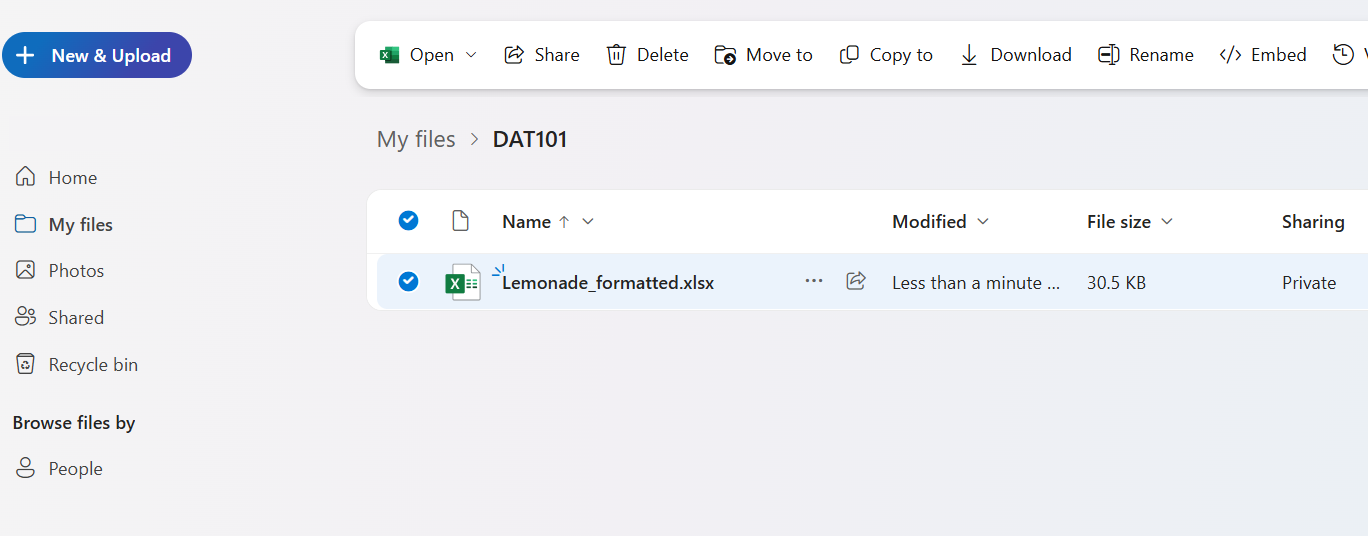
After a few seconds, the Lemonade_formatted.xlsx file should appear in your folder like this:


Exercise 1: Analyze data with a PivotTable
PivotTables are an excellent way to slice and dice data, summarizing numeric measures by one or more dimensions. In this exercise, you'll use a PivotTable to view the lemonade data, aggregated in various ways.
Create a PivotTable
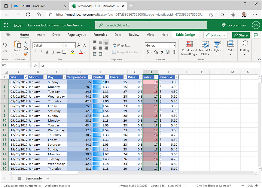
If you haven't already done so, in your web browser, navigate to https://onedrive.live.com, and sign in using your Microsoft account credentials. If you completed the previous module in this learning path, then open the Lemonade.xlsx workbook, otherwise open the Lemonade-formatted.xlsx in the folder where you uploaded it in the Before you start section. Your workbook should look like this:
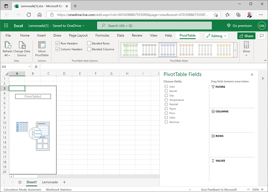
Select any cell in the table of data, and on the Insert tab of the ribbon, click PivotTable, and create a PivotTable from your table of data in a new worksheet. Excel adds a new worksheet with a PivotTable that looks like this:
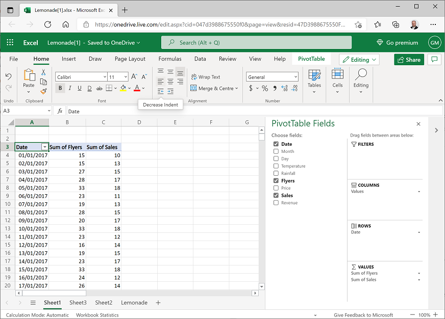
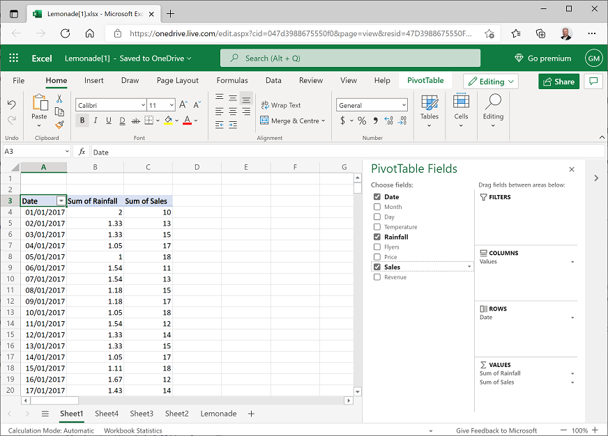
In the PivotTable Fields pane, select Month. Excel automatically adds Month to the Rows area of the PivotTable and displays the month names in chronological order.
In the PivotTable Fields pane, select Sales. Excel automatically adds Sum of Sales to the Values area of the PivotTable and displays the total number (sum) of lemonade sales for each month, like this:
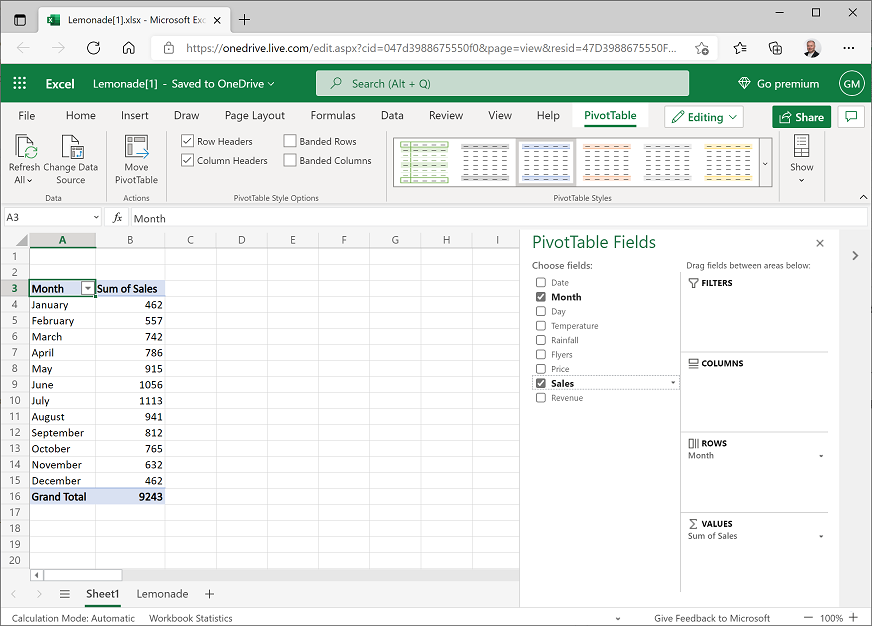
You can now see the sales aggregated by month – so for example, there were 1,056 sales in June.
Add a second dimension
In the PivotTable Fields pane, select Day. Excel automatically adds Day to the Rows area of the PivotTable and displays the total number (sum) of lemonade sales for each weekday within each month, like this:
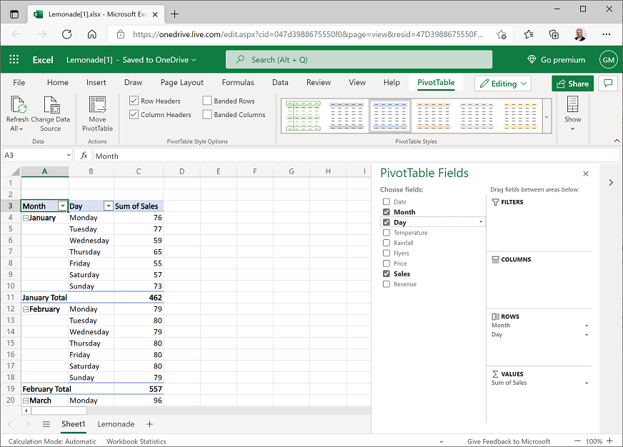
Now you can see monthly sales aggregated by weekday. For example, 57 of the sales in January were made on a Saturday. You can also expand/collapse months to drill-up/drill-down the levels of the hierarchy.
In the PivotTable Fields pane, drag Day from the Rows area to the Columns area. Excel now shows total sales for each month on rows, broken down by weekday in columns; like this:
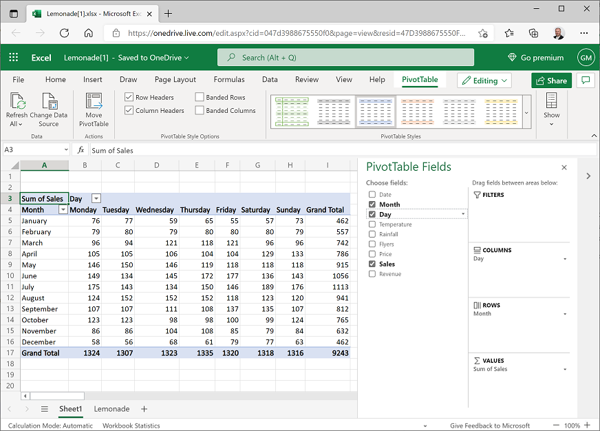
You can still see monthly sales broken down by weekday, but you can also see (in the bottom row) the totals for each weekday across the entire year. For example, a total of 1,324 sales were made on a Monday.
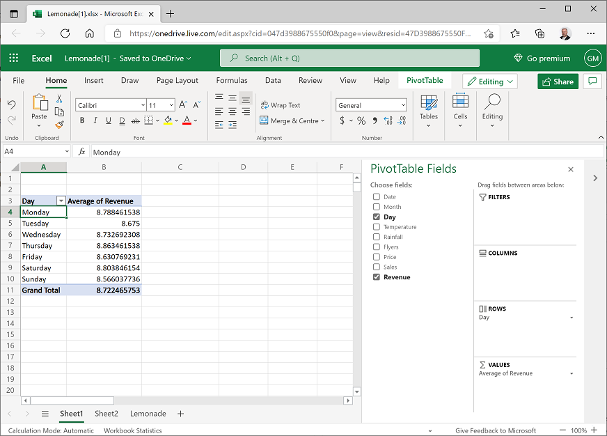
Change the aggregation
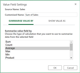
In the PivotTable Fields pane, in the Values area, click the drop-down arrow next to Sum of Sales, and then click Value Field Settings.
In the Value Field Settings dialog box, select Average as shown here:
The table of data now shows the average number of sales for each month and weekday, as shown here:
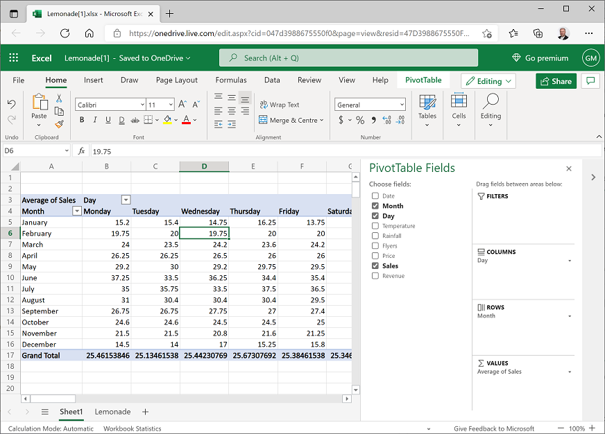
You can now see the average number of sales for each weekday by month. For example, the average number of sales on a Wednesday in February is 19.75.
Challenge: PivotTable analysis
- Modify the fields in the PivotTable to find the following information:
- The total sum of revenue for August.
- The temperature on the hottest Saturday in July.
- The lowest number of flyers distributed in a day during November.
Exercise 2: Visualizing data with charts
It can often be easier to identify trends and relationships in data by creating data visualizations such as charts.
View the sales trend for the year
Modify the PivotTable you created in the previous exercise so that it shows Date in the Rows area and the sum of Sales and sum of Temperature (in that order) in the Values area, like this:
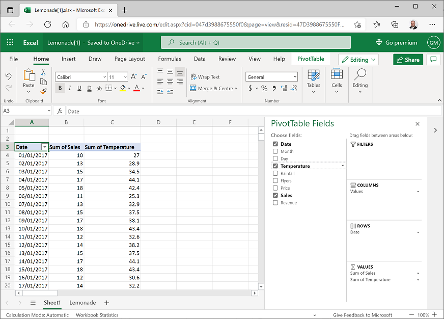
Make sure your table looks like the one shown, before you proceed (note that the date may be formatted differently for your location).
Using the following instructions, select the cells containing the date, daily sales, and temperature values only, but not the Date, Sum of Sales, and Sum of Temperature header cells or the Grand Total footer cells:
- Click cell A4, which should contain the date value for January 1 2017.
- Then press SHIFT + CTRL + ⇨ (SHIFT + ⌘ + ⇩ on Mac OSX) to extend the selection to include the sales and temperature values.
- Then press SHIFT + CTRL + ⇩ (SHIFT + ⌘ + ⇩ on Mac OSX) to select the rows beneath the current selection.
- Finally press SHIFT + ⇧ to de-select the grand totals.
On the Home tab of the ribbon, click the Copy button (🗐) to copy the selected cells to the clipboard.
Under the worksheet, click the New Sheet button (+) to add a new worksheet to the workbook.
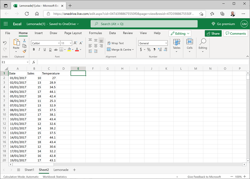
In the new sheet, select cell A2, and then on the Home tab click the Paste button (📋) to paste the copied cells into the new worksheet. You may need to widen the A column to see the dates.
In cells A1 to C1, add the columns headers Date, Sales, and Temperature. Your new worksheet should look like this:
Select the Date and Sales data, including the headers (but not the temperature data). Then on the Insert tabs of the ribbon, in the Line drop-down list, click the first line chart format. Excel inserts a line chart like this:
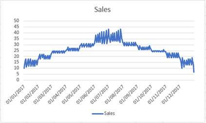
Note that the line chart shows daily fluctuations in sales, but the general trend seems to indicate that sales are higher during the summer months and lower at the beginning and end of the year.
Delete the chart, and then select all the data and headers, including Temperature and insert a new line chart. This inserts a chart like this:
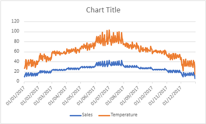
This time, the chart includes separate series for Sales and Temperature. Both series show a similar pattern; it seems sales and temperature both increase over the summer months.
Select the chart and double-click the chart title. Then in the Chart pane on the Format tab, expand Chart Title and change the chart title to Sales and Temperature:
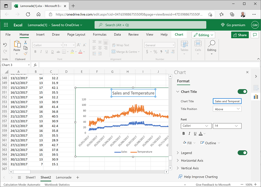
Close the Chart pane.
View revenue by weekday
Return to the worksheet containing the PivotTable, and modify it to show Day on rows with the average of Revenue. Your result should look like this although your days of the week may not be ordered:
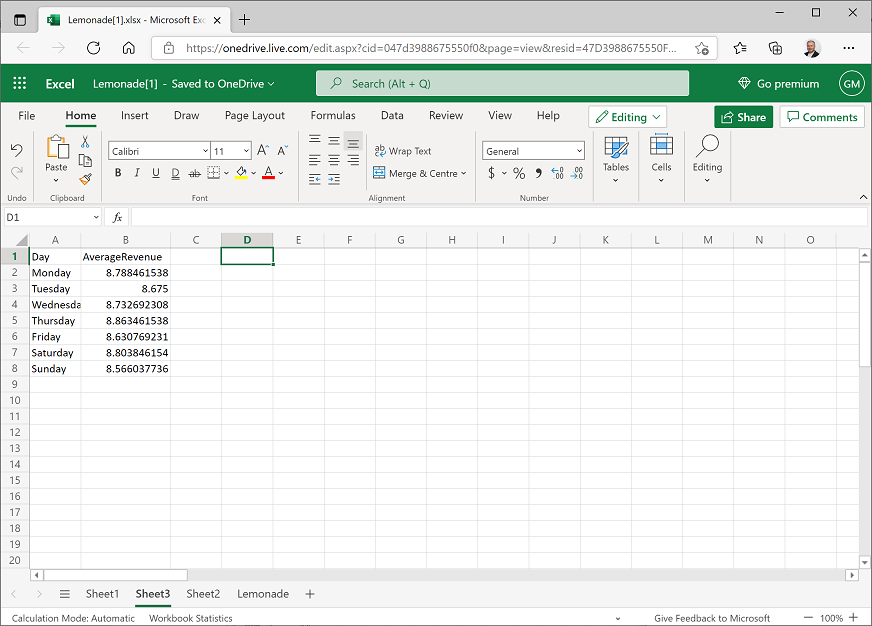
Copy the day and average revenue values (but not the headers or total) to the clipboard, and then add a new worksheet, paste the copied data in cell A2, and add Day and AverageRevenue headers like this:
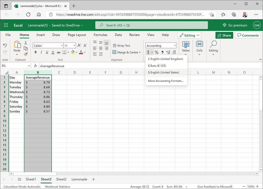
Select the B column header and on the Home ribbon tab, use the $ menu to format the revenue data as $ English (United States), like this:
Select all the data, including the Day and AverageRevenue headers, and on the Insert tab of the ribbon, in the Column drop-down list, select the first column chart format. A chart like this is created:
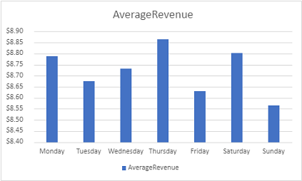
At first glance, this chart appears to show some significant variation between average revenue of different days of the week; with revenue on Thursdays much higher than on Sundays. However, look more closely at the scale on the vertical (Y) axis – The difference is less than 30 cents.
Select the column chart, and on the Chart tab of the ribbon, in the Pie drop-down list select the 2D Pie chart format. The chart changes to a pie chart like this:
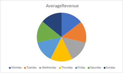
Note that the pie segments are more or less the same size for each day.
Select the pie chart and on the Chart tab, in the Data Labels drop-down list, select Inside End. This displays the actual data amounts in the chart, like this:
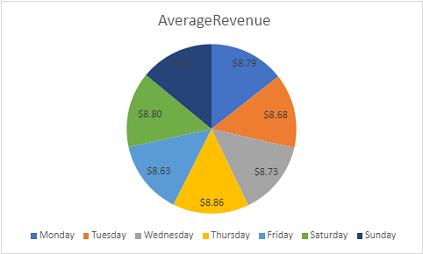
Now it's clearer that there's little apparent variation in average revenue for different days of the week.
View sales by flyers
Return to the worksheet containing the PivotTable, and modify it to show Date on rows with the sum of Flyers and the sum of Sales, like this:
Copy the date, flyers, and sales values (but not the headers or totals) to a new worksheet and add Date, Flyers, and Sales headers like this:
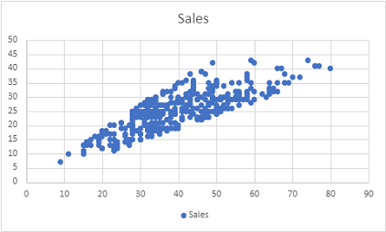
Select the Flyers and Sales data and headers (but not the dates). Then on the Insert tab, in the Scatter drop-down list, select the first scatter-plot format. This creates a scatter-plot chart like this:
Note
The chart shows the number of flyers distributed each day on the horizontal (X) axis, and the number of sales each day on the vertical (Y) axis. The plot forms a roughly diagonal line (with some variance), indicating a general trend where the number of sales tends to increase in-line with the number of flyers distributed.
View sales by rainfall
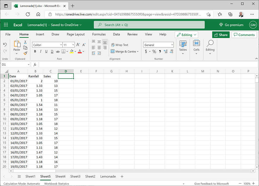
Return to the worksheet containing the PivotTable, and modify it to show Date on rows with the sum of Rainfall and the sum of Sales as values, like this:
Copy the date, rainfall, and sales values (but not the headers or totals) to a new worksheet and add Date, Rainfall, and Sales headers like this:
Select the Rainfall and Sales data and headers (but not the dates). Then on the Insert tab, in the Scatter drop-down list, select the first scatter-plot format. This creates a scatter-plot chart like this:
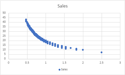
This plot seems to indicate some kind of relationship between rainfall and sales, with sales falling as rainfall increases. However, the line formed by the plots is curved. This often means there's a non-linear, possibly logarithmic relationship.
Delete the chart so you can see the empty D and E columns after the daily rainfall and sales data.
In D1, add the column header LogRainfall, and then select cell D2 and enter the following formula in the fx box above the worksheet to calculate the base 10 log of the rainfall value:
=log(B2)Copy the formula to the other cells in the LogRainfall column. The easiest way to do this is to select the cell containing the formula and double-click on the small square "handle" (▪) at the bottom right of the selected cell.
In E1, add the column header LogSales, and then select cell E2 and enter the following formula in the fx box above the worksheet to calculate the base 10 log of the sales value:
=log(C2)Copy the formula to the other cells in the LogSales column.
Select the LogRainfall and LogSales data and headers. Then on the Insert tab, in the Scatter drop-down list, select the first scatter-plot format. This creates a scatter-plot chart like this:
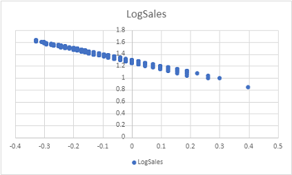
Note that this plot shows a linear relationship between the log of rainfall and the log of sales. This is potentially useful as we explore relationships in the data, as it's easier to calculate a linear equation that relates rainfall to sales than to define a logarithmic equation to do the same.
Challenge: Visualizing data
- Create a column chart showing the sum of flyers distributed on each day of the week, and note the days on which the highest and lowest number of flyers were distributed.
- Create a scatter plot showing daily temperature and rainfall and examine the apparent relationship between these fields.