Exercise - Import custom visuals
Power BI comes with many stylization options out of the box, but users are also given the opportunity to import their own visuals. Let's go over this process.
Make sure you're using the MyFirstPowerBIModel file you have been working on in the previous units. If you missed the previous modules, or are starting from this one, open the Lab 4 solution.pbix file located in the Reports folder of your student files.
Section 1: Add background images
We can use a background image to format the report. Let's try it.
Select the white space in the canvas to deselect any selected visuals.
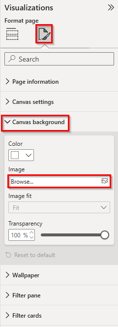
From the Visualizations pane, select the Format page tab (the paint brush icon).
Expand the Canvas Background section.
Select the Browse Image button.
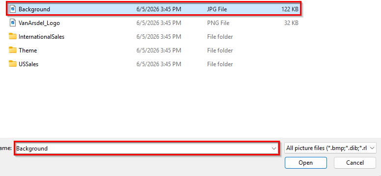
A File browser dialog box opens. Browse to the DIAD folder, then the Data folder (DIAD/Data).
Select the Background.jpg file.
Select the Open button.
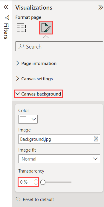
Within the Canvas background section of the Visualizations pane, change and set the Transparency slider to 0%.
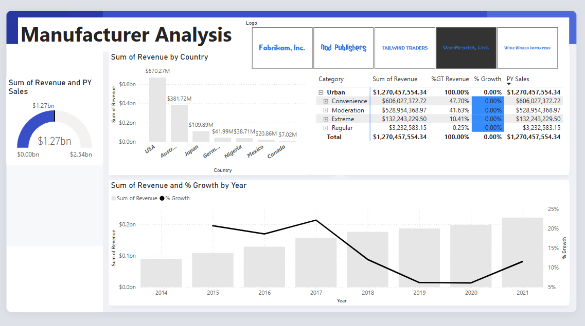
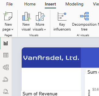
Notice our template has space for a header and slots for images.
Resize and position the visuals as shown in the figure below:
Section 2: Add a logo
Now let's add a logo.
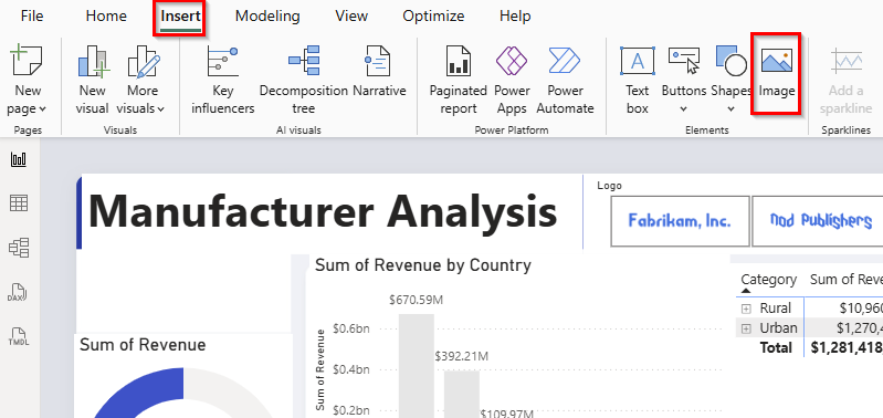
From the ribbon, select the Insert tab and then choose Image.
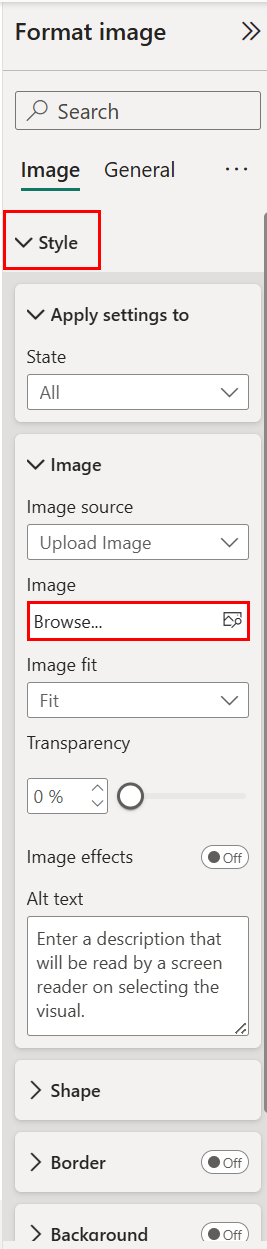
Select Style from the Format Image section of the Visualization Pane. Then select Browse.
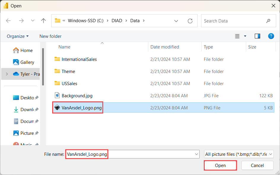
The File browser dialog opens. Browse to the DIAD folder then the Data folder (DIAD/Data).
Select the VanArsdel_Logo.png file.
Then, select Open.
Resize and drag the image to the top left corner of the report.
Note
The logo is white. You will need to place it over the blue background to see it.
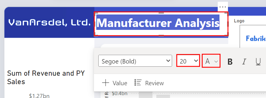
Now let's change the font color of the report title.
Highlight Manufacturer Analysis within the text box.
Select the drop-down arrow next to the A to change the font color.
Select the color white.
Change the font size to 20.
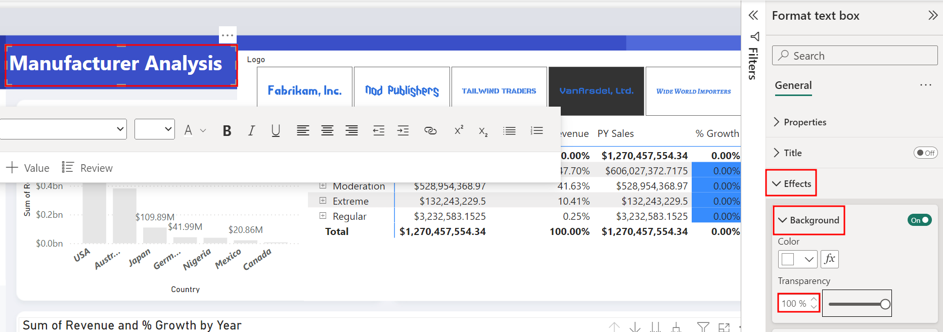
Within the Effects section of the Format text box pane, expand the Background sub-section.
Set the Transparency to 100%.
Resize and move the visuals around if needed, making sure they're still in the same locations as before.
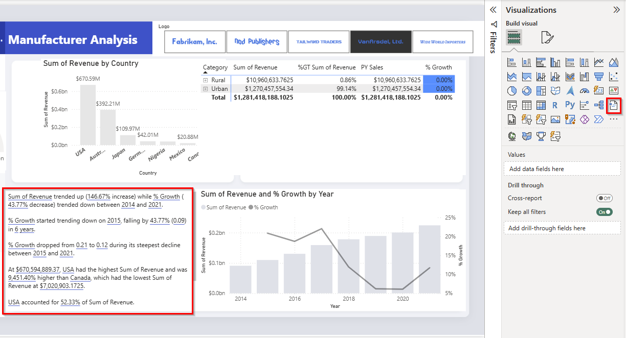
Now let's add a smart narrative visual to our report.
First, resize the Sum of Revenue and % Growth by Year visual to make space to the left of the visual at the bottom of the report.
Add a Narrative visual to the canvas. Remember, you need to deselect any current visuals by selecting blank space on the canvas.
Note
If your tenant has Copilot enabled, a window will open asking if you want to use Copilot to build the narrative. If so, select Custom.
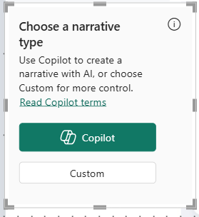
The Narrative visualization helps you quickly summarize visuals and reports. It provides relevant innovative insights that you can customize.
Section 3: Import custom visuals
Out of the box, Power BI has a large selection of visuals. However, there might be a use-case when you need a custom visual. To meet this requirement, the visualization engine is open-sourced. The Power BI community contributes visuals in the marketplace. You can add and use these visuals in your reports.
There's also an option to create your own visual or import visuals in Power BI Desktop.
Now, let's add a custom visual.
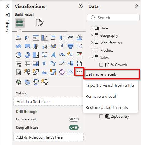
From the Visualizations pane, select the ellipses (...) in the last row of visuals.
Select Get more visuals.
Note
You might be asked to sign into your Power BI account to access the custom visuals library. If you're unable to login, you can select Import a visual from a file and select the Play Axis visual that's found in the class files in the Data folder.
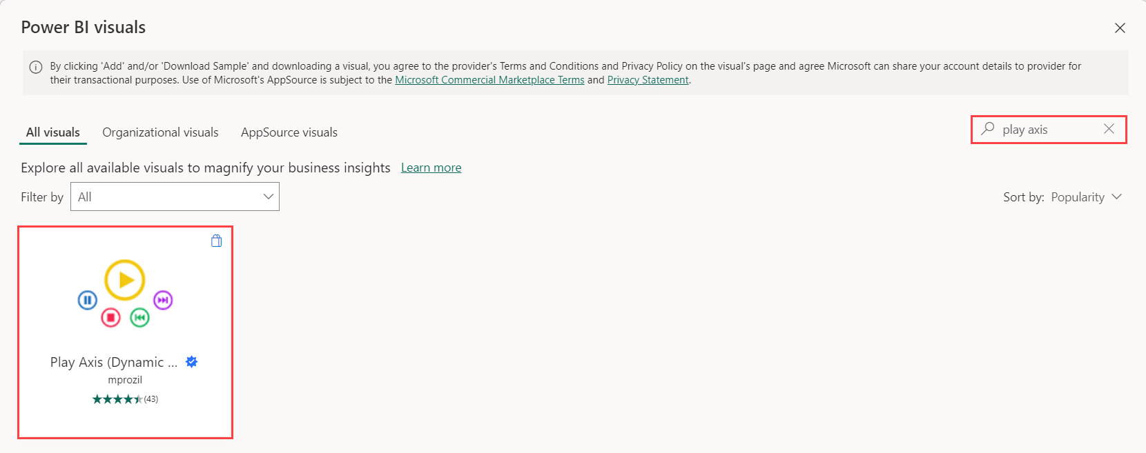
Type play axis in the search box in the top right-hand corner of the Power BI visuals dialog box.
Select the Search icon.
Select the Play Axis (Dynamic Slicer).
Note
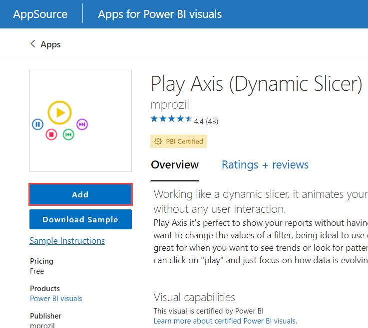
Notice the checkmark in the blue star. This image helps to identify certified custom visuals. Custom visuals that meet Power BI teams coding requirements are certified. Certified custom visuals support features like export to PowerPoint and the ability to display in subscription emails which aren't supported by non-certified custom visuals.
The AppSource dialog box appears.
Select the Add button below the Play Axis (Dynamic Slicer) cover image.
After a few moments, you should see a notification that the visual was successfully imported. Select OK.
Notice a new visual is added to the list of available visuals.
Select the white space in the canvas to deselect anything that might be currently selected.
From the Visualizations pane, select the newly imported Play Axis visual.
From the Data pane, select the checkbox next to the Date field in the Date table.
From the Visualizations pane, select the Format visual tab.
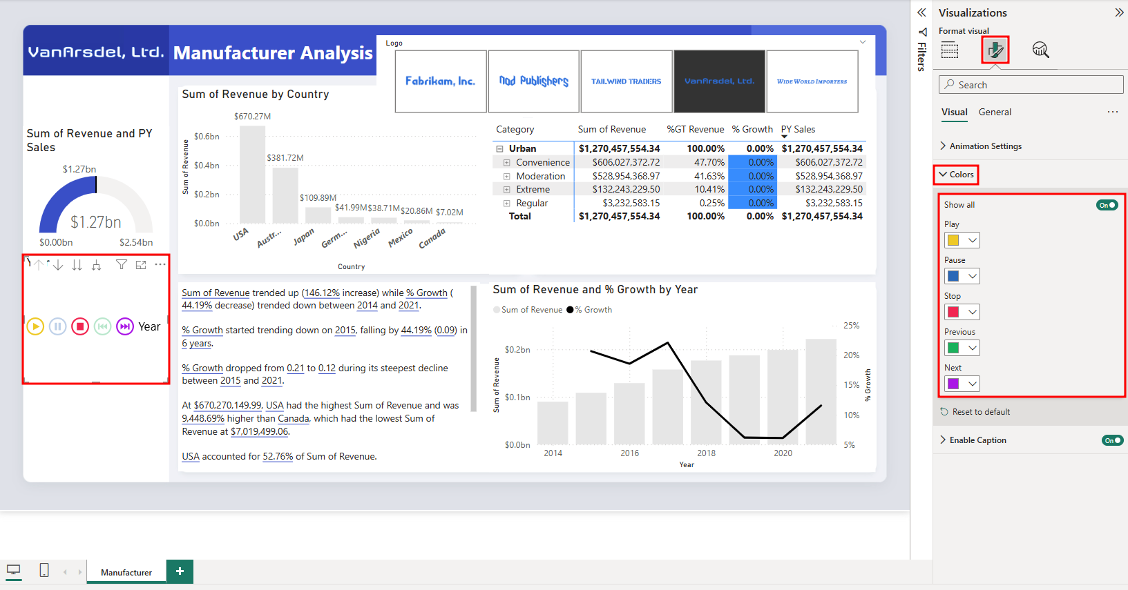
Expand the Colors section.
Turn on the Show all option.
Resize and position the visual as shown in the figure below.