Exercise – Power BI service interaction and personalization (Bookmarks, alerts, Q&A)
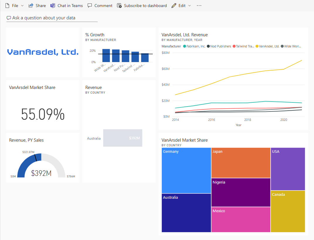
Make sure you're in the VanArsdel, Ltd. dashboard for the Final Report in your DIAD workspace on Power BI Service.
Let's create a visual that represents Market Share by country.
Section 1: Using Q&A
Notice on the top of the dashboard, there's an option to Ask a question about your data. This is like Ask a question in the desktop.
Select the Ask a question about your data text box at the top of the page. You'll then be taken to a Q&A page.
Type VanArsdel market share in the text box at the top of the page. Notice that a card visual is created.
Type VanArsdel market share by country. Notice that a bar chart is created.
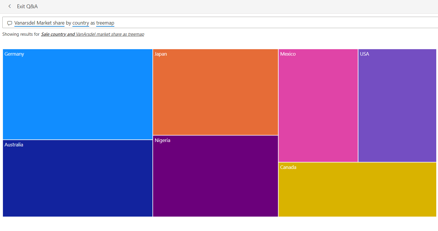
Type VanArsdel market share by country as treemap. Notice that a treemap visual is created.
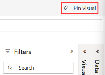
In the top right corner of the screen, select Pin Visual.
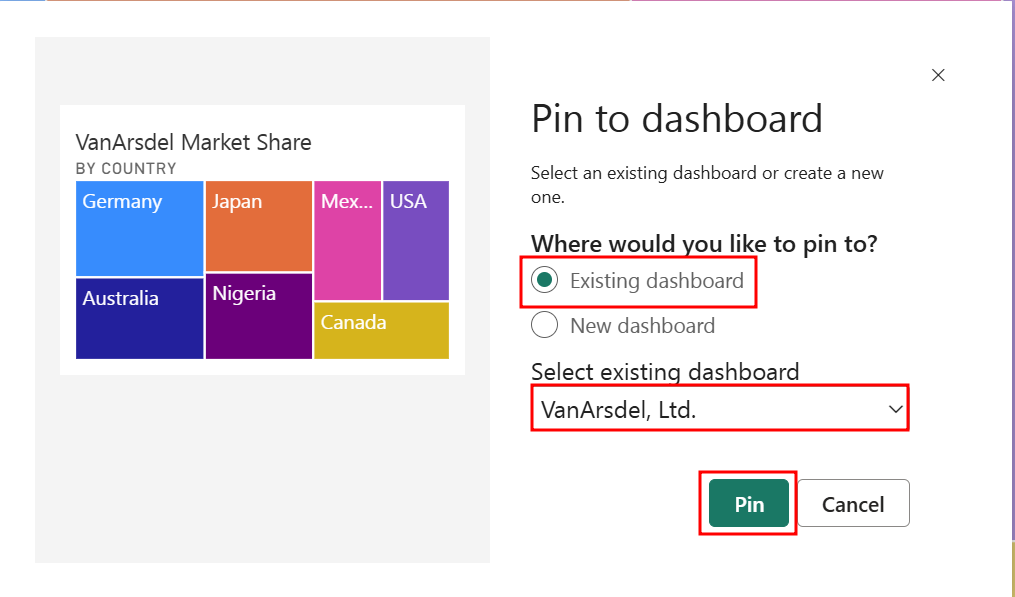
The Pin to dashboard dialog box opens. Make sure that Existing dashboard is selected, then select Pin to pin the visual to the VanArsdel, Ltd. dashboard.
Close the alert dialog boxes.
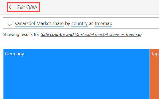
Select Exit Q&A in the top left corner of the page to go back to the dashboard.
Notice that the treemap visual is added as a tile to the dashboard. Selecting the treemap visual will take you back to the Q&A section.
Power BI quickly searches different subsets of your model while applying a set of sophisticated algorithms to discover potentially interesting insights. You can run insights against a model or a dashboard tile.
Section 2: Generate insights
Let's generate insights on a dashboard tile. When we run insights on a dashboard tile, instead of searching for insights against an entire model, the search is narrowed to the data used to create a single dashboard tile. This is called scoped insights.
Hover over the Revenue by Manufacturer line chart on the dashboard.
Select the ellipsis on the top right corner of the line chart.
Choose View Insights.
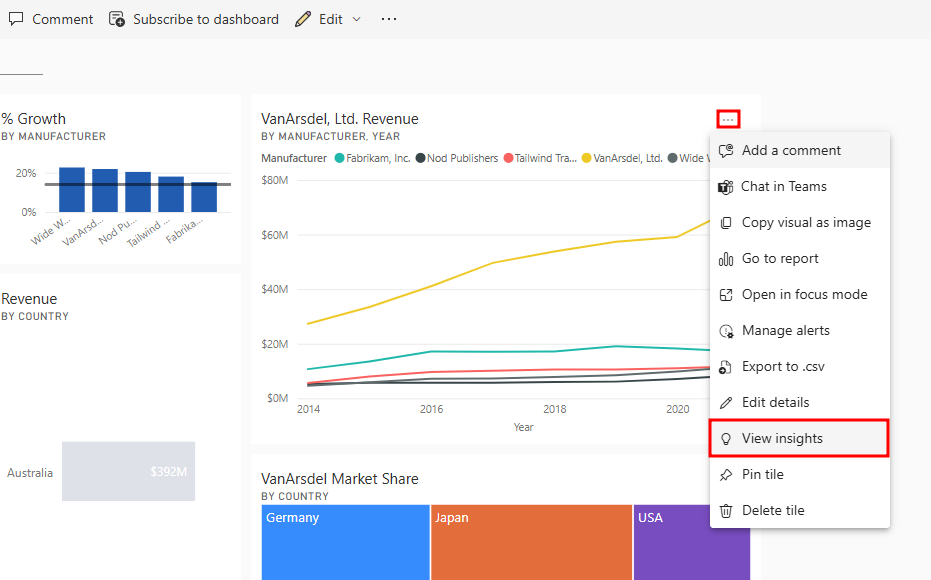
You'll be taken to Focus mode for the line chart.
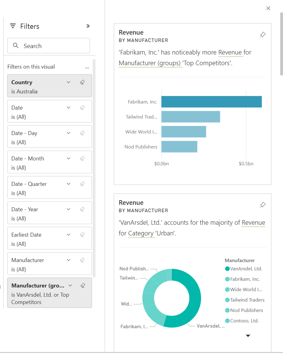
Scroll on the Insights pane to the right of the screen to review the various insights Power BI can generate. Notice that there's an option to pin insight visuals to the dashboard.
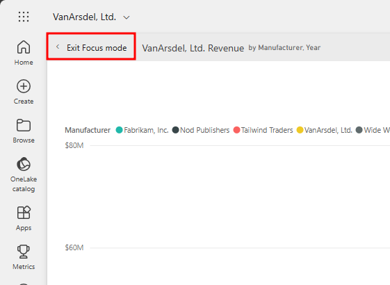
Select Exit Focus mode in the top left corner of the page to go back to the dashboard.
Section 3: Setting alerts
We want to be notified when VanArsdel's Market Share goes above or below a threshold. We can set up alerts to do this.
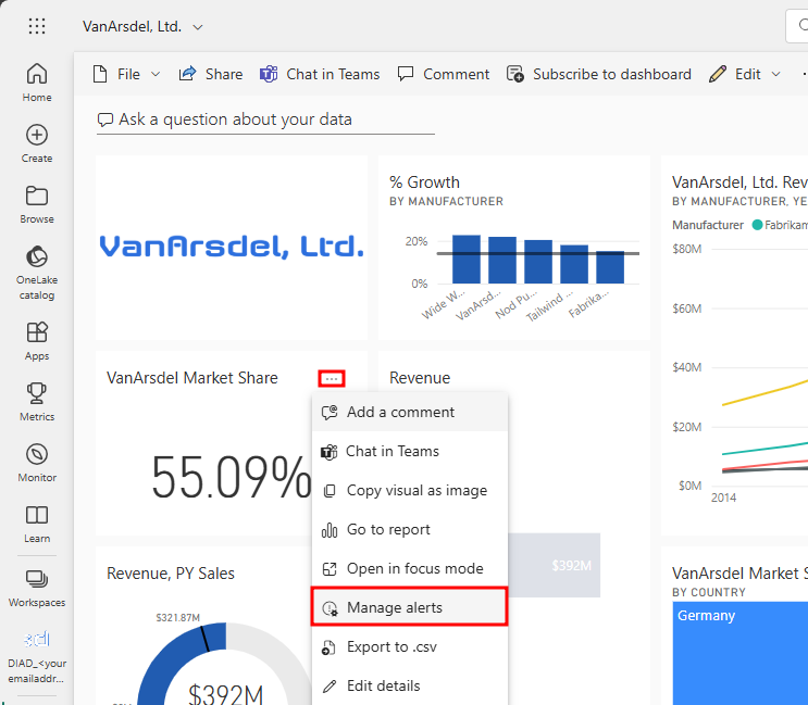
Hover over the VanArsdel Market Share card tile.
Select the ellipsis in the top right corner of the tile.
Choose Manage alerts. The Manage alerts dialog box opens.
Select Add alert rule.
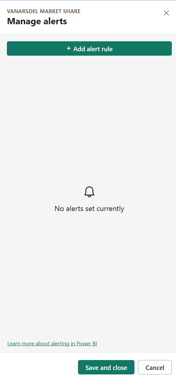
Notice that you can add Above or Below threshold. You can also set the notification frequency.
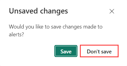
Select Cancel to close the dialog box.
From the Unsaved changes alert dialog box, select Don't Save.
Select the VanArsdel Market Share card visual tile to navigate to the report.
In the Revenue by Country and State map visual, drill up from the State level to the Country level.
Hover your mouse over the Australia bubble in the map and choose Drill through.
Then, select By Manufacturer.
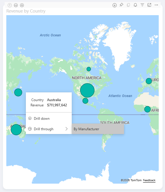
You'll then go to the By Manufacturer page of the report with the Australia filter applied to the report page.
Hover over the Matrix visual and drill up to the highest level if it's not already there.
Select the Focus mode icon in the top right corner of the visual.
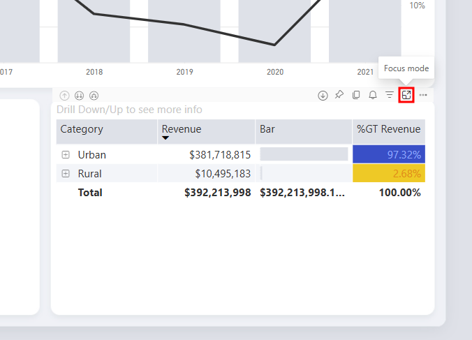
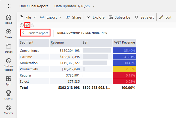
Select the double-down arrow to drill down.
Then, select the Back to report button in the top left-hand corner of the page.
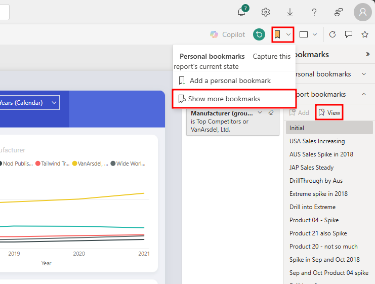
Open the Bookmark panel on the right-side of the report by selecting the bookmark icon in the top-right corner and choosing Show more bookmarks, then select View to open the bookmark viewing interface.
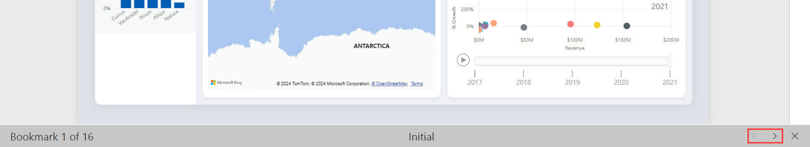
Notice that you can view and move through the bookmarks using the arrow at the bottom of the screen. This behavior is like in Power BI Desktop. You can test this out on your own.
Select Exit under the Report bookmarks section of the pane to close it.
Section 4: Quick insights
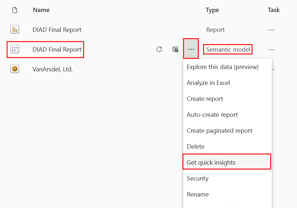
Power BI provides an option to get quick insights into the complete dataset or Semantic model.
Go back to the workspace you created earlier in the lab using the navigation pane to the left of the screen.
Once in the workspace, find the semantic model called DIAD Final Report and select the ellipsis (...).
From the menu, select Get quick insights.
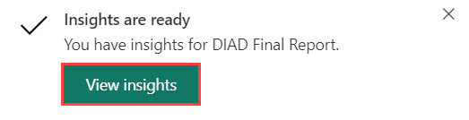
It might take a few minutes for the insights to be created. Once the insights are ready, a message appears in the top right corner.
From the Insights are ready alert dialog box, select View insights.
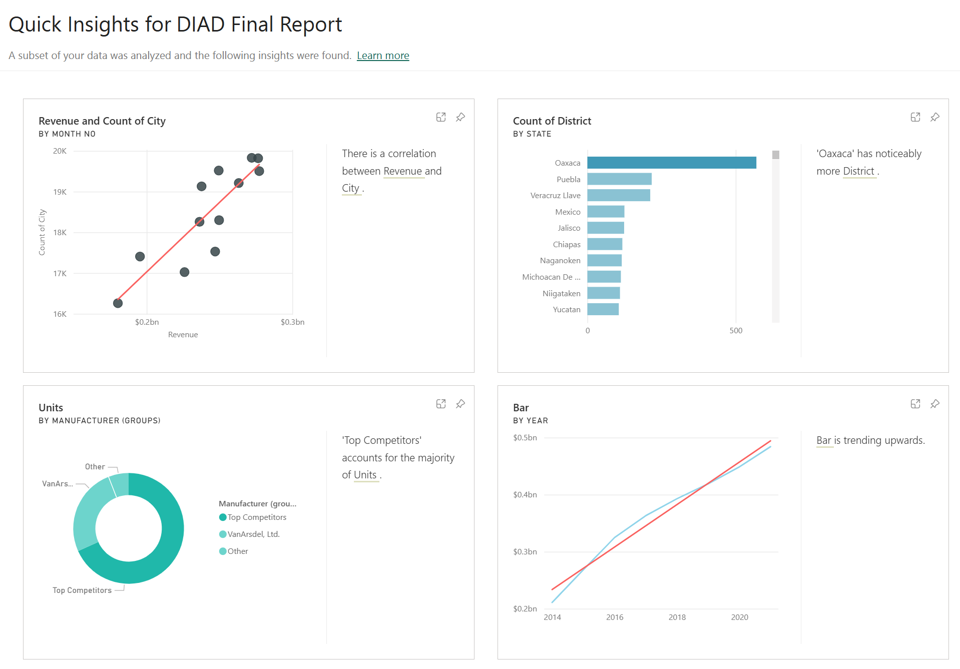
A quick insights report is displayed based on the model. This provides insights into data you might have missed and helps to get a quick start on creating dashboards. Hovering over each report provides an option to Pin it to a dashboard.
Now that you've published your report and built your dashboard, the required portion of this Module is complete.
In the next optional unit, we'll show you the process of sharing your dashboard and collaborating with other team members and see how you can create storytelling presentations within PowerPoint using data from Power BI.