Exercise - Create the Dive Center canvas app
In this exercise, you apply your learned knowledge by creating a Dive Center canvas app.
Scenario
You work at a dive center, servicing and selling dive gear. You manage the organization's Dataverse environment.
The service department employees require a Power Apps app that allows them to proceed with the check-in and check-out processes for customers who bring in dive gear for repairs.
To support these processes, the employees require the following features:
A list of customers for the repair services
The ability to store check-ins
A list of dive gear to identify the type of equipment to be registered
The users have expressed other requests, and you may also want to include the following features:
Enable the ability to proceed with check-outs for completed service requests.
Create new dive gear with picture, color, and gear type specified.
Capture pictures and the type of service at time of check-in.
Capture a signature to complete the checkout.
Create new customers.
Exercise
Prerequisite: The solution and data source referred to in this exercise are explained in the previous unit Exercise - Prepare for the Dive Center canvas app. Start in your environment titled Dive Center App, where your app Dataverse tables already reside.
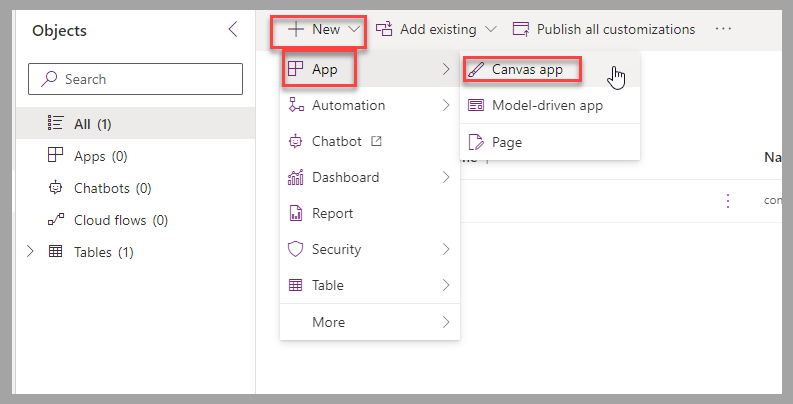
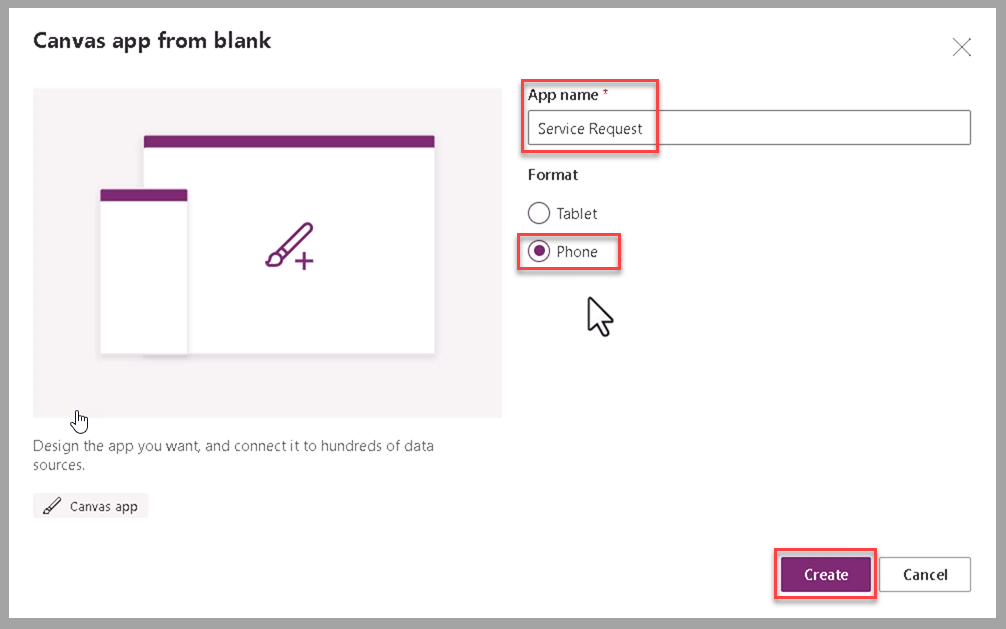
From your environment screen's command bar, select New > App > Canvas app to create a new canvas app named Service Request.
Select Phone as the format of the canvas app. Then select Create.
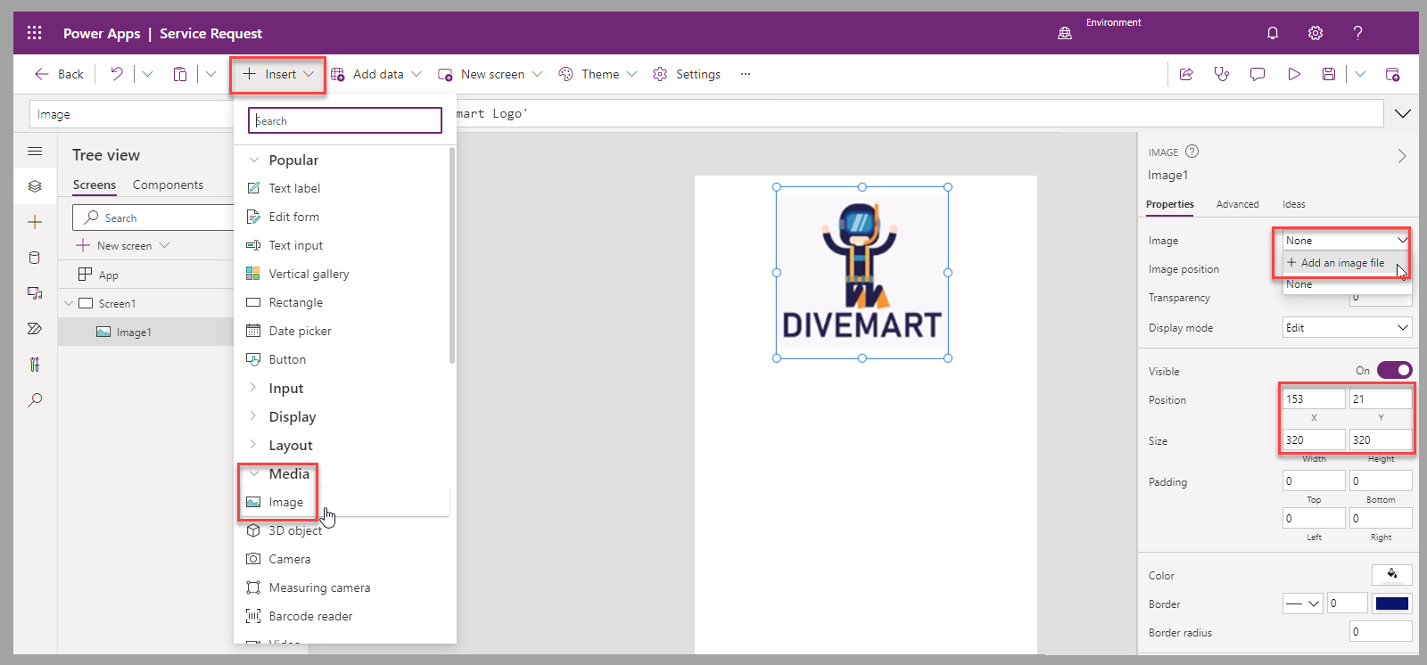
In the Power Apps canvas studio, insert an image to use as the main logo.
Position and size the image based on available screen estate and other components to include in the app. You can also adjust the background of the screen to the logo color by using the Fill property.
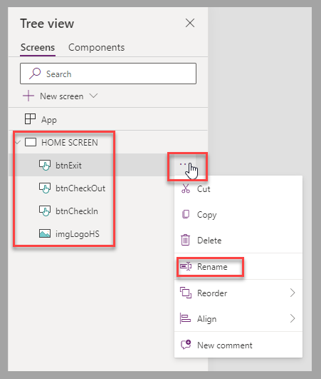
To provide navigation to subsequent screens, add three buttons for Check In, Check Out, and Exit. Define colors, positions, and size based on the expected user experience.
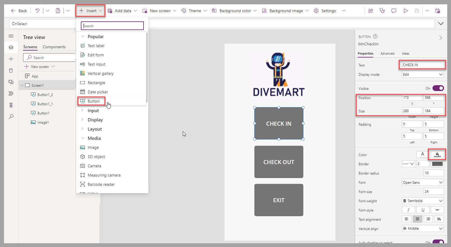
Rename default controls and screens by using names that represent their usage. This is best practice to identify them more easily. You can double click each control in the Tree view to rename it or use the ellipsis next to the control and select Rename.
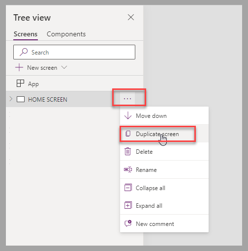
Create the check-in screen by selecting Duplicate Screen from the Home Screen and rename the new screen "CHECKIN".
Remove the buttons from the new screen, and then resize the main image to provide room for the form that is added for the check-in process.
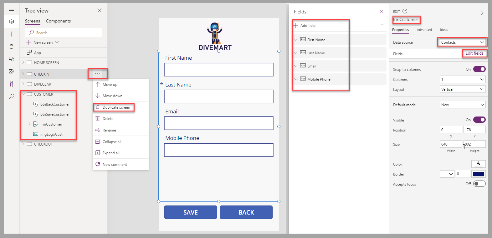
Insert an Edit form, connect the data source to the Dataverse Service Requests table, set the Default mode property of the form to New, and rename it frmCheckIn.
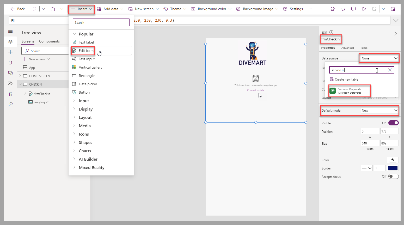
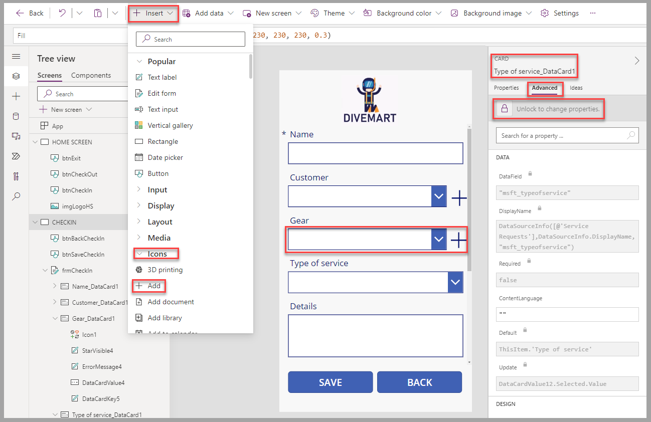
On the form, move and resize it to use the screen real-estate, and select the Edit fields option from the Properties panel so you can modify the form's fields.
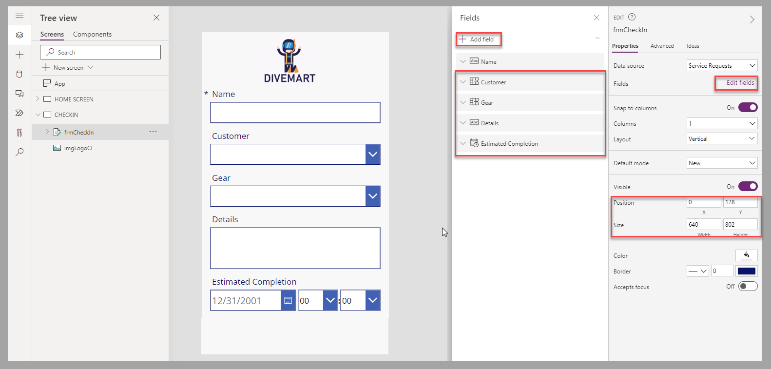
Copilot auto-suggests what fields should be included and orders them accordingly, but let's arrange them for the check-in process as follows, by dragging and dropping them in the Fields panel as follows from top to bottom (you can refer to the image below): Name, Customer, Gear, Details, and Estimated Completion. (You can position any optional fields below these fields.)
If you don't see these fields in your form, select the + Add field button to find/add them.
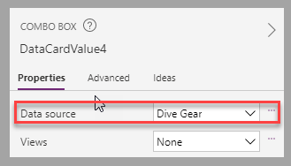
You will need to add data to your Dive Gear table, and perhaps your Contacts table too, to see the results in your combo box within the Gear and Customer portion of your form.
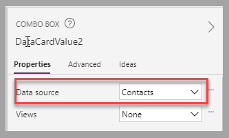
Check your combo box control fields for the Customer and Gear cards on your form. They may not show the correct data, so you may need to unlock these cards and make a couple of tweaks. For the Customer combo box, ensure you update the DisplayFields property to show
[fullname]and for the Gear combo box, set the DisplayFields property to["msft_name"].To provide update and navigation functionality to the users, add two buttons at the bottom of the canvas screen. Update the text for them to "SAVE" and "BACK", and rename them as btnSaveCheckIn and btnBackCheckIn, respectively.
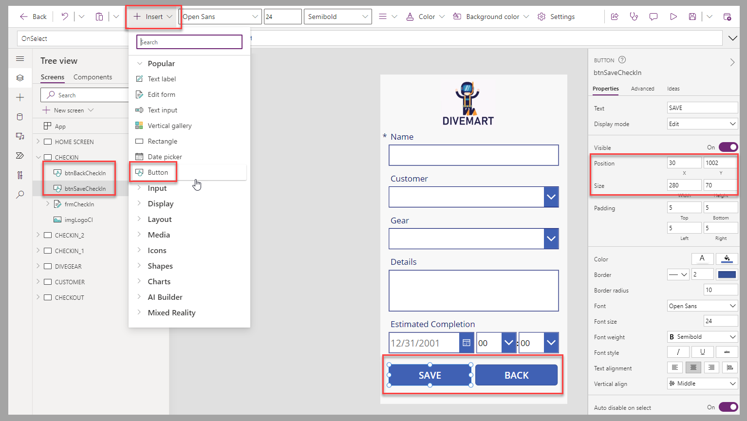
To update the form when the btnSaveCheckIn button is selected and allow a new check in to be processed, enter the following PowerFx script in the OnSelect property of the button:
SubmitForm(frmCheckIn); NewForm(frmCheckIn);To navigate back to the HOME SCREEN when the btnBackCheckIn button is selected, enter the following PowerFx script in the OnSelect property of the button:
Navigate('HOME SCREEN',ScreenTransition.Fade);To navigate to the CHECKIN screen from the HOME SCREEN when the btnCheckIn button of the HOME SCREEN is selected, enter the following PowerFx script in the OnSelect property of the button:
Navigate(CHECKIN,ScreenTransition.Fade);To allow the users to close the app when they select the btnExit button of the HOME SCREEN, enter the following PowerFx script in the OnSelect property of the button:
Exit();At this point, you can save and play the app to test the navigation between the screens and the creation of new check-in entries.


Optional features
The following section provides the steps required to proceed with the optional features of the app. Some of these features require tables and columns defined in the unit Exercise - Prepare for the Dive Center canvas app earlier in this module.
Check-out feature
To provide check-out functionality to the users of the app, follow these steps:
Create a duplicate of the CHECKIN screen and rename it CHECKOUT. Rename the screen components, and then perform the following actions:
Change the "SAVE" button to read "CHECK OUT".
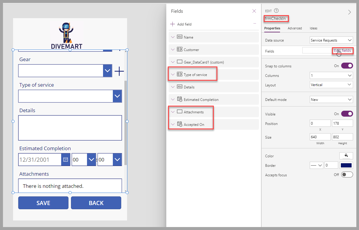
Edit the frmCheckOut fields to remove the Name field.
Add/move the optional Attachments field to just under the Estimated Completion field.
Set the Default mode to View so the form displays as Read-Only.
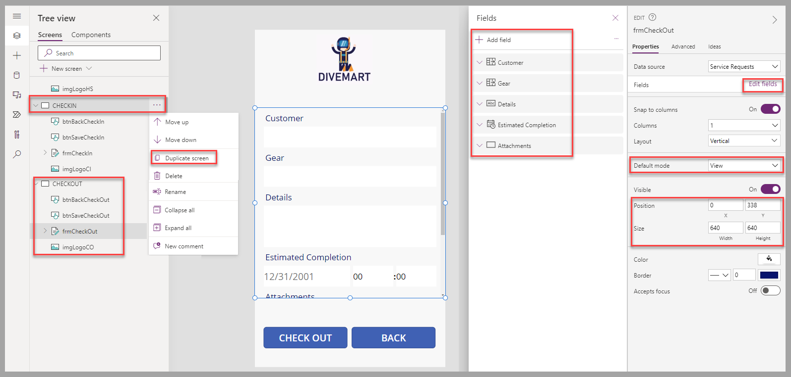
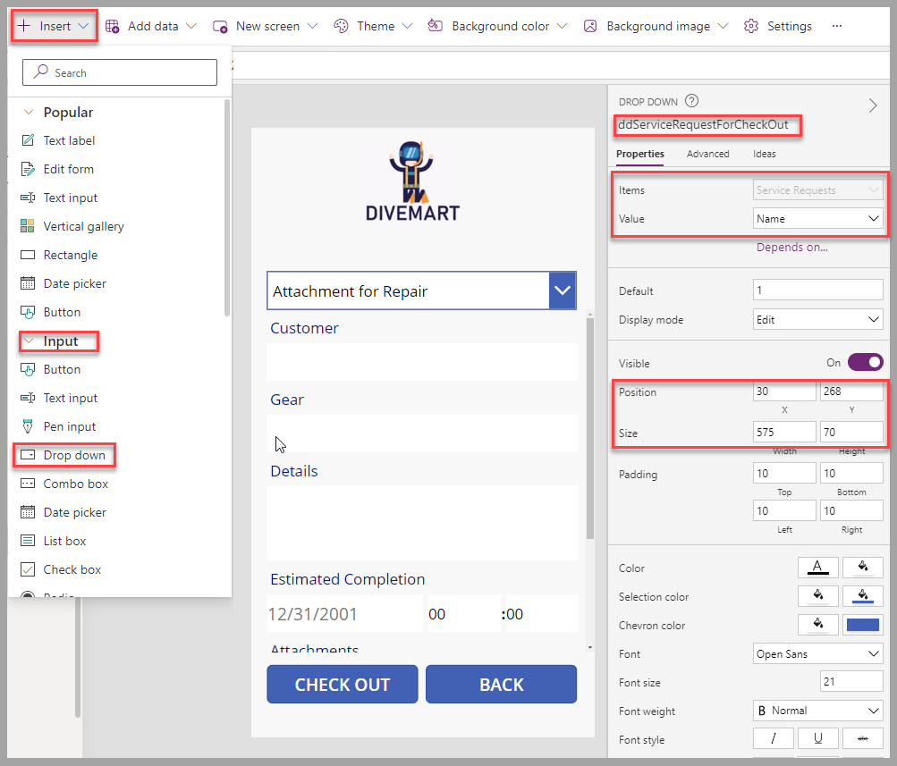
To provide a list of service requests that are available to check out, add a Drop down input to the top of the screen and then perform the following actions:
Rename the drop-down to ddServiceRequestForCheckOut.
Position the drop-down above the frmCheckOut form (resize your form accordingly).
Set the Items property to the Service Requests table.
Set the Value property to be the Name column.
To display the selected Service Request from the drop-down control, enter the following PowerFx script in the Item property of the frmCheckOut form:
ddServiceRequestForCheckOut.SelectedTo display only the list of service requests that are available for checkout, enter the following PowerFx script in the Items property of the drop-down input:
Filter('Service Requests',IsBlank('Actual Completion'))So the service request appears as checked out when the btnSaveCheckOut button is selected, enter the following PowerFx script in the OnSelect property of the button:
Patch('Service Requests',ddServiceRequestForCheckOut.Selected,{'Actual Completion':Now()});To navigate to the CHECKOUT screen from the HOME SCREEN when the btnCheckOut button on the HOME SCREEN is selected, enter the following PowerFx script in the OnSelect property of the button:
Navigate(CHECKOUT,ScreenTransition.Fade);At this point, you can save and play the app to test the navigation between the screens and the check-out process.


Create dive gear feature
To let users create new dive gear with color, gear type, and a picture, follow these steps:
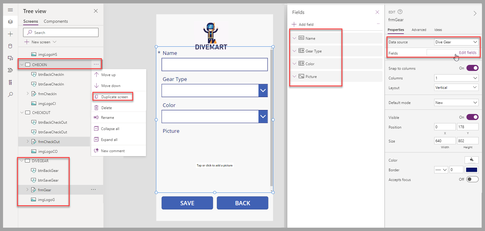
Create a duplicate of the CHECKIN screen and rename it DIVEGEAR. Rename the screen components, and then perform the following actions:
Edit the frmGear properties to use the Dive Gear table as the data source
Select the different fields that you want to provide to the users, including the Picture field.
To create the dive gear when the btnSaveGear button is selected and allow creation of new dive gear, enter the following PowerFx script in the OnSelect property of the button:
SubmitForm(frmGear); NewForm(frmGear); Refresh ('Dive Gear');To navigate back to the CHECKIN screen when the btnBackGear button is selected, enter the following PowerFx script in the OnSelect property of the button:
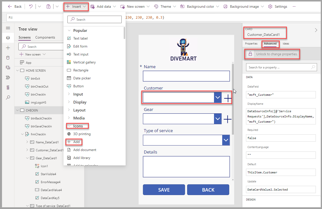
Navigate(CHECKIN,ScreenTransition.Fade);To navigate from the CHECKIN to the new Dive Gear creation you built, unlock the properties of the data card for the Gear field of the frmCheckIn form on the CHECKIN screen. Resize the combo box of the data card to provide space to insert an Add icon next to it.
To navigate to the DIVEGEAR screen, enter the following PowerFx script in the OnSelect property of the Add icon:
Navigate(DIVEGEAR,ScreenTransition.Fade);To ensure that the list of gear is updated when new gear is created, change the data source property of the Combo box to the Dive Gear table.
At this point, you can save and play the app to test the navigation between the screens and the creation of new dive gear.


Capture pictures and service type feature
To let users capture pictures and type of service at time of check-in, follow these steps:
Ensure you've added Type of service, Attachments, and Accepted On as fields to the frmCheckin form.
To set the Accepted On value to the date and time the service request is created, unlock the Accepted On data card, and then set the Update property with the following PowerFx script:
Now()At this point, you can save and play the app to test the addition of pictures as attachments to the service request.

Capture signature feature
To let users capture a signature to complete a check-out, follow these steps:
Add a container to your CHECKOUT screen and stretch the container to fit the entire screen. Set the Fill property of the container to:
RGBA(149,149,149,0.4)Add the following labels to the container control
Name Text Position/Size Other info lbl_SignatureCapture <empty> X: 0
Y: 338
Width: 640
Height: 384Fill: RGBA(255, 255, 255, 1) lbl_SignatureLine <empty> X: 0
Y: 587
Width: 640
Height: 13Fill: RGBA(0,0,0,1) lbl_CustomerSignature Customer Signature X: 21
Y: 600
Width: 560
Height: 70Font size: 21 lbl_OK OK X: 388
Y: 599
Width: 60
Height: 70Font size: 21 lbl_Cancel Cancel X: 492
Y: 599
Width: 122
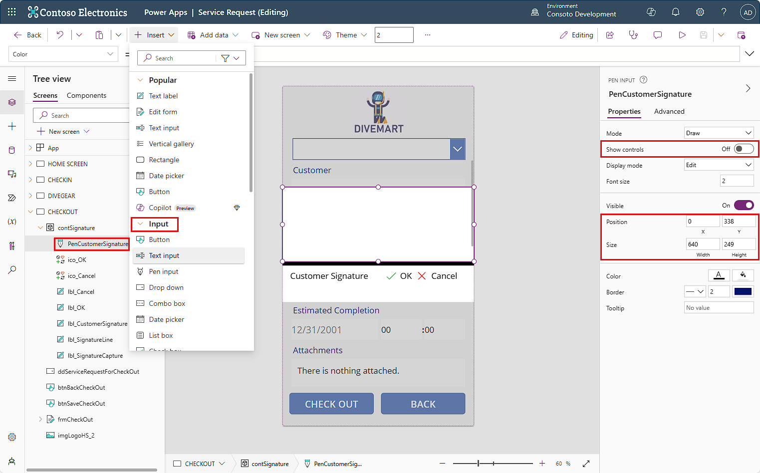
Height: 70Font size: 21 The result should be similar to the following screenshot.
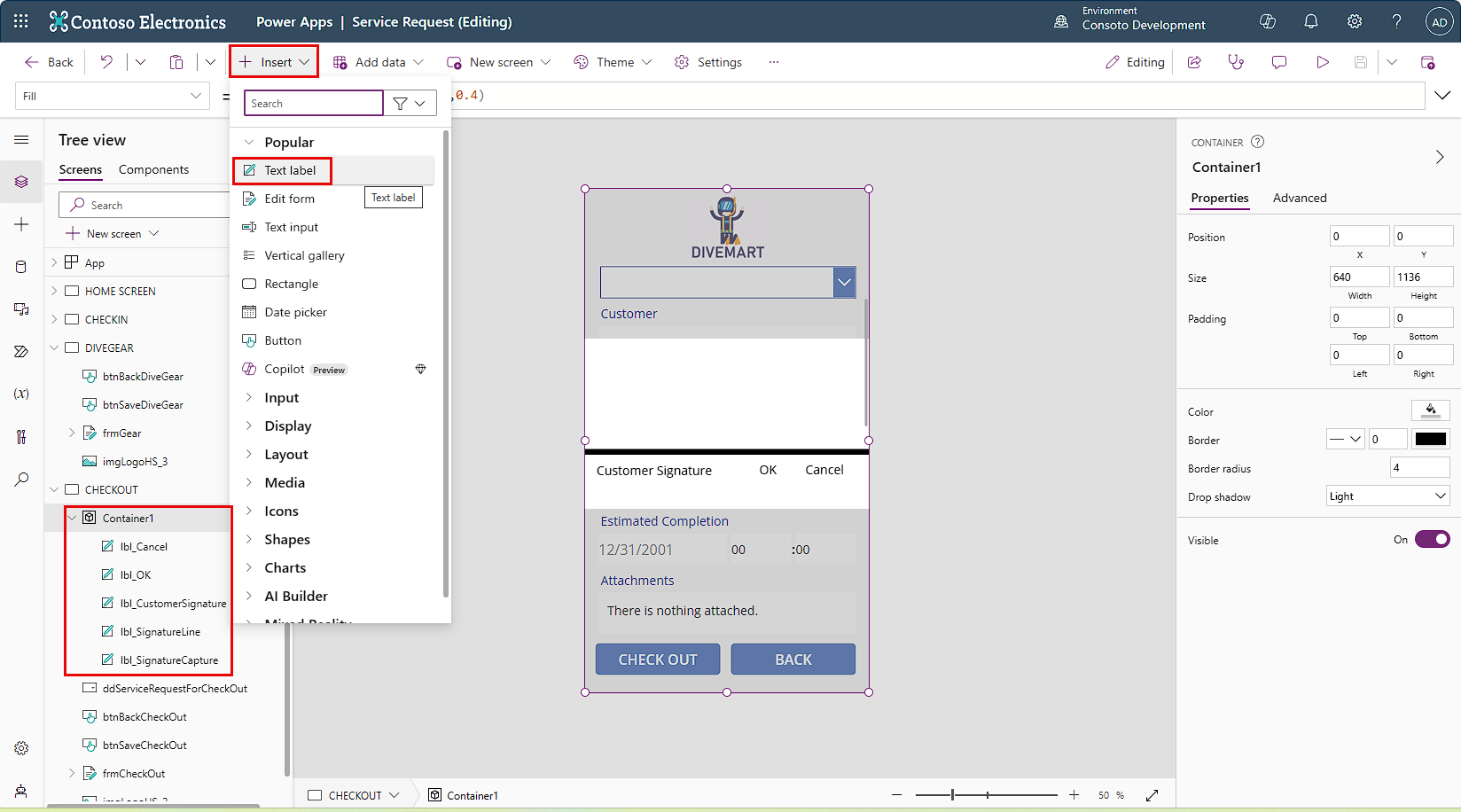
Add the following Icons controls to the container in the CHECKOUT screen. They will appear just to the left of your Cancel and OK labels and will be selectable.
Name Icon Position/Size Color ico_Cancel Cancel X: 448
Y: 615
Width: 35
Height: 39RGBA(255,0,0,1) ico_OK Check X: 346
Y: 615
Width: 35
Height: 39RGBA(51,176,75,1) To capture the customer signature, add a Pen input control into your container. Rename it PenCustomerSignature and set the properties for Show controls to Off. Set the position and size so it is above the lbl_SignatureLine control.
We will add a variable to display and hide the container with the signature-related controls based on the stage of the process. Replace the current OnSelect property of the btnSaveCheckOut button with the following PowerFx script:
Set(flgSignature, true);To display and hide the container with the signature-related controls based on the status of the flgSignature variable, set the Visible property of the container to:
flgSignatureTo provide the option to cancel the signature capture and get back to the CHECKOUT screen, set the OnSelect property of ico_Cancel with the following PowerFx script:
Reset(PenCustomerSignature);Set(flgSignature, false);To update the Service Request with the captured signature and complete the check-out process, set the OnSelect property of ico_OK with the following PowerFx script:
Patch('Service Requests',ddServiceRequestForCheckOut.Selected,{'Actual Completion':Now(),'Customer Signature':PenCustomerSignature.Image}); Reset(PenCustomerSignature); Set(flgSignature, false);At this point, you can save and play the app to test the signature capture when checking out a service request.


Create new customers feature
To let users create new customers from the CHECKIN screen, follow these steps:
Create a duplicate of the CHECKIN screen and rename it CUSTOMER. Rename the screen components and follow these steps:
Edit the frmCustomer properties to use the Contacts table as the Data source
Select the different fields that you want to provide to the users, such as First Name, Last Name, Email, and Mobile Phone.
To create the customer when the btnSaveCustomer button is selected and allow new customers to be created, enter the following PowerFx script in the OnSelect property of the button:
SubmitForm(frmCustomer); NewForm(frmCustomer); Refresh(Contacts);To navigate back to the CHECKIN screen when the btnBackCustomer button is selected, enter the following PowerFx script in the OnSelect property of the button:
Navigate(CHECKIN,ScreenTransition.Fade);To navigate from the CHECKIN to this one, unlock the properties of the data card for the Customer field of the frmCheckIn form. Resize the combo box of the data card to provide space to insert an Add icon next to it.
To navigate to the CUSTOMER screen, enter the following PowerFx script in the OnSelect property of the icon:
Navigate(CUSTOMER,ScreenTransition.Fade);To ensure that the list of customers is updated when a new customer is created, change the data source property of the Combo box to the Contacts table.
At this point, you can save and play the app to test the navigation between the screens and the creation of new dive gear.


Next steps
You now have learned how to create a Dive Center canvas app using Dataverse as the data source. Next, you will learn how to create a model-driven app.