Exercise - Creating an Excel report using a Power BI Dataset
Overview
The estimated time to complete this exercise is 30 minutes.
In this exercise, you'll complete the following tasks:
- Publish a Power BI Desktop Dataset & Report to the Power BI service
- Download, Install, and Use Analyze in Excel
- Build an Excel Report using a Power BI Dataset
Note
This exercise has been created based on the sales activities of the fictitious Wi-Fi company called SureWi, which has been provided by P3 Adaptive. The data is property of P3 Adaptive and has been shared with the purpose of demonstrating Excel and Power BI functionality with industry sample data. Any use of this data must include this attribution to P3 Adaptive. If you haven't already, download and extract the lab files from https://aka.ms/modern-analytics-labs into your C:\ANALYST-LABS folder.
Exercise 1: Publish a Power BI Desktop Dataset & Report to the Power BI service
In this exercise, you use Power BI Desktop to publish your Dataset and Report to My workspace in the Power BI service.
Task 1: Launch Power BI Desktop
In this task, you'll launch Power BI Desktop and open a PBIX file.
- Launch Power BI Desktop.
- If applicable, use the X in the upper right-hand corner to close the Welcome window.
Task 2: Open the PBIX file
In this task, you'll navigate and open the starting PBIX file with the Dataset and Report created from Lab 02.
Select File > Open report > Browse reports.
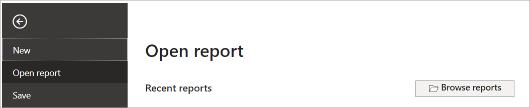
Navigate to the C:\ANALYST-LABS\Lab 03A folder.
Select the file MAIAD Lab 03A - Power BI Model.pbix and choose Open.

Task 3: Publish the PBIX file to the Service
In this task, you'll publish the Dataset and Report from the Power BI Desktop file to the Power BI service.
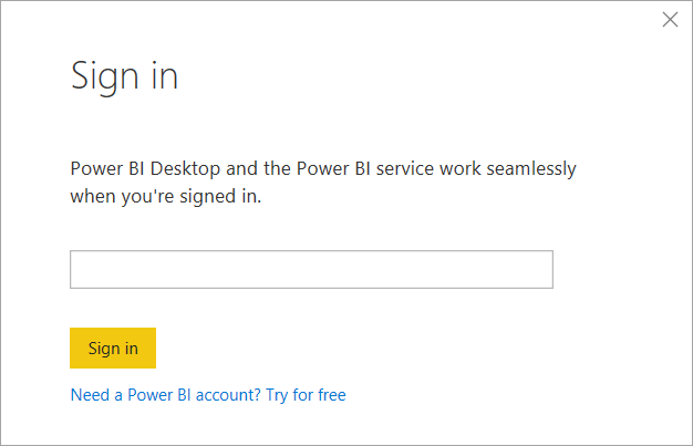
First, you need to sign in to Power BI. Select Sign in located in the upper right-hand corner of Power BI Desktop.

Next, enter your Power BI username and password. Once you're signed in, the Sign-in changes to become your name.
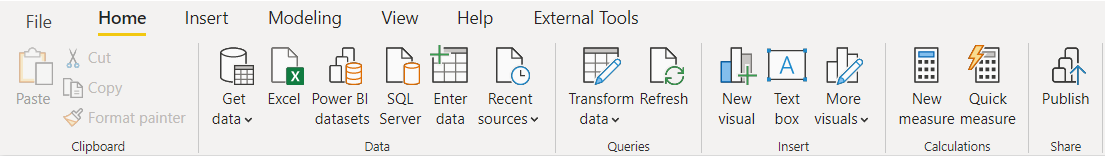
From the Home tab in the main menu, select the Publish button.
Select My workspace.
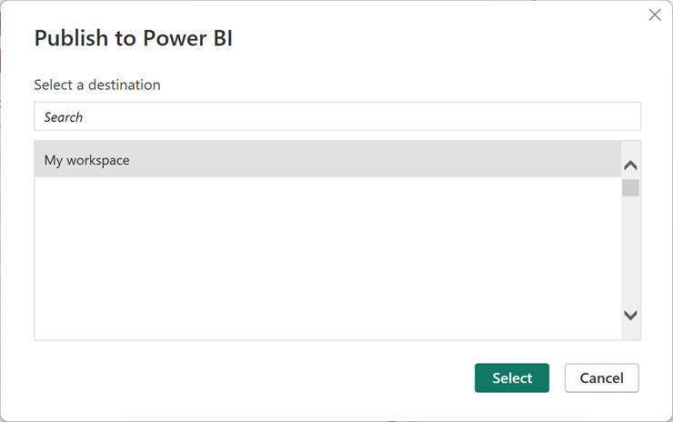
Choose the Select button to publish the data model and report page to the Power BI service.
Note
All users have My workspace in Power BI service. This is your personal sandbox. Every organization has different Workspaces. Workspaces can be created, and users can be added to Workspaces to share Datasets and Reports across the organization.
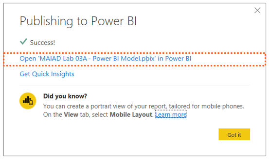
Once the publish is successful, you see the Success! message with a link that you can select to open the report in the Power BI service.
Select the Open MAIAD Lab 03A - Power BI Model.pbix in Power BI link.
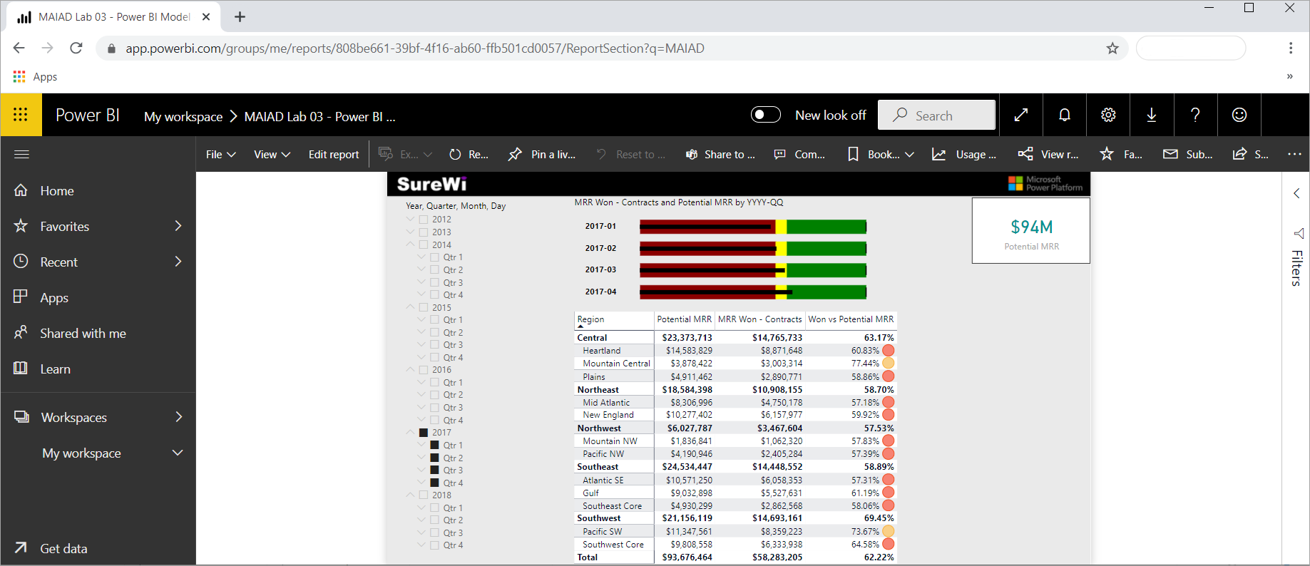
After you select the link, your browser opens and displays your report published to Power BI service in your My workspace location.
Note
To navigate directly to Power BI service, enter the URL: https://app.powerbi.com in your browser.
Note
THe selected report page, slicers, and filters are captured as default settings when published to the Power BI service.


Exercise 2: Download, install, and use Analyze in Excel
In this exercise, you'll download the Analyze in Excel libraries and use Analyze in Excel to connect to the published MAIAD Lab 03A - Power BI Model in Power BI from within the Excel application.
Task 1: Download Analyze in Excel updates
In this task, you'll download a one-time Excel library that enables Excel to connect to Power BI Datasets.
From within the Power BI service, select Analyze in Excel updates from the Downloads menu, which is in the upper right corner.
Select the Download button.

Task 2: Install Analyze in Excel
In this task, you'll install the Excel libraries that enable Excel to connect to Power BI Datasets.
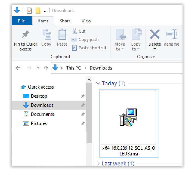
Once the download completes, the installation file will be in your default Downloads folder. Navigate to your downloaded file and double-click the file to launch the (.msi) installer wizard.
Note
You can open this file directly from your browser's Downloads section. For Firefox, this is in the top-right corner. For Microsoft Edge, this is the top-right corner under Settings and more menu. Download location varies by browser.
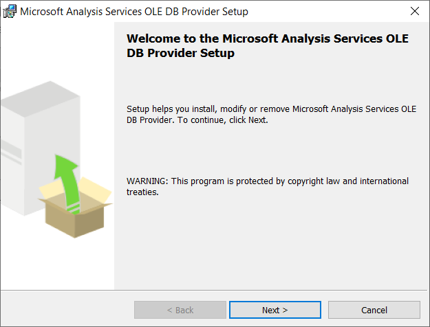
Follow the wizard steps to install the Analyze in Excel libraries.


Task 3: Launch Analyze in Excel from Datasets + dataflows
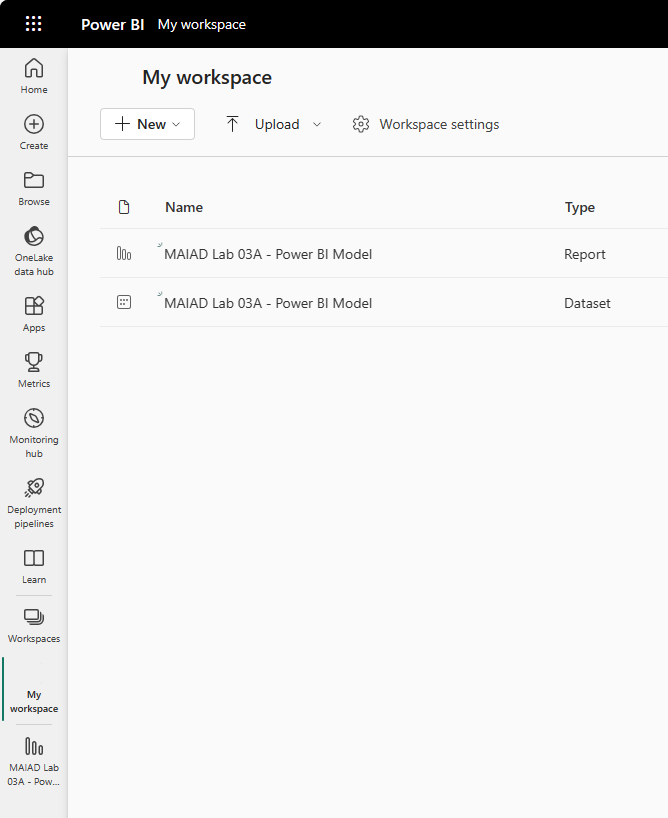
In this task, you'll navigate to the My workspace location in the Power BI service to launch Analyze in Excel using the MAIAD Lab 03A - Power BI Model Dataset.
From the left-hand pane navigation, select My workspace.
Note
When you publish your PBIX file to the service, there are two Power BI artifacts created: the Data Model and the Report.
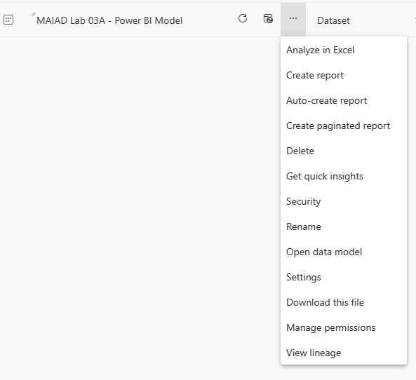
From the MAIAD Lab 03A - Power BI Model dataset, select More options, then selectAnalyze in Excel.


Task 4: Launch the Analyze in Excel file
In this task, you'l launch the Excel file that has been connected to the MAIAD Lab 03A - Power BI Model Data Model.
Select Open in Excel for the Web. Select the Editing drop-down in the top-right corner of Excel for the Web, then select Open in Desktop App to open the file in Excel on your local computer.
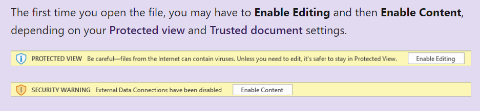
Once Excel launches, you may need to select the buttons to Enable Editing and Enable Content. This allows Excel to connect to the data model published to the Power BI service, which is an external data connection to Microsoft's Azure storage in the cloud.
Note
If you're not prompted with both the Enable Editing and Enable Content messages, you might need to check Options > Trust Center > Trust Center Settings... to ensure your Message Bar Settings are turned on.

Exercise 3: Build an Excel report using a Power BI Dataset
In this exercise, you'll create a report in Excel using the Power BI Dataset connected to MAIAD Lab 03A - Power BI Model created using Analyze in Excel. The Excel report will contain a Pivot Table, a PivotChart, and CUBE formulas.
Task 1: Add Measures to the Pivot Table Fields Values
In this task, you'll populate the Pivot Table with Measure fields from the Power BI Dataset connection.
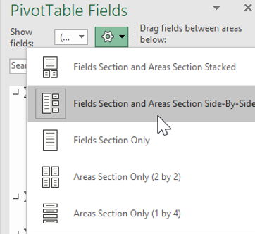
From the Pivot Table Fields window, select the Tools (gear) icon and select Fields Section and Areas Section Side-By-Side.
Note
By default, the Pivot Table Fields are displayed with the Fields Section and Areas Section Stacked. The instructions that follow have the Pivot Table Fields displayed as Fields Section and Areas Section Side-By-Side.
From the Offices measure table, drag the # of Offices measure to the Values section in the Pivot Table Fields List.
From the Contracts measure table, select the checkbox for the Total Contracts and MRR Won - Contracts measures to the Values section in the Pivot Table Fields List.
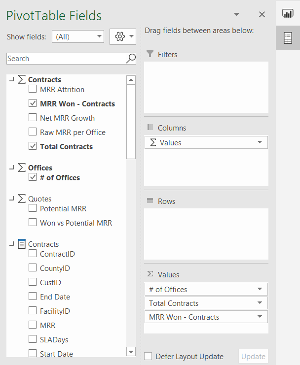
Note
When selecting fields from the measure tables, the checkbox will move the field into the Values section by default. This is because only measures can go into the Values section of a Pivot Table Field List when connecting Excel to a Power BI service Dataset.
Right-click the Pivot Table and select Pivot Table Options....
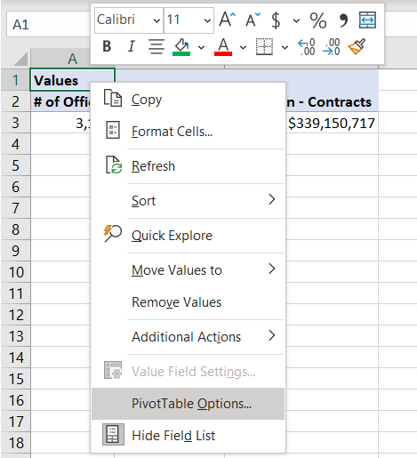
Select the Display tab, then uncheck the Show the Values row box. Select OK.
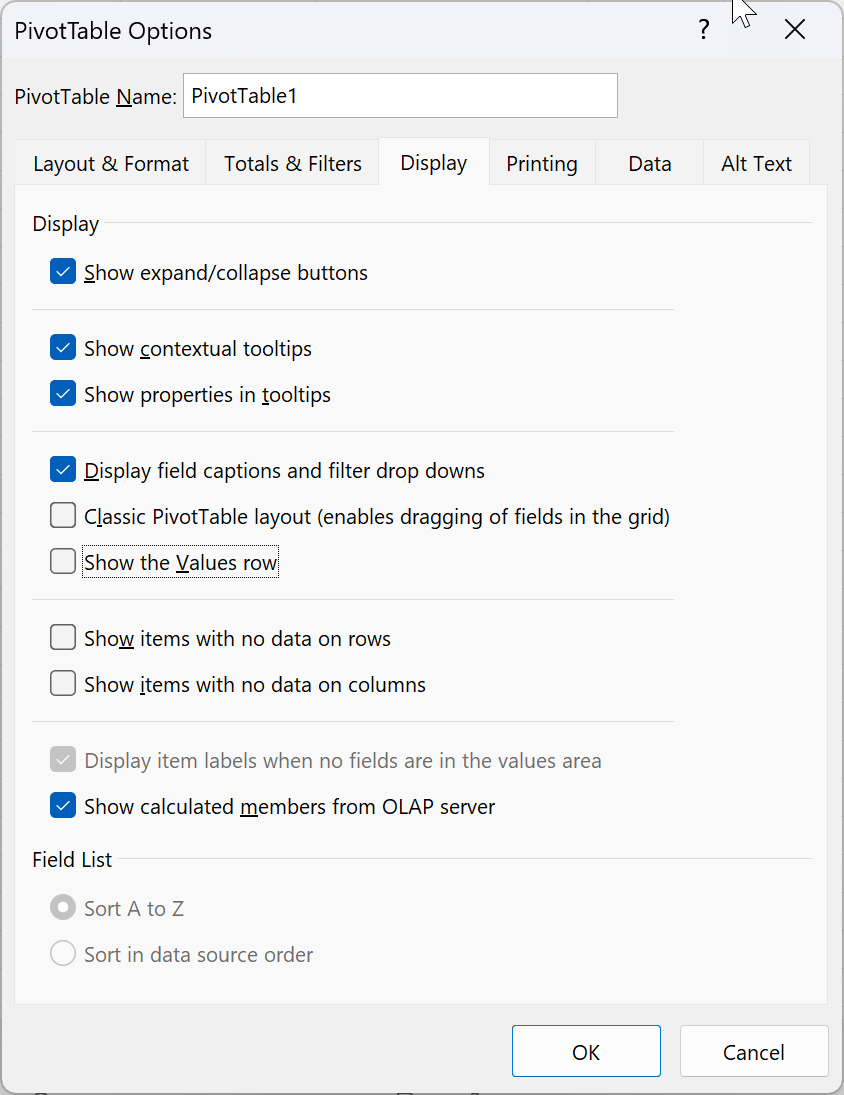
Note
This is done for aesthetic purposes, to remove the row with Values in the heading that happens by default when adding more than one measure into the Values section of the Pivot Table Fields.


Task 2: Add Fields to the Pivot Table Fields Rows
In this task, you'll populate the Pivot Table with Lookup fields from the Power BI Dataset connection.
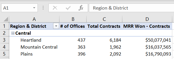
From the Offices field table, drag the Region and District columns to the Rows section in the Pivot Table Fields List.
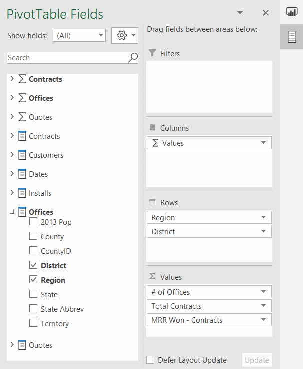
Use the mouse to place the cursor in Cell A1 and type the name Region & District into the cell to change the default heading name.


Task 3: Insert a PivotChart
In this task, you'll insert a PivotChart workspace into the Excel worksheet to the right of the Pivot Table. Then you add fields to the Axis and Values sections.
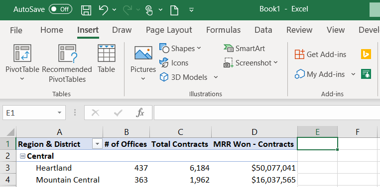
Use your mouse to select Cell E1 on the worksheet. This selects the location for the PivotChart.
 ](../media/location.png#lightbox)
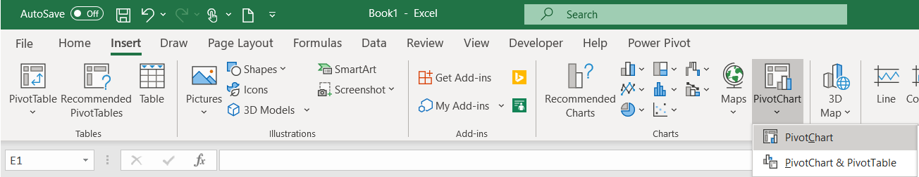
Select the Insert tab on the main menu and select the PivotChart option from the PivotChart drop-down.
On the Create PivotChart window, select the Use an external data source radio button.
Select the Choose Connection... button.
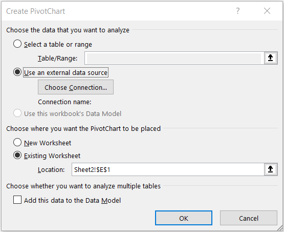
From the Connections tab and the Connections in this Workbook section, select the
pbiazure//api.powerbi.comconnection string path name to connect the PivotChart to the Power BI Dataset external data source.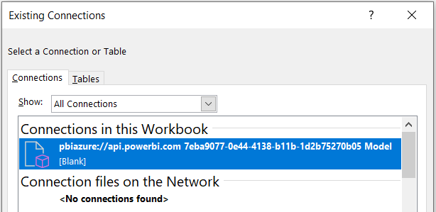
Note
The exact name of your pbiazure://api.powerbi.com connection string will be different than the one shown in the preceding image. This is the unique connection location identifier for a published Power BI dataset artifact.
Select Open, then select OK.
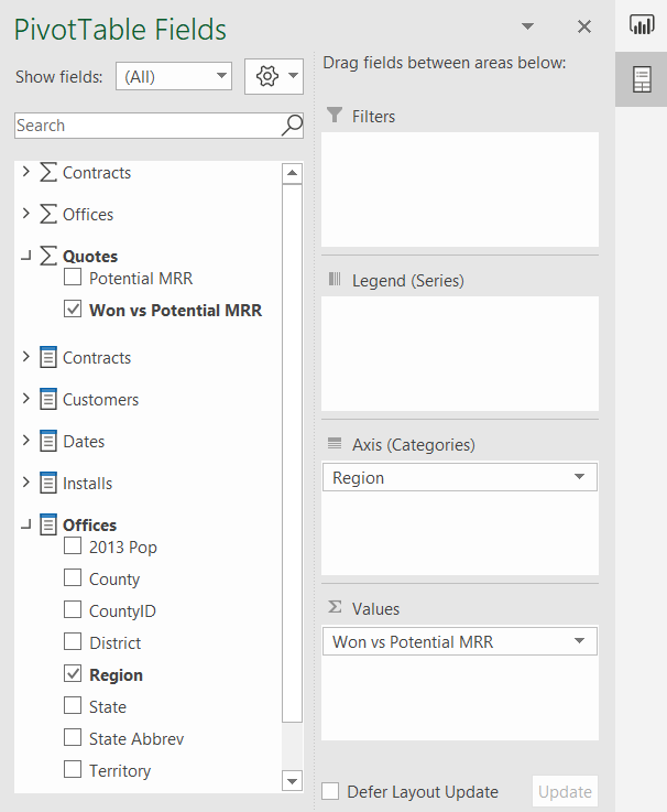
From the Quotes measure table, click the checkbox next to the Won vs Potential MRR measure to move it into the Values section in the Pivot Table Fields List.
From the Offices field table, drag the Region measure to the Axis (Categories) section in the Pivot Table Fields List.


Task 4: Format PivotChart
In this task, you'll format the PivotChart using some of the familiar formatting options in Excel.
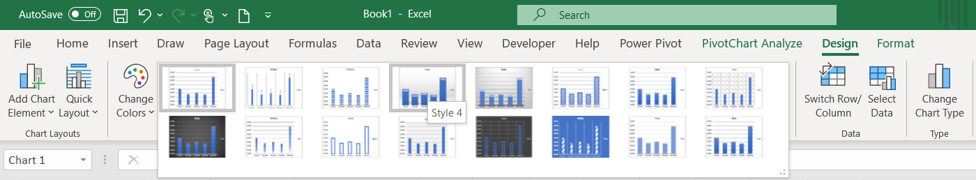
From the Design tab in the main menu, select Style 4.
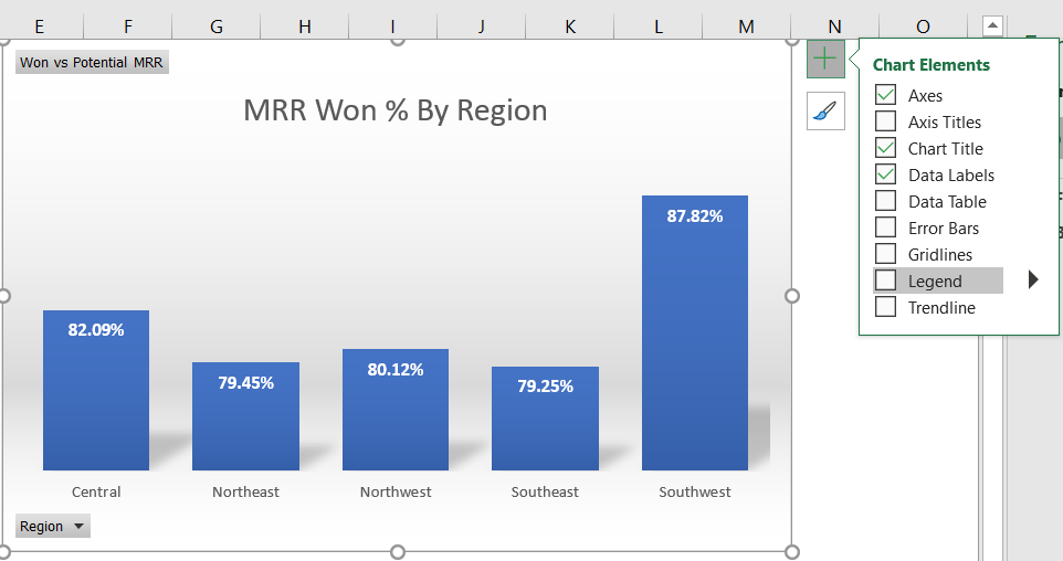
Double-click the Chart Title and change the default title text to MMR Won % by Region.
Use the mouse to hover over the upper right-hand side of the PivotChart to display the Chart Elements options and uncheck the Legend checkbox.


Task 5: Add KPIs using CUBEVALUE
In this task, you'll use CUBE formulas to create high-level KPIs for the report.
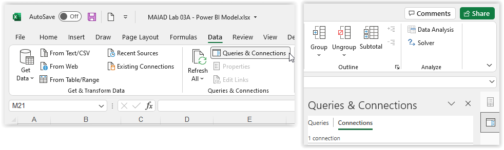
Rename the data connection with a friendly name. Select the Data tab, then select Queries & Connections to open the Queries & Connections pane along the right-hand side.
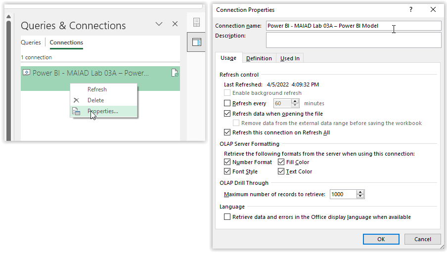
Select Connections, right-click your connection, choose Properties, and change the connection name to Power BI - MAIAD Lab 03A – Power BI Model. Select OK.
Note
The best practice when referencing data models within Excel is to provide user-friendly names for reference and to provide a detailed description about the data connection.
Right-click Row 1, then select Insert to add a row above the Pivot Table and PivotChart.
Press CTRL + Y to repeat the last step and add another row above the Pivot Table and PivotChart.
Right-click Column A, then select Insert to add a column before the Pivot Table.
Note
This provides a row and column buffer for aesthetic purposes and provides a row for a report heading and the KPIs using CUBEVALUE formulas.
Right-click Column A, select Column width, and enter 1. Select OK.
Select the Home tab. Select Row 2, then select Black in the Fill Color drop-down to create a report heading in Row 2.
Select Gold, Accent 4 in the Font Color drop-down.
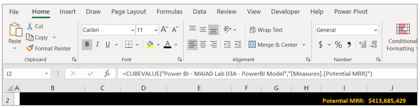
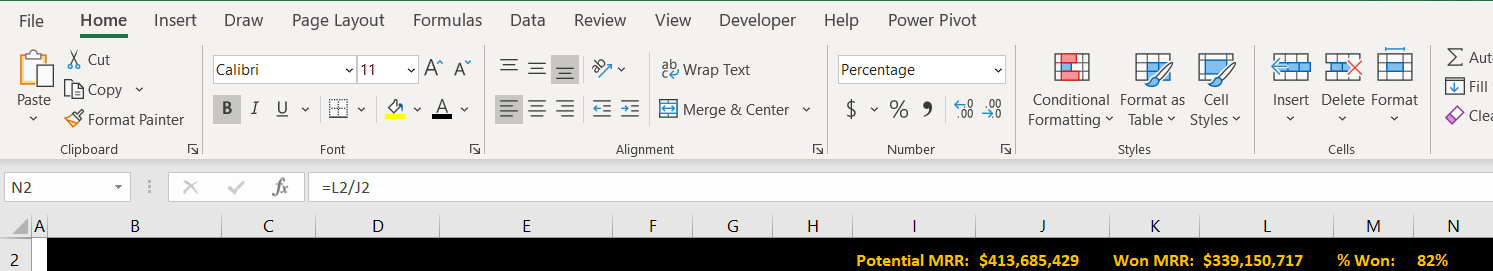
Select Cell I2 and enter the text "Potential MRR:". This will serve as the KPI description.
In Cell J2, enter the following CUBEVALUE formula and press Enter:
=CUBEVALUE("Power BI - MAIAD Lab 03A – Power BI Model","[Measures].[Potential MRR]")
Tip
As you type the CUBEVALUE formula, you'll notice that Intellisense guides you as to the syntax needed to complete the formula. A CUBEVALUE formula can be combined for use with Slicers.
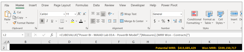
Select Cell K2 and enter the text "Won MRR:". This will serve as the KPI description.
In Cell L2, enter the following CUBEVALUE formula and press Enter:
=CUBEVALUE("Power BI - MAIAD Lab 03A – Power BI Model","[Measures].[MRR Won - Contracts]")
Select Cell M2 and enter the text "% Won:". This will serve as the KPI description.
In Cell N2, enter the following Excel formula and press Enter:
=L2/J2
Tip
You can combine the familiarity and features of Excel with Dataset published to Power BI.
Right-click Cell N2, select Format Cells, and select Percentage. Select OK.
Select File from the Main Excel Ribbon Menu, then Save a Copy.
Navigate to the C:\ANALYST-LABS\Lab 03A folder.
Save the file as MAIAD Lab 03A - Power BI Model - My Solution.xlsx.


In this exercise, you published a Power BI Desktop Dataset and Report to the Power BI service. Then you created a report in Excel with a Pivot Table, PivotChart, and CUBE functions connected to a Power BI Dataset. This final exercise illustrates what's possible when you use Power BI together with Excel.

Important
Now that you have your report created, you want to keep it updated. But don' worry, it takes just two button clicks: Data > Refresh All.
