Use Metrics Explorer to view detailed host metrics
- 5 minutes
You want to investigate how traffic flowing into your VM affects its CPU capability. If the built-in metrics charts for a VM don't already show the data you need, you can use Metrics Explorer to create customized metrics charts. In this unit, you plot a graph that displays your VM's maximum percentage CPU and average inbound flow data together.
Azure Monitor Metrics Explorer offers a UI for exploring and analyzing VM metrics. You can use Metrics Explorer to view and create custom charts for many VM host metrics in addition to the metrics shown on the built-in graphs.
Understand Metrics Explorer
To open Metrics Explorer, you can:
- Select Metrics from the VM's left navigation menu under Monitoring.
- Select the See all Metrics link next to Platform metrics on the Monitoring tab of the VM's Overview page.
- Select Metrics from the left navigation menu on the Azure Monitor Overview page.

In Metrics Explorer, you can select the following values from the dropdown fields:
- Scope: If you open Metrics Explorer from a VM, this field is prepopulated with the VM name. You can add more items with the same resource type (VMs) and location.
- Metric Namespace: Most resource types have only one namespace, but for some types, you must pick a namespace. For example, storage accounts have separate namespaces for files, tables, blobs, and queues.
- Metric: Each metrics namespace has many metrics available to choose from.
- Aggregation: For each metric, Metrics Explorer applies a default aggregation. You can use a different aggregation to get different information about the metric.
You can apply the following aggregation functions to metrics:
- Count: Counts the number of data points.
- Average (Avg): Calculates the arithmetic mean of values.
- Maximum (Max): Identifies the highest value.
- Minimum (Min): Identifies the lowest value.
- Sum: Adds up all the values.
You can select flexible time ranges for graphs from the past 30 minutes to the last 30 days, or custom ranges. You can specify time interval granularity from one minute to one month.
Create a metrics graph
To create a Metrics Explorer graph that shows host VM maximum percentage CPU and inbound flows together for the past 30 minutes:
Open Metrics Explorer by selecting See all Metrics on the VM's Monitoring tab or selecting Metrics from the VM's left navigation menu.
Scope and Metric Namespace are already populated for the host VM. Select Percentage CPU from the Metrics dropdown list.
Aggregation is automatically populated with Avg, but change it to Max.
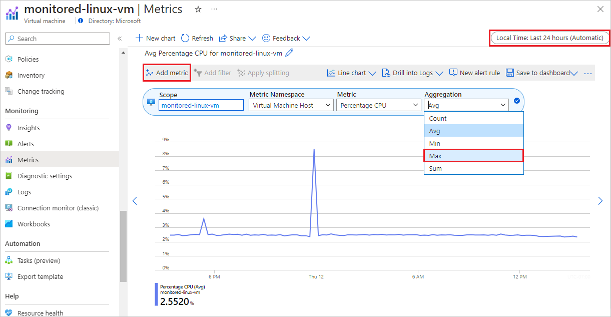
Select Add metric at upper left.
Under Metric, select Inbound Flows. Leave Aggregation at Avg.
At upper right, select Local Time: Last 24 hours (Automatic - 15 minutes), change it to Last 30 minutes, and select Apply.

Your graph should look similar to the following screenshot:
