Exercise - Style components to match your branding
In this exercise, you'll learn how to use custom CSS properties with Microsoft Graph Toolkit components to change the styling of your application.
Before you start
As a prerequisite for this exercise, you'll need to complete the previous exercise: "Change the behavior of components by using attributes."
Style the Login component to match your branding
Let's say you want to change the appearance of the button content for the Login component. In index.html, you can use the <style> tag inside <head> to customize components.
<head>
  <style>
  </style>
</head>
To customize the body of the page, add
body{}between the<style>tags. Use the following CSS property inside thebody{}selector:background-colorchanges the background color of the page to follow the background color of the themecolorchanges the text color of the page to follow the text color of the theme
To customize the Login component, add
mgt-login{}between the<style>tags. Use the following CSS properties inside themgt-login{}selector:--login-button-paddingmodifies the spacing inside the "user's mail" element. Define it as30pxfor equal space from top, bottom, left, and right.--login-signed-in-backgroundchanges the button background color toslategrey--login-popup-text-colorchanges the user profile pop-up font color toslategrey.
To customize the
Agendacomponent, addmgt-agenda{}between the<style>tags. Use the following CSS properties inside themgt-agenda{}selector:--agenda-header-font-sizechanges the font size of the agenda header to24px.--agenda-event-paddingmodifies spacing inside the events to20px.--agenda-event-background-colorchanges the event background color toslategrey.--agenda-event-box-shadowchanges the event box shadow togrey.
<head>
  <style>
    body {
      background-color: var(--fill-color);
      color: var(--neutral-foreground-rest);
    }
    mgt-login {
      --login-signed-in-background: slategrey;
      --login-button-padding: 30px;
      --login-popup-text-color: slategrey;
    }
    mgt-agenda {
      --agenda-header-font-size: 24px;
      --agenda-event-padding: 20px;
      --agenda-event-background-color: slategrey;
      --agenda-event-box-shadow: grey;
    }
  </style>
</head>
Let's add the component to toggle theme color. Open the index.html file, and add the
mgt-theme-toggletag to the<body>tag.<html> <head> ... </head> <body> <mgt-theme-toggle></mgt-theme-toggle> ... </body> </html>
The final version of the index.html file will look like this example:
<!DOCTYPE html>
<html>
<head>
  <script src="https://unpkg.com/@microsoft/mgt@3/dist/bundle/mgt-loader.js"></script>

  <style>
    body {
      background-color: var(--fill-color);
      color: var(--neutral-foreground-rest);
    }
    mgt-login {
      --login-signed-in-background: slategrey;
      --login-button-padding: 30px;
      --login-popup-text-color: slategrey;
    }
    mgt-agenda {
      --agenda-header-font-size: 24px;
      --agenda-event-padding: 20px;
      --agenda-event-background-color: slategrey;
      --agenda-event-box-shadow: grey;
    }
  </style>
</head>
<body>

  <mgt-msal2-provider client-id="[Your-Client-ID]"></mgt-msal2-provider>

  <mgt-theme-toggle></mgt-theme-toggle>
  <mgt-login>
    <template data-type="signed-in-button-content" >
      <div>
        {{personDetails.mail}}
      </div>
    </template>
  </mgt-login>

  <mgt-agenda class="agenda"
      date="June 29, 2023"
      days="3"
      group-by-day>
  </mgt-agenda>

</body>
</html>
Test your app in the browser
In Visual Studio Code, select the following key combination, and search for Live Server:
- Windows: CTRL+SHIFT+P
- macOS: COMMAND+SHIFT+P
Run Live Server to test your app.
Open your browser, and go to
http://localhost:3000.Sign in with your Microsoft 365 developer account. Consent to the required permissions, and select Accept.
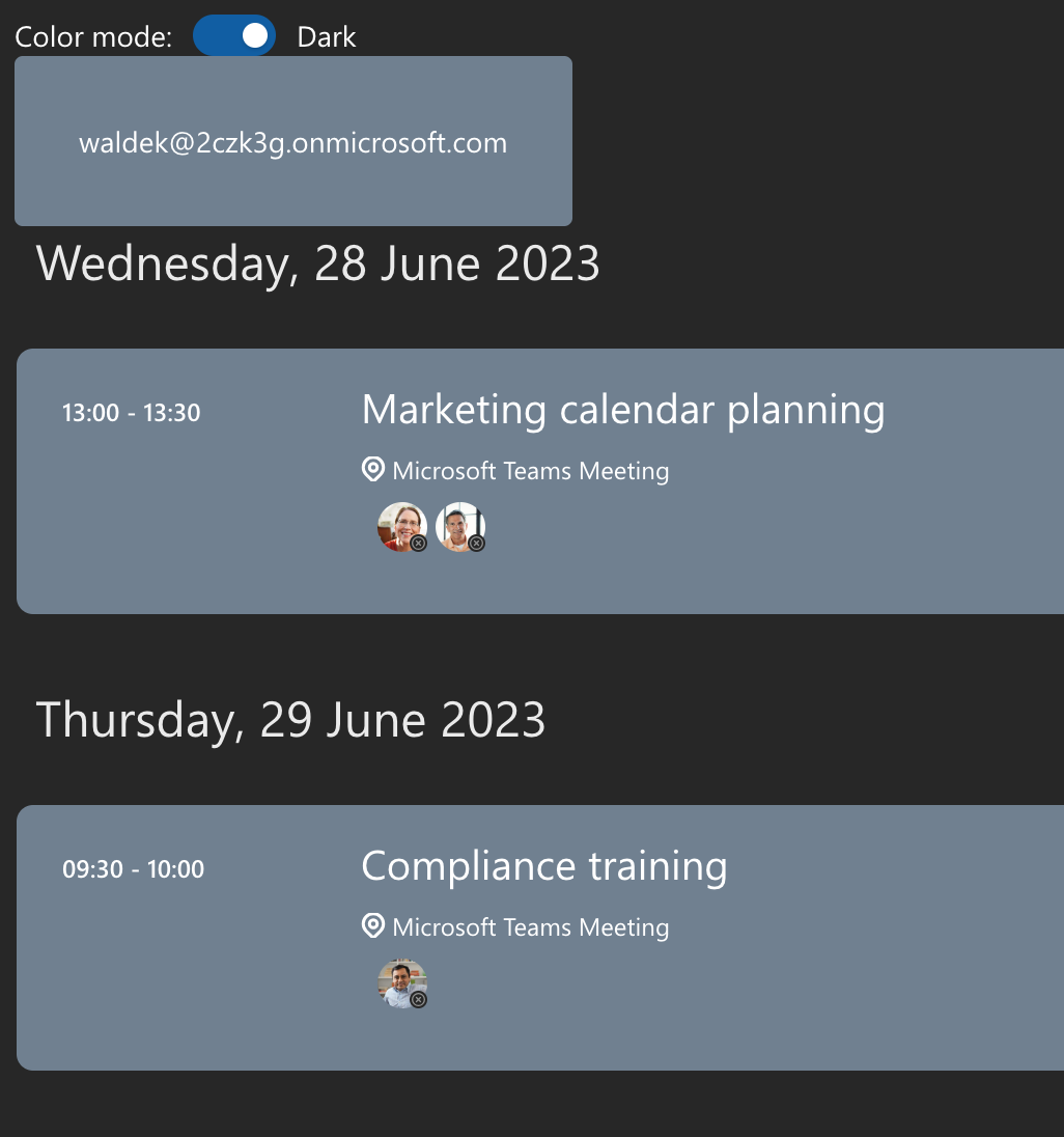
Using the theme toggle, switch the theme to Dark
Finally, you'll see that the components are automatically adapted to the dark theme and the signed-in button style has changed.
Overall, the Microsoft Graph Toolkit components are flexible when it comes to customization. You can modify the way the components look by using custom CSS properties and match them with your application's branding.