Identify outliers with Power BI visuals
An outlier is a type of anomaly in your data. It's something that you don't expect or that surprises you, based on historical averages or results. You should identify outliers to isolate data points that significantly differ from other data points, and then take action to investigate the reasons for the differences. This analysis can make a significant effect on business decision making.
Consider a scenario where you're analyzing data for a shipping warehouse. You notice that the number of orders increased above average for a specific product category. You first want to identify the product category. Then, you want to ask several questions about the outlier, like:
- Did above average shipments happen that day?
- Did this anomaly occur in a specific warehouse?
- Did a single event cause the increase in orders for that specific category?
- Did this event occur on other days in the last month, quarter, year, or prior year?
Power BI allows you to identify outliers in your data, but you first need to determine the logic behind what constitutes an outlier. You can use trigger points, such as calculations, around what you would consider the outlier to be.
The process of identifying outliers involves segmenting your data into two groups: one group is the outlier data and the other group isn't. You could use calculated columns to identify outliers, but the results would be static until you refresh the data. A better way to identify outliers is to use a visualization or measures because these methods ensure that your results are dynamic.
When you identify outliers in your data, you can use slicers or filters to highlight those outliers. You can also add a legend to your visuals so that outliers can be identified among the other data. You can then drill in to the outlier data for more detailed analysis.
Use a visual to identify outliers
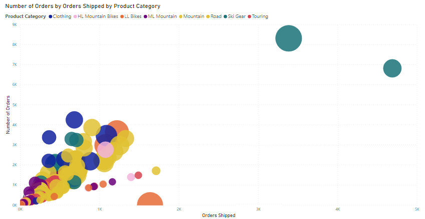
The best visual to use for identifying outliers is the scatter chart. It can show the relationship between two numerical values. Scatter charts display patterns in large sets of data and are, therefore, ideal for displaying outliers.
When you add a scatter chart to your report, put the fields of interest into the X Axis and Y Axis wells, respectively. In this case, the Orders Shipped field is on the X-axis, and the Qty Orders field is on the Y-axis.
The visual updates to show the data based on the selected fields, making it easy to spot outliers, which are the items separated from the main data points.
Now that you can identify outliers in your data, you can investigate the reasons for their existence and take corrective action.
Use measures to identify outliers
You can create a measure to identify outliers in your data based on specific values. In the following code, Order Qty is a measure in the Sales table, and Min Qty is a measure that determines the lowest order quantity in the Sales table.
Outliers =
CALCULATE (
    [Order Qty],
    FILTER (
        VALUES ( 'Product'[Product Name] ),
        COUNTROWS (
            FILTER (
                Sales,
                [Order Qty] >= [Min Qty]
            )
        ) > 0
    )
)
After you create the outlier measure, you can group products into categories and then add the measure to a scatter chart visual to analyze and act on outliers.

