Perform data exploration
Data Wrangler facilitates the exploration of your data with an easy-to-use grid interface that dynamically present summary statistics of your data.
Through the visual exploration of summary statistics, data scientists are able to select the appropriate statistical or machine learning models that best fit the data. For example, some models assume that the data is normally distributed and may not perform well if this assumption is violated.
Tip
To learn more about the fundamentals of data exploration using notebooks, see Explore data for data science with notebooks in Microsoft Fabric.
View summary statistics
For demonstration purposes, let’s generate some random data to simulate a hypothetical scenario involving house prices in a particular neighborhood.
import pandas as pd
import numpy as np

# Set the seed
np.random.seed(0)

# Define the size of the dataset
size = 500

# Generate random data
data = {
    'Size': np.random.randint(1000, 4001, size, dtype=int) // 10 * 10, # any integer value between 1000 and 4000, with multiple of 10
    'Bedrooms': np.random.choice([2, 4, 3, 2, 1], size),
    'YearBuilt': np.random.randint(1980, 2021, size), # any integer value between 1980 and 2020
    'Price': np.random.normal(loc=110000, scale=20000, size=size), # normally distributed prices
    'Type': np.random.choice(['Single Family', 'Townhouse', 'Condo', 'Duplex'], size) # type of the house
}

# Create a DataFrame
df = pd.DataFrame(data)
To view summary statistics for the df dataframe, select Data in the notebook ribbon, and then choose Launch Data Wrangler for the df dataframe.

For numerical variables, the grid displays a histogram, counts of missing and unique values, as well as the minimum and maximum values. When it comes to categorical variables, the grid offers insights into the proportion of each category within the variable.
The Summary panel provides detailed descriptive statistics and dynamically updates as you select different columns in the grid.
Group and aggregate data
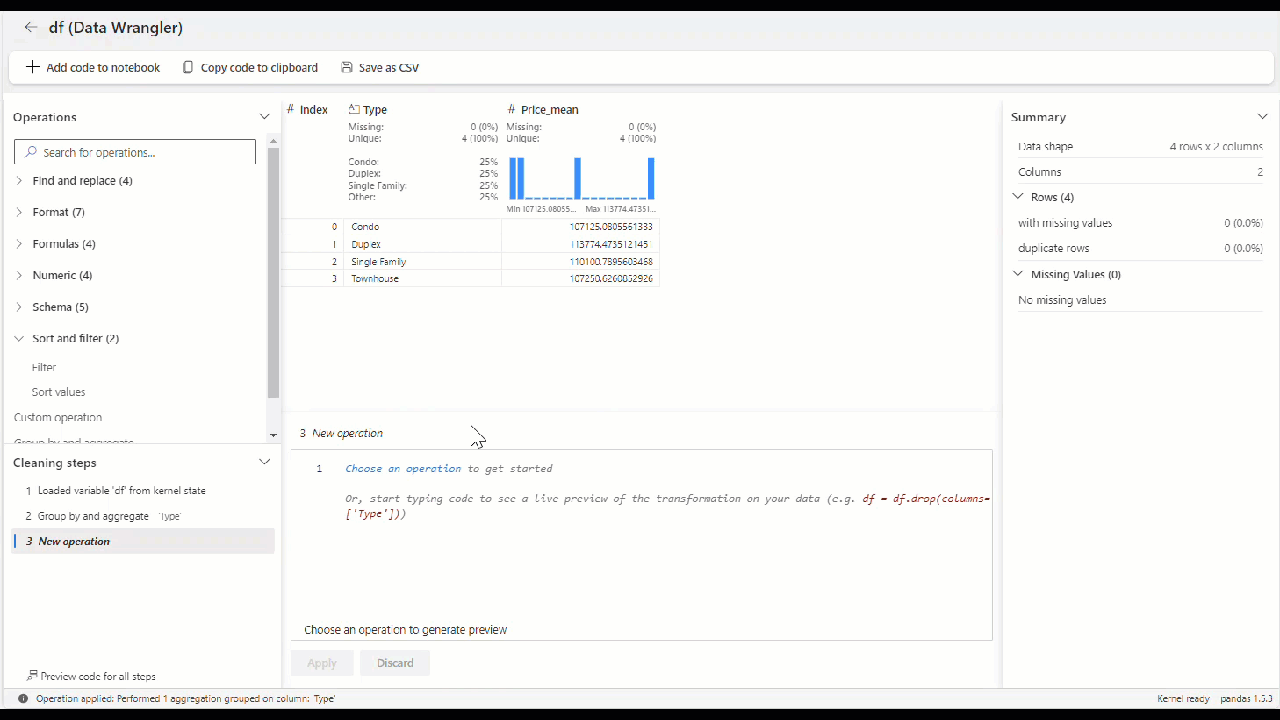
Alternatively, you can apply aggregation in your data using the Group by and aggregate operator in the operator panel.
For our house prices scenario, imagine that we need the average of house price by type.

In just a few seconds, we can configure the group by and aggregate operator, where the code is automatically generated for you. Also, the grid shows the new data in green, and the columns to be removed in red.
Once the operator is applied, this is how your final grid should appear.

At this point, you can decide to generate the code or download the transformed dataframe as a comma-separated values (CSV) file.
Generate code
In Data Wrangler, when you use any built-in or custom operators, the dataframe isn't changed until you add and execute the generated code in your notebook.
Once you've applied all the operators to transform the data, select + Add code to notebook in the toolbar above the Data Wrangler grid. This generates a function that you can then execute in your data pipeline.
This feature simplifies the data exploration and preprocessing tasks in your data science workflow.