Practice PCA
It's finally time to perform the PCA on our data. As stated before, even with fairly clean data, a lot of effort goes into preparing the data for analysis.
First, run this code:
fit = PCA()
pca = fit.fit_transform(nutr_df_TF)
Now that we've performed the PCA on our data, what do we actually have? Remember that PCA is foremost about finding the eigenvectors for our data. Then, we want to select a subset of those vectors to form the lower-dimensional subspace in which to analyze our data.
Not all eigenvectors are equal. Just a few of them will account for the majority of the variance in the data. Put another way, a subspace composed of just a few of the eigenvectors will retain the majority of the information from our data. We want to focus on those vectors.
To help us get a sense of how many vectors we should use, consider the following scree graph of the variance for the PCA components. It plots the variance explained by the components, from greatest to least.
plt.plot(fit.explained_variance_ratio_)
The output is:
[<matplotlib.lines.Line2D at 0x7f28e0c9f588>]
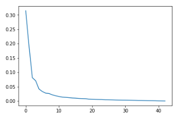
This is where data science can become an art. As a general rule, we want to look for "elbow" in the graph, which is the point at which the few components have captured the majority of the variance in the data. After that point, we're only adding complexity to the analysis for increasingly diminishing returns. In this case, that appears to be at about five components.
We can take the cumulative sum of the first five components to see how much variance they capture in total:
print(fit.explained_variance_ratio_[:5].sum())
The output is 0.6998599762716344.
Our five components capture approximately 70 percent of the variance. We can see what fewer or additional components would yield by looking at the cumulative variance for all the components:
print(fit.explained_variance_ratio_.cumsum())
The output is:
[0.31427328 0.50592605 0.58725445 0.65790094 0.69985998 0.73306959
 0.76058757 0.78686042 0.80856174 0.82704048 0.84268438 0.85623303
 0.86920214 0.88102937 0.89156926 0.90166235 0.91054636 0.91900343
 0.92709175 0.93385062 0.93993572 0.94566278 0.95116044 0.95653205
 0.96101821 0.96533821 0.9694181  0.97312722 0.97646728 0.97953211
 0.98246063 0.98517824 0.9876946  0.99000148 0.99201253 0.99389209
 0.99541908 0.99661961 0.9977484  0.99873972 0.9993591  0.99983003
 1.        ]
We also can examine this visually:
plt.plot(np.cumsum(fit.explained_variance_ratio_))
plt.title("Cumulative Explained Variance Graph")
The output is:
Text(0.5,1,'Cumulative Explained Variance Graph')
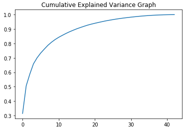
Ultimately, the number of components to use is a matter of judgment, but five vectors (and 70 percent of the variance) will suffice for our purposes.
To help with further analysis, let's now put those five components into a DataFrame:
pca_df = pd.DataFrame(pca[:, :5], index=desc_df.index)
pca_df.head()
The output is:
--------------------------------------------------------------------
|        | 0         | 1         | 2        | 3        | 4         |
--------------------------------------------------------------------
| NDB_No |           |           |          |          |           |
--------------------------------------------------------------------
| 1001   | -0.555546 | -1.505790 | 6.702793 | 2.342886 | 1.220440  |
--------------------------------------------------------------------
| 1002   | -1.546083 | -0.449361 | 6.714724 | 3.818746 | 1.871954  |
--------------------------------------------------------------------
| 1003   | -2.153483 | -3.386737 | 7.661698 | 1.456534 | 3.746811  |
--------------------------------------------------------------------
| 1004   | 3.478079  | 0.171293  | 1.768920 | 2.996483 | -1.874145 |
--------------------------------------------------------------------
| 1005   | 2.557895  | -0.278522 | 2.670310 | 2.878214 | -1.738544 |
--------------------------------------------------------------------
Each column represents one of the eigenvectors. Each row is one of the coordinates that define that vector in five-dimensional space.
We want to add the FoodGroup column back in to help with our interpretation of the data later on. Let's also rename the component-columns $c_{1}$ through $c_{5}$ so that we know what we're looking at:
pca_df = pca_df.join(desc_df)
pca_df.drop(['Shrt_Desc', 'GmWt_Desc1', 'GmWt_2', 'GmWt_Desc2', 'Refuse_Pct'],
            axis=1, inplace=True)
pca_df.rename(columns={0:'c1', 1:'c2', 2:'c3', 3:'c4', 4:'c5'},
              inplace=True)
pca_df.head()
The output is:
---------------------------------------------------------------------------------------------
|        | c1        | c2        | c3       | c4       | c5        | FoodGroup              |
---------------------------------------------------------------------------------------------
| NDB_No |           |           |          |          |           | Dairy and Egg Products |
---------------------------------------------------------------------------------------------
| 1001   | -0.555546 | -1.505790 | 6.702793 | 2.342886 | 1.220440  | Dairy and Egg Products |
---------------------------------------------------------------------------------------------
| 1002   | -1.546083 | -0.449361 | 6.714724 | 3.818746 | 1.871954  | Dairy and Egg Products |
---------------------------------------------------------------------------------------------
| 1003   | -2.153483 | -3.386737 | 7.661698 | 1.456534 | 3.746811  | Dairy and Egg Products |
---------------------------------------------------------------------------------------------
| 1004   | 3.478079  | 0.171293  | 1.768920 | 2.996483 | -1.874145 | Dairy and Egg Products |
---------------------------------------------------------------------------------------------
| 1005   | 2.557895  | -0.278522 | 2.670310 | 2.878214 | -1.738544 | Dairy and Egg Products |
---------------------------------------------------------------------------------------------
Don't worry that the FoodGroup column has all NaN values. It's not a vector, so it has no vector coordinates.
One last thing we should demonstrate is that each component is mutually perpendicular (or orthogonal, in math terms). One way of expressing that condition is that each component-vector should perfectly correspond with itself and not correlate at all (positively or negatively) with any other vector.
np.round(pca_df.corr(), 5)
The output is:
-----------------------------------------
|    | c1   | c2   | c3   | c4   | c5   |
-----------------------------------------
| c1 |  1.0 | -0.0 |  0.0 | -0.0 |  0.0 |
-----------------------------------------
| c2 | -0.0 |  1.0 | -0.0 |  0.0 | -0.0 |
-----------------------------------------
| c3 |  0.0 | -0.0 |  1.0 | -0.0 | -0.0 |
-----------------------------------------
| c4 | -0.0 |  0.0 | -0.0 |  1.0 |  0.0 |
-----------------------------------------
| c5 |  0.0 | -0.0 | -0.0 |  0.0 |  1.0 |
-----------------------------------------