Create, update and delete files within a Container
- 11 minutes
In this exercise, you'll update the existing project to store files in a SharePoint Embedded Container.
Add Microsoft Graph Type Declarations to the project
Before we create the new React components, let's start by updating out project.
Throughout this exercise, we'll use types provided by Microsoft Graph. Because we haven't installed the npm package that includes them, we need to do that first.
From the command line, run the following command from the root folder for our project:
npm install @microsoft/microsoft-graph-types -DE
Update the React Containers component to display files
Recall from the previous exercise, we left a placeholder in our Containers component that will be used to display the contents of the selected Container.
We haven't created our Files component, but let's start by updating the Containers component to replace the placeholder with the Files component we'll create.
Locate and open the ./src/components/containers.tsx file.
Add the following import statement to the list of existing imports at the top of the file:
import { Files } from "./files";
Next, locate the following placeholder code near the end of the file…
{selectedContainer && (`[[TOOD]] container "${selectedContainer.displayName}" contents go here`)}
… and replace it with the following code:
{selectedContainer && (<Files container={selectedContainer} />)}
Create the Files React component
Let's start by creating a new React component to display and manage the contents of the Containers.
Create a new file, ./src/components/files.tsx, and add the following code it. This is the boilerplate component that includes all imports and the skeleton of our component:
import React, {
  useState,
  useEffect,
  useRef
} from 'react';
import { Providers } from "@microsoft/mgt-element";
import {
  AddRegular, ArrowUploadRegular,
  FolderRegular, DocumentRegular,
  SaveRegular, DeleteRegular,
} from '@fluentui/react-icons';
import {
  Button, Link, Label, Spinner,
  Input, InputProps, InputOnChangeData,
  Dialog, DialogActions, DialogContent, DialogBody, DialogSurface, DialogTitle, DialogTrigger,
  DataGrid, DataGridProps,
  DataGridHeader, DataGridHeaderCell,
  DataGridBody, DataGridRow,
  DataGridCell,
  TableColumnDefinition, createTableColumn,
  TableRowId,
  TableCellLayout,
  OnSelectionChangeData,
  SelectionItemId,
  Toolbar, ToolbarButton,
  makeStyles
} from "@fluentui/react-components";
import {
  DriveItem
} from "@microsoft/microsoft-graph-types-beta";
import { IContainer } from "./../common/IContainer";
require('isomorphic-fetch');

interface IFilesProps {
  container: IContainer;
}

interface IDriveItemExtended extends DriveItem {
  isFolder: boolean;
  modifiedByName: string;
  iconElement: JSX.Element;
  downloadUrl: string;
}

export const Files = (props: IFilesProps) => {

  // BOOKMARK 1 - constants & hooks

  // BOOKMARK 2 - handlers go here

  // BOOKMARK 3 - component rendering return (
  return
  (
    <div>
    </div>
  );
}

export default Files;
Note
Notice the // BOOKMARK # comments in the component. These to ensure you're adding code in the correct places.
Display a list of the selected Container contents
The first thing we need to address is to display the contents of the selected Container. To do this, we'll use the DataGrid component from the Fluent UI React library.
Add the following markup inside the <div> element in the return() statement after the // BOOKMARK 3 comment:
<DataGrid
  items={driveItems}
  columns={columns}
  getRowId={(item) => item.id}
  resizableColumns
  columnSizingOptions={columnSizingOptions}
  >
  <DataGridHeader>
    <DataGridRow>
      {({ renderHeaderCell }) => (
        <DataGridHeaderCell>{renderHeaderCell()}</DataGridHeaderCell>
      )}
    </DataGridRow>
  </DataGridHeader>
  <DataGridBody<IDriveItemExtended>>
    {({ item, rowId }) => (
      <DataGridRow<IDriveItemExtended> key={rowId}>
        {({ renderCell, columnId }) => (
          <DataGridCell>
            {renderCell(item)}
          </DataGridCell>
        )}
      </DataGridRow>
    )}
  </DataGridBody>
</DataGrid>
The DataGrid contains a few references to collections, settings, and methods that we need to set up. Let's start with the visual things, then we'll get the data.
The columns in the DataGrid can be resized according to the properties we set. Create a new constant, columnSizingOptions, and add the code immediately before the // BOOKMARK 3 comment:
const columnSizingOptions = {
  driveItemName: {
    minWidth: 150,
    defaultWidth: 250,
    idealWidth: 200
  },
  lastModifiedTimestamp: {
    minWidth: 150,
    defaultWidth: 150
  },
  lastModifiedBy: {
    minWidth: 150,
    defaultWidth: 150
  },
  actions: {
    minWidth: 250,
    defaultWidth: 250
  }
};
Next, define the structure and rendering settings for all the columns in the DataGrid. Do this by creating a new collection, columns, and add it immediately before the columnSizingOptions you created:
const columns: TableColumnDefinition<IDriveItemExtended>[] = [
  createTableColumn({
    columnId: 'driveItemName',
    renderHeaderCell: () => {
      return 'Name'
    },
    renderCell: (driveItem) => {
      return (
        <TableCellLayout media={driveItem.iconElement}>
          <Link href={driveItem!.webUrl!} target='_blank'>{driveItem.name}</Link>
        </TableCellLayout>
      )
    }
  }),
  createTableColumn({
    columnId: 'lastModifiedTimestamp',
    renderHeaderCell: () => {
      return 'Last Modified'
    },
    renderCell: (driveItem) => {
      return (
        <TableCellLayout>
          {driveItem.lastModifiedDateTime}
        </TableCellLayout>
      )
    }
  }),
  createTableColumn({
    columnId: 'lastModifiedBy',
    renderHeaderCell: () => {
      return 'Last Modified By'
    },
    renderCell: (driveItem) => {
      return (
        <TableCellLayout>
          {driveItem.modifiedByName}
        </TableCellLayout>
      )
    }
  }),
  createTableColumn({
    columnId: 'actions',
    renderHeaderCell: () => {
      return 'Actions'
    },
    renderCell: (driveItem) => {
      return (
        <>
          <Button aria-label="Download"
            disabled={!selectedRows.has(driveItem.id as string)}
            icon={<SaveRegular />}>Download</Button>
          <Button aria-label="Delete"
            icon={<DeleteRegular />}>Delete</Button>
        </>
      )
    }
  }),
];
This code will use the utility method createTableColumn() to give each column an ID and specify how the header and body cells in the table are rendered.
With the DataGrid configured, add the following constants to manage the React app's state with the properties our existing code is using. Add the following code immediately before the // BOOKMARK 1 comment:
const [driveItems, setDriveItems] = useState<IDriveItemExtended[]>([]);
const [selectedRows, setSelectedRows] = useState<Set<SelectionItemId>>(new Set<TableRowId>([1]));
Now, let's add some handlers to fetch and display the data from our Container.
Add the following handler and React hook to get the contents of the selected Container. The useEffect hook will run the first time the component is rendered as well as when the <Files />component's input properties change.
Add the following code immediately before the // BOOKMARK 2 comment:
useEffect(() => {
  (async () => {
    loadItems();
  })();
}, [props]);

const loadItems = async (itemId?: string) => {
  try {
    const graphClient = Providers.globalProvider.graph.client;
    const driveId = props.container.id;
    const driveItemId = itemId || 'root';

    // get Container items at current level
    const graphResponse = await graphClient.api(`/drives/${driveId}/items/${driveItemId}/children`).get();
    const containerItems: DriveItem[] = graphResponse.value as DriveItem[]
    const items: IDriveItemExtended[] = [];
    containerItems.forEach((driveItem: DriveItem) => {
      items.push({
        ...driveItem,
        isFolder: (driveItem.folder) ? true : false,
        modifiedByName: (driveItem.lastModifiedBy?.user?.displayName) ? driveItem.lastModifiedBy!.user!.displayName : 'unknown',
        iconElement: (driveItem.folder) ? <FolderRegular /> : <DocumentRegular />,
        downloadUrl: (driveItem as any)['@microsoft.graph.downloadUrl']
      });
    });
    setDriveItems(items);
  } catch (error: any) {
    console.error(`Failed to load items: ${error.message}`);
  }
};
The loadItems function uses the Microsoft Graph client to get a list of all the files within the current folder, defaulting to the root if no folder is already selected.
It then takes the collection of DriveItems returned by the Microsoft Graph and adds a few more properties to simplify our code later. At the end of the method, it calls the setDriveitems() state accessor method that will trigger a re-rendering of the component. The driveItems are set on the DataGrid.items property that explains why the table displays some information.
Test the rendering of listing the contents of a Container
Now let's test the client-side React app to ensure the <Files /> component is displaying the contents of the selected Container.
From the command line in the root folder of the project, run the following command:
npm run start
When the browser loads, sign-in using the same Work and School account you've been using.
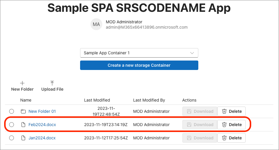
After signing-in, select an existing Container. If that Container already has some content in it, it will be displayed as follows:
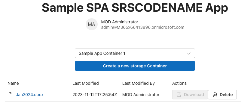
If you select the file, in this case a Word document, it will open a new tab and load the URL of the item. For this example, the file is opened in Word online.
Add support for downloading files
With the content display feature complete, let's update the component to support downloading files.
Start by adding the following code immediately before the // BOOKMARK 1 comment:
const downloadLinkRef = useRef<HTMLAnchorElement>(null);
Next, we want to make sure an item in the DataGrid is selected before they can download it. Otherwise the Download button will be disabled as it currently is.
In the DataGrid, add three properties to set it to support a single item selection mode (selectionMode), keep track of which items are selected (selectedItems), and what to do when the selection changes (onSelectionChange).
<DataGrid
  ...
  selectionMode='single'
  selectedItems={selectedRows}
  onSelectionChange={onSelectionChange}>
Next, add the following handler immediately before the // BOOKMARK 2 comment:
const onSelectionChange: DataGridProps["onSelectionChange"] = (event: React.MouseEvent | React.KeyboardEvent, data: OnSelectionChangeData): void => {
  setSelectedRows(data.selectedItems);
}
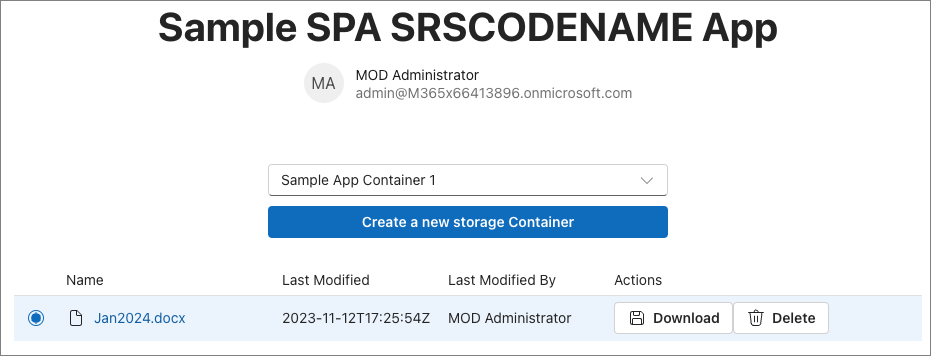
Now when an item in the list is selected, you'll see the Download button is no longer disabled.
The download option will use a hidden hyperlink that we'll programmatically first set the download link for the selected item and then programmatically do the following:
- Set the URL of the hyperlink to the download URL of the item.
- Select the hyperlink.
This will trigger the download for the user.
Add the following markup just after the opening <div> in the return() method:
<a ref={downloadLinkRef} href="" target="_blank" style={{ display: 'none' }} />
Now, locate the existing columns constant you added previously and find the createTableColumn that references the columnId: 'actions'. In the renderCell property, add a onClick handler that will call the onDownloadItemClick. The button should look like the following when you're complete:
<Button aria-label="Download"
        disabled={!selectedRows.has(driveItem.id as string)}
        icon={<SaveRegular />}
        onClick={() => onDownloadItemClick(driveItem.downloadUrl)}>Download</Button>
Finally, add the following handler immediately after the existing onSelectionChange event handler you previously added. This will handle those two programmatic steps previously mentioned:
const onDownloadItemClick = (downloadUrl: string) => {
  const link = downloadLinkRef.current;
  link!.href = downloadUrl;
  link!.click();
}
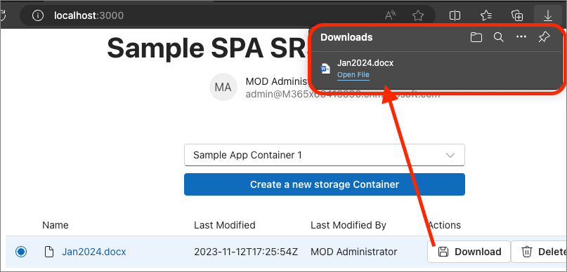
Save your changes, refresh the browser, and select the Download link to see the file get downloaded.
Add the ability to create a folder in a Container
Let's continue building out the <Files /> component by adding support to creating and displaying folders.
Start by adding the following code immediately before the // BOOKMARK 1 comment. This will add the necessary React state values we'll use:
const [folderId, setFolderId] = useState<string>('root');
const [folderName, setFolderName] = useState<string>('');
const [creatingFolder, setCreatingFolder] = useState<boolean>(false);
const [newFolderDialogOpen, setNewFolderDialogOpen] = useState(false);
To create a new folder, we'll display a dialog to the user when they select a button in the toolbar.
Within the return() method, immediately before the <DataGrid>, add the following code to implement the dialog:
<Toolbar>
  <ToolbarButton vertical icon={<AddRegular />} onClick={() => setNewFolderDialogOpen(true)}>New Folder</ToolbarButton>
</Toolbar>

<Dialog open={newFolderDialogOpen}>
  <DialogSurface>
    <DialogBody>
      <DialogTitle>Create New Folder</DialogTitle>
      <DialogContent className={styles.dialogContent}>
        <Label htmlFor={folderName}>Folder name:</Label>
        <Input id={folderName} className={styles.dialogInputControl} autoFocus required
          value={folderName} onChange={onHandleFolderNameChange}></Input>
        {creatingFolder &&
          <Spinner size='medium' label='Creating folder...' labelPosition='after' />
        }
      </DialogContent>
      <DialogActions>
        <DialogTrigger disableButtonEnhancement>
          <Button appearance="secondary" onClick={() => setNewFolderDialogOpen(false)} disabled={creatingFolder}>Cancel</Button>
        </DialogTrigger>
        <Button appearance="primary"
          onClick={onFolderCreateClick}
          disabled={creatingFolder || (folderName === '')}>Create Folder</Button>
      </DialogActions>
    </DialogBody>
  </DialogSurface>
</Dialog>
The dialog makes use of some custom styles that we haven't added yet. Do that now by first adding the following code immediately before the declaration of the Files component:
const useStyles = makeStyles({
  dialogInputControl: {
    width: '400px',
  },
  dialogContent: {
    display: 'flex',
    flexDirection: 'column',
    rowGap: '10px',
    marginBottom: '25px'
  }
});
Then, add the following code immediately before the return() method in our component:
const styles = useStyles();
Now that the UI is set up, we now need to add some handlers. Add the following handlers immediately before the // BOOKMARK 2 comment. These will handle opening the dialog, saving the value of the new folder's name, and what happens when they select the button in the dialog:
const onFolderCreateClick = async () => {
  setCreatingFolder(true);

  const currentFolderId = folderId;
  const graphClient = Providers.globalProvider.graph.client;
  const endpoint = `/drives/${props.container.id}/items/${currentFolderId}/children`;
  const data = {
    "name": folderName,
    "folder": {},
    "@microsoft.graph.conflictBehavior": "rename"
  };
  await graphClient.api(endpoint).post(data);

  await loadItems(currentFolderId);

  setCreatingFolder(false);
  setNewFolderDialogOpen(false);
};

const onHandleFolderNameChange: InputProps["onChange"] = (event: React.ChangeEvent<HTMLInputElement>, data: InputOnChangeData): void => {
  setFolderName(data?.value);
};
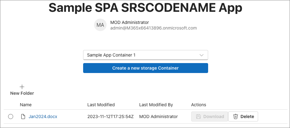
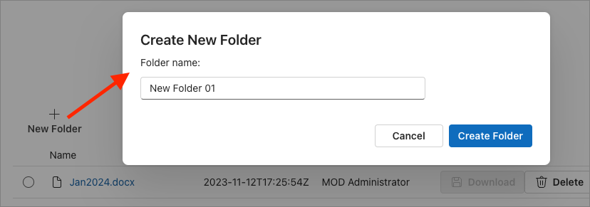
Save your changes, refresh the browser, and select the New Folder button above the Container's contents:
Select the New Folder button, enter a name, and select the Create Folder button in the dialog.
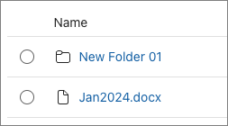
When the folder is created, you'll see it listed in the contents table:
We need to make one more change to our component. Right now, when you select a folder, it will launch the URL in a new tab leaving out app. That's not what we want… we want it to drill into the folder.
Let's fix that by locating the existing columns constant you added previously and find the createTableColumn that references the columnId: 'driveItemName'. In the renderCell property, replace the existing <Link /> component with the following code. This will generate two links based on if the current item being rendered is a folder or a file:
{(!driveItem.isFolder)
  ? <Link href={driveItem!.webUrl!} target='_blank'>{driveItem.name}</Link>
  : <Link onClick={() => {
    loadItems(driveItem.id);
    setFolderId(driveItem.id as string)
  }}>{driveItem.name}</Link>
}
Now when you select a folder, the app will show the contents of the folder.
Add ability to delete a file or folder
The next step is to add the ability to delete a folder or file from the Container.
To do this, start by adding the following code to the existing list of useState() calls before the // BOOKMARK 1 comment
const [deleteDialogOpen, setDeleteDialogOpen] = useState(false);
Next, add a dialog to act as a confirmation when the user selects the Delete button. Add the following code just after the existing <Dialog> component in the return() method:
<Dialog open={deleteDialogOpen} modalType='modal' onOpenChange={() => setSelectedRows(new Set<TableRowId>([0]))}>
  <DialogSurface>
    <DialogBody>
      <DialogTitle>Delete Item</DialogTitle>
      <DialogContent>
        <p>Are you sure you want to delete this item?</p>
      </DialogContent>
      <DialogActions>
        <DialogTrigger>
          <Button
            appearance='secondary'
            onClick={() => setDeleteDialogOpen(false)}>Cancel</Button>
        </DialogTrigger>
        <Button
          appearance='primary'
          onClick={onDeleteItemClick}>Delete</Button>
      </DialogActions>
    </DialogBody>
  </DialogSurface>
</Dialog>
Update the Delete button to do something when it's selected. Locate the existing columns constant you added previously and find the createTableColumn that references the columnId: 'actions'. In the renderCell property, add a onClick handler that will call the onDeleteDialogOpen. The button should look like the following when you're complete:
<Button aria-label="Delete"
        icon={<DeleteRegular />}
        onClick={() => setDeleteDialogOpen(true)}>Delete</Button>
Finally, add the following code immediately before the // BOOKMARK 2 comment to handle the deletion of the currently selected item:
const onDeleteItemClick = async () => {
  const graphClient = Providers.globalProvider.graph.client;
  const endpoint = `/drives/${props.container.id}/items/${selectedRows.entries().next().value[0]}`;
  await graphClient.api(endpoint).delete();
  await loadItems(folderId || 'root');
  setDeleteDialogOpen(false);
}
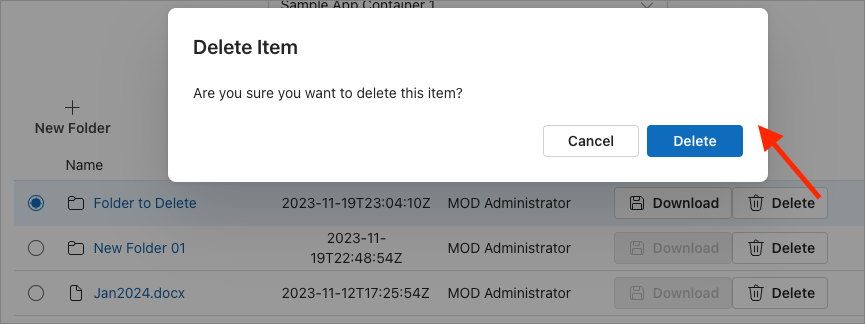
Save your changes and refresh the browser. Select the Delete button on one of the existing folders or files in your Collection. The confirmation dialog will appear and when you select the Delete button in the dialog, the Container's contents table will refresh to show the item has been deleted:
Add the ability to upload files to the Container
The last step is to add the ability to upload files to a Container or a folder within a Container.
Start by adding the following code immediately before the // BOOKMARK 1 comment:
const uploadFileRef = useRef<HTMLInputElement>(null);
Next, we'll repeat a similar technique using a hidden <Input> control to upload a file. Add the following code immediately after the opening <div> in the component's return() method:
<input ref={uploadFileRef} type="file" onChange={onUploadFileSelected} style={{ display: 'none' }} />
Add a button to the toolbar to trigger the file selection dialog. Do this by adding the following code immediately after the existing toolbar button that adds a new folder:
<ToolbarButton vertical icon={<ArrowUploadRegular />} onClick={onUploadFileClick}>Upload File</ToolbarButton>
Finally, add the following code immediately before the // BOOKMARK 2 comment to add two event handlers. The onUploadFileClick handler is triggered when you select the Upload File toolbar button and the onUploadFileSelected handler is triggered when the user selects a file:
const onUploadFileClick = () => {
  if (uploadFileRef.current) {
    uploadFileRef.current.click();
  }
};

const onUploadFileSelected = async (event: React.ChangeEvent<HTMLInputElement>) => {
  const file = event.target.files![0];
  const fileReader = new FileReader();
  fileReader.readAsArrayBuffer(file);
  fileReader.addEventListener('loadend', async (event: any) => {
    const graphClient = Providers.globalProvider.graph.client;
    const endpoint = `/drives/${props.container.id}/items/${folderId || 'root'}:/${file.name}:/content`;
    graphClient.api(endpoint).putStream(fileReader.result)
      .then(async (response) => {
        await loadItems(folderId || 'root');
      })
      .catch((error) => {
        console.error(`Failed to upload file ${file.name}: ${error.message}`);
      });
  });
  fileReader.addEventListener('error', (event: any) => {
    console.error(`Error on reading file: ${event.message}`);
  });
};
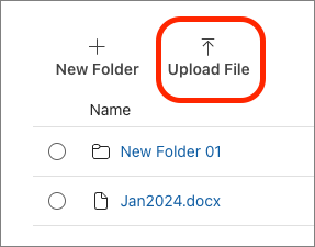
Test the changes by saving the file, refreshing the browser, and selecting the Upload File button:
After selecting a file, our app will upload the file and refresh the table of the Container's contents:
Summary
In this exercise, you updated the existing project to store and manage files in a SharePoint Embedded Container.