Exercise - Create SPFx Basic Card ACE showing SharePoint list data
In this exercise, you'll create a SharePoint Framework (SPFx) Adaptive Card Extension (ACE) with the Basic Card template that shows items in a SharePoint list and lets the user add items to the list.
Prerequisites
Developing ACEs for Viva Connections requires a Microsoft 365 tenant, SharePoint Online, and Viva Connections set up in your tenant. Use the following resources to prepare your tenant:
- Viva Connections enabled in the Microsoft 365 tenant
- SharePoint Framework: Set up your Microsoft 365 tenant
You also need the necessary developer tools installed on your workstation:
Important
In most cases, installing the latest version of the following tools is the best option. The versions listed here were used when this module was published and last tested.
- Node.js - v16.*
- Gulp-cli - v2.3.*
- Yeoman - v4.3.*
- Yeoman Generator for SharePoint - v1.17.1
- Visual Studio Code
Create a SharePoint list to store the data
The first step is to create a new SharePoint list to hold the data to display in this component.
In a browser, navigate to the SharePoint site where you want to test the project you'll create in this exercise.
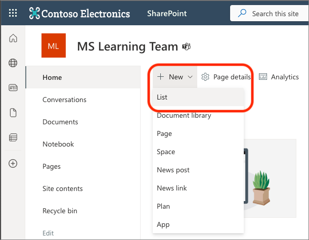
Select the New and then List from the available options:
On the Create a list dialog, select Blank list.
Set the Name of the list to ACE data and select Create.
When the browser refreshes to display the new list, select Add column, select Text, and then select the Next button. On the Create a column panel, enter the following values and select Save:
- Name: Description
- Type: Single line of text
Once you've created the list, add a few items to it.
Create and prepare the SPFx project
Open a command prompt, move to a folder where you want to create the SPFx project. Then, run the SharePoint Yeoman generator by executing the following command:
yo @microsoft/sharepoint
Use the following to complete the prompt that's displayed:
- What is your solution name?: AceSharePointRest
- Which type of client-side component to create?: Adaptive Card Extension
- Which template would you like to use?: Basic Card Template
- What is your Adaptive Card Extension name?: SharePoint REST
After provisioning the folders required for the project, the generator will install all the dependency packages by running npm install automatically. When npm completes downloading all dependencies, open the project in Visual Studio Code.
Test and explore the default ACE project
Let's take a moment to explore the default ACE project experience and understand how the project works.
In the console, execute the following statement:
gulp serve --nobrowser
In a browser, navigate to the SharePoint hosted workbench in the same site where you created the list to list items. For example, if the list URL is https://contoso.sharepoint.com/sites/MSLearningTeam/Lists/ACE%20data/AllItems.aspx, the URL for the hosted workbench is https://contoso.sharepoint.com/sites/MSLearningTeam/_layouts/15/workbench.aspx.
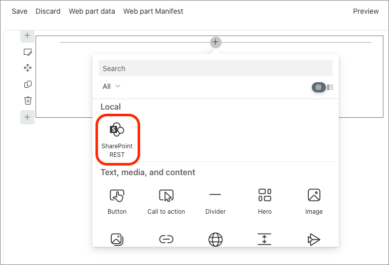
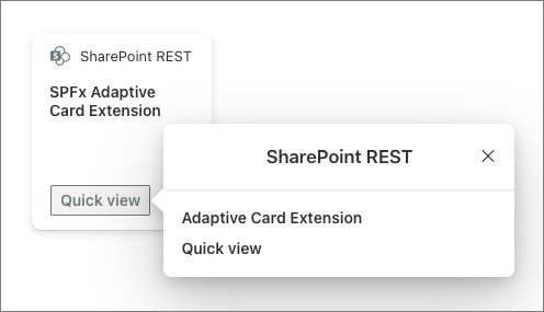
Select the + icon and then select the SharePoint REST from the toolbox:
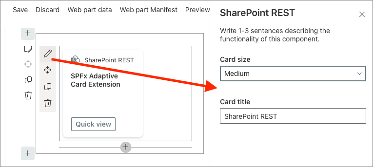
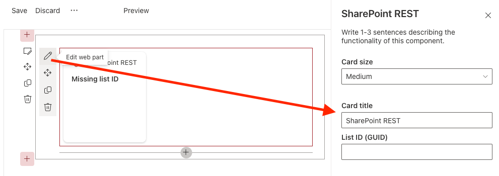
Just like a SPFx web part, you can hover the mouse over the ACE component and select the pencil icon to open the property pane:
Close the property pane by selecting the X in the top-right corner.
Unlike SPFx web parts, ACEs behave differently when the page is in edit or display mode. The page is currently in edit mode. Switch it to display mode to interact with the card by selecting the Preview button in the top right of the top navigation.
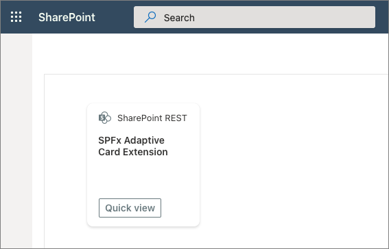
Notice all the edit tools on the side of the canvas and ACE component are no longer visible.
The default view of the ACE is the CardView. It's selectable and can contain buttons. The default ACE will open a link in a new tab when selected. This is implemented in the ./src/adaptiveCardExtensions/sharePointRest/cardView/CardView.ts file's onCardSelection() accessor method. This method can open a QuickView, an external link, or do nothing.
public get onCardSelection(): IQuickViewCardAction | IExternalLinkCardAction | undefined {
  return {
    type: 'ExternalLink',
    parameters: {
      target: 'https://www.bing.com'
    }
  };
}
CardViews can contain zero, one, or two buttons. Two buttons are only shown when card size is set to Large.
The buttons on a CardView are implemented using the cardActions() accessor method. This method can return one or two buttons. The object returned by this method determines what happens when the button is selected. For example, in the default project's code, the button opens a QuickView:
public get cardButtons(): [ICardButton] | [ICardButton, ICardButton] | undefined {
  return [
    {
      title: strings.QuickViewButton,
      action: {
        type: 'QuickView',
        parameters: {
          view: QUICK_VIEW_REGISTRY_ID
        }
      }
    }
  ];
}
QuickViews are implemented using two files and registering it with the ACE component.
The rendering of the QuickView is defined in a JSON file containing the definition of an Adaptive Card. The JSON file for the default project's QuickView is ./src/adaptiveCardExtensions/sharePointRest/quickView/template/QuickViewTemplate.json.
The QuickView is defined in the ./src/adaptiveCardExtensions/sharePointRest/quickView/QuickView.ts file. This file gives the SPFx the JSON for the Adaptive Card used in it's rendering, the data to bind to the rendering, and the handler method onAction() that's called when certain actions happen in the card.
All CardViews and QuickViews must be registered with their respective navigators in the ACE component. This is typically implemented in the onInit() method in the ACE component, the ./src/adaptiveCardExtensions/sharePointRest/SharePointRestAdaptiveCardExtension.ts in our sample project.
public onInit(): Promise<void> {
  this.state = { };

  this.cardNavigator.register(CARD_VIEW_REGISTRY_ID, () => new CardView());
  this.quickViewNavigator.register(QUICK_VIEW_REGISTRY_ID, () => new QuickView());

  return Promise.resolve();
}
Let's take this default project and make it more dynamic: reading and writing data in a SharePoint list.
Add SharePoint REST API service helper
Let's add a SharePoint REST service to the project to handle all reading and writing to the SharePoint list you created.
Create a new file ./src/adaptiveCardExtensions/sharePointRest/sp.service.ts in the project and add the following code to it:
import { AdaptiveCardExtensionContext } from '@microsoft/sp-adaptive-card-extension-base';
import { SPHttpClient } from '@microsoft/sp-http'

export interface IListItem {
  id: string;
  title: string;
  description: string;
  index: number;
}

export const fetchListTitle = async (spContext: AdaptiveCardExtensionContext, listId: string): Promise<string> => {
  if (!listId) { return Promise.reject('No listId specified.'); }

  const response = await (await spContext.spHttpClient.get(
    `${spContext.pageContext.web.absoluteUrl}/_api/web/lists/GetById(id='${listId}')/?$select=Title`,
    SPHttpClient.configurations.v1
  )).json();

  return Promise.resolve(response.Title);
}

export const fetchListItems = async (spContext: AdaptiveCardExtensionContext, listId: string): Promise<IListItem[]> => {
  if (!listId) { return Promise.reject('No listId specified.'); }

  const response = await (await spContext.spHttpClient.get(
    `${spContext.pageContext.web.absoluteUrl}/_api/web/lists/GetById(id='${listId}')/items?$select=ID,Title,Description`,
    SPHttpClient.configurations.v1
  )).json();

  if (response.value?.length > 0) {
    return Promise.resolve(response.value.map(
      (listItem: any, index: number) => {
        return <IListItem>{
          id: listItem.ID,
          title: listItem.Title,
          description: listItem.Description,
          index: index
        };
      }
    ));
  } else {
    return Promise.resolve([]);
  }
}

const getItemEntityType = async (spContext: AdaptiveCardExtensionContext, listId: string): Promise<string> => {
  const response: { ListItemEntityTypeFullName: string } = await (await spContext.spHttpClient.get(
    `${spContext.pageContext.web.absoluteUrl}/_api/web/lists/GetById(id='${listId}')?$select=ListItemEntityTypeFullName`,
    SPHttpClient.configurations.v1
  )).json();

  return response.ListItemEntityTypeFullName;
}

export const addListItem = async (
  spContext: AdaptiveCardExtensionContext,
  listId: string,
  listItemTitle: string,
  listItemDescription: string): Promise<void> => {

    // get the entity type of list item
    const entityListItemType = await getItemEntityType(spContext, listId);

    // create item to send to SP REST API
    const newListItem: any = {
      '@odata.type': entityListItemType,
      Title: listItemTitle,
      Description: listItemDescription
    };

    await spContext.spHttpClient.post(
      `${spContext.pageContext.web.absoluteUrl}/_api/web/lists/GetById(id='${listId}')/items`,
      SPHttpClient.configurations.v1,
      {
        headers: {
          'ACCEPT': 'application/json; odata.metadata=none',
          'CONTENT-TYPE': 'application/json'
        },
        body: JSON.stringify(newListItem)
      }
    );

    return Promise.resolve();
}
This service exports the following things you'll use throughout the project:
addListItem(): This method creates a new item in the specified list.fetchListTitle(): This method retrieves the title of the specified list.fetchListItems(): This method retrieves all the items in the specified list.
Update the component to display SharePoint list data
Now that the project has some core dependencies added, let's set up the ACE when it first loads. This involves setting the state of the ACE and letting the user set the ID of the SharePoint list to read from and write to.
Update the ACE to enable the user to set the SharePoint list ID
Locate the ACE class in the file ./src/adaptiveCardExtensions/sharePointRest/SharePointRestAdaptiveCardExtension.ts and open it in VS Code.
Locate the ISharePointRestAdaptiveCardExtensionProps interface and add the listId property to store the ID of the SharePoint list that contains the driver status records:
export interface ISharePointRestAdaptiveCardExtensionProps {
  title: string;
  listId: string;
}
Locate and open the file ./src/adaptiveCardExtensions/sharePointRest/SharePointRestPropertyPane.ts. Add a new PropertyPaneTextField to the groupFields array to add an option for the user to set the ID of the list that contains the driver status records:
groupFields: [
  PropertyPaneTextField('title', {
    label: strings.TitleFieldLabel
  }),
  PropertyPaneTextField('listId', {
    label: 'List ID (GUID)'
  })
]
Finally, go back to the SharePointRestAdaptiveCardExtension.ts file and add the following method to the SharePointRestAdaptiveCardExtension class. The SPFx runtime raises this event when the value of a property in the property pane changes.
You'll come back and update this method later.
protected onPropertyPaneFieldChanged(propertyPath: string, oldValue: any, newValue: any): void {
  if (propertyPath === 'listId' && newValue !== oldValue) {
    // TODO onPropertyPaneFieldChanged
  }
}
Update the ACE state and initial card view
Add the following import statement after the existing import statements in the file:
import {
  fetchListItems,
  fetchListTitle,
  IListItem
} from './sp.service';
Locate the state interface ISharePointRestAdaptiveCardExtensionState and add a few properties as shown in the following code:
export interface ISharePointRestAdaptiveCardExtensionState {
  listTitle: string;
  listItems: IListItem[];
  currentIndex: number;
}
Initialize the state property in the existing onInit() method. Replace the existing this.state = { }; with the following code:
this.state = {
  currentIndex: 0,
  listTitle: '',
  listItems: []
};
Next, add the following code to the onInit() method, immediately before the return Promise.resolve(); statement to retrieve title of the list and all items in the list, overwriting the empty values you set when initializing the state.
if (this.properties.listId) {
  Promise.all([
    this.setState({ listTitle: await fetchListTitle(this.context, this.properties.listId) }),
    this.setState({ listItems: await fetchListItems(this.context, this.properties.listId) })
  ]);
}
This code uses the await keyword but the onInit() method signature, while it returns a Promise, it doesn't have the required async keyword. Update the onInit() method declaration to include this keyword:
public async onInit(): Promise<void> { .. }
Now that the public properties and state are set for the ACE component, you need to handle when a user updates the list ID in the property pane.
Locate the onPropertyPaneFieldChanged() method and replace the // TODO onPropertyPaneFieldChanged with the following code:
if (newValue) {
  (async () => {
    this.setState({ listTitle: await fetchListTitle(this.context, newValue) });
    this.setState({ listItems: await fetchListItems(this.context, newValue) });
  })();
} else {
  this.setState({ listTitle: '' });
  this.setState({ listItems: [] });
}
At this point, the ACE component is reading the title and items in the SharePoint list. Let's now display that information in the ACE rendering.
Update the ACE CardView
Let's start with the CardView.
Locate and open the ./src/adaptiveCardExtensions/sharePointRest/cardView/CardView.ts file in VS Code.
Update the existing data() method with the following code to change the primary text displayed in the list.
public get data(): IBasicCardParameters {
  return {
    title: this.properties.title,
    primaryText: (this.state.listTitle)
      ? `View items in the '${this.state.listTitle}' list`
      : `Missing list ID`,
  };
}
Next, locate the onCardSelection() method. Change this to launch a QuickView instead of an external link by replacing the object returned with the following code:
return {
  type: 'QuickView',
  parameters: {
    view: QUICK_VIEW_REGISTRY_ID
  }
};
Update the ACE QuickView
Let's update the Adaptive Card for the QuickView to display the data from the SharePoint list as a carousel.
Locate and open the ./src/adaptiveCardExtensions/sharePointRestCrud/quickView/template/QuickViewTemplate.json file and replace its contents with the following code:
{
  "$schema": "http://adaptivecards.io/schemas/adaptive-card.json",
  "type": "AdaptiveCard",
  "version": "1.5",
  "body": [
    {
      "type": "ColumnSet",
      "columns": [
        {
          "type": "Column",
          "width": "30px",
          "items": [
            {
              "type": "Image",
              "url": "data:image/svg+xml;utf8,<svg xmlns=\"http://www.w3.org/2000/svg\" fill=\"none\" viewBox=\"0 0 24 24\" stroke-width=\"1.5\" stroke=\"currentColor\" class=\"w-6 h-6\"><path stroke-linecap=\"round\" stroke-linejoin=\"round\" d=\"M18.75 19.5l-7.5-7.5 7.5-7.5m-6 15L5.25 12l7.5-7.5\" /></svg>",
              "size": "Small",
              "width": "30px",
              "selectAction": {
                "type": "Action.Submit",
                "id": "-1",
                "title": "Previous"
              },
              "isVisible": "${previousEnabled}",
              "horizontalAlignment": "Left"
            }
          ],
          "verticalContentAlignment": "Center"
        },
        {
          "type": "Column",
          "width": "auto",
          "items": [
            {
              "type": "Container",
              "items": [
                {
                  "type": "TextBlock",
                  "text": "(${id}) ${title}",
                  "horizontalAlignment": "Center",
                  "size": "Medium",
                  "weight": "Bolder",
                  "wrap": true
                },
                {
                  "type": "TextBlock",
                  "text": "${description}",
                  "horizontalAlignment": "Center",
                  "size": "Default",
                  "wrap": true
                }
              ]
            }
          ]
        },
        {
          "type": "Column",
          "width": "30px",
          "items": [
            {
              "type": "Image",
              "url": "data:image/svg+xml;utf8,<svg xmlns=\"http://www.w3.org/2000/svg\" fill=\"none\" viewBox=\"0 0 24 24\" stroke-width=\"1.5\" stroke=\"currentColor\" class=\"w-6 h-6\"><path stroke-linecap=\"round\" stroke-linejoin=\"round\" d=\"M11.25 4.5l7.5 7.5-7.5 7.5m-6-15l7.5 7.5-7.5 7.5\" /></svg>",
              "size": "Small",
              "width": "30px",
              "selectAction": {
                "type": "Action.Submit",
                "id": "1",
                "title": "Next"
              },
              "isVisible": "${nextEnabled}",
              "horizontalAlignment": "Right"
            }
          ],
          "verticalContentAlignment": "Center"
        }
      ],
      "spacing": "None",
      "horizontalAlignment": "Center",
      "height": "stretch",
      "style": "emphasis",
      "bleed": true
    }
  ]
}
Now let's update the QuickView class.
Locate and open the ./src/adaptiveCardExtensions/sharePointRestCrud/quickView/QuickView.ts file.
Start by updating the imports section:
Add a reference to the
IActionArgumentsinterface imported from the@microsoft/sp-adaptive-card-extension-basepackage:import { ISPFxAdaptiveCard, BaseAdaptiveCardView, IActionArguments // << add } from '@microsoft/sp-adaptive-card-extension-base';Add the following code to import the interface from the SharePoint service file you added to the project:
import { IListItem } from '../sp.service';
Next, update the existing IQuickViewData interface to extend the IListItem interface and add two more properties:
export interface IQuickViewData extends IListItem {
  previousEnabled: boolean;
  nextEnabled: boolean;
}
Next, update the data() method to the following code. This will return the currently selected item retrieved from the SharePoint list, along with two more properties, as an object to the Adaptive Card rendering engine. The properties on this object are bound to specific elements in the Adaptive Card template:
public get data(): IQuickViewData {
  return {
    previousEnabled: this.state.currentIndex !== 0,
    nextEnabled: this.state.currentIndex !== (this.state.listItems.length - 1),
    ...(this.state.listItems[this.state.currentIndex])
  };
}
Next, add a new method, onAction(), to handle a submission from the QuickView's Adaptive Card. In this scenario, two images are used to cycle through the items retrieved from the SharePoint list:
public onAction(action: IActionArguments): void {
  if (action.type !== 'Submit') { return ;}

  let currentIndex = this.state.currentIndex;
  this.setState({ currentIndex: currentIndex + Number(action.id) });
}
Finally, comment out or remove the following reference to the strings object:
import * as strings from 'SharePointRestAdaptiveCardExtensionStrings';
Test the dynamic ACE
Test the ACE to verify the QuickView is working. If you previously stopped the local web server, restart it by executing the following in the console:
gulp serve --nobrowser
Navigate to the SharePoint hosted workbench to see the ACE.
Hover your mouse over the ACE component and select the pencil icon to open the property pane:
Enter the ID of the SharePoint list in the List ID textbox, then close the property pane by selecting the X icon in the upper right corner.
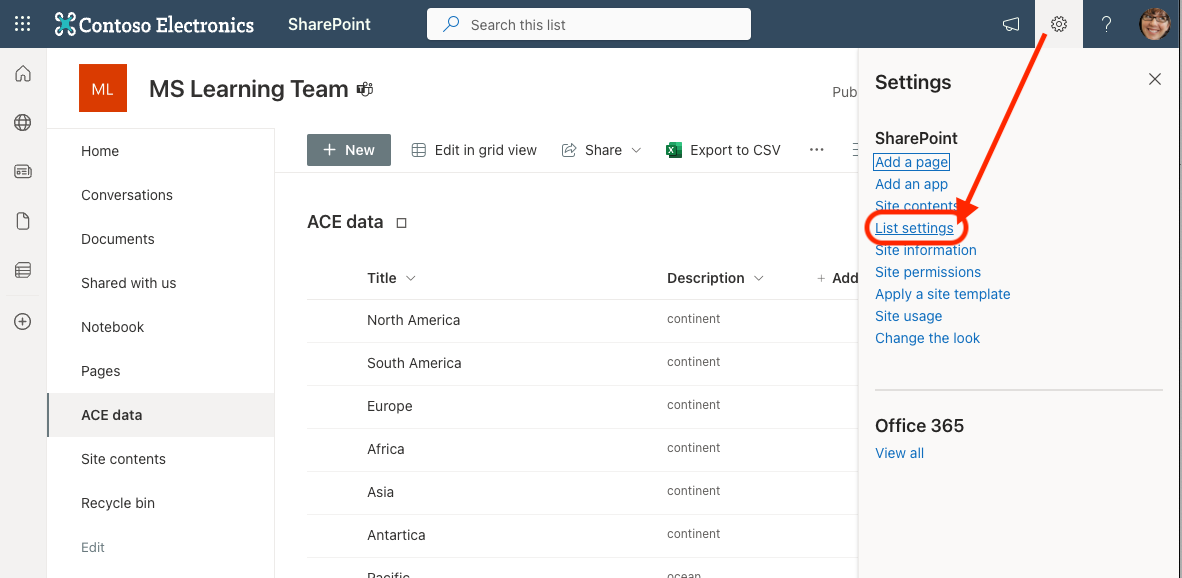
Tip
You can obtain the ID of a list from the list's settings page URL.
First browse to the list and then select the gear icon in the suite bar, then select the List settings link.
The query string of the list settings' page contains a List property, such as List=%7B93f11b8b-6201-4199-b263-3ca78408a73b%7D. This is a URL encoded string that contains GUID surrounded by {}. Remove the %7B prefix and %7D suffix to get the list's ID. For example, this list ID is 93f11b8b-6201-4199-b263-3ca78408a73b.
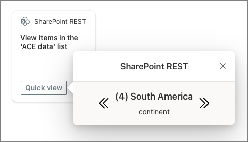
Switch to the preview mode of the ACE by selecting the Preview link in the right-most part of the toolbar on the page, then select the Quick View button on the CardView.
You'll see the new updated rendering for the QuickView and a set of arrows that will cycle through all items in the list:
Update the component to add items to the list
In this last section, add a new QuickView to add items to the SharePoint list. This demonstrates how you can use QuickViews to collect data from a form.
Create a new file, NewItemQuickView.ts, in the ./src/adaptiveCardExtensions/sharePointRest/quickView folder and add the following code to it:
import {
  ISPFxAdaptiveCard,
  BaseAdaptiveCardView,
  IActionArguments
} from '@microsoft/sp-adaptive-card-extension-base';
import {
  ISharePointRestAdaptiveCardExtensionProps,
  ISharePointRestAdaptiveCardExtensionState,
} from '../SharePointRestAdaptiveCardExtension';
import {
  fetchListItems,
  addListItem
} from '../sp.service';

export interface INewItemQuickView { }

export class NewItemQuickView extends BaseAdaptiveCardView<
  ISharePointRestAdaptiveCardExtensionProps,
  ISharePointRestAdaptiveCardExtensionState,
  NewItemQuickView
> {

  public get data(): NewItemQuickView {
    return undefined;
  }

  public get template(): ISPFxAdaptiveCard {
    return require('./template/NewItemQuickView.json');
  }

  public onAction(action: IActionArguments): void {
    if (action.type === 'Submit') {
      (async () => {
        // save item
        await addListItem(
          this.context,
          this.properties.listId,
          action.data.title,
          action.data.description
        );

        // refresh items
        this.setState({ listItems: await fetchListItems(this.context, this.properties.listId) });

        // remove quickview
        this.quickViewNavigator.close();
      })();
    }
  }

}
The interesting part of this QuickView is the onAction() method. Notice how it gets the information from the input controls in the Adaptive Card using the data property on the action: IActionArguments object passed into the method.
After saving the item to the list, it refreshes the list of items, updates the item collection on the ACE's component state, and closes the QuickView.
Now, implement the rendering for the QuickView. Create a new file NewItemQuickView.json in the ./src/adaptiveCardExtensions/sharePointRestCrud/quickView/template and add the following code to it:
{
  "$schema": "http://adaptivecards.io/schemas/adaptive-card.json",
  "type": "AdaptiveCard",
  "version": "1.5",
  "body": [{
    "type": "Container",
    "separator": true,
    "items": [
      {
        "type": "Input.Text",
        "id": "title",
        "label": "Title",
        "placeholder": "Title",
        "isMultiline": false
      },
      {
        "type": "Input.Text",
        "id": "description",
        "label": "Description",
        "placeholder": "Description",
        "isMultiline": true
      },
      {
        "type": "ActionSet",
        "actions": [{
          "type": "Action.Submit",
          "id": "save",
          "title": "Save",
          "style": "positive"
        }]
      }
    ]
  }]
}
To use this new QuickView, you need to register it:
- Open the ./src/adaptiveCardExtensions/sharePointRest/SharePointRestAdaptiveCardExtension.ts file.
Add the following
importstatement to import the NewItem QuickView:import { NewItemQuickView } from './quickView/NewItemQuickView';Locate the constants that declare the IDs of the CardView and QuickView and add the following ID for the new QuickView:
export const NEW_ITEM_QUICK_VIEW_REGISTRY_ID: string = 'SharePointRestCrud_NEW_ITEM_QUICK_VIEW';Within the
onInit()method in theSharePointRestAdaptiveCardExtensionclass, add the following code after the existing call to thethis.quickViewNavigator.register()statement that registered the StartTrip QuickView:this.quickViewNavigator.register(NEW_ITEM_QUICK_VIEW_REGISTRY_ID, () => new NewItemQuickView());
The last step is to update the CardView to trigger the new item.
Locate and open the ./src/adaptiveCardExtensions/sharePointRest/cardView/CardView.ts file.
Add the new QuickView ID exported from the
SharePointRestAdaptiveCardExtensionto the list of existing objects imported from that module:import { ISharePointRestAdaptiveCardExtensionProps, ISharePointRestAdaptiveCardExtensionState, QUICK_VIEW_REGISTRY_ID, NEW_ITEM_QUICK_VIEW_REGISTRY_ID // << add } from '../SharePointRestAdaptiveCardExtension';Next, replace the existing
cardButtons()accessor with the following code. This updated implementation will now only show a button Add item when the list ID has been set in the property pane. When this button is selected, it launches the new QuickView:public get cardButtons(): [ICardButton] | [ICardButton, ICardButton] | undefined { if (!this.properties.listId) { return undefined; } else { return [{ title: 'Add item', action: { type: 'QuickView', parameters: { view: NEW_ITEM_QUICK_VIEW_REGISTRY_ID } } }]; } }Finally, comment out or remove the following reference to the
stringsobject:import * as strings from 'SharePointRestAdaptiveCardExtensionStrings';
Test the add item QuickView ACE
Let's Test the new QuickView is working. If you previously stopped the local web server, restart it by executing the following in the console:
gulp serve --nobrowser
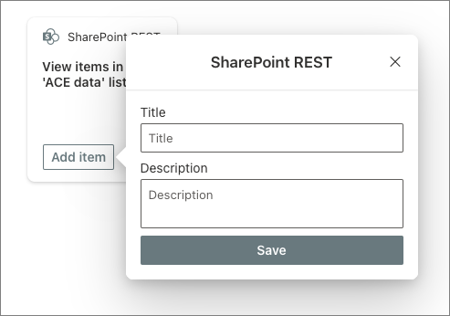
Navigate to the SharePoint hosted workbench to see the ACE. Select the Add item button on the CardView.
You'll see the new form for the new QuickView:
Add a new item to the list, then select the CardView to launch the initial QuickView. Use the arrow controls to cycle through the items until you see the new item you just added.
In this exercise, you created a SharePoint Framework (SPFx) Adaptive Card Extension (ACE) with the Basic Card template that showed items in a SharePoint list and let the user add items to the list using a QuickView.