Visualize data
One of the most intuitive ways to analyze the results of data queries is to visualize them as charts. Notebooks in Azure Databricks provide charting capabilities in the user interface, and when that functionality doesn't provide what you need, you can use one of the many Python graphics libraries to create and display data visualizations in the notebook.
Using built-in notebook charts
When you display a dataframe or run a SQL query in a Spark notebook in Azure Databricks, the results are displayed under the code cell. By default, results are rendered as a table, but you can also view the results as a visualization and customize how the chart displays the data, as shown here:
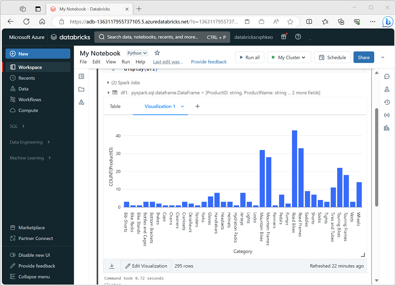
Visualization Types
These are the different kinds of visualizations you can make in Databricks, each good for certain kinds of data-insights. Key points:
Bar charts / Line charts / Area charts: for showing trends over time, categorical comparisons, or both. Useful to see how metrics evolve.
Pie charts: good for showing proportional parts of a whole (but not for time-series).
Histogram: to see distribution of numeric data (how values are spread, clustered).
Heatmap: useful for visualizing two categorical axes and coloring by a numeric value, helps see patterns across groups.
Scatter / Bubble charts: show relationship between two (or more) numeric variables; bubbles allow using size or color as a third dimension.
Box plot: to compare distributions (spread, quartiles, outliers) across categories.
Combo chart: mix of lines and bars in the same chart, helpful where you want to compare different metrics with different scales.
Pivot table: lets you reshape and aggregate data in table form (like SQL PIVOT/GROUP BY), helpful for cross-tab analyses.
Special types: cohort analysis (tracking groups over time), counter display (highlighting a single summary metric, maybe against target), funnel, map visualizations (choropleth, marker), word cloud, etc. These are more specialized.
The built-in visualization functionality in notebooks is useful when you want to quickly summarize the data visually. When you want to have more control over how the data is formatted, or to display values that you have already aggregated in a query, you should consider using a graphics package to create your own visualizations.
Using graphics packages in code
There are many graphics packages that you can use to create data visualizations in code. In particular, Python supports a large selection of packages; most of them built on the base Matplotlib library. The output from a graphics library can be rendered in a notebook, making it easy to combine code to ingest and manipulate data with inline data visualizations and markdown cells to provide commentary.
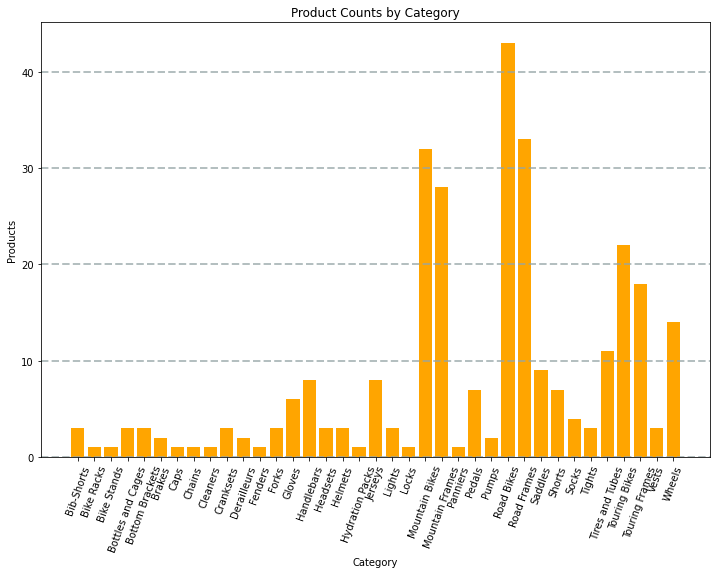
For example, you could use the following PySpark code to aggregate data from the hypothetical products data explored previously in this module, and use Matplotlib to create a chart from the aggregated data.
from matplotlib import pyplot as plt

# Get the data as a Pandas dataframe
data = spark.sql("SELECT Category, COUNT(ProductID) AS ProductCount \
                  FROM products \
                  GROUP BY Category \
                  ORDER BY Category").toPandas()

# Clear the plot area
plt.clf()

# Create a Figure
fig = plt.figure(figsize=(12,8))

# Create a bar plot of product counts by category
plt.bar(x=data['Category'], height=data['ProductCount'], color='orange')

# Customize the chart
plt.title('Product Counts by Category')
plt.xlabel('Category')
plt.ylabel('Products')
plt.grid(color='#95a5a6', linestyle='--', linewidth=2, axis='y', alpha=0.7)
plt.xticks(rotation=70)

# Show the plot area
plt.show()
The Matplotlib library requires data to be in a Pandas dataframe rather than a Spark dataframe, so the toPandas method is used to convert it. The code then creates a figure with a specified size and plots a bar chart with some custom property configuration before showing the resulting plot.
The chart produced by the code would look similar to the following image:
You can use the Matplotlib library to create many kinds of chart; or if preferred, you can use other libraries such as Seaborn to create highly customized charts.
Note
The Matplotlib and Seaborn libraries may already be installed on Databricks clusters, depending on the Databricks Runtime for the cluster. If not, or if you want to use a different library that isn't already installed, you can add it to the cluster. See Cluster Libraries in the Azure Databricks documentation for details.