Note
Access to this page requires authorization. You can try signing in or changing directories.
Access to this page requires authorization. You can try changing directories.
Advance width rule
There are two main categories of numerals.
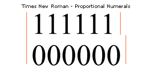
Proportional - the advanced widths of characters zero through nine are on widths in proportion to their individual character's black width. In most proportionally spaced numerals the number one is on a thinner proportional advance width than the other figures which are on the same width as the zero. Old style numerals are also considered proportional numerals.
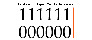
Tabular - all character's advance widths are the same value. This aids in setting numerals for data in columns.
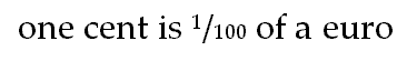
Note : Traditional non-digital typefaces offered proportional, tabular, old style and/or lining numerals. In tabular numerals the advance width and in proportional numerals any good model figure, such as the figure zero, is commonly referred to as the 'figure width' and it is used for the widths of some monetary symbols. The Dollar, Pound Sterling, Lira, Vietnamese Dong and Euro should all be on the figure width. The monetary signs Cent, Colon, Cruzeiro, French Franc, Naira, Peseta, Rupee, Won, and New Shekel may require a unique advance width.
Vertical alignments
This is the value of uppercase flat heights such as the top of the 1, 4, 5, and 7 in most typefaces with proportional and lining numerals.
Alignment rule
All figure flat characters that have the same top feature should be at the same value exactly in most text fonts.
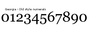
Old style numerals like the numerals in Georgia, have different alignment rules. These numerals are sometimes called hanging or x-height numerals and were offered in most traditional text fonts. They are best suited for text settings with numerals as opposed to solely numeric data. The 0, 1, and 2 align from the baseline to the x-height (rounds to overshoot heights). The numerals 3, 4, 5, 7 and 9 descend to the nearly the lowercase descender. The numerals 6 and 8 ascend to commonly the figure overshoot height.
Note : The figure 1 or 4 tops may not align with the flat numerals 5 and 7 in many serif typefaces dependent on the diagonal strokes at the top of the characters.
Round overshoot values
This is the value of figure round heights such as the 0, 2, 3, 5, 6, 8 and 9.
Overshoot rule
All other figure round characters that have the same top and bottom feature should be at the same value exactly in most text fonts. They should overshoot the baseline of the flat characters the same amount as the top overshoots the top of the figure flat characters.
Spacing rule
The most important character with regard to spacing any figure, mathematical or monetary symbol is the zero. This is the model character most type designers use to space the rest of these groups. They are used in chains to test how the current character spaces between other straight or round stems.
When spacing outlines, glyphs should be visually centered as opposed to mathematically. It is helpful in modern geometric designs to use a mathematical logic in spacing. In such a case the sidebearing values of round featured characters are mathematically the same and usually less than the flat characters values.
All characters should position in their cell in a similar way so when placed in text they space evenly. This does not mean center. It is common for some typefaces (italics) to position the black of the glyph (black width) to the right of the mathematical center of the advance width. The zero is used to test how the current character centers in the font, not in its advance width.
Superior numerals
Superior one
Unicode: U+00B9Superior two
Unicode: U+00B2Superior three
Unicode: U+00B3These characters are based on the full size numerals. A suggested scale factor of 63% in the horizontal direction and 60% in the vertical yields a good proportional superior or inferior numeral. It is always necessary to adjust the weight of the scaled numeral in making a superior or inferior character. These smaller characters need to have proportionally heavier stems than the scaling provides.
Related Unicode characters: Superior numerals and forms U+2070..208E. These characters share the same standards.
Advance width : The advance width is proportional and usually the about same as the math sign's advance width.
Alignment : The alignment of the superior numerals is unique. The round character's tops align with the round numeral tops. The flat height and baseline are centered on the round top and bottom of the zero and the difference or resulting overshoot value should be evenly distributed. The value of each overshoot should be about 60% of the figure overshoot value.
Inferior numerals are commonly placed descending below the baseline in numerals used for scientific notation and on the baseline for numerals intended to be used as shilling fraction denominators.
Inferior numerals
Inferior numerals zero to nine
Unicode: U+2080..2089Advance width : The advance width should be the same as the superior numeral's advance width.
Alignment : There are traditionally two alignments for inferior numerals.
The most useful for text and scientific notation is an alignment that descends below the baseline approximately half the inferior numeral's height.
The alignment commonly used for setting shilling fractions is on the baseline. Many typefaces also have shilling fractions with denominators that descend.
Vulgar fractions
Fraction bar
Unicode: U+2044This character is used when making fractions that are not pre-composed.
Advance width : The advance width is proportional to the design and commonly the advance width is only wide enough so it separates two numerals or superior and inferior numerals to form an inline fraction. The fraction bar will have a negative right and left sidebearing in most cases.
Alignment : The top and bottom of the bar are design dependant and commonly at the visual top and bottom of the figure height.
One quarter
Unicode: U+00BCOne half
Unicode: U+00BDThree quarters
Unicode: U+00BEThese characters are built from the inferior and superior numerals and the fraction bar.
Advance width : The advance width is proportional to the design and all fractions should share the same advance width.
Additional Unicode fraction characters:
Fraction numerator one
Unicode: U+215FThe left sidebearing should be the same as other fractions with a numerator one. The right sidebearing should be adjusted to space well when an inferior baseline numeral follows.
Alignment : The numerator aligns with the figure height and at the same position as the one in other fractions.
Case fractions - 'nut' fractions
These characters are fractions useful for setting data in tighter spaces than allowed by shilling or vulgar fractions. They are called 'nut' fractions commonly since they are placed on the en space or 'nut' of the typeface.
Design : The numerator and denominator for these fractions usually need to be smaller than the inferior and superior numerals to fit within the figure height of the typeface. Their weight should be adjusted so they do not appear too light in comparison to the rest of the typeface.
Alignment : The numerator aligns with the figure height and the denominator traditionaly sits below the baseline. It is also common for the denominator to sit on the baseline.