Note
Access to this page requires authorization. You can try signing in or changing directories.
Access to this page requires authorization. You can try changing directories.
This section covers math symbols supported by the Latin 1 code page. The characters that are less commonly used in text mathematical symbols and line drawing symbols are covered in the Symbol design section of this specification.
All math symbols are primarily used with numerals and should align, space and work well with the numerals. Many of them share the same advance width, particularly math operators. Traditionally math signs were not part of the standard font set. Math signs also traditionally are only upright. Some designers are creating and arguing about the need for italic math operators.
Math symbols advance width
Advance width is proportional to the typeface and the numeral design. Traditionally larger than the figure space width in most regular width fonts. It is common for type designers to make the math widths equal to the figure width. In some typefaces with larger numerals the math signs advance widths are smaller. Example Adobe Minion is overall a medium width typeface and its figure width is 944 units and its math widths are 1272 units. The em is 2000 units. Bookman Old Style's has very wide numerals and the figure width is 1270 and the math width is 1229. The em is 2048 units.
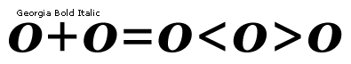
Plus sign
Unicode: U+002BAlignment : Traditionally placed slightly lower than center on the figure height. Often on the baseline.
Advance width : Advance width should be the same as the figure space width.
Spacing : This character should space between figure zeros.
Minus
Unicode: U+2212Alignment : Vertically centers on the plus sign.
Advance width : Advance width should be the same as the figure space width.
Spacing : This character should space between figure zeros.
Equals
Unicode: U+003DAlignment : Vertically centers on the plus sign.
Advance width : Advance width should be the same as the figure space width.
Spacing : This character should space between figure zeros.
Not equal
Unicode: U+2260Design : The design is based on the equals and should be the same horizontal length, vertical height and stem thickness as the equals.
Alignment : Vertically centers on the plus sign with the same alignment as the equals.
Advance width : Advance width should be the same as the figure space width.
Spacing : This character should space between figure zeros.
Less than
Unicode: U+003CGreater than
Unicode: U+003EAlignment : Traditionally placed slightly lower than center on the figure height and centering on the plus sign. Often the lowest point is on the baseline.
Advance width : Advance width should be the same as the figure space width.
Spacing : This character should space between figure zeros.
Less than or equal
Unicode: U+2264Alignment : Traditionally placed slightly lower than center on the figure height and centering on the plus sign. The bar should align with Greater Than or Equal character and PlusMinus character bars. Often the bar is also on the baseline.
Advance width : Advance width should be the same as the figure space width.
Spacing : This character should space between figure zeros.
Greater than or equal
Unicode: U+2265Alignment : Traditionally placed slightly lower than center on the figure height and centering on the plus sign. The bar should align with Less Than or Equal character and PlusMinus character bars. Often the bar is also on the baseline.
Advance width : Advance width should be the same as the figure space width.
Spacing : This character should space between figure zeros.
Plus minus
Unicode: U+00B1Design : Lower minus bar aligns with Greater Than or Equals and Less Than or Equals bar. Not necessarily on the baseline and the plus sign does not necessarily connect with the minus in all fonts.
Alignment : Bottom minus bar aligns with the Greater Than or Equals and Less Than or Equals bar and vertically visually centered on the plus sign.
Advance width : Advance width should be the same as the figure space width.
Spacing : This character should space between figure zeros.
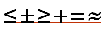
Multiply
Unicode: U+00D7Alignment : Vertically centers on the plus sign.
Advance width : Advance width should be the same as the figure space width.
Spacing : This character should space between figure zeros.
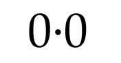
Period centered - bullet operator
Unicode: U+2219Note : In the Latin 1 code page 1252 for Windows this is the character used for position decimal 183. This is both a Math operator and centering period punctuation character used in the Catalan language. With the Catalan and Spanish keyboards this character is commonly used as a mid dot to separate lowercase and uppercase L characters that are not part of the same syllable in a word. In many typefaces the period character maybe considered too large to be used as a mid dot in the Catalan language and a substitute glyph for the lowercase l and uppercase L would be more appropriate. OpenType fonts support glyph substitution.
Design : Same design and size as the period.
Alignment : Vertically centers on the figure height.
Advance width : Advance width should be the same as the period width.
Spacing : This character should space between figure zeros.
ASCII tilde
Unicode: U+007EDesign : This character is used in mathematics as an operator for 'is proportional or similar to'. This character is also commonly used in text as a sign of approximation. The double tilde U+2248 is the correct mathematical operator for ' is approximately equal to'.
Example of common usage : One inch is ~72 point in traditonal typography.
This is not the same design and character as the lowercase spacing tilde diacritic.
Alignment : Vertically centers on the plus sign.
Advance width : Advance width should be the same as the figure space width.
Spacing : This character should space between figure zeros.
ASCII circumflex
Unicode: U+005EThis character, often called a 'caret' is used in mathematical expressions for exponents.
The expression 2^5 is read 'two to the power of five'.
It is also used by some computer programming languages as a symbol. In Pascal and Modula-2 it is used to signify a pointer to a variable.
This is not the same design and character as the lowercase spacing circumflex diacritic.
Alignment : Aligns to the figure height
Advance width : Advance width should be the same as the figure space width.
Spacing : This character should space between figure zeros.
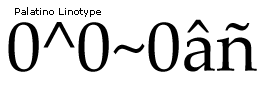
Degree
Unicode: U+00B0Alignment : Aligns to the figure height overshoot
Advance width : Advance width should be the same as the figure space width.
Spacing : This character should space between figure zeros.
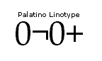
Logical not
Unicode: U+00ACThis character is used in mathematical expressions as a sign of negation.
Design : Horizontal length is the same as the horizontal length of the plus sign. Vertical stem is the same length and thickness as the plus vertical strokes. Design of the strokes is the same as the plus sign.
Alignment : Vertically centers in some designs on the plus sign or others on the figure height.
Advance width : Advance width should be the same as the figure space width.
Spacing : This character should space between figure zeros.
Approximately equal
Unicode: U+2248Alignment : Vertically centers on the plus sign.
Advance width : Advance width should be the same as the figure space width.
Spacing : This character should space between figure zeros.

Micro sign
Unicode: U+00b5Design : This character's design is commonly the same as the lowercase Greek mu U+03BC based on the lowercase u.
Alignment : Aligns with the lowercase x-height and the lowercase u.
Advance width : Advance width is commonly the same as the lowercase u and is sometimes adjusted on the left side dependent on the design.
Spacing : This character should space between figure zeros.