Note
Access to this page requires authorization. You can try signing in or changing directories.
Access to this page requires authorization. You can try changing directories.
From outlines to pixels
The outline of a glyph is a mathematical description of the glyph's shape using lines and curves (Béziers).
The particular choice of curve is irrelevant. Both quadratic and cubic Bézier curves will do, as long as we have control points. The control points are needed to scale the glyph to the desired type size and resolution (or ppem size for short).
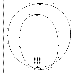
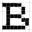
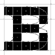
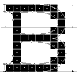
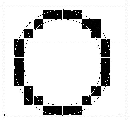
The screen is a regularly spaced grid of black and white dots (pixels).
To rasterize the glyph essentially means to turn on all pixels inside the scaled outline.
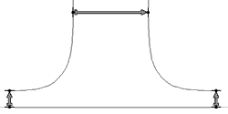
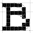
Doing so naïvely results in the above raster tragedy: disjoined arches, unequal stems, missing serifs, etc.
What went wrong?
Control point coordinates are integers. There are no decimal places or fractional numbers.
- In TrueType, the design grid (em-square) is typically 2048 by 2048 font units.
- In Type 1, the design grid is 1000 by 1000 font units. Type 1 allows decimal places. But: 253.7 out of 1000 units is the same as 2537 out of 10000. Hence, for the sake of the argument, there are no decimal places.
- The pixel grid is integer as well, there are no fractional pixels either. E.g., at 12 pt and 96 dpi, the em-square is 16 by 16 pixels. If the pixel grid were not integer, we would simply round it. On screen, we can't tell 12.2 pt from 12 anyhow.
Scaling the font
What's left to do to scale the outline is to multiply all coordinates by 16/2048, i.e., first multiply them by 16, then divide them by 2048.
The only thing that can (and will) go wrong is the division. Most integers don't divide. Therefore, the computer will have to round some numbers. This is the same as to decide for pixels. As a consequence of rounding, "things don't add up anymore." Something always has to give way. Some things (distances, proportions) must not give way.
Notice that if we were to use fractional coordinates and/or allow fractional point sizes, the computer still would have to decide for pixels. In the end, the problem with fractional numbers is the same, it is merely more difficult to understand.
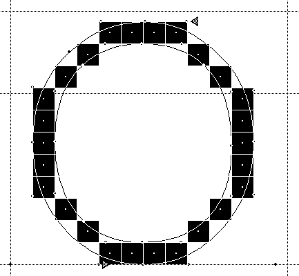
Hinting, grid-fitting, instructing
The computer has to be told, which things must not give way. This is what is colloquially called hinting. More precisely, it is called grid-fitting or instructing, since we give the computer precise instructions how to fit the outlines to the grid before turning on the pixels. The purpose of hinting is to...
- Preserve regularity of locations and distances
- Preserve near-regularity of locations and distances
- Preserve proportions
- Control digitized appearance
Can't have the cake and eat it, too
We cannot have both the left and right edge of stem in the right place and have the correct stem weight (correct in terms of pixels). We have to make a trade-off chosing one of the following:
leftEdge + stemWeight = rightEdge
rightEdge - stemWeight = leftEdge
rightEdge - leftEdge = stemWeight
The trade-offs are the variables on the right. They will have to give way.
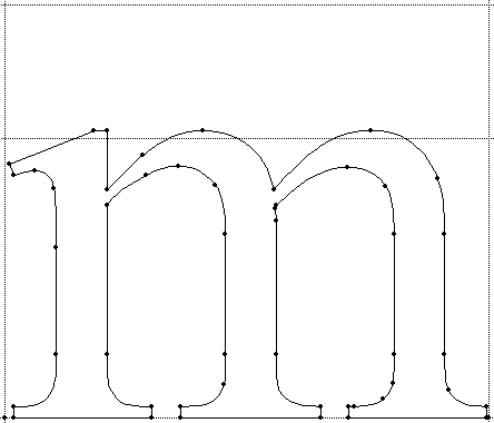
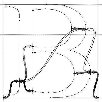
Control points galore
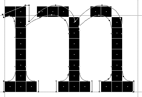
In TrueType, there is no concept of edges and stems. There are just control points.
There are on-curve points ( ) and off-curve points (
 ). Both on- and off-curve points are called control points.
VTT's "Show fewer points" hides the off-curve points.
We have to choose which control points we want to define the edge ( ).
).
x- and y-directions
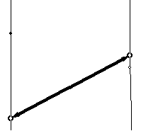
A pair of control points defines a pair of edges, which in turn delimits a stem.
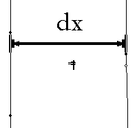
- The "horizontal portion" of the distance (= the distance in x-direction, or dx) between these control points defines the weight of a vertical stem
- The "vertical portion" of the distance (= the distance in y-direction, or dy) between these control points defines the weight of a horizontal stem
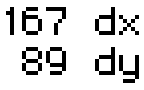
VTT's "Measuring Tool"shows measurements for both distances, in x- and in y-directions.
Vertical is x, horizontal is y?
This may be a bit confusing:
For a vertical stem, the relevant distance is in x (i.e. horizontal). We move the point in x-direction to fit it to the grid.
For a horizontal stem, the relevant distance is in y (i.e. vertical). We move the point in y-direction to fit it to the grid.
"Touched" points will be followed "accordingly"
Suppose we have grid-fitted ("touched") the above points in y-direction to control the horizontal stems. Now what about the other ("untouched") points?
They follow "accordingly," due to a pair of IUP instructions ("interpolate-untouched-points") in x-and y-direction that VTT adds at the end of the other instructions.
Always touch the "extremes":
If we don't "touch" all extremes, IUP can't interpolate all the "untouched" points between pairs of "touched" points, only shift them along with the "touched" points.
This is probably not what we want. But we may still see this intermediate stage while we're linking with "grid-fitting" turned on. Just turn it off, as desired.
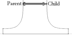
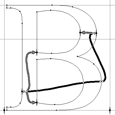
A link to preserve regular distances:
So, the left and right edge of a stem is just a pair of control points. If we move these points, the other points will follow "accordingly". Now then, let's give priority to the left edge and the stem weight.
This is what the link tool is for. It defines a relationship between:
a parent point (on the edge from which we start out) and
a child point (on the edge which has to give way in the trade-off).
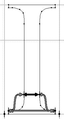
Linking across the stems preserves the weights of the stems.
Linking across the serifs preserves the weight of the serifs.
A link across a black distance keeps a minimum distance of one pixel.
bottomOfSerif + serifWeight = topOfSerif
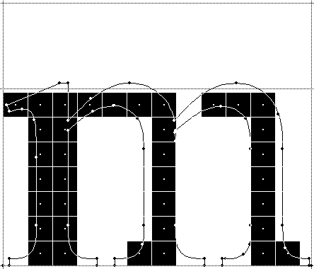
Linking across the arches (and more):
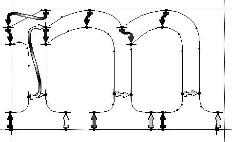
prevents arches from "drop-outs".
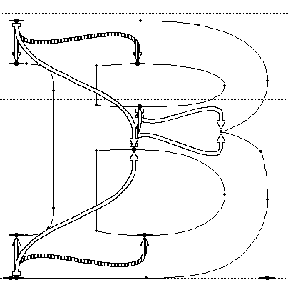
The trouble with the outlines:

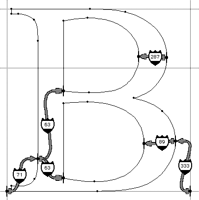
Notice the two links in x-direction across the left stem. We can see a stem, but the computer cannot. It merely sees a bunch of unrelated control points. We have to relate these control points by links or shifts, even though they are on the same edge of the stem.
But why are there two links, rather than four? IUP[X] will take care of the others if there is no gap between them.
Compare this to the vstem or hstem hints in Type 1.
There are really no stems, just control points:
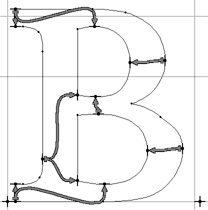
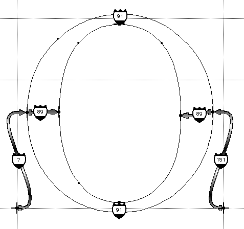
How many links for the "Croatian d"?
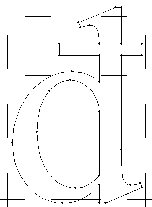
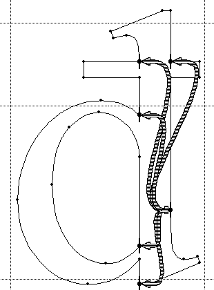
Fortunately, this case is rare.
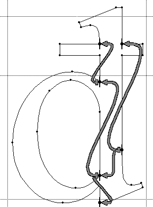
Arrows link one parent point on the stem to three child points. Two child points link as parents to other points.
Also, there are different ways to do it.
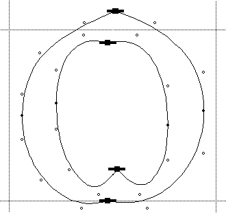
Linking across the counters:
regularly spaces the stems. A link can entail another link, which in turn can entail a third one etc.
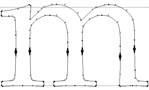
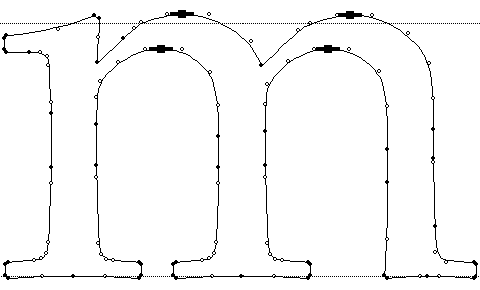
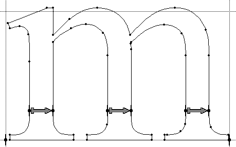
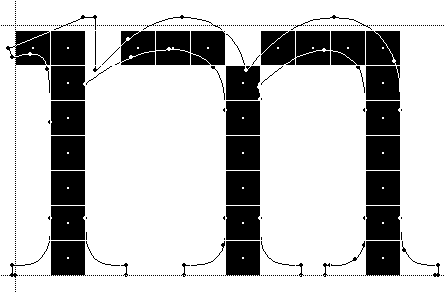
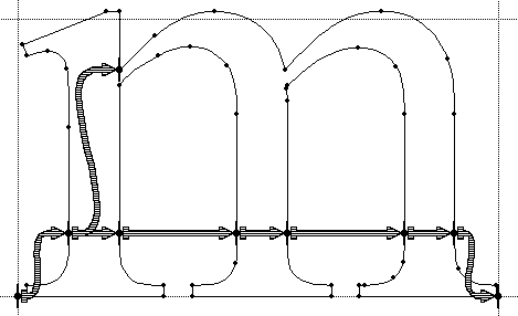
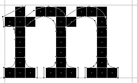
A perfect 'm'?
The chain of links goes from the left to the right sidebearing in 7 steps. Each step may be off by ½ pixel. Therefore, the right sidebearing may be off by 3½ pixels.
Trade-off: proportion (width vs. height), advance width, wysiwyg.
At 96 dpi, 3½ pixels is 50% of the x-height (of 7 pixels). In contrast, at 600 dpi, 3½ pixels is only 8% of the x-height. How is that going to "line up" such as to see what you get?
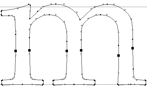
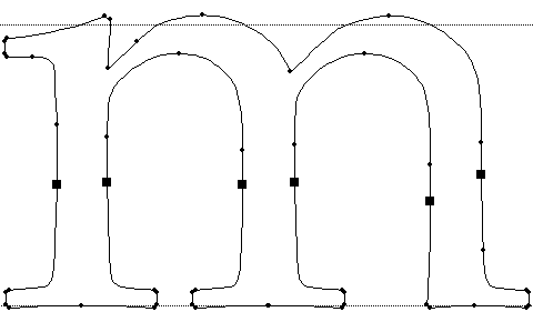
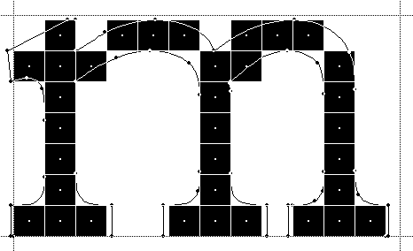
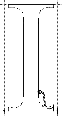
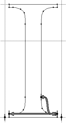
Other linking strategies
- We can link the left edges of the stems, rather than the counters, reducing the chain to 4 steps.
Trade-off: counters, wysiwyg to a lesser degree. - We can link outside-in, not left-to-right, for unconditional wysiwyg. Trade-off: spacing of stems for an odd number of pixels.
- For an extra bold m we may wish to reduce the middle stem to 1 pixel.
- etc.
- Compare this to the vstem3 hint in Type 1. We don't have to know what it does, nor can we do anything if it doesn't do what we want it to.
Other ways to go "too far"
 |
 |
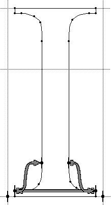 |
 |
A link too many would create a circular chain of links. This means that nothing can give way. But we can't keep passing the buck around in a circle. Something always has to give way.
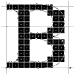
An interpolation to preserve proportions:
This looks fairly acceptable at 12 pt and 96 dpi.
Proportions of the counters or location of the middle crossbar:
It is still fine at 10, but not at 8 and 6 pt. At 8 and 6 pt, the cap height must have rounded down, while the location of the middle bar appears to have rounded up. The proportions don't add up to the capheight.
An interpolation to place the crossbar:
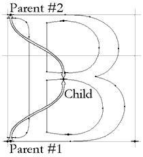
Arrows indicate control of a point on the middle bar using interpolation between points on the top and bottom edges.
The interpolation doesn't preserve a distance from a parent to a child. The interpolation preserves the proportion of the distance from parent #1 to a child, relative to the total distance from parent #1 to parent #2. It does so in terms of pixels.
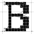
The crossbars are all set:
- We can interpolate the bottom edge of the middle crossbar and link to its top edge.
Trade-off: This tends to push the crossbar up (but works fine for the B). - We can interpolate the top edge of the crossbar and link down.
Trade-off: This tends to push the crossbar down (which may be better for the A). - Compare this to the hstem3 hint in Type 1.
While we're interpolating:
Arrows indicate control of a point on the right edge of the top bowl by interpolation between points on the left stem and the right edge of the bottom bowl.
One way to horizontally align the top bowl with the bottom one.
Proportionally placing strokes

This works fine with an interpolation. But we might just as well link them. A link across a white or grey distance does not keep a minimum distance. Eventually, the distance rounds down to 0 pixels, and remains 0 for smaller sizes (consistency).
A bad interpolation:
Arrows indicate control of a point on the bottom bowl by extrapolation from a point on the left stem and a point on the right edge of the top bowl.
The interpolation doesn't work the other way round. We cannot extrapolate the position of the bottom bowl relative to the top bowl. The child point has to be between the parent points.
Placing children between parents:


At 8 and 6 pt, the point at the crotch between the two bowls is roughly in the center of the middle crossbar, while at 7 pt it isn't.
A good interpolation:
Extremal points don't know where to go. We have to tell them. What were parent and child for the link become parents for the interpolation.
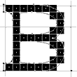
Interpolations to keep children inside:
What a difference a pixel makes. Notice that this last interpolation is relevant to many point sizes, although we're merely looking at one of them. The fact that the 6 pt B has rather odd bowls is another problem, quite specific to that point size.
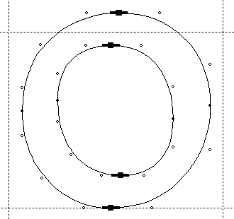
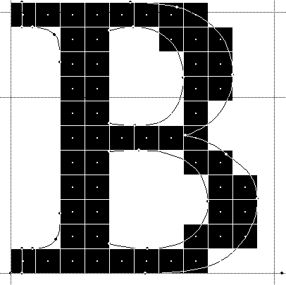
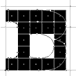
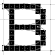
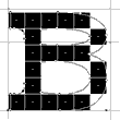
Control value table entries to control near regularities:
The B at 12, 11, and 10 pt: By design, the round vertical strokes are a bit wider than the straight ones. We can't see this at 12 and 10 pt. In contrast, at 11 pt we can see a bit too much.
The role of the control value table
The round stroke is just over 1½ pixels, which rounds up to 2 pixels. The straight stroke is just under 1½ pixels, which rounds down to 1 pixel.
We need a common reference distance that both strokes can refer to. A control value is a dominant width or length of a group of features such as the stem width or the serif length. Control values are tabulated in the control value table (cvt). You'll have to populate the cvt by measuring the character's features.
Compare this to blue values and dictionaries in Type 1.
How do control values work?
The pre-program (prep) scales the control values for the desired ppem size. In the prep, we can adjust, at and below which ppem size the scaled cvt values for straight and round strokes should be the same, and similar. Links can then use the respective values from the cvt, rather than using the actual distance between the two control points. As a result, we have
leftEdge + stemWeightFromCvtForRoundStrokes = rightEdge
leftEdge + stemWeightFromCvtForStraightStrokes = rightEdge
yielding the same stem weights for the set ppem size and below.
Which cvts to use?
Cvts are attributed by:
- Character group (UC, LC, ...)
- Link color (black, white, grey)
- Link Direction (x, y, diagonal)
- Feature (distance, straight or round stroke, left or right sidebearing, absolute or relative height, ...)
VTT will pick the best match for a given attribute and the actual distance. We can override this choice.
Using cvts
Compare this to hint replacement commands in Type 1.
We just put the right cvts in the right places, but we have to put them there at all. Then we can override at what size a 1 pixel stem becomes 2 pixels. We can also override whether e.g. the round strokes should be tied to the straight ones or vice versa for more contrast at smaller sizes.
Other reason for cvts
- Even strokes that appear to have the same weight sometimes don't.
- Outlines may have been scanned in from hand-drawings.
- Outlines may have been converted from other outline formats. For example, cubic Bézier curves (Type 1) don't convert to quadratic Bézier curves (TrueType) identically. The math can only approximate them, at the expense of the total number of control points (and font size).
- Straight lines are still a problem. For example, going from Type 1 to TrueType, the conversion must scale from a 1000 by 1000 grid to a 2048 by 2048 grid. To do so it has to multiply all coordinates by 2048/1000. The problem is the division, again.
- We'll use average stroke weight for actual cvt value.
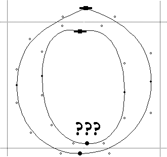
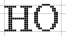
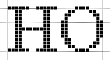
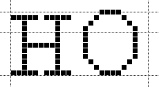
Other places for cvts
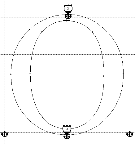
The O looks fairly straightforward to do. The question mark merely indicates VTT didn't find a cvt for UC White X LSB.
Cvts for height guidelines
Cvts for height guidelines are a bit tricky. We have to store the absolute value (base line, cap height) for the squares (like the H), and relative value (over- and undershoot) for the rounds (like the O). We would like to link from the cap height to the cap height overshoot and from the base line to the base line undershoot, using the same cvt both times. But the O has no control points on the cap height or on the base line. Therefore, we have to simulate this behaviour.
Anchoring control points on height guidelines
Anchor icons on control points indicate anchoring control points. Anchor icons with a badge indicate anchors that have associated CVTs.
VTT will pick a cvt for the height if it is attributed as "Grey-Y-Absolute (or Relative) Height" We can override this choice.
The 'O' with anchors and cvt numbers:
In daily font production, you may start with the heights and then go from there with links and interpolates. But we first had to learn about things not adding up and how links and cvts can fix this.
We use cvts for squares as well. Like this we can tweak the cap height for coordination of the roman with the italic or the bold.
Compare this to the blue lines in Type 1.
Deltas for digitised appearance
Grid-fitting is
- ppem size independent
- pixel size independent
Links round strokes to the nearest number of pixels at any ppem size, and using cvts makes them come out the same width. Links do not specify a number of pixels nor address a specific pixel.
But after linking, we may be left with knees or elbows and other unfortunate pixel patterns. First, we should make sure no link with round-to-halfgrid etc. can control this pattern.
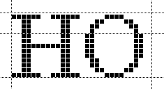
The final O:
Arrowheads indicate where delta instructions have been applied. The pixels display O without any corners.
A delta can e.g. at 12 pt/96 dpi (16 ppem) move the off-curve point at the top 1/8 pixel to the left and another delta can move a point at the bottom 1/8 pixel to the right.
These deltas apply to
- a specific ppem size
- a specific pixel amount
We'll have to check and fix all sizes likely to be displayed on screen. We can insert a delta between links and interpolates or add a bitmap for a particular size if this saves many deltas.
Hand hinting vs. auto-hinting
Hand hinting requires a lot of work. While VTT makes it easier to learn and faster to do the work, we still have to learn all the various hinting strategies and do the work.
Auto-hinting would be nice to have, but would you trust a computer to have enough "taste" to make the right trade-offs, always?
What is the "right" trade-off, anyway?
Are the trade-offs always the same ones? Or are they different for different fonts, usages, or customers?
The future of VTT may look into more computer assistance in cases where it can make logical decisions or crunch numbers.
Summa summarum
The main difference between Type 1 and TrueType is:
- A lot of situations you need not worry about in Type 1
- A lot of situations you can't do anything about in Type 1
- Which of the two should you put into an OpenType font? This depends on what you'll use it for.