Note
Access to this page requires authorization. You can try signing in or changing directories.
Access to this page requires authorization. You can try changing directories.
This topic covers accessible text requirements for Windows apps, including contrast, UI Automation text roles, and guidance for text in graphics.
Contrast ratios
Do not treat high-contrast mode as the primary mitigation for low readability. Base text design on sufficient foreground/background contrast in the default experience.
Contrast evaluation is deterministic and does not account for hue perception. For example, red text on a green background can be unreadable for some users with color vision deficiencies, even when the colors appear visually distinct.
The recommendations in this section align with G18: Ensuring that a contrast ratio of at least 4.5:1 exists between text (and images of text) and background behind the text in W3C Techniques for WCAG 2.0.
To meet this requirement, visible text must have a minimum luminance contrast ratio of 4.5:1 against its background. Exceptions include logos and incidental text, such as text in inactive UI.
Decorative text that conveys no information is excluded. For example, words used only as a visual background, and are interchangeable without changing meaning, do not need to meet this criterion.
Use color contrast tools to verify that the visible text contrast ratio is acceptable. See Techniques for WCAG 2.0 G18 (Resources section) for tools that can test contrast ratios.
Note
Some of the tools listed by Techniques for WCAG 2.0 G18 can't be used interactively with a Windows app. You may need to enter foreground and background color values manually in the tool, or make screen captures of app UI and then run the contrast ratio tool over the screen capture image.
Text element roles
Windows apps commonly use the following text elements and roles:
- TextBlock: role is Text
- TextBox: role is Edit
- RichTextBlock (and overflow class RichTextBlockOverflow): role is Text
- RichEditBox: role is Edit
When a control reports the Edit role, assistive technologies assume the value can be edited by the user. Putting static text in a TextBox misreports both role and interaction model.
For static text, use TextBlock and RichTextBlock. These are not Control subclasses, are not keyboard-focusable, and typically do not appear in tab order but screen readers can still read them through reading/navigation modes that are independent of focus (for example, virtual cursor behavior).
Avoid placing static text in focusable containers just to expose it through tab navigation. Users expect tab stops to be actionable, and static content in tab order is usually a usability regression. Validate behavior with Narrator.
Auto-suggest accessibility
Auto-suggest is the pattern where a suggestions list updates while the user types in an input field. If you use XAML AutosuggestBox or intrinsic HTML controls, most accessibility wiring is built in.
To make custom implementations accessible, the input and suggestion list must be associated in the UIA tree. See Implementing auto-suggest.
Narrator supports this pattern with a dedicated suggestions experience. When the input and list are connected correctly, users can:
- Know the list is present and when the list closes
- Know how many suggestions are available
- Know the selected item, if any
- Be able to move Narrator focus to the list
- Be able to navigate through a suggestion with all other reading modes
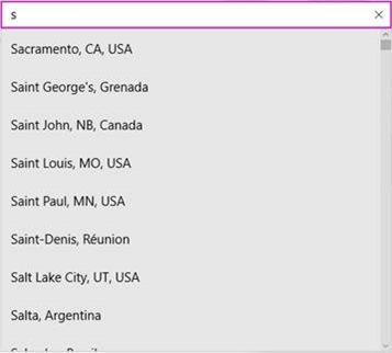
Example of a suggestion list
Implementing auto-suggest
Associate the input field and suggestion list in the UIA tree. Use UIA_ControllerForPropertyId in desktop apps or ControlledPeers in XAML apps.
There are two common auto-suggest behaviors.
Default selection
If the list has a default selection, Narrator expects UIA_SelectionItem_ElementSelectedEventId in desktop apps or AutomationEvents.SelectionItemPatternOnElementSelected in XAML apps.
Fire the corresponding selected event whenever selection changes, including updates caused by typing or list navigation.
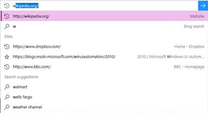
Example where there is a default selection
No default selection
If there is no default selection, Narrator expects UIA_LayoutInvalidatedEventId in desktop apps or LayoutInvalidated in XAML apps whenever the list updates.
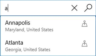
Example where there is no default selection
XAML implementation
With the default AutosuggestBox, required accessibility behavior is already wired.
For custom implementations (such as TextBox plus list), set AutomationProperties.ControlledPeers on the TextBox. Fire AutomationPropertyChanged whenever ControlledPeers is added or removed, and raise either SelectionItemPatternOnElementSelected or LayoutInvalidated, based on your scenario.
HTML implementation
With intrinsic HTML controls, the UIA mapping is already provided. Example:
<label>Sites <input id="input1" type="text" list="datalist1" /></label>
<datalist id="datalist1">
        <option value="http://www.google.com/" label="Google"></option>
        <option value="http://www.reddit.com/" label="Reddit"></option>
</datalist>
If you build custom controls, implement the required ARIA semantics as defined by W3C standards.
Text in graphics
Avoid embedding text in graphics when possible. Text rendered inside an Image source is not automatically readable by assistive technologies.
If text in graphics is required, set AutomationProperties.Name to equivalent content (or a concise semantic summary). Apply the same principle to text-like content rendered through Path or Glyphs.
Text font size and scale
Text that is too small can cause readability issues. Start with a reasonable default size throughout the app.
You should then validate against Windows text-related accessibility settings, including:
- Magnifier, which enlarges part of the UI. Ensure layout and line wrapping remain readable under magnification.
- Global scale and resolution settings in Settings->System->Display->Scale and layout. Available values vary by display hardware.
- Text size settings in Settings->Ease of access->Display. Make text bigger scales text in supported controls across apps and screens (WinUI text controls support this by default).
Note
The Make everything bigger setting lets a user specify their preferred size for text and apps in general on their primary screen only.
Many text elements and controls expose IsTextScaleFactorEnabled, which defaults to true. When enabled, text scales automatically, with smaller FontSize values typically affected more than larger ones.
Set IsTextScaleFactorEnabled to false only when necessary.
See Text scaling for more details.
Use this sample to compare behavior with and without IsTextScaleFactorEnabled when Text size changes.
<TextBlock Text="In this case, IsTextScaleFactorEnabled has been left set to its default value of true."
    Style="{StaticResource BodyTextBlockStyle}"/>

<TextBlock Text="In this case, IsTextScaleFactorEnabled has been set to false."
    Style="{StaticResource BodyTextBlockStyle}" IsTextScaleFactorEnabled="False"/>
Avoid disabling text scaling broadly. Consistent cross-app text scaling is an important accessibility capability.
WinUI text controls support the full text scaling experience without any customization or templating. For other WinRT-based apps, you can monitor TextScaleFactorChanged and get the TextScaleFactor to react to system text size changes:
private readonly Windows.UI.ViewManagement.UISettings _uiSettings = new();

public MainWindow()
{
    InitializeComponent();
    _uiSettings.TextScaleFactorChanged += UISettings_TextScaleFactorChanged;
}

private void UISettings_TextScaleFactorChanged(Windows.UI.ViewManagement.UISettings sender, object args)
{
    // Marshal to the UI thread before applying layout or visual updates.
    DispatcherQueue.TryEnqueue(() =>
    {
        var scale = sender.TextScaleFactor;
        // Apply updates for UI that depends on text scale.
    });
}
TextScaleFactor is a double in the range [1,2.25]. You can use it to coordinate related UI elements (for example, scaling graphics with text).
Do not assume uniform scaling across all text sizes. Larger text is generally affected less than smaller text.
These types have an IsTextScaleFactorEnabled property:
- ContentPresenter
- Control and derived classes
- FontIcon
- RichTextBlock
- TextBlock
- TextElement and derived classes
Examples
The WinUI 3 Gallery app includes interactive examples of WinUI controls and features. Get the app from the Microsoft Store or browse the source code on GitHub.
Related topics
- Text scaling
- Accessibility overview
- Basic accessibility information
- XAML text display sample (archived legacy sample)
- XAML text editing sample (archived legacy sample)
- XAML accessibility sample (archived legacy sample)
Collaborate with us on GitHub
The source for this content can be found on GitHub, where you can also create and review issues and pull requests. For more information, see our contributor guide.

Windows developer