Flyouts
A flyout is a light dismiss container that can show arbitrary UI as its content. Flyouts can contain other flyouts or context menus to create a nested experience.
Is this the right control?
- Don't use a flyout instead of tooltip or context menu. Use a tooltip to show a short description that hides after a specified time. Use a context menu for contextual actions related to a UI element, such as copy and paste.
For recommendations on when to use a flyout vs. when to use a dialog (a similar control), see Dialogs and flyouts.
UWP and WinUI 2
Important
The information and examples in this article are optimized for apps that use the Windows App SDK and WinUI 3, but are generally applicable to UWP apps that use WinUI 2. See the UWP API reference for platform specific information and examples.
This section contains information you need to use the control in a UWP or WinUI 2 app.
APIs for this control exist in the Windows.UI.Xaml.Controls namespace.
- UWP APIs: Flyout class, Button.Flyout property
- Open the WinUI 2 Gallery app and see the Flyout in action. The WinUI 2 Gallery app includes interactive examples of most WinUI 2 controls, features, and functionality. Get the app from the Microsoft Store or get the source code on GitHub.
We recommend using the latest WinUI 2 to get the most current styles and templates for all controls. WinUI 2.2 or later includes a new template for this control that uses rounded corners. For more info, see Corner radius.
Create a flyout
- Important APIs: Flyout class, Button.Flyout property
The WinUI 3 Gallery app includes interactive examples of most WinUI 3 controls, features, and functionality. Get the app from the Microsoft Store or get the source code on GitHub
Flyouts are attached to specific controls. You can use the Placement property to specify where a flyout appears: Top, Left, Bottom, Right, or Full. If you select the Full placement mode, the app stretches the flyout and centers it inside the app window. Some controls, such as Button, provide a Flyout property that you can use to associate a flyout or context menu.
This example creates a simple flyout that displays some text when the button is pressed.
<Button Content="Click me">
  <Button.Flyout>
     <Flyout>
        <TextBlock Text="This is a flyout!"/>
     </Flyout>
  </Button.Flyout>
</Button>
If the control doesn't have a flyout property, you can use the FlyoutBase.AttachedFlyout attached property instead. When you do this, you also need to call the FlyoutBase.ShowAttachedFlyout method to show the flyout.
This example adds a simple flyout to an image. When the user taps the image, the app shows the flyout.
<Image Source="Assets/cliff.jpg" Width="50" Height="50"
  Margin="10" Tapped="Image_Tapped">
  <FlyoutBase.AttachedFlyout>
    <Flyout>
      <TextBlock Text="This is some text in a flyout."  />
    </Flyout>
  </FlyoutBase.AttachedFlyout>
</Image>
private void Image_Tapped(object sender, TappedRoutedEventArgs e)
{
    FlyoutBase.ShowAttachedFlyout((FrameworkElement)sender);
}
The previous examples defined their flyouts inline. You can also define a flyout as a static resource and then use it with multiple elements. This example creates a more complicated flyout that displays a larger version of an image when its thumbnail is tapped.
<!-- Declare the shared flyout as a resource. -->
<Page.Resources>
    <Flyout x:Key="ImagePreviewFlyout" Placement="Right">
        <!-- The flyout's DataContext must be the Image Source
             of the image the flyout is attached to. -->
        <Image Source="{Binding Path=Source}"
            MaxHeight="400" MaxWidth="400" Stretch="Uniform"/>
    </Flyout>
</Page.Resources>
<!-- Assign the flyout to each element that shares it. -->
<StackPanel>
    <Image Source="Assets/cliff.jpg" Width="50" Height="50"
           Margin="10" Tapped="Image_Tapped"
           FlyoutBase.AttachedFlyout="{StaticResource ImagePreviewFlyout}"
           DataContext="{Binding RelativeSource={RelativeSource Mode=Self}}"/>
    <Image Source="Assets/grapes.jpg" Width="50" Height="50"
           Margin="10" Tapped="Image_Tapped"
           FlyoutBase.AttachedFlyout="{StaticResource ImagePreviewFlyout}"
           DataContext="{Binding RelativeSource={RelativeSource Mode=Self}}"/>
    <Image Source="Assets/rainier.jpg" Width="50" Height="50"
           Margin="10" Tapped="Image_Tapped"
           FlyoutBase.AttachedFlyout="{StaticResource ImagePreviewFlyout}"
           DataContext="{Binding RelativeSource={RelativeSource Mode=Self}}"/>
</StackPanel>
private void Image_Tapped(object sender, TappedRoutedEventArgs e)
{
    FlyoutBase.ShowAttachedFlyout((FrameworkElement)sender);
}
Style a flyout
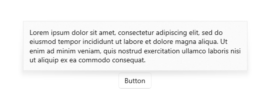
To style a Flyout, modify its FlyoutPresenterStyle. This example shows a paragraph of wrapping text and makes the text block accessible to a screen reader.
<Flyout>
  <Flyout.FlyoutPresenterStyle>
    <Style TargetType="FlyoutPresenter">
      <Setter Property="ScrollViewer.HorizontalScrollMode"
          Value="Disabled"/>
      <Setter Property="ScrollViewer.HorizontalScrollBarVisibility" Value="Disabled"/>
      <Setter Property="IsTabStop" Value="True"/>
      <Setter Property="TabNavigation" Value="Cycle"/>
    </Style>
  </Flyout.FlyoutPresenterStyle>
  <TextBlock Style="{StaticResource BodyTextBlockStyle}" Text="Lorem ipsum dolor sit amet, consectetur adipiscing elit, sed do eiusmod tempor incididunt ut labore et dolore magna aliqua. Ut enim ad minim veniam, quis nostrud exercitation ullamco laboris nisi ut aliquip ex ea commodo consequat."/>
</Flyout>
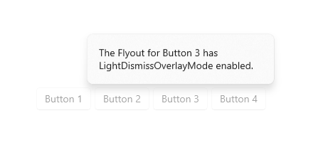
Styling flyouts for 10-foot experiences
Light dismiss controls like flyout trap keyboard and gamepad focus inside their transient UI until dismissed. To provide a visual cue for this behavior, light dismiss controls on Xbox draw an overlay that dims the contrast and visibility of out of scope UI. This behavior can be modified with the LightDismissOverlayMode property. By default, flyouts will draw the light dismiss overlay on Xbox but not other device families, but apps can choose to force the overlay to be always On or always Off.
<MenuFlyout LightDismissOverlayMode="On">
Light dismiss behavior
Flyouts can be closed with a quick light dismiss action, including
- Tap outside the flyout
- Press the Escape keyboard key
- Press the hardware or software system Back button
- Press the gamepad B button
When dismissing with a tap, this gesture is typically absorbed and not passed on to the UI underneath. For example, if there's a button visible behind an open flyout, the user's first tap dismisses the flyout but does not activate this button. Pressing the button requires a second tap.
You can change this behavior by designating the button as an input pass-through element for the flyout. The flyout will close as a result of the light dismiss actions described above and will also pass the tap event to its designated OverlayInputPassThroughElement. Consider adopting this behavior to speed up user interactions on functionally similar items. If your app has a favorites collection and each item in the collection includes an attached flyout, it's reasonable to expect that users may want to interact with multiple flyouts in rapid succession.
Note
Be careful not to designate an overlay input pass-through element which results in a destructive action. Users have become habituated to discreet light dismiss actions which do not activate primary UI. Close, Delete, or similarly destructive buttons should not activate on light dismiss to avoid unexpected and disruptive behavior.
In the following example, all three buttons inside FavoritesBar will be activated on the first tap.
<Page>
    <Page.Resources>
        <Flyout x:Name="TravelFlyout" x:Key="TravelFlyout"
                OverlayInputPassThroughElement="{x:Bind FavoritesBar}">
            <StackPanel>
                <HyperlinkButton Content="Washington Trails Association"/>
                <HyperlinkButton Content="Washington Cascades - Go Northwest! A Travel Guide"/>
            </StackPanel>
        </Flyout>
    </Page.Resources>

    <Grid>
        <Grid.RowDefinitions>
            <RowDefinition Height="Auto"/>
            <RowDefinition Height="*"/>
        </Grid.RowDefinitions>
        <StackPanel x:Name="FavoritesBar" Orientation="Horizontal">
            <HyperlinkButton x:Name="PageLinkBtn">Bing</HyperlinkButton>
            <Button x:Name="Folder1" Content="Travel" Flyout="{StaticResource TravelFlyout}"/>
            <Button x:Name="Folder2" Content="Entertainment" Click="Folder2_Click"/>
        </StackPanel>
        <ScrollViewer Grid.Row="1">
            <WebView x:Name="WebContent"/>
        </ScrollViewer>
    </Grid>
</Page>
private void Folder2_Click(object sender, RoutedEventArgs e)
{
     Flyout flyout = new Flyout();
     flyout.OverlayInputPassThroughElement = FavoritesBar;
     ...
     flyout.ShowAt(sender as FrameworkElement);
{
Get the sample code
- WinUI Gallery sample - See all the XAML controls in an interactive format.
Related articles

Windows developer