Note
Access to this page requires authorization. You can try signing in or changing directories.
Access to this page requires authorization. You can try changing directories.
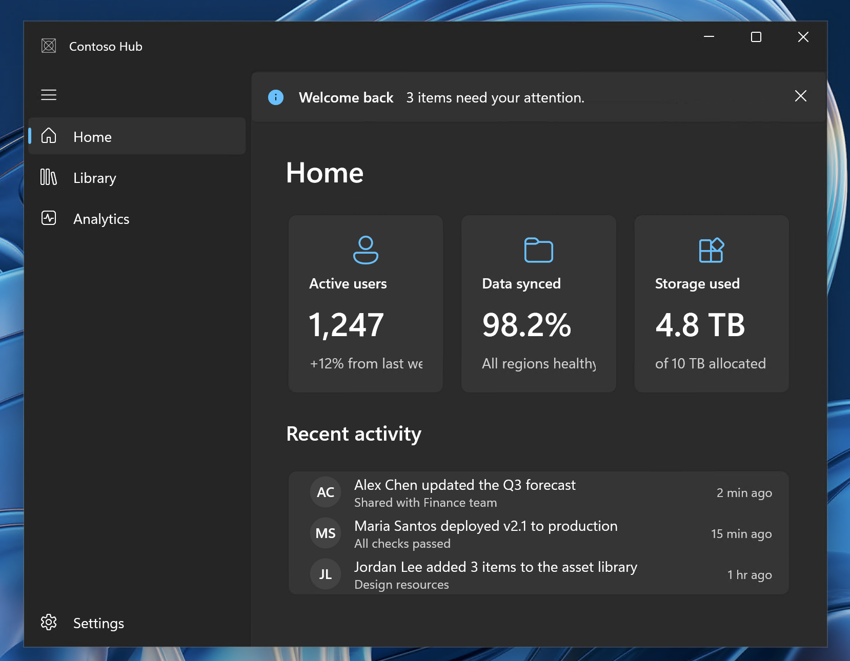
This article shows you how to assemble the standard chrome elements of a modern Windows desktop app using WinUI 3. By combining a few foundational components, your app gets the polished look users expect on Windows 11: a translucent Mica backdrop, integrated title bar, sidebar navigation, and consistent status messaging.
The pattern at a glance
A typical modern WinUI 3 desktop app uses these elements:
| Element | Purpose |
|---|---|
| Mica backdrop | Translucent material that connects the window to the desktop wallpaper |
| Custom TitleBar | App icon + title in the draggable title area, replacing the default caption bar |
| NavigationView (Left pane) | Primary navigation shell with a left sidebar |
| InfoBar | Non-modal status and error messages |
| Transparent page backgrounds | Pages don't set their own background, allowing Mica to show through |
The following screenshot shows these elements working together in a sample app:
Add Mica backdrop
Mica is the recommended backdrop for primary app windows. In WinUI 3, you enable it with a single XAML element:
<Window ...>
    <Window.SystemBackdrop>
        <MicaBackdrop />
    </Window.SystemBackdrop>

    <!-- Window content goes here -->
</Window>
No code-behind is required. The system handles fallback on older Windows versions automatically.
Tip
Don't set a Background on your Window, NavigationView, or page Grid elements. Any opaque background covers the Mica effect. If you need section backgrounds, use semi-transparent brushes from the theme resources (such as CardBackgroundFillColorDefaultBrush).
For more options and C++ examples, see Apply Mica or Acrylic materials in desktop apps.
Set up a custom title bar
Use the TitleBar control to render the app icon, title, and an optional subtitle in the title bar area. The control reserves space for the system caption buttons and the minimum drag region for you, so you don't have to calculate caption-button padding manually.
Define the title bar in XAML:
<Grid>
    <Grid.RowDefinitions>
        <RowDefinition Height="Auto" /> <!-- Title bar row -->
        <RowDefinition Height="*" />    <!-- Content row -->
    </Grid.RowDefinitions>

    <TitleBar x:Name="AppTitleBar"
              Title="My App"
              Subtitle="Sample code">
        <TitleBar.IconSource>
            <ImageIconSource ImageSource="/Assets/AppIcon.png" />
        </TitleBar.IconSource>
    </TitleBar>

    <!-- Main content below the title bar -->
    <NavigationView Grid.Row="1" ... />
</Grid>
Then, in your MainWindow constructor, hide the default system title bar and register the TitleBar control as the draggable region:
public MainWindow()
{
    InitializeComponent();

    // Hide the default system title bar.
    ExtendsContentIntoTitleBar = true;

    // Use the TitleBar control as the draggable title bar region.
    SetTitleBar(AppTitleBar);
}
Important
Keep app identity in the title bar only. Don't repeat the app name or icon in the page content, because this creates visual clutter and wastes vertical space.
Note
The TitleBar control is available starting in Windows App SDK 1.7. If the control isn't available in your project, update to Windows App SDK 1.7 or later. The control also provides built-in back and pane-toggle buttons that you can use with NavigationView, and it can host other content. For the full list of properties, see Title bar.
For the full title bar API reference, see Title bar customization.
Add NavigationView
Use NavigationView with PaneDisplayMode="Left" as your top-level app shell. This replaces the UWP-era SplitView pattern.
<NavigationView x:Name="NavView"
                PaneDisplayMode="Left"
                IsSettingsVisible="True"
                IsBackButtonVisible="Collapsed"
                SelectionChanged="NavView_SelectionChanged">
    <NavigationView.MenuItems>
        <NavigationViewItem Icon="Home" Content="Home" Tag="home" />
        <NavigationViewItem Icon="Library" Content="Library" Tag="library" />
    </NavigationView.MenuItems>

    <!-- Page content appears here -->
    <Frame x:Name="ContentFrame" />
</NavigationView>
NavigationView shows a built-in Settings item when IsSettingsVisible is True (the default), so you don't need to add your own NavigationViewItem for settings. Handle it with the IsSettingsSelected flag on the SelectionChanged event args:
private void NavView_SelectionChanged(NavigationView sender,
    NavigationViewSelectionChangedEventArgs args)
{
    if (args.IsSettingsSelected)
    {
        ContentFrame.Navigate(typeof(SettingsPage));
    }
    else if (args.SelectedItemContainer?.Tag is string tag)
    {
        Type pageType = tag switch
        {
            "home" => typeof(HomePage),
            "library" => typeof(LibraryPage),
            _ => typeof(HomePage)
        };
        ContentFrame.Navigate(pageType);
    }
}
For complete NavigationView guidance, see NavigationView control.
Use InfoBar for status messages
Replace colored status borders, toast-like popups, or custom status bars with InfoBar. It provides a consistent, accessible way to show informational, success, warning, or error messages inline.
<InfoBar x:Name="StatusInfoBar"
         Title="Update available"
         Message="Version 2.1 is ready to install."
         Severity="Informational"
         IsOpen="True"
         IsClosable="True" />
Place InfoBar at the top of your content area (inside the NavigationView but above the Frame) so it's visible regardless of which page is loaded.
For usage patterns, see InfoBar control.
Transparent page backgrounds
To let Mica show through your pages, don't set explicit backgrounds on your page root elements:
<!-- Do this — no Background attribute -->
<Page ...>
    <Grid Padding="24">
        <!-- Page content -->
    </Grid>
</Page>

<!-- Don't do this -->
<Page Background="{ThemeResource ApplicationPageBackgroundThemeBrush}" ...>
If individual content cards need a background, use the layered CardBackgroundFillColorDefaultBrush from the theme dictionary. It's semi-transparent and works with Mica.
MainWindow.xaml example
Here's a starter MainWindow.xaml that brings the elements together. The TitleBar control reserves space for the system caption buttons automatically, so no manual inset handling is required.
<Window
    x:Class="MyApp.MainWindow"
    xmlns="http://schemas.microsoft.com/winfx/2006/xaml/presentation"
    xmlns:x="http://schemas.microsoft.com/winfx/2006/xaml">

    <Window.SystemBackdrop>
        <MicaBackdrop />
    </Window.SystemBackdrop>

    <Grid>
        <Grid.RowDefinitions>
            <RowDefinition Height="Auto" />
            <RowDefinition Height="*" />
        </Grid.RowDefinitions>

        <!-- Title bar -->
        <TitleBar x:Name="AppTitleBar"
                  Title="My App"
                  Subtitle="Sample code">
            <TitleBar.IconSource>
                <ImageIconSource ImageSource="/Assets/AppIcon.png" />
            </TitleBar.IconSource>
        </TitleBar>

        <!-- Navigation shell -->
        <NavigationView x:Name="NavView"
                        Grid.Row="1"
                        PaneDisplayMode="Left"
                        IsSettingsVisible="True"
                        IsBackButtonVisible="Collapsed"
                        SelectionChanged="NavView_SelectionChanged">
            <NavigationView.MenuItems>
                <NavigationViewItem Icon="Home" Content="Home" Tag="home" />
                <NavigationViewItem Icon="Library" Content="Library" Tag="library" />
            </NavigationView.MenuItems>

            <Grid>
                <Grid.RowDefinitions>
                    <RowDefinition Height="Auto" />
                    <RowDefinition Height="*" />
                </Grid.RowDefinitions>

                <!-- Status bar -->
                <InfoBar x:Name="StatusInfoBar"
                         IsOpen="False" />

                <!-- Page host -->
                <Frame x:Name="ContentFrame" Grid.Row="1" />
            </Grid>
        </NavigationView>
    </Grid>
</Window>
Related content
Collaborate with us on GitHub
The source for this content can be found on GitHub, where you can also create and review issues and pull requests. For more information, see our contributor guide.
Windows developer