Note
Access to this page requires authorization. You can try signing in or changing directories.
Access to this page requires authorization. You can try changing directories.
Note
For info about the benefits of WinUI 3, as well as other app type options, see Overview of framework options.
In this topic we walk through the process of creating a new WinUI 3 project in Visual Studio; and then building a simple app to display photos. We'll use controls, layout panels, and data-binding. And we'll be writing both XAML markup (which is declarative) and your choice of either C# or C++ code (which are imperative, or procedural). Use the language picker above the topic title to choose C# or C++/WinRT.
Tip
The source code in this topic is provided in both C# and C++/WinRT. If you're a C++ developer, then for more details and concepts explaining how the code that we show here works, see the C++/WinRT documentation. Relevant topics there include XAML controls; bind to a C++/WinRT property, XAML items controls; bind to a C++/WinRT collection, and Photo Editor C++/WinRT sample application.
Step 1: Install tools for the Windows App SDK
To set up your development computer, see Get started with WinUI. In that article, you'll also find instructions to create and launch a WinUI 3 project.
Important
You'll find release notes topics along with the Windows App SDK release channels topic. There are release notes for each channel. Be sure to check any limitations and known issues in those release notes, since those might affect the results of following along with this tutorial and/or running the app we'll build.
Step 2: Create a new project
In Visual Studio, create your choice of a new C# or C++ project from the Blank App, Packaged (WinUI 3 in Desktop) project template. Name the project SimplePhotos, and (so that your folder structure will match the one described in this tutorial) uncheck Place solution and project in the same directory. You can target the most recent release (not preview) of the client operating system.
Step 3: Copy asset files
The app that we'll be building carries image files around with it in the form of asset files; and those are the photos that it displays. In this section you'll add those assets to your project. But first you'll need to obtain a copy of the files.
So clone (or download as a
.zip) the Windows App SDK samples repo (see WindowsAppSDK-Samples). Having done that, you'll find the asset files that we'll be using in the folder\WindowsAppSDK-Samples\Samples\PhotoEditor\cs-winui\Assets\Samples(use this folder for both a C# and a C++/WinRT project). If you want to see those files in the repo online, then you can visit WindowsAppSDK-Samples/Samples/PhotoEditor/cs-winui/Assets/Samples/.In File Explorer, select that Samples folder, and copy it to the clipboard.
Go to Solution Explorer in Visual Studio. Right-click the Assets folder (it's a child of the project node), and click Open Folder in File Explorer. That opens the Assets folder in File Explorer.
Paste (into the Assets folder) the Samples folder that you just copied.
Step 4: Add a GridView control
Our app needs to display rows and columns of photos. In other words, a grid of images. For a UI like that, the main controls to use are List view and grid view.
Open
MainWindow.xaml. Currently, there's a Window element, and within that a StackPanel layout panel. Inside the StackPanel is a Button control, which is hooked up to an event handler method.The main window of any app represents the view that you see first when you run the app. In the app we'll be building, the main window's job is to load the photos from the Samples folder, and to display a tiled view of those images together with various info about them.
Replace the StackPanel and Button markup with the Grid layout panel and the GridView control shown in the listing below.
<Window ...>
    <Grid>
        <GridView x:Name="ImageGridView"/>
    </Grid>
</Window>
Tip
x:Nameidentifies a XAML element so that you can refer to it elsewhere in the XAML and in the code-behind.C#. Open
MainWindow.xaml.cs, and delete the myButton_Click method.C++/WinRT. Open
MainWindow.xaml.handMainWindow.xaml.cpp, and delete the myButton_Click method.
You can build and run now, but the window will be empty at this stage. For the GridView control to show anything, we need to give it a collection of objects to show. We'll make a start on that next.
For background info about some of the types we've just mentioned, see Layout panels and Controls for Windows apps.
Step 5: The ImageFileInfo model
A model (in the sense of models, views, and view models) is a class that to some degree represents a real-world object or concept (such as a bank account). It's an abstraction of that real-world thing. In this section we'll be adding to our project a new class called ImageFileInfo. ImageFileInfo will be a model of an image file, such as a photo. This section will take us a step closer to being able to display photos in the app's user interface (UI).
Tip
In preparation for the code example below, let's introduce the term observable. A property that can be dynamically bound to a XAML control (so that the UI updates each time the property value changes) is known as an observable property. This idea is based on the software design pattern known as the observer pattern. In the app that we build in this tutorial, the properties of our ImageFileInfo model won't change. But even so, we'll show how to make ImageFileInfo observable, by having it implement the INotifyPropertyChanged interface.
Right-click the project node (SimplePhotos), and click Add > New Item.... Under C# Items > Code, select Class. Set the name to ImageFileInfo.cs, and click Add.
Replace the contents of
ImageFileInfo.cswith the code listing below.using Microsoft.UI.Xaml.Media.Imaging; using System; using System.ComponentModel; using System.Runtime.CompilerServices; using System.Threading.Tasks; using Windows.Storage; using Windows.Storage.FileProperties; using Windows.Storage.Streams; namespace SimplePhotos { public class ImageFileInfo : INotifyPropertyChanged { public ImageFileInfo(ImageProperties properties, StorageFile imageFile, string name, string type) { ImageProperties = properties; ImageName = name; ImageFileType = type; ImageFile = imageFile; var rating = (int)properties.Rating; var random = new Random(); ImageRating = rating == 0 ? random.Next(1, 5) : rating; } public StorageFile ImageFile { get; } public ImageProperties ImageProperties { get; } public async Task<BitmapImage> GetImageSourceAsync() { using IRandomAccessStream fileStream = await ImageFile.OpenReadAsync(); // Create a bitmap to be the image source. BitmapImage bitmapImage = new(); bitmapImage.SetSource(fileStream); return bitmapImage; } public async Task<BitmapImage> GetImageThumbnailAsync() { StorageItemThumbnail thumbnail = await ImageFile.GetThumbnailAsync(ThumbnailMode.PicturesView); // Create a bitmap to be the image source. var bitmapImage = new BitmapImage(); bitmapImage.SetSource(thumbnail); thumbnail.Dispose(); return bitmapImage; } public string ImageName { get; } public string ImageFileType { get; } public string ImageDimensions => $"{ImageProperties.Width} x {ImageProperties.Height}"; public string ImageTitle { get => string.IsNullOrEmpty(ImageProperties.Title) ? ImageName : ImageProperties.Title; set { if (ImageProperties.Title != value) { ImageProperties.Title = value; _ = ImageProperties.SavePropertiesAsync(); OnPropertyChanged(); } } } public int ImageRating { get => (int)ImageProperties.Rating; set { if (ImageProperties.Rating != value) { ImageProperties.Rating = (uint)value; _ = ImageProperties.SavePropertiesAsync(); OnPropertyChanged(); } } } public event PropertyChangedEventHandler PropertyChanged; protected void OnPropertyChanged([CallerMemberName] string propertyName = null) => PropertyChanged?.Invoke(this, new PropertyChangedEventArgs(propertyName)); } }Save and close the
ImageFileInfo.csfile.
Step 6: Define and populate a property for a collection of images
In this section we'll add a new property to the MainWindow class. The property (named Images) will be a collection class that contains the images that we want to display.
Define the property like this, in
MainWindow.xaml.cs:... using System.Collections.ObjectModel; ... namespace SimplePhotos { public sealed partial class MainWindow : Window { public ObservableCollection<ImageFileInfo> Images { get; } = new ObservableCollection<ImageFileInfo>(); ... } }The code to populate the new collection property with images is shown in the GetItemsAsync and LoadImageInfoAsync methods below. Paste the
usingdirectives, and the two method implementations, intoMainWindow.xaml.cs, too. These methods are members of the MainWindow class, so paste them inside there just as you did with the Images property above.... using System.Threading.Tasks; using Windows.ApplicationModel; using Windows.Storage; using Windows.Storage.Search; ... private async Task GetItemsAsync() { StorageFolder appInstalledFolder = Package.Current.InstalledLocation; StorageFolder picturesFolder = await appInstalledFolder.GetFolderAsync("Assets\\Samples"); var result = picturesFolder.CreateFileQueryWithOptions(new QueryOptions()); IReadOnlyList<StorageFile> imageFiles = await result.GetFilesAsync(); foreach (StorageFile file in imageFiles) { Images.Add(await LoadImageInfoAsync(file)); } ImageGridView.ItemsSource = Images; } public async static Task<ImageFileInfo> LoadImageInfoAsync(StorageFile file) { var properties = await file.Properties.GetImagePropertiesAsync(); ImageFileInfo info = new(properties, file, file.DisplayName, file.DisplayType); return info; }The last thing we need to do in this section is to update the constructor of MainWindow to call GetItemsAsync.
public MainWindow()
{
    ...
    GetItemsAsync();
}
You can build and run now if you like (to confirm you've followed the steps ok), but there's not much to see in the window at this stage. That's because what we've done so far is to ask the GridView to render a collection of objects of type ImageFileInfo; and the GridView doesn't quite know how to do that yet.
Remember that the Images property is an observable collection of ImageFileInfo objects. And the last line of GetItemsAsync tells the GridView (which is named ImageGridView) that the source of its items (ItemsSource) is the Images property. And the job of the GridView is then to display those items.
But we haven't yet told the GridView anything about the ImageFileInfo class. So the best it can do so far is to display the ToString value of each ImageFileInfo object in the collection. And by default, that's just the type's name. In the next section we'll create a data template to define how we want an ImageFileInfo object to be displayed.
Tip
I used the term observable collection above. In the app that we build in this tutorial, the number of images doesn't change (and as we've said, neither do the values of the properties of each image, either). But it's still convenient, and a good practice, to use data-binding to initially connect the UI to the data. So that's what we'll do.
Step 7: Add a data template
To begin with, let's use a sketch-like placeholder data template. That will serve until we're done exploring some layout options. After that we can update the data template to show the actual photos.
Tip
That's actually a very practical thing to do. It's been found that if a UI looks like a sketch (in other words, low-fidelity), then people are more willing to suggest and/or test out quick ideas with it—sometimes involving quite substantial changes. That's because we guess (correctly) that such changes will be cheap to try.
On the other hand, the more finished a UI looks (the higher fidelity it has), the more we guess (again, correctly) that a lot of work has gone into the current look of it. And that makes us less inclined to suggest, or to try out, new ideas.
Open
MainWindow.xaml, and change the contents of the Window so that they look like this markup:<Window ...> <Grid> <Grid.Resources> <DataTemplate x:Key="ImageGridView_ItemTemplate"> <Grid/> </DataTemplate> </Grid.Resources> <GridView x:Name="ImageGridView" ItemTemplate="{StaticResource ImageGridView_ItemTemplate}"> </GridView> </Grid> </Window>To the layout root, we've added a simple DataTemplate resource, and given it a key of
ImageGridView_ItemTemplate. And we've used that same key to set the ItemTemplate of the GridView. Items controls such as GridView have an ItemTemplate property (just like they have the ItemsSource property that we saw earlier). An item template is a data template; and it's used for displaying each item in the collection.For more info, see Item containers and templates.
Now we can take a few edit passes over the data template—adding to, and editing, the elements inside it to make it more interesting and useful. We'll give the root Grid a height and a width of 300, and a margin of 8. Then we'll add two row definitions, and set the height of the second row definition to Auto.
<DataTemplate x:Key="ImageGridView_ItemTemplate">
    <Grid Height="300"
          Width="300"
          Margin="8">
        <Grid.RowDefinitions>
            <RowDefinition />
            <RowDefinition Height="Auto" />
        </Grid.RowDefinitions>
    </Grid>
</DataTemplate>
For more info, see Alignment, margin, padding.
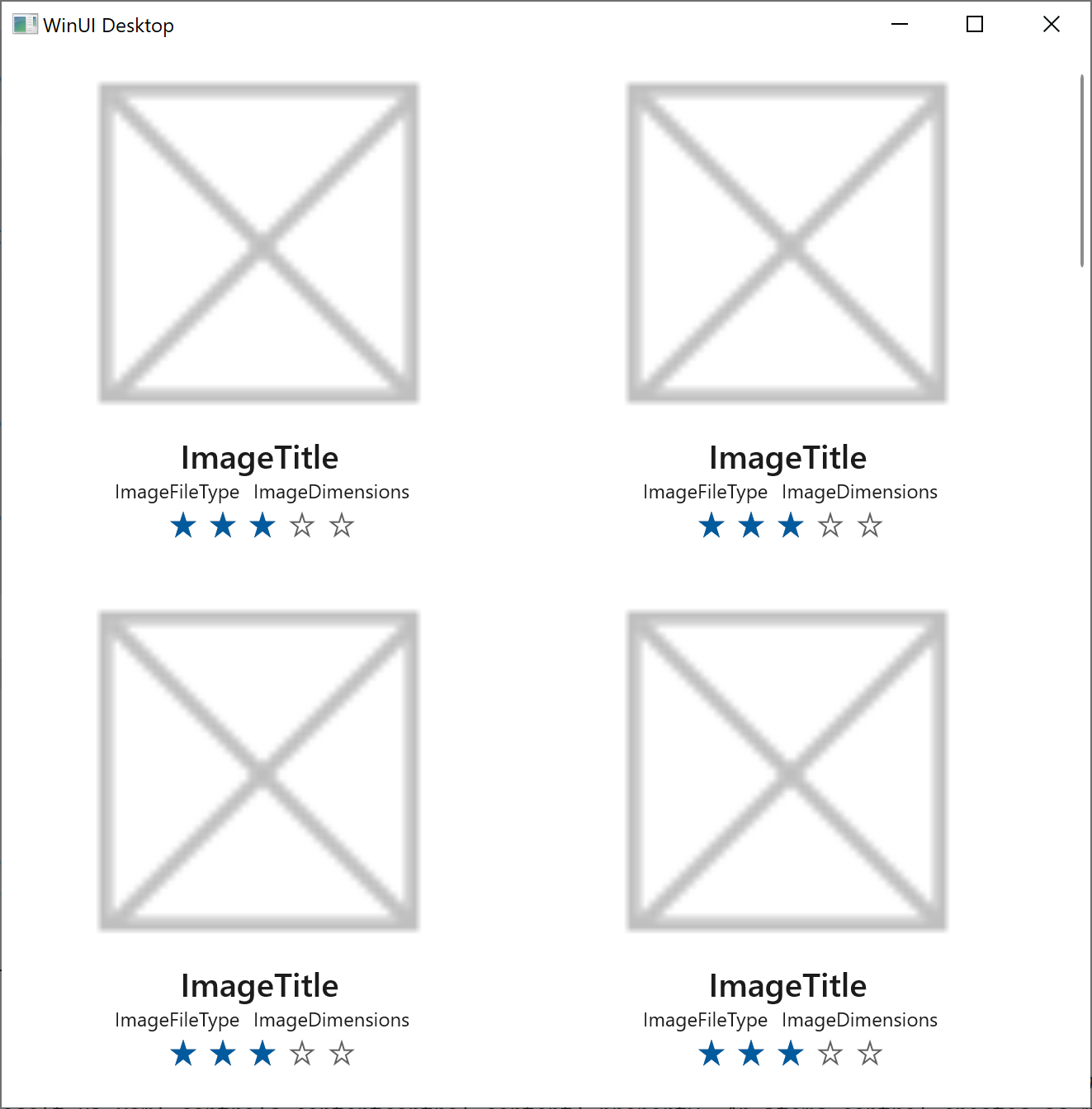
We want the data template to display each photo's image, name, file type, dimensions, and rating. So we'll be adding, respectively, an Image control, some TextBlock controls, and a RatingControl control. We'll lay out the text inside StackPanel layout panels. The Image will, initially, display the project's sketch-like Microsoft Store logo as a placeholder.
After all those edits, here's how the data template looks:
<DataTemplate x:Key="ImageGridView_ItemTemplate">
    <Grid Height="300"
          Width="300"
          Margin="8">
        <Grid.RowDefinitions>
            <RowDefinition />
            <RowDefinition Height="Auto" />
        </Grid.RowDefinitions>

        <Image x:Name="ItemImage"
               Source="Assets/StoreLogo.png"
               Stretch="Uniform" />

        <StackPanel Orientation="Vertical"
                    Grid.Row="1">
            <TextBlock Text="ImageTitle"
                       HorizontalAlignment="Center"
                       Style="{StaticResource SubtitleTextBlockStyle}" />
            <StackPanel Orientation="Horizontal"
                        HorizontalAlignment="Center">
                <TextBlock Text="ImageFileType"
                           HorizontalAlignment="Center"
                           Style="{StaticResource CaptionTextBlockStyle}" />
                <TextBlock Text="ImageDimensions"
                           HorizontalAlignment="Center"
                           Style="{StaticResource CaptionTextBlockStyle}"
                           Margin="8,0,0,0" />
            </StackPanel>

            <RatingControl Value="3" IsReadOnly="True"/>
        </StackPanel>
    </Grid>
</DataTemplate>
Build the project now, and run the app to see the GridView control with the item template that you just created. Next, we'll take a look at how the items are laid out. We'll change some brushes, and we'll add space between the items.
Step 8: Edit the item container's style
Another concept related to items controls such as GridView is the item container. An item container is a content control that displays an item as the value of its Content property. An items control creates as many item containers as it needs in order to display the items that are visible on the screen at any time.
Being a control, an item container has a style and a control template. Its style and control template determine how the item container looks in its various states (such as selection, pointer over, and focus). And, as we've seen, the item template (which is a data template) determines how the item itself looks.
For GridView, the type of its item containers is GridViewItem.
So in this section we'll focus on designing the item container's style. And for that we'll be creating a Style resource for GridViewItem, and then setting that as the ItemContainerStyle of the *GridView. In the style, we'll set the Background and Margin properties of the item container to give it a gray background and a bit of a margin around the outside of it.
In
MainWindow.xaml, add a new Style resource to the same Grid.Resources XML element that we put the data template into.<Grid> <Grid.Resources> ... <Style x:Key="ImageGridView_ItemContainerStyle" TargetType="GridViewItem"> <Setter Property="Background" Value="Gray"/> <Setter Property="Margin" Value="8"/> </Style> </Grid.Resources>Next, we use the
ImageGridView_ItemContainerStylekey to set the ItemContainerStyle of the GridView.<GridView x:Name="ImageGridView" ... ItemContainerStyle="{StaticResource ImageGridView_ItemContainerStyle}"> </GridView>
Build and run the app, and see how it looks now. As you resize the window, the GridView control takes care of rearranging the items to best fit into the space. At some widths, there's a lot of space on the right-hand side of the app window. It would look better if the GridView, and/or its contents, were centered. So we'll take care of that next.
Tip
If you want to experiment, try setting the Background and Margin setters to different values to see what effect that has.
Step 9: Experimenting with layout
You might be wondering whether it's best to center the GridView itself, or to center its contents. Let's try centering the GridView first.
To make it easy to see exactly where the GridView is in the Window—and what happens as we experiment with layout—we'll set its Background property to red.
<GridView x:Name="ImageGridView"
        ...
        Background="Red">
</GridView>
And now we'll set its HorizontalAlignment property to Center.
<GridView x:Name="ImageGridView"
        ...
        HorizontalAlignment="Center">
</GridView>
Also see Alignment, margin, padding.
Build and run now, and experiment with adjusting the width of the window. You can see that there's an equal amount of empty space on either side of the GridView's red background. So we have achieved the goal of centering the images. But it's now clearer than before that the scroll bar belongs to the GridView, and not to the window. So we need to change the GridView back to filling the window. We've demonstrated that (instead of centering the GridView in the window) we need to center the images in the GridView.
- So now delete the HorizontalAlignment attribute that you added in the previous step.
Step 10: Edit the items panel template
Items controls lay out their item containers inside what's known as an items panel. We can define what kind of panel is used, and set properties on that panel, by editing the GridView's items panel template. So that's what we'll do in this section.
In
MainWindow.xaml, add an ItemsPanelTemplate resource to our resource dictionary. The items panel is of type ItemsWrapGrid, and we're setting its HorizontalAlignment property to Center.<Grid> <Grid.Resources> ... <ItemsPanelTemplate x:Key="ImageGridView_ItemsPanelTemplate"> <ItemsWrapGrid Orientation="Horizontal" HorizontalAlignment="Center"/> </ItemsPanelTemplate> </Grid.Resources>Next, we use the
ImageGridView_ItemsPanelTemplatekey to set the ItemsPanel of the GridView.<GridView x:Name="ImageGridView" ... ItemsPanel="{StaticResource ImageGridView_ItemsPanelTemplate}"> </GridView>
When you build and run this time, and experiment with adjusting the width of the window, there's an equal amount of the GridView's red background on either side of the images. And because the GridView fills the window, the scroll bar aligns nicely with the edge of the window, where users might expect it to be.
- Now that we're done experiment with layout, remove
Background="Red"from the GridView.
Step 11: Replace the placeholder image with a photo
Now it's time to move our sketch to a higher level of fidelity; and that means replacing the placeholder image with the real ones, and replacing the "lorem ipsum"-style placeholder text with real data. Let's take care of the images first.
Important
The technique we'll use to display the photos in the Assets\Samples folder involves updating the GridView's items progressively. Specifically, that's the code in the ImageGridView_ContainerContentChanging and ShowImage methods in the code example below, including use of the ContainerContentChangingEventArgs.InRecycleQueue and ContainerContentChangingEventArgs.Phase properties. For more info, see ListView and GridView UI optimization. But in a nutshell, the GridView will let us know (by way of an event) when one of its item containers is ready to display its item. And then we'll keep track of which phase of its update lifecycle the item container is in so that we can determine when it's ready to display photo data.
In
MainWindow.xaml.cs, add a new method to MainWindow named ImageGridView_ContainerContentChanging. This is an event-handling method, and the event it handles is ContainerContentChanging. We also need to provide the implementation of the ShowImage method that ImageGridView_ContainerContentChanging depends on. Paste theusingdirective and the two method implementations intoMainWindow.xaml.cs:... using Microsoft.UI.Xaml.Controls; ... private void ImageGridView_ContainerContentChanging( ListViewBase sender, ContainerContentChangingEventArgs args) { if (args.InRecycleQueue) { var templateRoot = args.ItemContainer.ContentTemplateRoot as Grid; var image = templateRoot.FindName("ItemImage") as Image; image.Source = null; } if (args.Phase == 0) { args.RegisterUpdateCallback(ShowImage); args.Handled = true; } } private async void ShowImage(ListViewBase sender, ContainerContentChangingEventArgs args) { if (args.Phase == 1) { // It's phase 1, so show this item's image. var templateRoot = args.ItemContainer.ContentTemplateRoot as Grid; var image = templateRoot.FindName("ItemImage") as Image; var item = args.Item as ImageFileInfo; image.Source = await item.GetImageThumbnailAsync(); } }
Then, in
MainWindow.xaml, register the ImageGridView_ContainerContentChanging event-handler with the GridView's ContainerContentChanging event.<GridView x:Name="ImageGridView" ... ContainerContentChanging="ImageGridView_ContainerContentChanging"> </GridView>
Step 12: Replace the placeholder text with real data
In this section we'll use one-time data-bindings. A one-time binding is great for data that doesn't change at run-time. And that means that one-time bindings are high-performance and easy to create.
In
MainWindow.xaml, find the ImageGridView_ItemTemplate data template resource. We're going to tell the data template that its job is to be a template for the ImageFileInfo class, which you'll recall is the type of the items that our GridView is displaying.To do that, add an
x:DataTypevalue to the template, like this:<DataTemplate x:Key="ImageGridView_ItemTemplate" x:DataType="local:ImageFileInfo"> ...If you're unfamiliar with the
local:syntax shown above (or with thexmlns:localsyntax already in the opening Window tag), then see XAML namespaces and namespace mapping.Now that we've set an
x:DataType, we can usex:Binddata-binding expressions in the data template to bind to properties of the data type we specified (ImageFileInfo, in this case).In the data template, find the first TextBlock element (the one with its Text currently set to ImageTitle). Replace its Text value as shown below.
Tip
You can either copy and paste the markup below, or you can use IntelliSense in Visual Studio. To do that, select the current value that's inside the quotation marks, and type
{. IntelliSense automatically adds the closing brace, and displays a code-completion list. You could scroll down tox:Bind, and double-click it. But it might be more efficient to typex:(note howx:Bindis then filtered to the top of the completion list), and press the TAB key. Now press the SPACE key, and typeImageT(as much of the property nameImageTitleas necessary to get it to the top of the completion list), and TAB.<TextBlock Text="{x:Bind ImageTitle}" ... />An
x:Bindexpression links the value of a UI property with the value of a data-object property. Of course, that depends on first settingx:DataTypeto the type of that data-object so that the tooling and the runtime know what properties are available to bind to.For more info, see {x:Bind} markup extension and Data binding in depth.
In the same way, replace the values of the other TextBlocks and the RatingControl. Here's the result:
<TextBlock Text="{x:Bind ImageTitle}" ... /> <StackPanel ... > <TextBlock Text="{x:Bind ImageFileType}" ... /> <TextBlock Text="{x:Bind ImageDimensions}" ... /> </StackPanel> <RatingControl Value="{x:Bind ImageRating}" ... />
If you build and run the app now, instead of placeholders you'll see real photos, and real text (and other data). Visually and functionally, this simple little app is now complete. But as a coda, let's do one last little bit of data binding.

Step 13: Bind the GridView to the Images collection (C# only)
Important
Perform this last step only if you created a C# project.
Tip
You'll find that there are some things (usually related to dynamically-generated UI) that you can't do in XAML markup. But in general if you can do something in markup, then that's preferable. It gives a slightly cleaner separation between the view that the XAML markup represents and the model (or view model) that the imperative code represents. And that tends to improve workflow in tooling and between team members.
We're currently using imperative code to associate the GridView's ItemsSource) property with MainWindow's Images property. But we can do that in markup instead.
In the MainWindow class, delete (or comment-out) the last line of GetItemsAsync, which sets the ItemsSource of
ImageGridViewto the value of the Images property.And then in
MainWindow.xaml, find the GridView named ImageGridView, and add an ItemsSource attribute like this. You can use IntelliSense to make this change if you like.<GridView x:Name="ImageGridView" ... ItemsSource="{x:Bind Images}"
The Images property value doesn't change at run-time for this particular app. But because Images is of type ObservableCollection<T>, the contents of the collection can change (that is, elements can be added or deleted), and the binding will automatically notice the changes and update the UI.
Conclusion
In this tutorial we walked through the process of using Visual Studio to build a simple WinUI 3 app that displays photos. Hopefully this tutorial has given you experience working in a WinUI 3 app with controls, layout panels, data-binding, and GridView UI optimization.
See also
Tutorial: Build a simple photo viewer that targets multiple platforms
Collaborate with us on GitHub
The source for this content can be found on GitHub, where you can also create and review issues and pull requests. For more information, see our contributor guide.

Windows developer