Note
Access to this page requires authorization. You can try signing in or changing directories.
Access to this page requires authorization. You can try changing directories.
Connected animations let you create a dynamic and compelling navigation experience by animating the transition of an element between two different views.
The Connected Animations XAML Attached Properties enable connected animations to be defined directly in your XAML code by simply adding a Key to the element that should animate. There are also attached properties to enable coordinated animations and animations in lists and grids.
Syntax
<Page ...
    xmlns:animations="using:Microsoft.Toolkit.Uwp.UI.Animations">

<Border x:Name="Element" animations:Connected.Key="item"></Border>

<TextBlock animations:Connected.AnchorElement="{x:Bind Element}" Text="Hello World"/>

<GridView animations:Connected.ListItemElementName="ItemThumbnail"
          animations:Connected.ListItemKey="listItem">
    <GridView.ItemTemplate>
        <DataTemplate>
            <Image x:Name="ItemThumbnail" Height="200" Width="200"></Image>
        </DataTemplate>
    </GridView.ItemTemplate>
</GridView>
</Page>
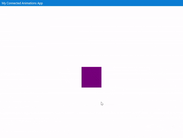
Sample Output
XAML Attached Properties
Connected.Key
Registers element with the ConnectedAnimationsService. For the animation to work, the same key must be registered on two different pages when navigating
Connected.AnchorElement
To enable coordinated animations, use the AnchorElement attached property on the element that should appear alongside the connected animation element by specifying the connected animation element
Connected.ListItemKey
Registers a ListView/GridView for connected animations. When navigating from/to a page that is using this property, the connected animation will use the item passed as a parameter in the page navigation to select the item in the list that should animated. See Select List Item to be animated section below for more details. The Connected.ListItemElementName attached property must also be set for the animation to be registered
Connected.ListItemElementName
Specifies what named element in the DataTemplate of an item should animate. The Connected.ListItemKey attached property must also be set for the animation to be registered.
Registering elements in code behind
In cases where an element has not loaded before the navigation completes, the attached properties are not able to access the element properties to register it for the connected animation. In those case, you can register the element through code behind inside the OnNavigatedTo method. The following extension methods are available:
RegisterElementForConnectedAnimation(this Page page, string key, UIElement element, IEnumerable<UIElement> anchors = null)
Registers a UIElement with the ConnectedAnimations service to run automatically on page navigation
UnregisterElementForConnectedAnimation(this Page page, string key)
Unregisters a UIElement from the ConnectedAnimations service
AttachAnchorElementForConnectedAnimation(this Page page, UIElement element, UIElement anchor)
Add an anchor element to animate alongside the main element
RemoveAnchoredElementForConnectedAnimation(this Page page, UIElement element, UIElement anchor)
Remove an anchor element from animating alongside the main element
RegisterListItemForConnectedAnimation(this Page page, ListViewBase listViewBase, string key, string elementName)
Registers an element (part of a DataTemplate in a list control) with the ConnectedAnimations service to run automatically on page navigation
UnregisterListItemForConnectedAnimation(this Page page, ListViewBase listViewBase, string key)
Unregisters an element (part of a DataTemplate in a list control) from the ConnectedAnimations service
Select List Item to be animated
The helper uses the page navigation parameter to decide which list item will be animated during the page navigation. However, in some cases the parameter passed during page navigation is not part of the list. For example, you might be only passing the id of an item as a navigation parameter and not the item itself.
In those cases, you can use the SetListDataItemForNextConnectedAnnimation extension method before page navigation to specify which item should be animated.
    // dataItemToAnimate is an object in the ListViewBase.ItemsSource collection
    Frame.SetListDataItemForNextConnectedAnnimation(dataItemToAnimate);
    Frame.Navigate(typeof(DetailsPage), dataItemToAnimate.Id);
    ' dataItemToAnimate is an object in the ListViewBase.ItemsSource collection
    Frame.SetListDataItemForNextConnectedAnnimation(dataItemToAnimate)
    Frame.Navigate(GetType(DetailsPage), dataItemToAnimate.Id)
This method is also helpful when navigating back to an item different from the item it was navigated from.
    Frame.SetListDataItemForNextConnectedAnnimation(dataItemToAnimate);
    Frame.GoBack();
    Frame.SetListDataItemForNextConnectedAnnimation(dataItemToAnimate)
    Frame.GoBack()
Examples
We can create the above connected animations.
In first page
We need a set a key for the element to be connected with another element in a different page.
<Grid>
    <Border Height="100" Width="100" Background="Purple"
        VerticalAlignment="Center" HorizontalAlignment="Center"
        animations:Connected.Key="item" />
</Grid>
In second page
We need to set the same key for the element to be connected with. Also, You can anchor another element to move along the connected animation path.
<StackPanel Orientation="Horizontal">
    <Border x:Name="HeroElement" Height="300"  Width="300" Background="Purple"
    animations:Connected.Key="item"/>

    <StackPanel x:Name="HeroDetailsElement" Margin="20,0"
        VerticalAlignment="Bottom" MaxWidth="500"
        animations:Connected.AnchorElement="{x:Bind HeroElement}">
        <TextBlock Text="Header" FontSize="50">Header</TextBlock>
        <TextBlock TextWrapping="WrapWholeWords">Lorem ipsum ...</TextBlock>
    </StackPanel>
</StackPanel>
In this page, we can also create a GridView which implements connected animation for its items. You need to set ListItemKey and ListItemElementName for specifying the UIElement to animate.
<GridView x:Name="listView" Margin="0, 40, 0, 0" SelectionMode="None"
Grid.Row="1" ItemClick="ListView_ItemClick" IsItemClickEnabled="True"
animations:Connected.ListItemElementName="ItemThumbnail"
animations:Connected.ListItemKey="listItem">
    <GridView.ItemTemplate>
        <DataTemplate x:DataType="data:Item">
            <StackPanel>
                <Border x:Name="ItemThumbnail" Background="Purple" Height="200" Width="200"></Border>
                <TextBlock Text="{x:Bind Title}"></TextBlock>
            </StackPanel>
        </DataTemplate>
    </GridView.ItemTemplate>
</GridView>
In third page
In this page, you just need to give the same key.
<StackPanel>
    <StackPanel Orientation="Horizontal" HorizontalAlignment="Right">
        <StackPanel x:Name="HeroDetailsElement" Margin="20,0" VerticalAlignment="Bottom" MaxWidth="500"
        animations:Connected.AnchorElement="{x:Bind ItemHeroElement}">
            <TextBlock Text="{x:Bind item.Title}"
            FontSize="50"/>
            <TextBlock TextWrapping="WrapWholeWords">Lorem ipsum ...</TextBlock>
        </StackPanel>

        <Border x:Name="ItemHeroElement" Height="300" Width="300" Background="Purple"
        animations:Connected.Key="listItem"/>
    </StackPanel>

    <TextBlock Margin="0,40" TextWrapping="WrapWholeWords">Lorem Ipsum ...</TextBlock>
</StackPanel>
Sample Project
Connected Animations sample page source. You can see this in action in the Windows Community Toolkit Sample App.
Requirements
| Device family | Universal, 10.0.16299.0 or higher |
|---|---|
| Namespace | Microsoft.Toolkit.Uwp.UI.Animations |
| NuGet package | Microsoft.Toolkit.Uwp.UI.Animations |