BladeView
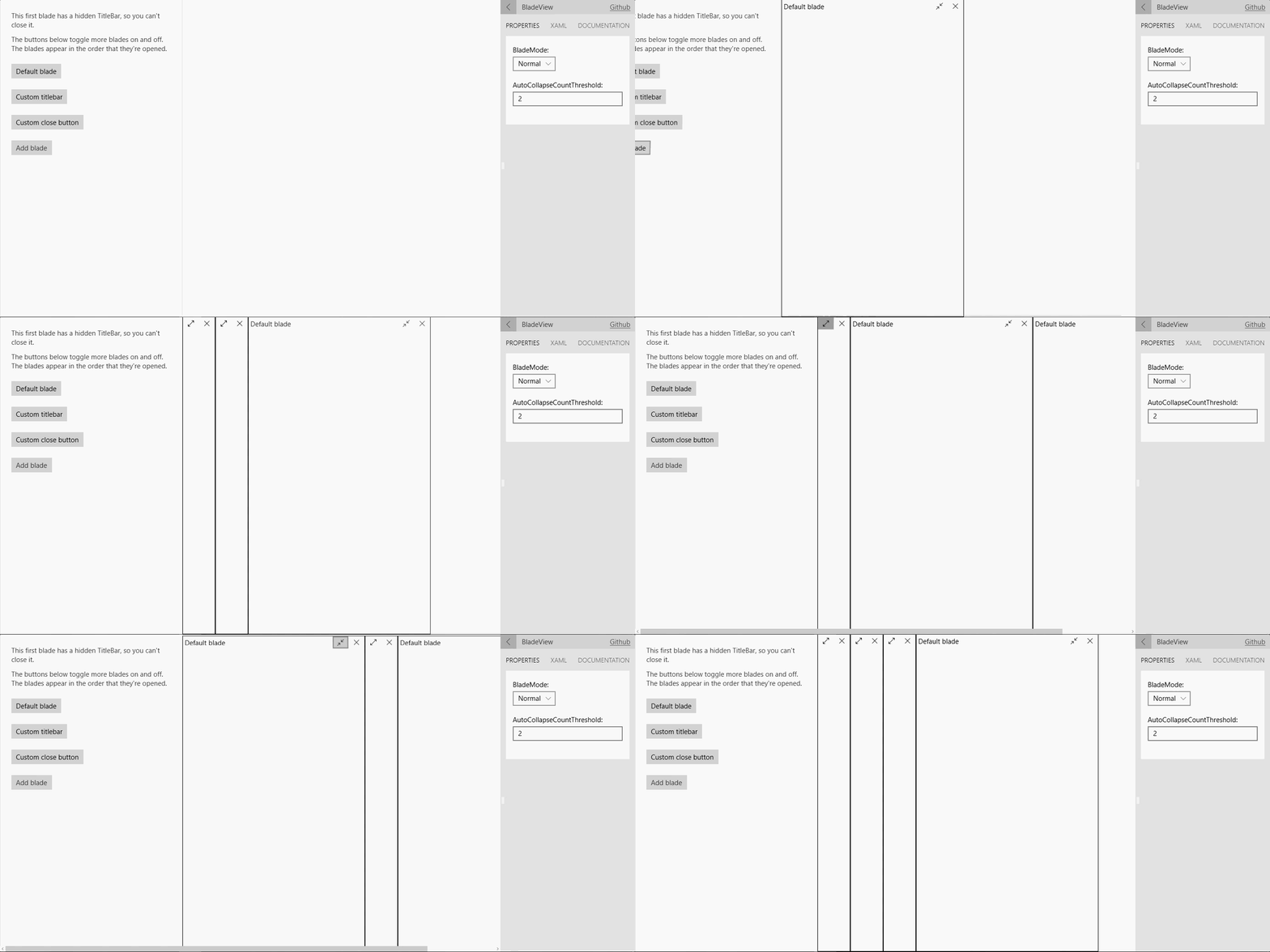
The BladeView control provides a horizontal collection of BladeItems for drilling into detailed scenarios. The control is based on how the Azure Portal works.
Syntax
<Page ...
     xmlns:controls="using:Microsoft.Toolkit.Uwp.UI.Controls"/>

<controls:BladeView>
    <controls:BladeItem IsOpen="True" TitleBarVisibility="Collapsed">
        <!-- BladeItem content -->
    </controls:BladeItem>

    <controls:BladeItem x:Name="DefaultBlade" Header="A blade" IsOpen="False">
        <!-- BladeItem content -->
    </controls:BladeItem>
</controls:BladeView>
Sample Output

Properties
BladeView Properties
| Property | Type | Description |
|---|---|---|
| ActiveBlades | IList<BladeItem> | Description |
| AutoCollapseCountThreshold | int | Gets or sets a value indicating what the overflow amount should be to start auto collapsing blade items |
| BladeMode | BladeMode | Gets or sets a value indicating whether blade mode (ex: whether blades are full screen or not) |
BladeItem Properties
| Property | Type | Description |
|---|---|---|
| CloseButtonBackground | Brush | Gets or sets the background color of the default close button in the title bar |
| CloseButtonForeground | Brush | Gets or sets the foreground color of the close button |
| IsOpen | bool | Gets or sets a value indicating whether this blade is opened |
| Header | string | Gets or sets the content for the header |
| TitleBarBackground | Brush | Gets or sets the background color of the title bar |
| TitleBarVisibility | Visibility | Gets or sets the visibility of the title bar for this blade |
Events
BladeView Events
| Events | Description |
|---|---|
| BladeClosed | Fires whenever a BladeItem is closed |
| BladeOpened | Fires whenever a BladeItem is opened |
BladeItem Events
| Events | Description |
|---|---|
| VisibilityChanged | Fires when the blade is opened or closed |
Examples
If you want to use the BladeView for handling a flow of actions, you can use the
AutoCollapseCountThresholdproperty to tell it to start auto collapsing BladeItems after a certain threshold count has been reached. This will also help keep a clean, uncluttered screen real estate.For example: if you set
AutoCollapseCountThresholdto 3, the BladeView will start counting all BladeItems that are open in the BladeView and have theirTitleBarVisibilityproperty set to Visible. When the n+1 BladeItem, in our case the 4th one, is being added, the BladeView will auto collapse all n BladeItems except for the last one. All additional BladeItems that are added afterwards will trigger the same effect; collapse all BladeItems except for the last open one.Sample Code
<controls:BladeView AutoCollapseCountThreshold="3">
    <controls:BladeItem>
        <!-- BladeItem content -->
    </controls:BladeItem>
    <controls:BladeItem>
        <!-- BladeItem content -->
    </controls:BladeItem>
    .....
    .....
</controls:BladeView>
Sample Project
BladeView Sample Page Source. You can see this in action in the Windows Community Toolkit Sample App.
Default Template
BladeView XAML File is the XAML template used in the toolkit for the default styling.
Requirements
| Device family | Universal, 10.0.16299.0 or higher |
|---|---|
| Namespace | Microsoft.Toolkit.Uwp.UI.Controls |
| NuGet package | Microsoft.Toolkit.Uwp.UI.Controls |
API
Feedback
Coming soon: Throughout 2024 we will be phasing out GitHub Issues as the feedback mechanism for content and replacing it with a new feedback system. For more information see: https://aka.ms/ContentUserFeedback.
Submit and view feedback for