Expander
The Expander control provides an expandable container to host any content. It is a specialized form of a HeaderedContentControl
You can show or hide this content by interacting with the Header.
Syntax
<Page ...
     xmlns:controls="using:Microsoft.Toolkit.Uwp.UI.Controls"/>

<controls:Expander Header="Header of the expander" Foreground="White"
                   Background="Gray" IsExpanded="True">
  <!-- Expander content -->
</controls:Expander>
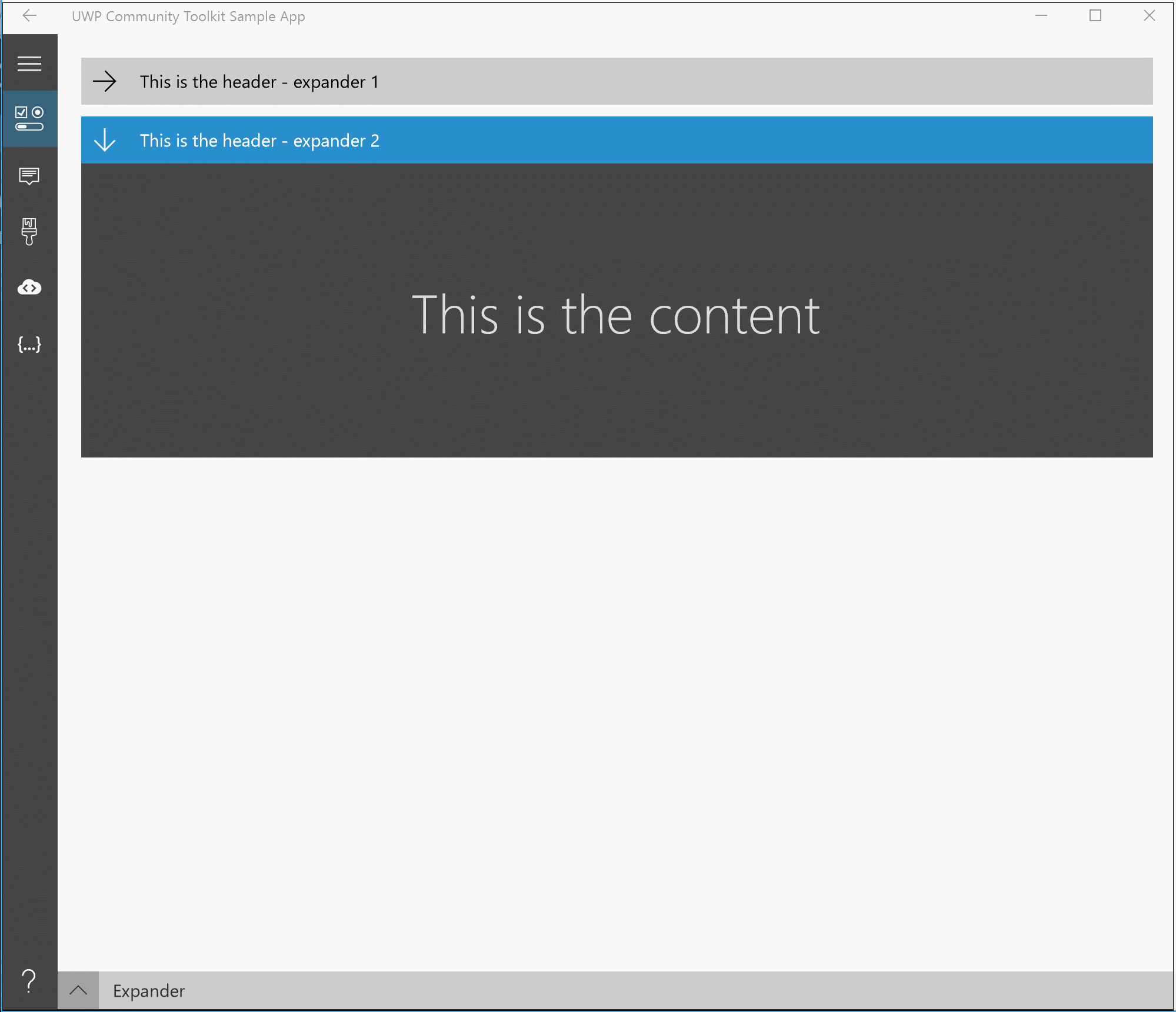
Sample Output
Properties
| Property | Type | Description |
|---|---|---|
| ContentOverlay | UIElement | Specifies alternate content to show when the Expander is collapsed. |
| ExpandDirection | ExpandDirection | Specifies the direction of where expanded content should be displayed in relation to the header. |
| HeaderStyle | Style | Specifies an alternate style template for the ToggleButton header control. |
| IsExpanded | bool | Indicates if the Expander is currently open or closed. The default is False. |
Events
| Events | Description |
|---|---|
| Collapsed | Fires when the expander is closed |
| Expanded | Fires when the expander is opened |
Examples
ContentOverlay
The ContentOverlay property can be used to define the content to be shown when the Expander is collapsed
<controls:Expander Header="Header">
  <Grid>
    <TextBlock Text="Expanded content" />
  </Grid>

  <controls:Expander.ContentOverlay>
    <Grid MinHeight="250">
      <TextBlock Text="Collapsed content" />
    </Grid>
  </controls:Expander.ContentOverlay>
</controls:Expander>
ExpandDirection
The ExpandDirection property can take 4 values that will expand the content based on the selected direction:
Down- from top to bottom (default)Up- from bottom to topRight- from left to rightLeft- from right to left
HeaderStyle
Allows creating an alternate style for the entire Expander header including the arrow symbol, in contrast to the HeaderTemplate which can control the content next to the arrow.
For instance to remove the header entirely from the Expander:
  <Page.Resources>
    <Style x:Key="NoExpanderHeaderStyle" TargetType="ToggleButton">
      <Setter Property="Visibility" Value="Collapsed"/>
    </Style>
  </Page.Resources>

  <controls:Expander HeaderStyle="{StaticResource NoExpanderHeaderStyle}" IsExpanded="True">
    <TextBlock Text="My Content"/>
  </controls:Expander>
Sample Project
Expander Sample Page Source. You can see this in action in the Windows Community Toolkit Sample App.
Default Template
Expander XAML File is the XAML template used in the toolkit for the default styling.
Requirements
| Device family | Universal, 10.0.16299.0 or higher |
|---|---|
| Namespace | Microsoft.Toolkit.Uwp.UI.Controls |
| NuGet package | Microsoft.Toolkit.Uwp.UI.Controls |
API
Related Topics
Feedback
Coming soon: Throughout 2024 we will be phasing out GitHub Issues as the feedback mechanism for content and replacing it with a new feedback system. For more information see: https://aka.ms/ContentUserFeedback.
Submit and view feedback for