Note
Access to this page requires authorization. You can try signing in or changing directories.
Access to this page requires authorization. You can try changing directories.
The GridSplitter control provides an easy-to-use Splitter that redistributes space between columns or rows of a Grid Control. By dragging the control, the control will resize the targeted columns or rows.
The control automatically detects the targeted columns/rows to resize, while dragging the control it starts to resize the columns/rows and redistributes space between columns/rows, you can manually specify the Resize Direction Auto, Column, Row and the Resize Behavior to select which columns/rows to resize.
Note
You can use the control to resize fixed and star (*) width/height columns/rows.
Syntax
<Page ...
xmlns:controls="using:Microsoft.Toolkit.Uwp.UI.Controls"/>
<controls:GridSplitter Width="11" ResizeBehavior="BasedOnAlignment" ResizeDirection="Auto"
Background="Gray" Foreground="White" FontSize="13">
<controls:GridSplitter.Element>
<Grid>
<TextBlock HorizontalAlignment="Center" IsHitTestVisible="False"
VerticalAlignment="Center" Text=""
Foreground="Black" FontFamily="Segoe MDL2 Assets"/>
</Grid>
</controls:GridSplitter.Element>
</controls:GridSplitter>
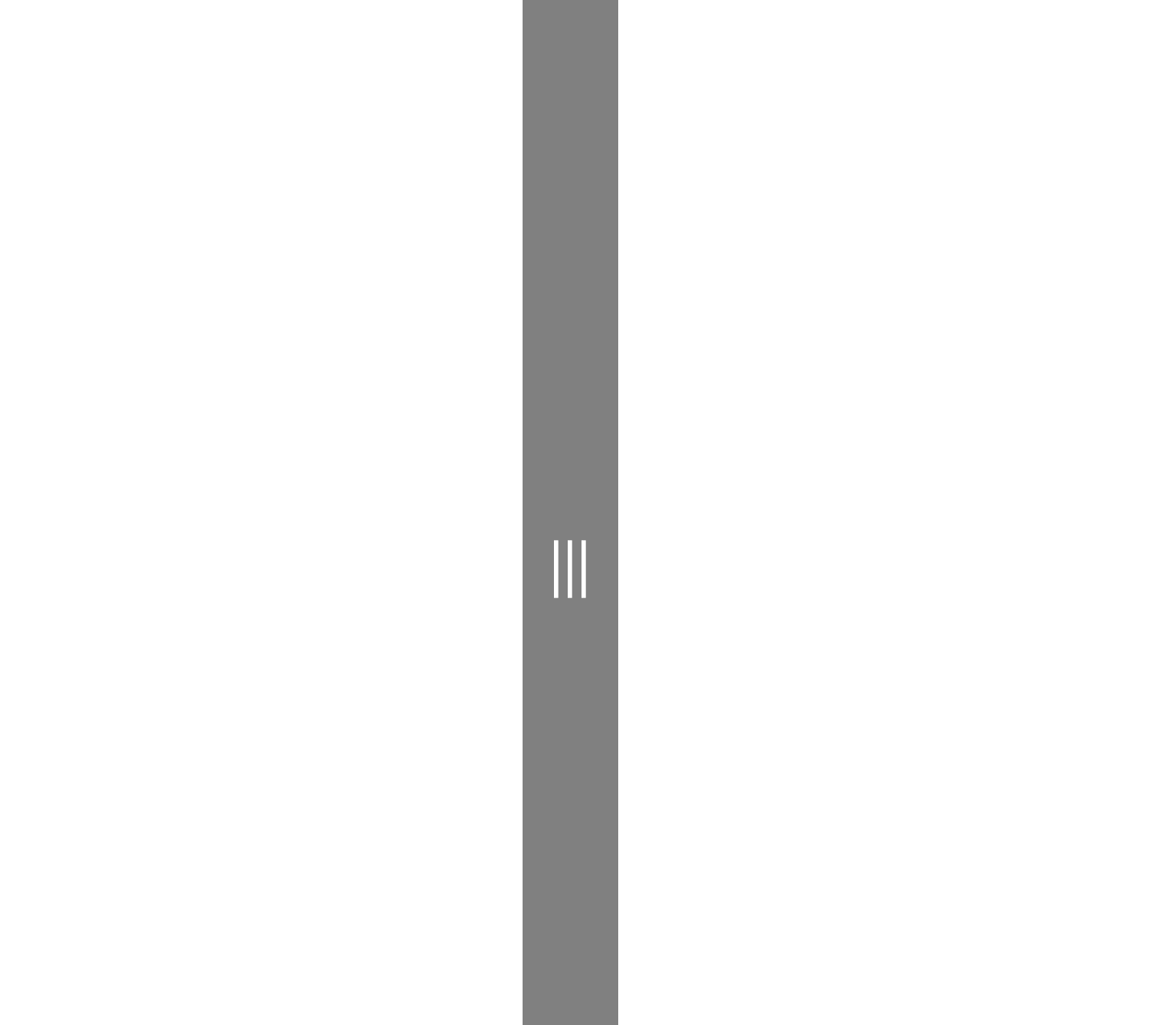
Sample Output
Properties
| Property | Type | Description |
|---|---|---|
| CursorBehavior | GridSplitter.SplitterCursorBehavior | Gets or sets splitter cursor on hover behavior |
| Element | UIElement | Gets or sets the visual content of this Grid Splitter |
| GripperCursor | GridSplitter.GripperCursorType | Gets or sets the gripper Cursor type |
| GripperCustomCursorResource | int | Gets or sets the gripper Custom Cursor resource number |
| GripperForeground | Brush | Gets or sets the foreground color of grid splitter grip |
| ParentLevel | int | Gets or sets the level of the parent grid to resize |
| ResizeBehavior | GridSplitter.GridResizeBehavior | Gets or sets which Columns or Rows the Splitter resizes |
| ResizeDirection | GridSplitter.GridResizeDirection | Gets or sets whether the Splitter resizes the Columns, Rows, or Both |
Examples
The following sample demonstrates how to add Grid Splitter Control
<Page ....
xmlns:controls="using:Microsoft.Toolkit.Uwp.UI.Controls">
<Grid>
<Grid.RowDefinitions>
<RowDefinition MinHeight="100"></RowDefinition>
<RowDefinition Height="11"></RowDefinition>
<RowDefinition></RowDefinition>
</Grid.RowDefinitions>
<Grid.ColumnDefinitions>
<ColumnDefinition MinWidth="200"></ColumnDefinition>
<ColumnDefinition Width="11"></ColumnDefinition>
<ColumnDefinition></ColumnDefinition>
</Grid.ColumnDefinitions>
<!--Column Grid Splitter-->
<controls:GridSplitter Grid.Column="1" Width="11" ResizeBehavior="BasedOnAlignment"
ResizeDirection="Auto" Background="Gray" Foreground="White" FontSize="13">
<controls:GridSplitter.Element>
<Grid>
<TextBlock HorizontalAlignment="Center" IsHitTestVisible="False" VerticalAlignment="Center"
Text="" Foreground="Black" FontFamily="Segoe MDL2 Assets">
</TextBlock>
</Grid>
</controls:GridSplitter.Element>
</controls:GridSplitter>
<!--Row Grid Splitter-->
<controls:GridSplitter Foreground="White" Grid.Row="1" ResizeBehavior="BasedOnAlignment"
ResizeDirection="Auto" Background="Gray" Height="11" HorizontalAlignment="Stretch" FontSize="13">
<controls:GridSplitter.Element>
<Grid>
<TextBlock HorizontalAlignment="Center" IsHitTestVisible="False" VerticalAlignment="Center"
Text="" Foreground="Black" FontFamily="Segoe MDL2 Assets">
</TextBlock>
</Grid>
</controls:GridSplitter.Element>
</controls:GridSplitter>
</Grid>
</Page>
Sample Code
GridSplitter Sample Page Source. You can see this in action in the Windows Community Toolkit Sample App.
Default Template
GridSplitter XAML File is the XAML template used in the toolkit for the default styling.
Requirements
| Device family | Universal, 10.0.16299.0 or higher |
|---|---|
| Namespace | Microsoft.Toolkit.Uwp.UI.Controls |
| NuGet package | Microsoft.Toolkit.Uwp.UI.Controls |