Note
Access to this page requires authorization. You can try signing in or changing directories.
Access to this page requires authorization. You can try changing directories.
The HeaderedItemsControl is a UI control that allows content to be displayed with a specified header. The Header property can be any object and you can use the HeaderTemplate to specify a custom look to the header.
Note
Setting the Background, BorderBrush and BorderThickness properties will not have any effect on the HeaderedItemsControl. This is to maintain the same functionality as the ItemsControl.
Syntax
<Page ...
     xmlns:controls="using:Microsoft.Toolkit.Uwp.UI.Controls"/>

<controls:HeaderedItemsControl>
    <!-- Header content or HeaderTemplate content -->
</controls:HeaderedItemsControl>
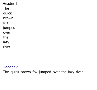
Sample Output
Properties
| Property | Type | Gets or sets the data used for the header of each control |
|---|---|---|
| Header | object | Gets or sets the data used for the header of each control |
| HeaderTemplate | DataTemplate | Gets or sets the template used to display the content of the control's header |
| Orientation | Orientation | Gets or sets the Orientation to use for layout of the header. If set to Vertical the Header will be above the items. If set to Horizontal the Header will be to the left of the items. |
Examples
The
Headerproperty can be set to a string, or any xaml elements. If binding theHeaderto an object that is not a string, use theHeaderTemplateto control how the content is rendered.Sample Code
<controls:HeaderedItemsControl Header="This is the header!"/>

<controls:HeaderedItemsControl>
    <controls:HeaderedItemsControl.Header>
        <Border Background="Gray">
            <TextBlock Text="This is the header!" FontSize="16">
        </Border>
    </controls:HeaderedItemsControl.Header>
</controls:HeaderedItemsControl>
Used to control the look of the header. The default value for the
HeaderTemplatewill display the string representation of theHeader. Set this property if you need to bind theHeaderto an object.Sample Code
<controls:HeaderedItemsControl Header="{Binding CustomObject}">
    <controls:HeaderedItemsControl.HeaderTemplate>
        <DataTemplate>
            <TextBlock Text="{Binding Title}">
        </DataTemplate>
    </controls:HeaderedItemsControl.HeaderTemplate>
</controls:HeaderedItemsControl>
Sample Project
HeaderedItemsControl Sample Page Source. You can see this in action in the Windows Community Toolkit Sample App.
Default Template
HeaderedItemsControl XAML File is the XAML template used in the toolkit for the default styling.
Requirements
| Device family | Universal, 10.0.16299.0 or higher |
|---|---|
| Namespace | Microsoft.Toolkit.Uwp.UI.Controls |
| NuGet package | Microsoft.Toolkit.Uwp.UI.Controls |