Note
Access to this page requires authorization. You can try signing in or changing directories.
Access to this page requires authorization. You can try changing directories.
The Loading control is for showing an animation with some content when the user should wait in some tasks of the app.
Syntax
<Page ...
     xmlns:controls="using:Microsoft.Toolkit.Uwp.UI.Controls"/>

<controls:Loading x:Name="LoadingControl" IsLoading="{Binding IsBusy}">
    <!-- Loading screen content -->
</controls:Loading>
Sample Output
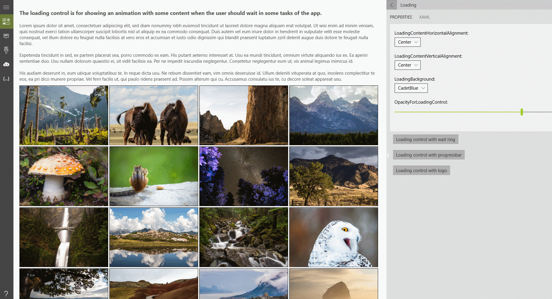
Properties
| Property | Type | Description |
|---|---|---|
| IsLoading | bool | Gets or sets a value indicating whether the control is in the loading state |
Examples
An example of how we can build the loading control.
BackgroundandOpacityare for the panel who appears and disappears behind our custom control.- Use the
LoadingControlto show specialized content. - You can also use
BorderBrushandBorderThicknessto change theLoadingControl.
<controls:Loading x:Name="LoadingControl" IsLoading="{Binding IsBusy}"  >
    <StackPanel Orientation="Horizontal" Padding="12">
        <Grid Margin="0,0,8,0">
            <Image Source="../../Assets/ToolkitLogo.png" Height="50" />
            <ProgressRing IsActive="True" Foreground="Blue" />
        </Grid>
        <TextBlock Text="It's ok, we are working on it :)" Foreground="Black" VerticalAlignment="Center" />
    </StackPanel>
</controls:Loading>
Finally that the loading control appears, we must set the IsLoading property to true
LoadingControl.IsLoading = true;
LoadingControl.IsLoading = true
Sample Project
Loading Sample Page Source. You can see this in action in the Windows Community Toolkit Sample App.
Default Template
Loading XAML File is the XAML template used in the toolkit for the default styling.
Requirements
| Device family | Universal, 10.0.16299.0 or higher |
|---|---|
| Namespace | Microsoft.Toolkit.Uwp.UI.Controls |
| NuGet package | Microsoft.Toolkit.Uwp.UI.Controls |