Note
Access to this page requires authorization. You can try signing in or changing directories.
Access to this page requires authorization. You can try changing directories.
Warning
This control has been removed from the Windows Community Toolkit. Please use the behavior directly instead, either FadeHeaderBehavior, QuickReturnHeaderBehavior, or StickyHeaderBehavior.
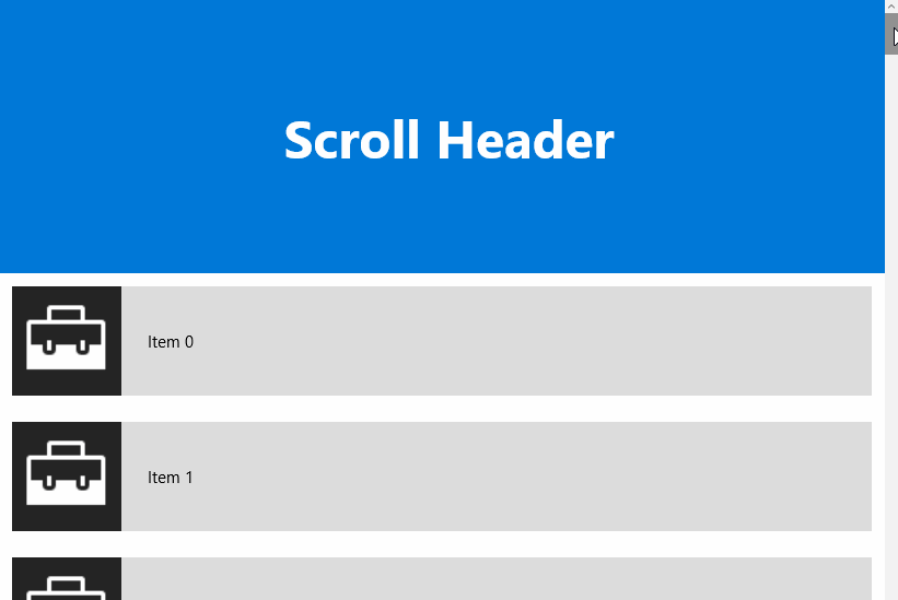
The ScrollHeader control provides a header for ListViews or GridViews that adds the ability to keep its content visible or fade it out while scrolling down. It also has a quick return mode where the header hides when the ListView is scrolled down and reappears immediately as soon as the ListView is scrolled up again.
Syntax
<Page xmlns:controls="using:Microsoft.Toolkit.Uwp.UI.Controls" .../>

<ListView Name="listView" ItemsSource="{x:Bind _items, Mode=OneWay}">
    <ListView.Header>
        <controls:ScrollHeader Mode="Sticky">
            <TextBlock Text="Scroll Header" />
        </controls:ScrollHeader>
    </ListView.Header>
</ListView>

<!-- or -->

<GridView Name="gridView" ItemsSource="{x:Bind _items, Mode=OneWay}">
    <GridView.Header>
        <controls:ScrollHeader Mode="Sticky">
            <TextBlock Text="Scroll Header" />
        </controls:ScrollHeader>
    </GridView.Header>
</GridView>
Sample Output
Properties
| Property | Type | Description |
|---|---|---|
| Mode | ScrollHeaderMode | Gets or sets a value indicating whether the current mode. Default is none |
| TargetListViewBase | ListViewBase | Gets or sets the container this header belongs to |
Sample Project
ScrollHeader Sample Page Source. You can see this in action in the Windows Community Toolkit Sample App.
Default Template
ScrollHeader XAML File ScrollHeader XAML File is the XAML template used in the toolkit for the default styling.
Requirements
| Device family | Universal, 10.0.16299.0 or higher |
|---|---|
| Namespace | Microsoft.Toolkit.Uwp.UI.Controls |
| NuGet package | Microsoft.Toolkit.Uwp.UI.Controls |
API
- ScrollHeader source code ScrollHeader source code